Toms In Town's Confident Packaging System Helps Rid The Period Market Of Its Stigma
by Chloe Gordon on 03/23/2023 | 2 Minute Read
Design studio Caserne created the packaging for Toms In Town, a period care brand working to erase the shame and stigma surrounding periods. The packaging aims to fuse industrial design with a sense of effortlessness, and the range within the color palette allows the brand to become accessible to a diverse set of consumers.
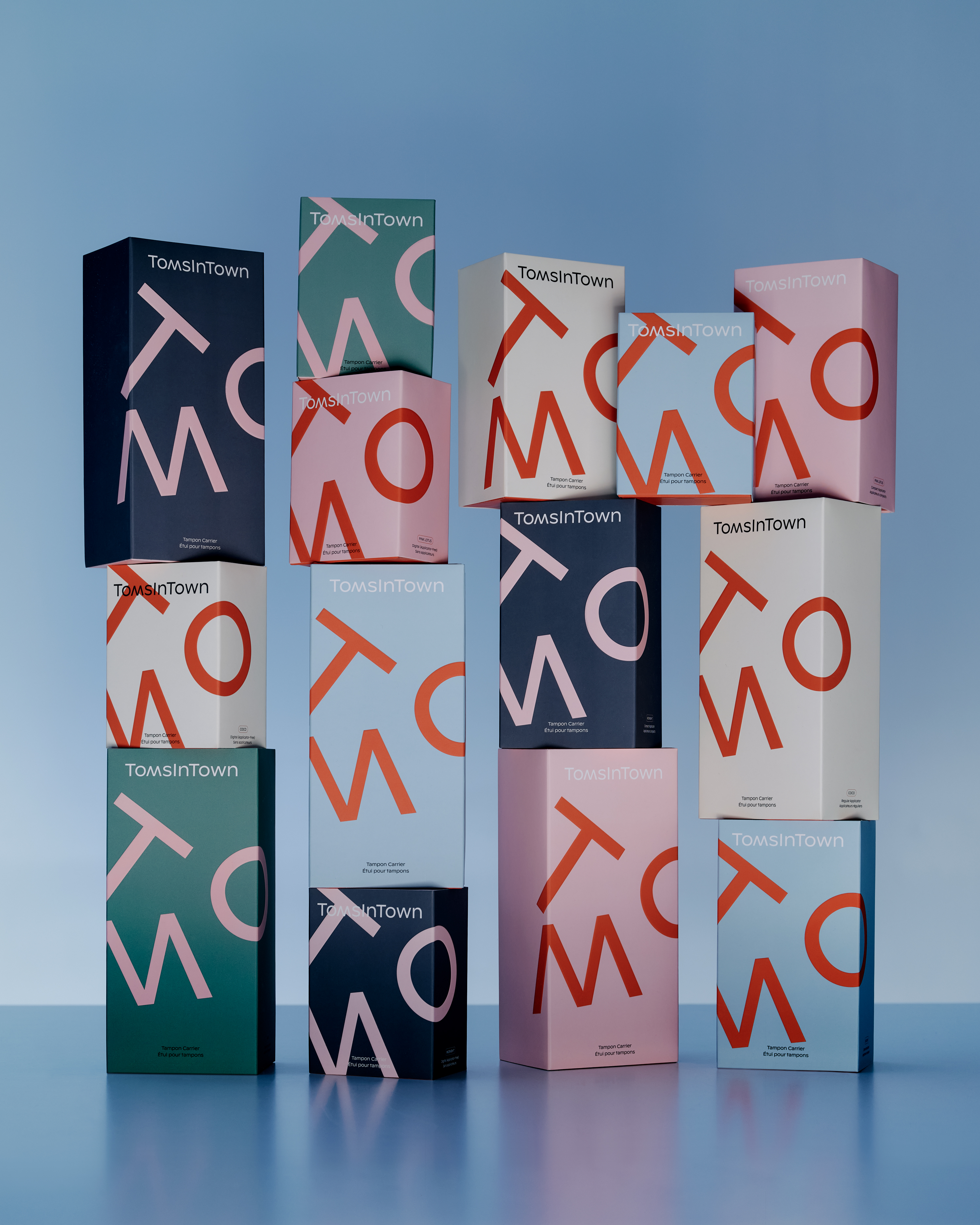
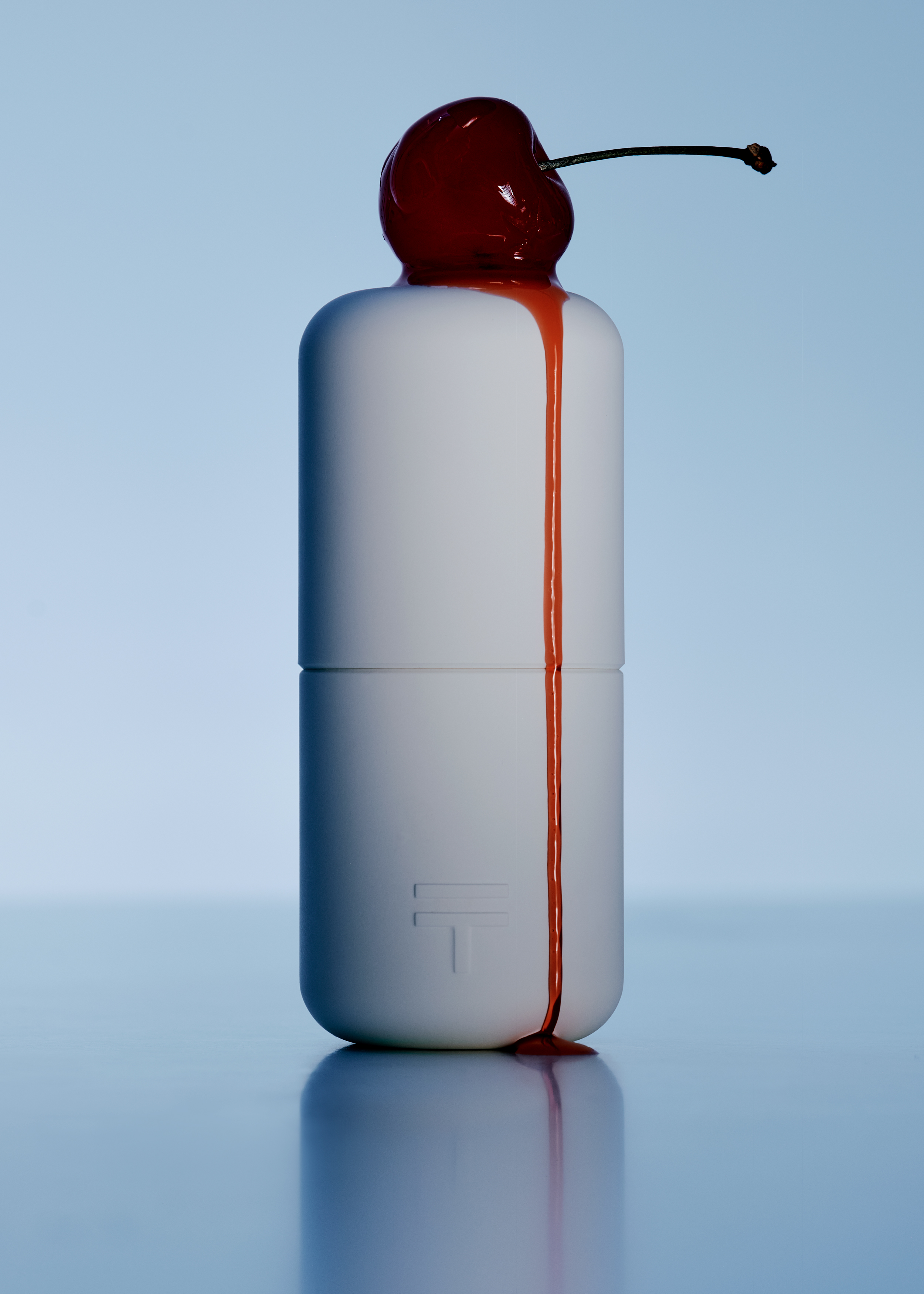
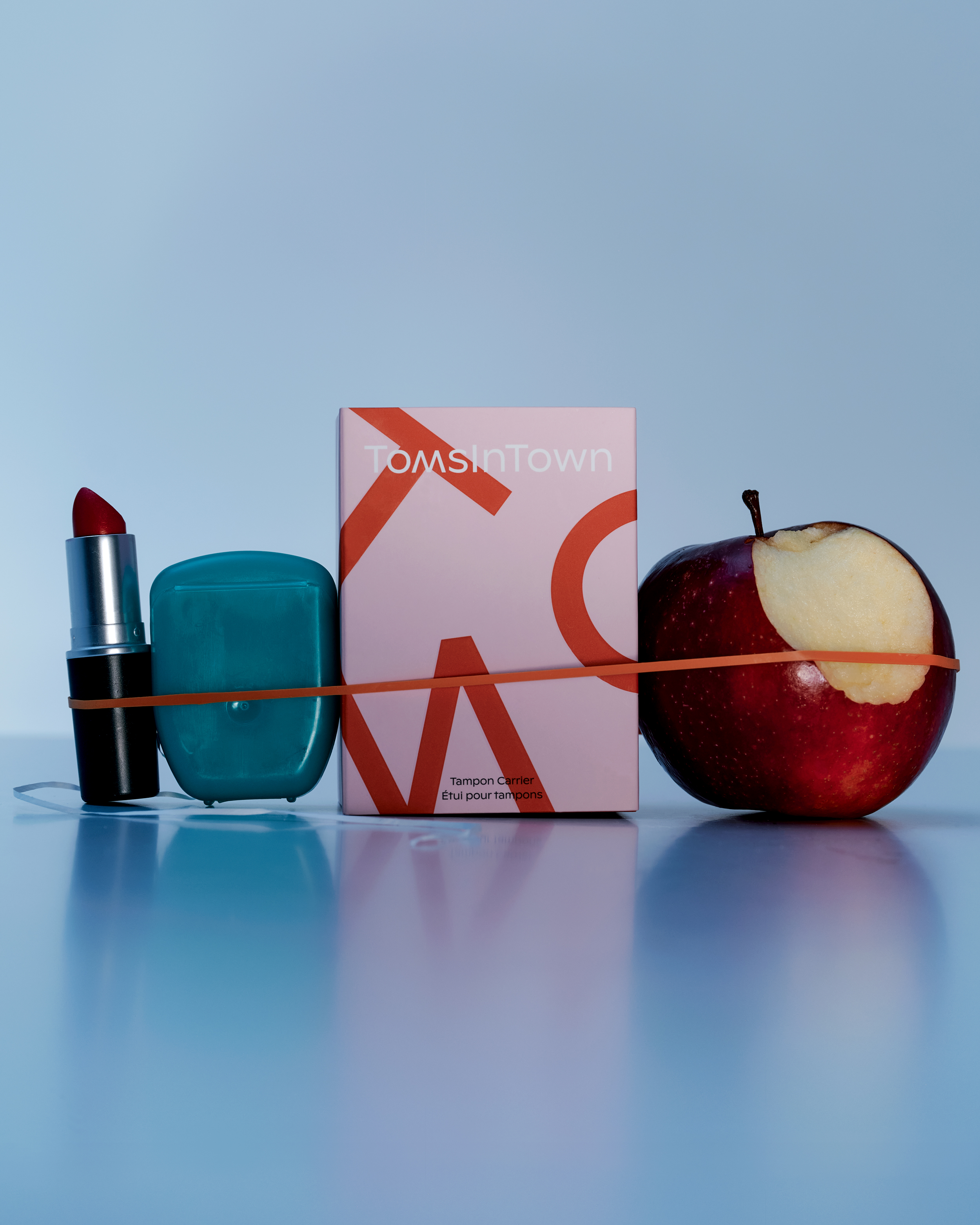
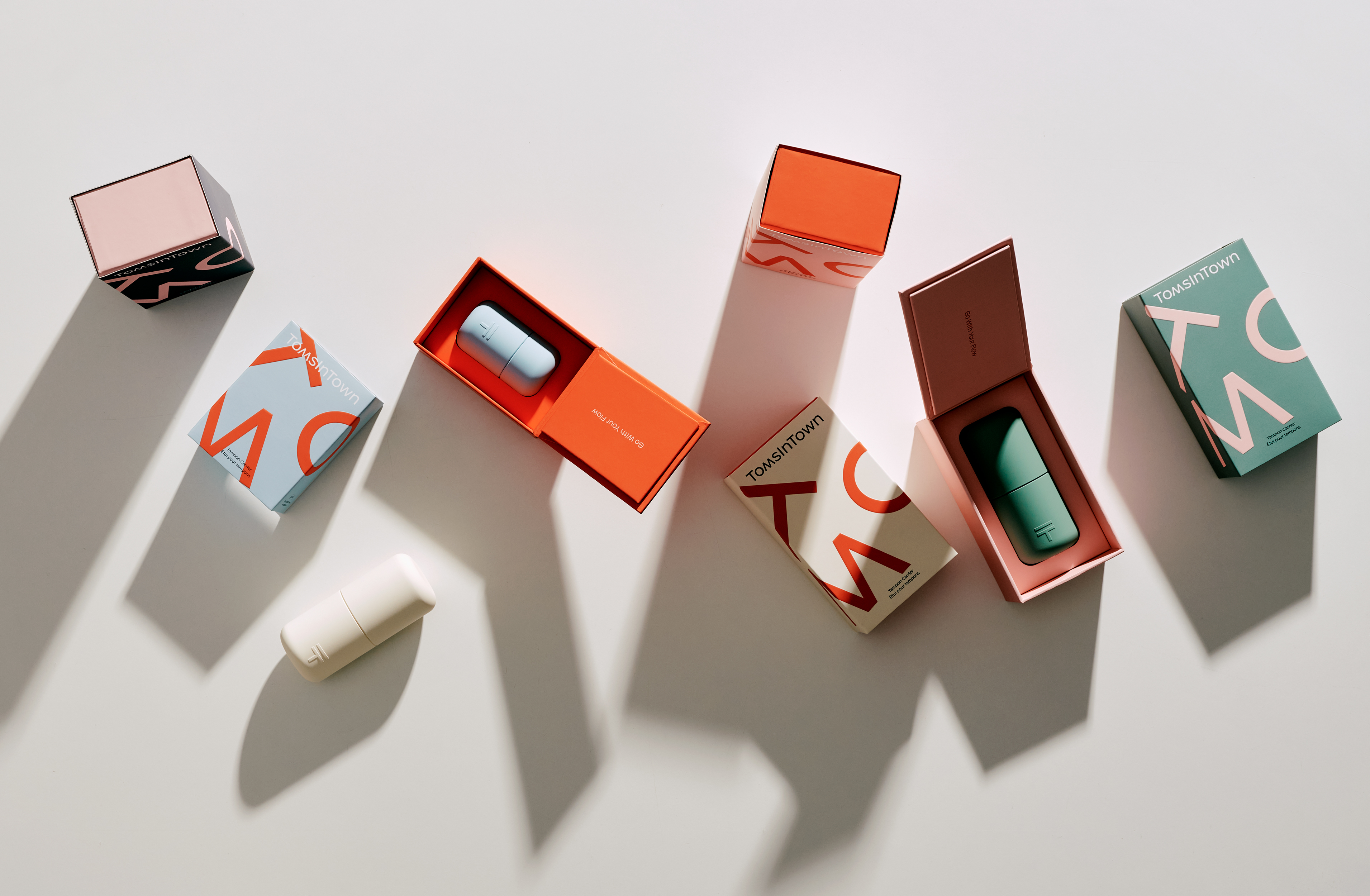
Toms In Town stems from the desire to bring quality products to the period market. The tampon cases were developed to keep your tampons clean, protected, and handy. The graphic identity has a confident attitude to distance itself from the shame and stigma often associated with period-related products. The color palette was carefully thought out to cater to different archetypes of potential consumers and became an integral part of the brand platform. The design process was started in parallel to the industrial design of the case to ensure a harmony between the object and the brand identity. The juxtaposition of the two T’s in the icon was directly inspired by the case and its two equal, distinct parts.

- Designed By:: Caserne