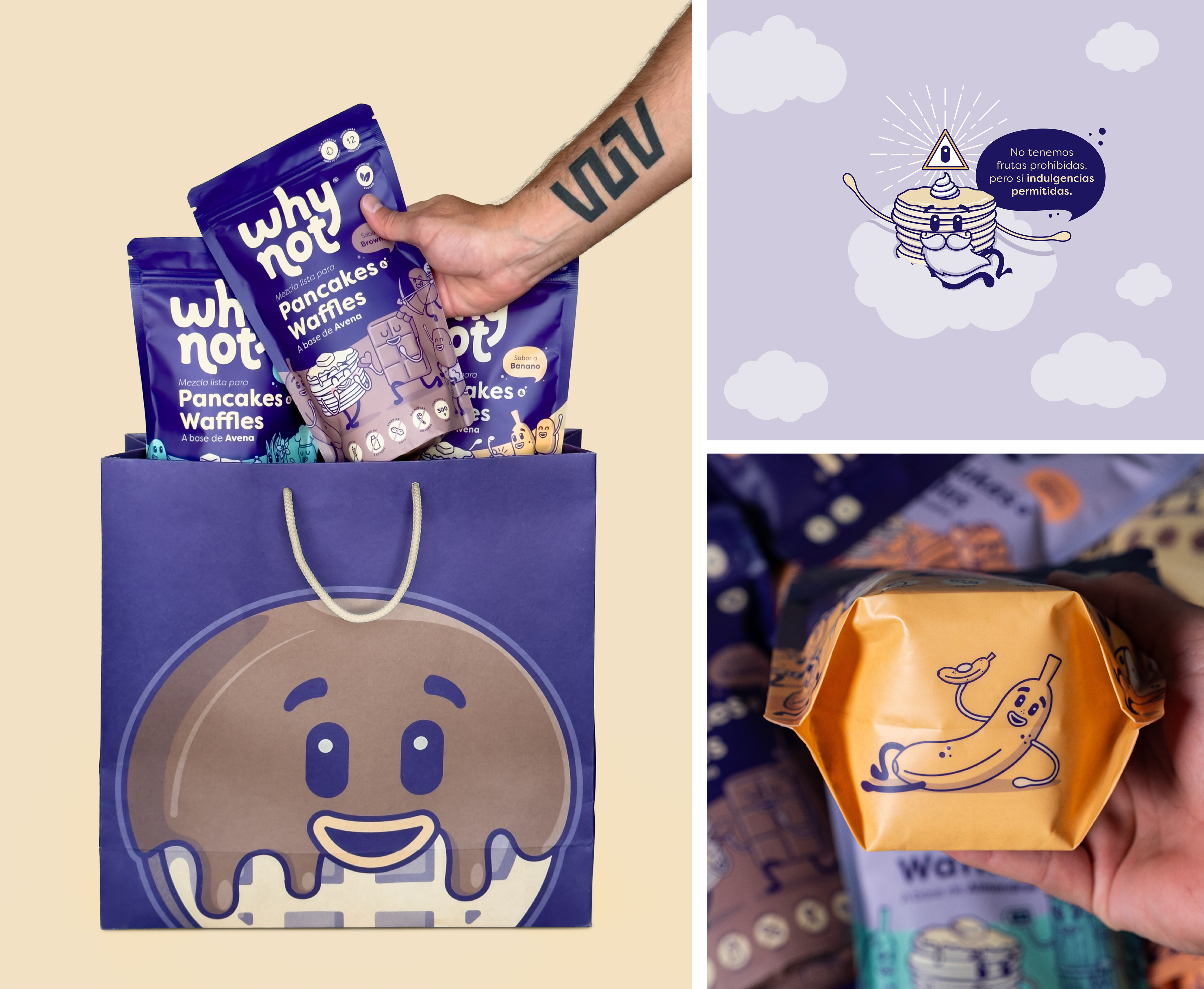
Borondo helped the Colombian food brand Why Not create a packaging system that helps the brand’s mission of creating an indulgently healthy product. The packaging system balances the brand’s irreverence with a charming twist, using sweet colors and adorable illustrations to depart the brand from the traditional.
Why Not is a Colombian food brand that wants to overthrow the belief that indulgence equals unhealthy. The brand’s name emphasizes the defiant idea of the founders of wanting to prove that the impossible can be achieved when it comes to changing the way we feel about certain types of food, such as pancakes, spreads, chocolate and thousands of foods that we usually think can only be eaten once in a while due to their high caloric content, because the ingredients are not of the best quality or because they include additives that can be harmful if consumed regularly.
The question Why not? acts as the brand’s engine to create delicious and easy-to-prepare/consume products, from the best quality ingredients and without the use of artificial additives –such as preservatives, colorings and sweeteners.
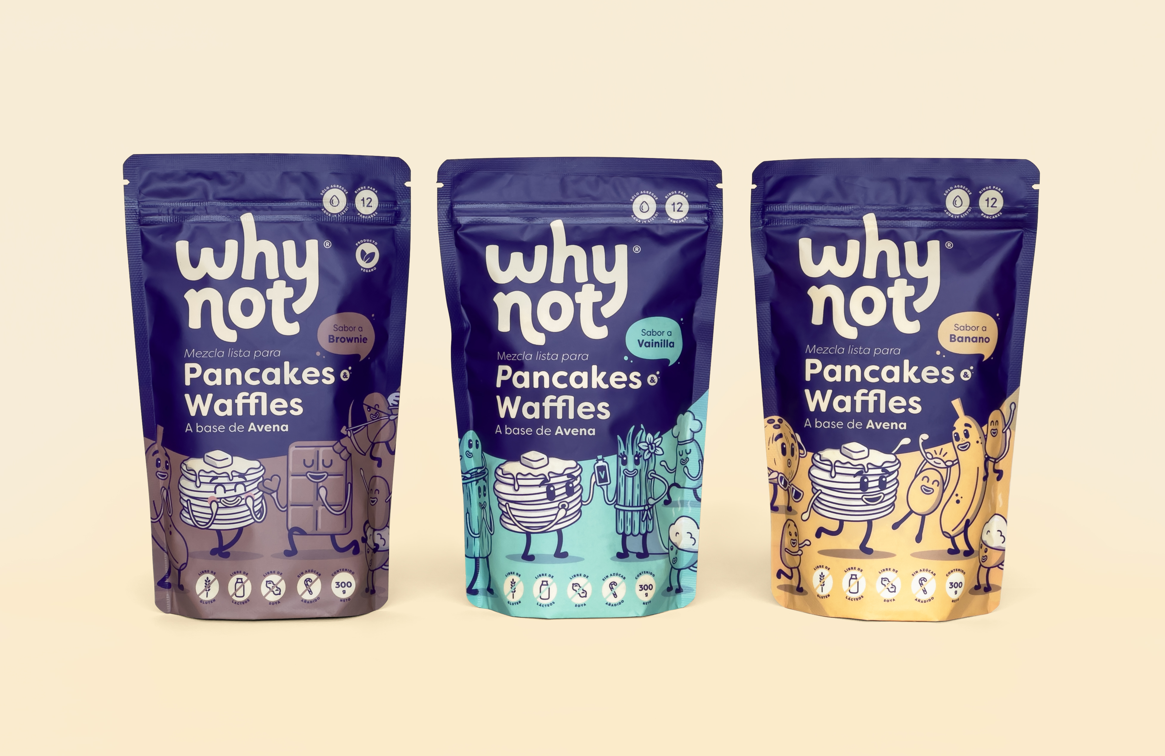
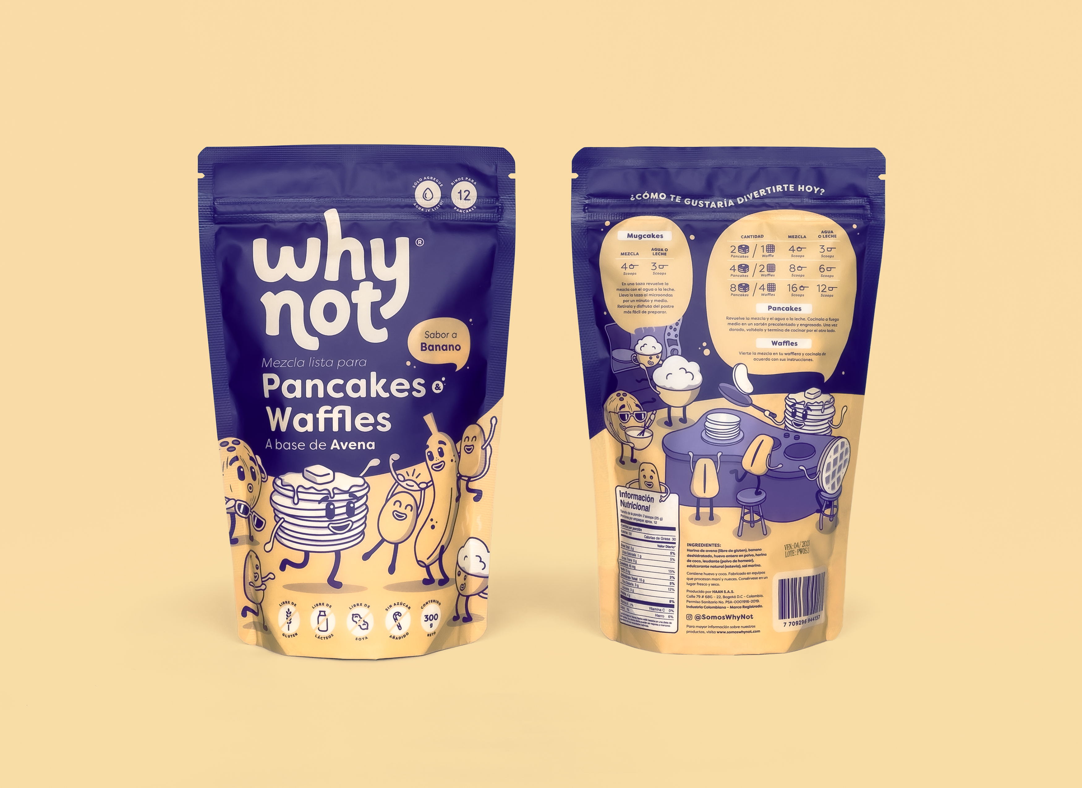
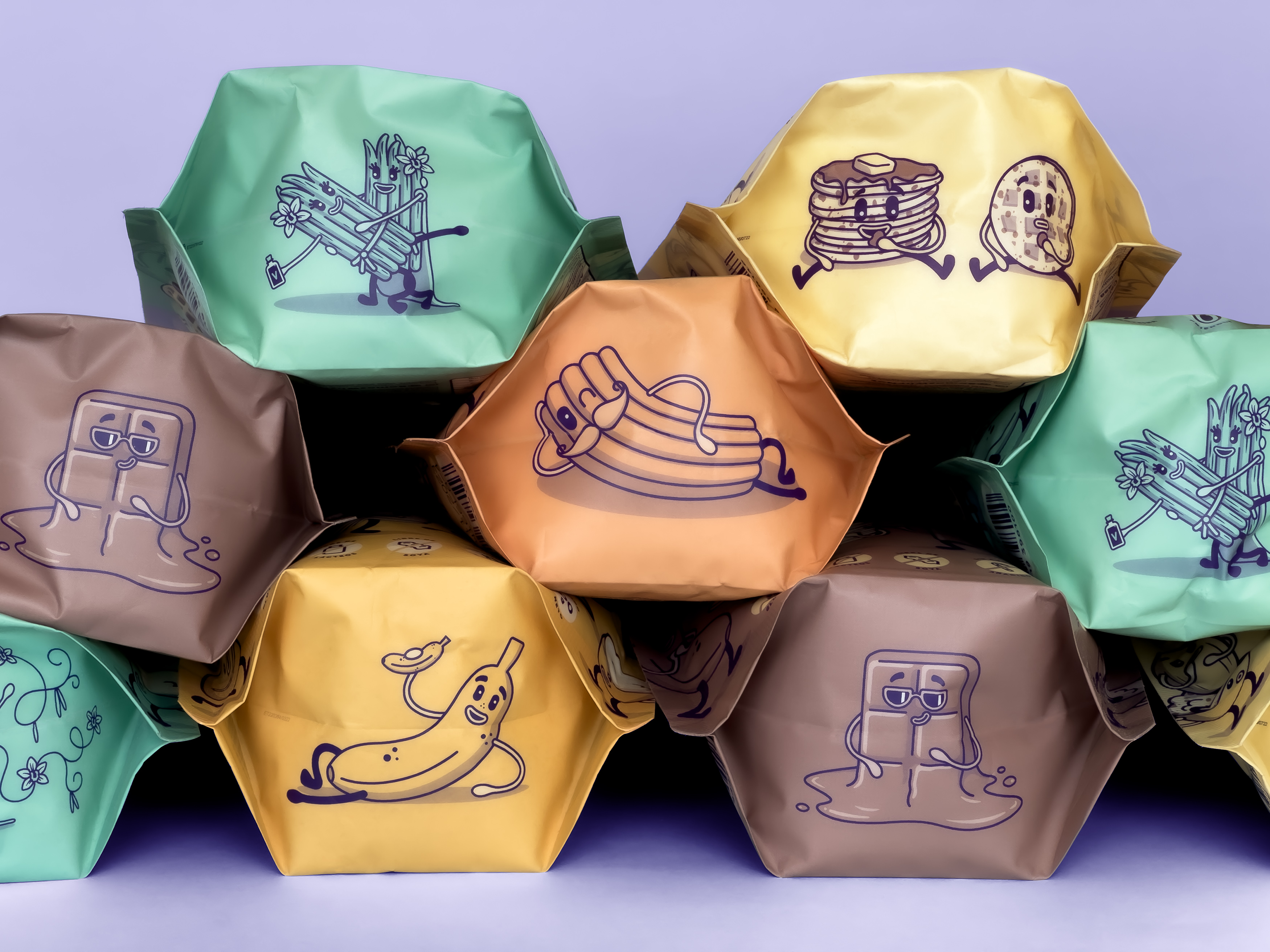
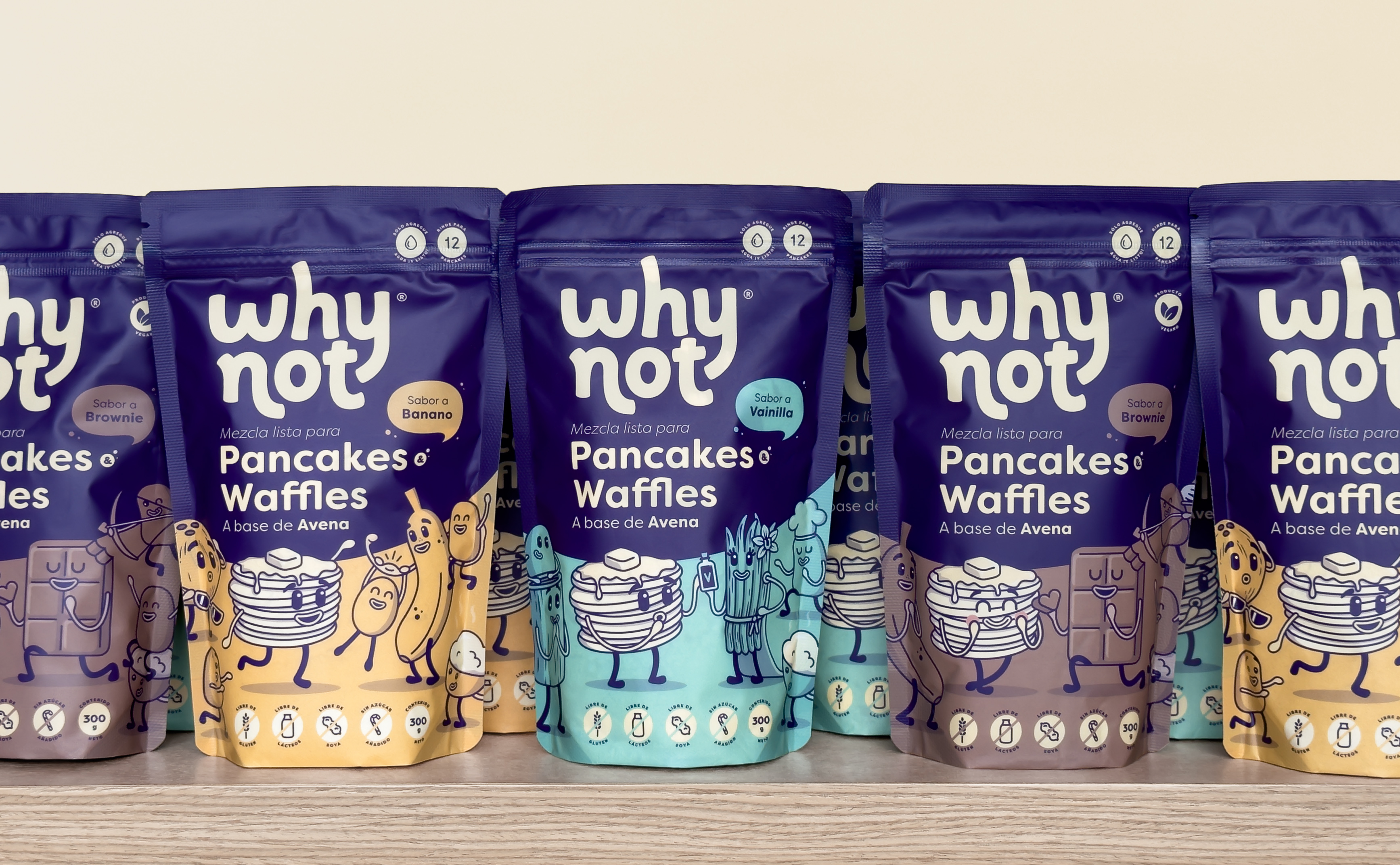
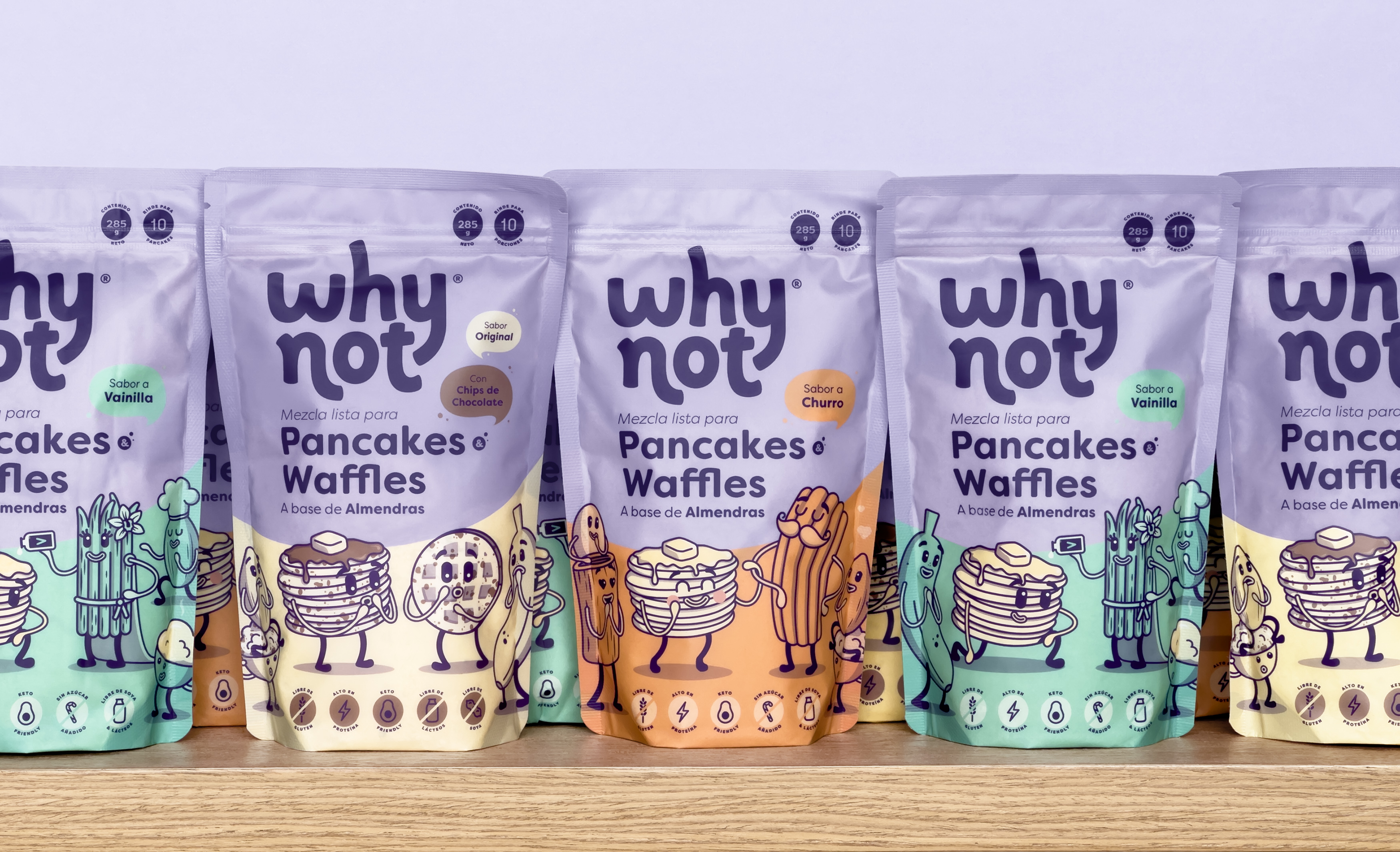
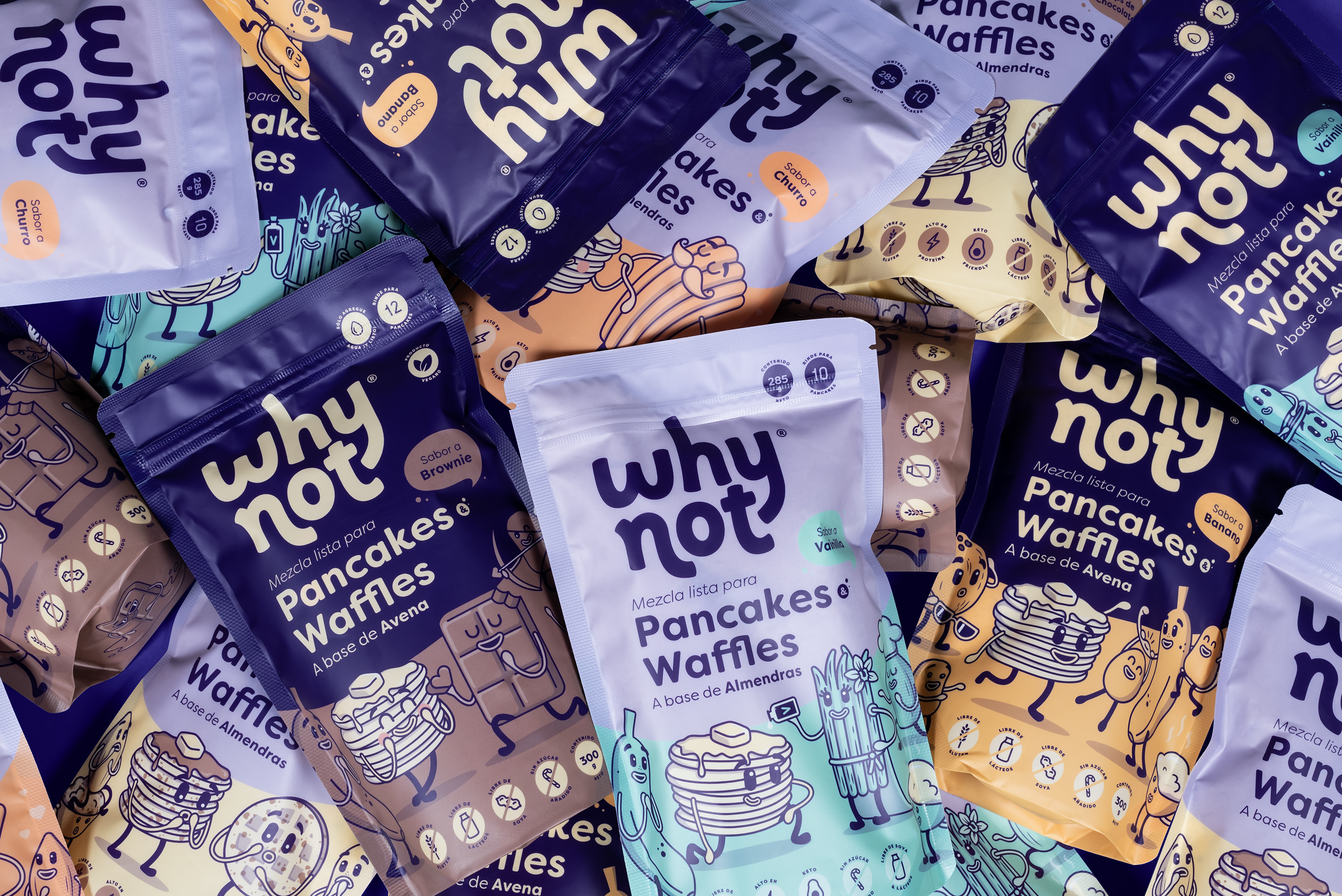
The transparency and irreverence proposed by Why Not are complemented by a tailor-made visual identity that uses illustrated characters, vibrant colors, a bit of Spanglish and an innocent and optimistic personality to capture the attention of those who have contact with the brand so they crack a smile and establish an emotional connection that goes far beyond just buying products: towards a new way of relating to food, where happiness and tranquility triumph over feelings of guilt.
Challenging the conventions of how we relate to indulgent foods required an equally challenging visual identity that strayed from the visual codes of a category where nearly every player looks like a copy of one another. That’s why it was decided from the beginning to use illustrated characters and an unconventional color palette within the Pancake & Waffle Mixes Category to not only distance itself from traditional brands, but break with the schemes and open the doors to a world of new possibilities.
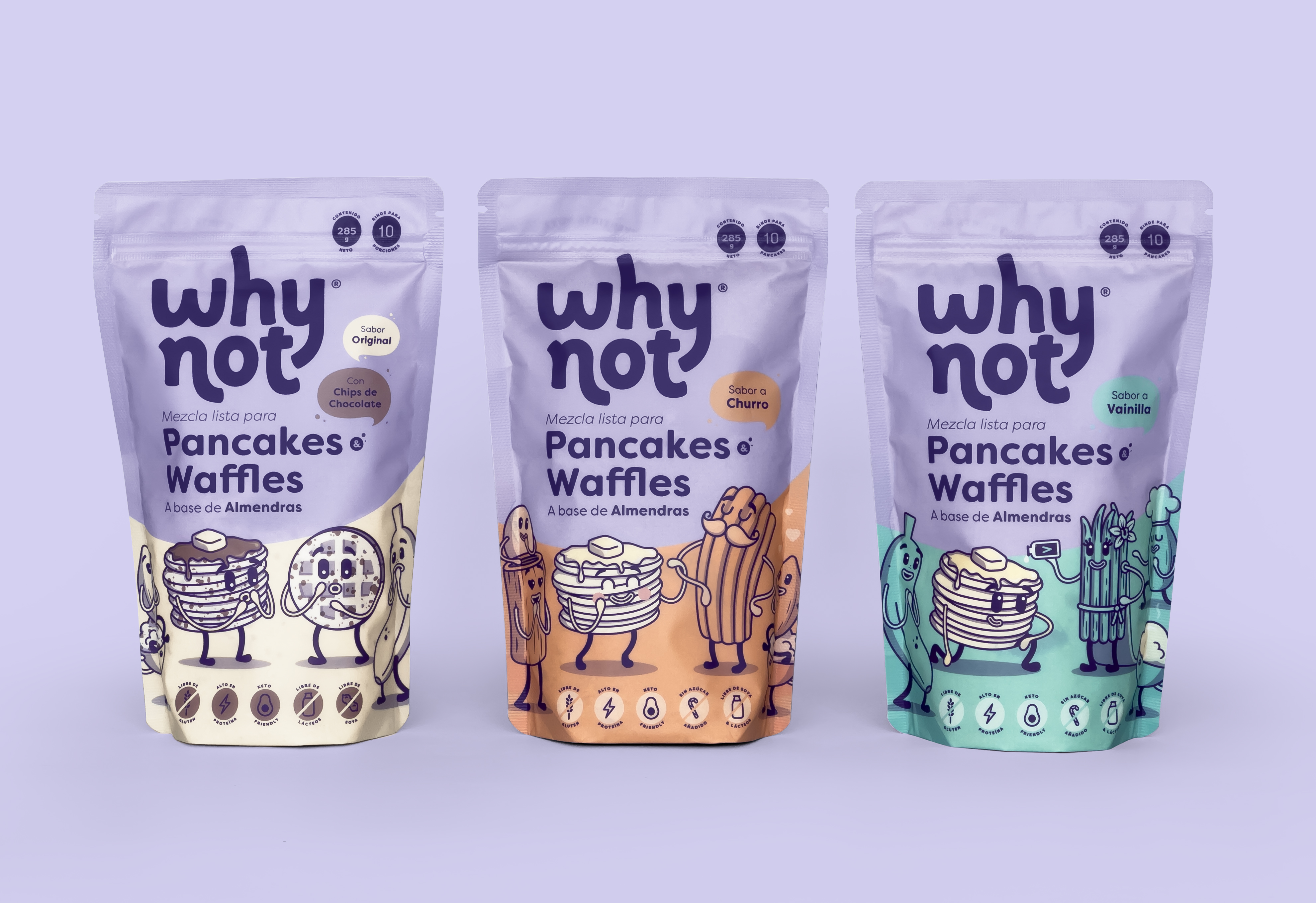
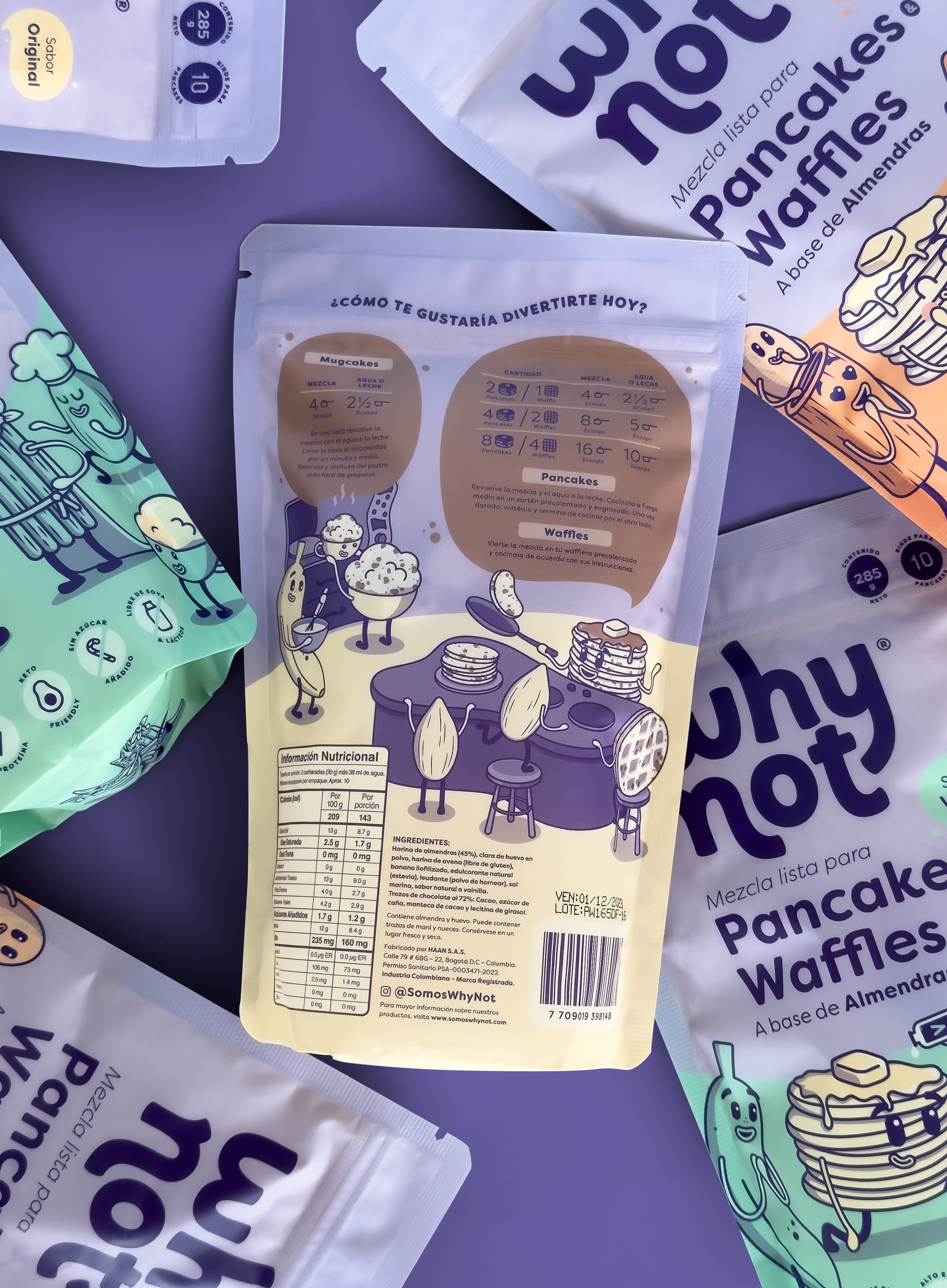
The redesign of the packaging for the Why Not Pancake & Waffle Mixes came at a time when the company seeks to stop being a niche brand and expand to enter both chain supermarkets and international markets. For this reason, the most valuable elements of the visual identity were taken and a highly visible and impressive composition was created at the point of sale that clearly establishes the name of the brand and the type of product in its main colors, followed by a section of secondary color that identifies the flavor of each reference and that contains a fun scene where the characters (derived from the ingredients of the product) are the protagonists of a magical world full of possibilities.