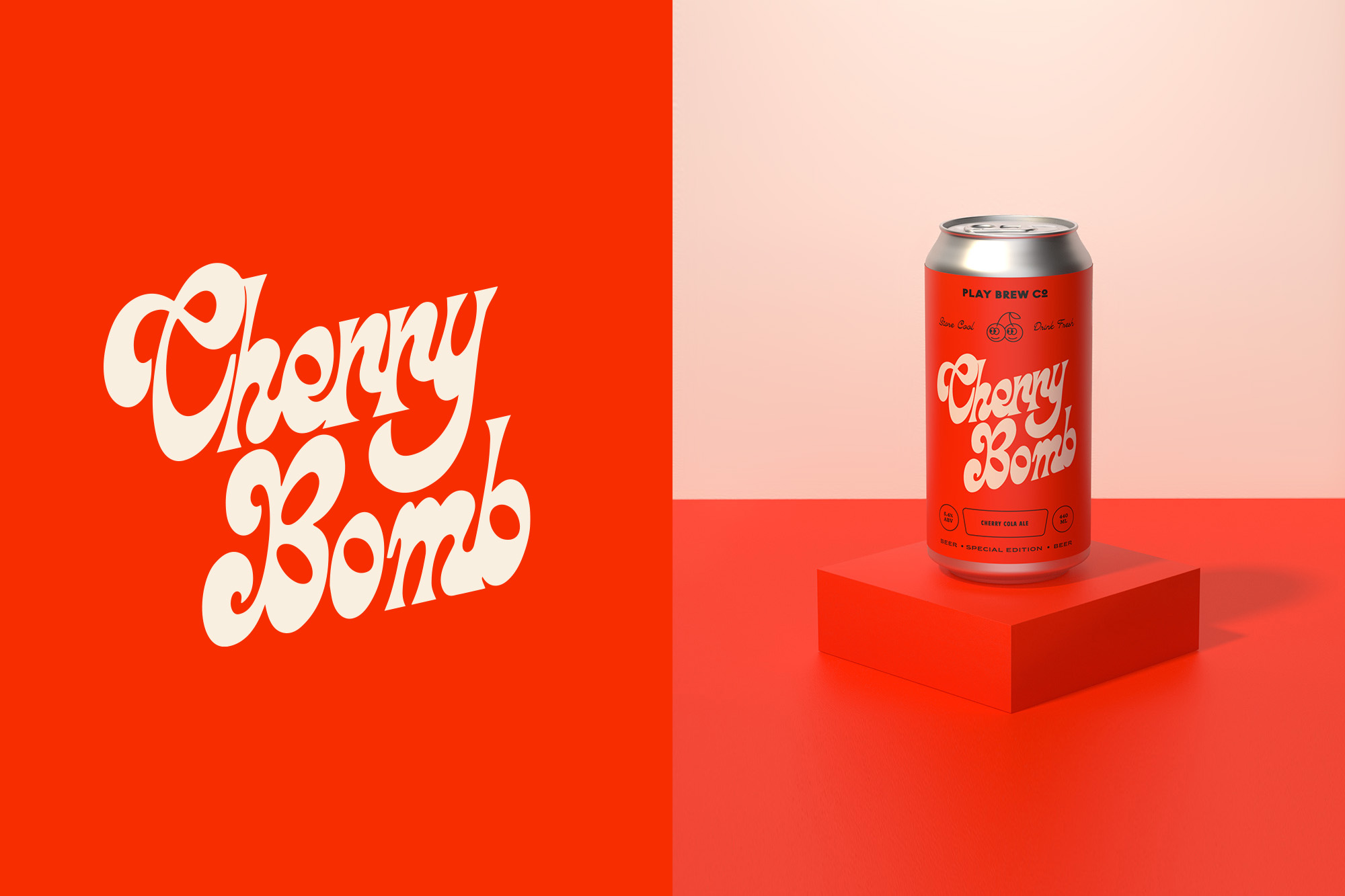
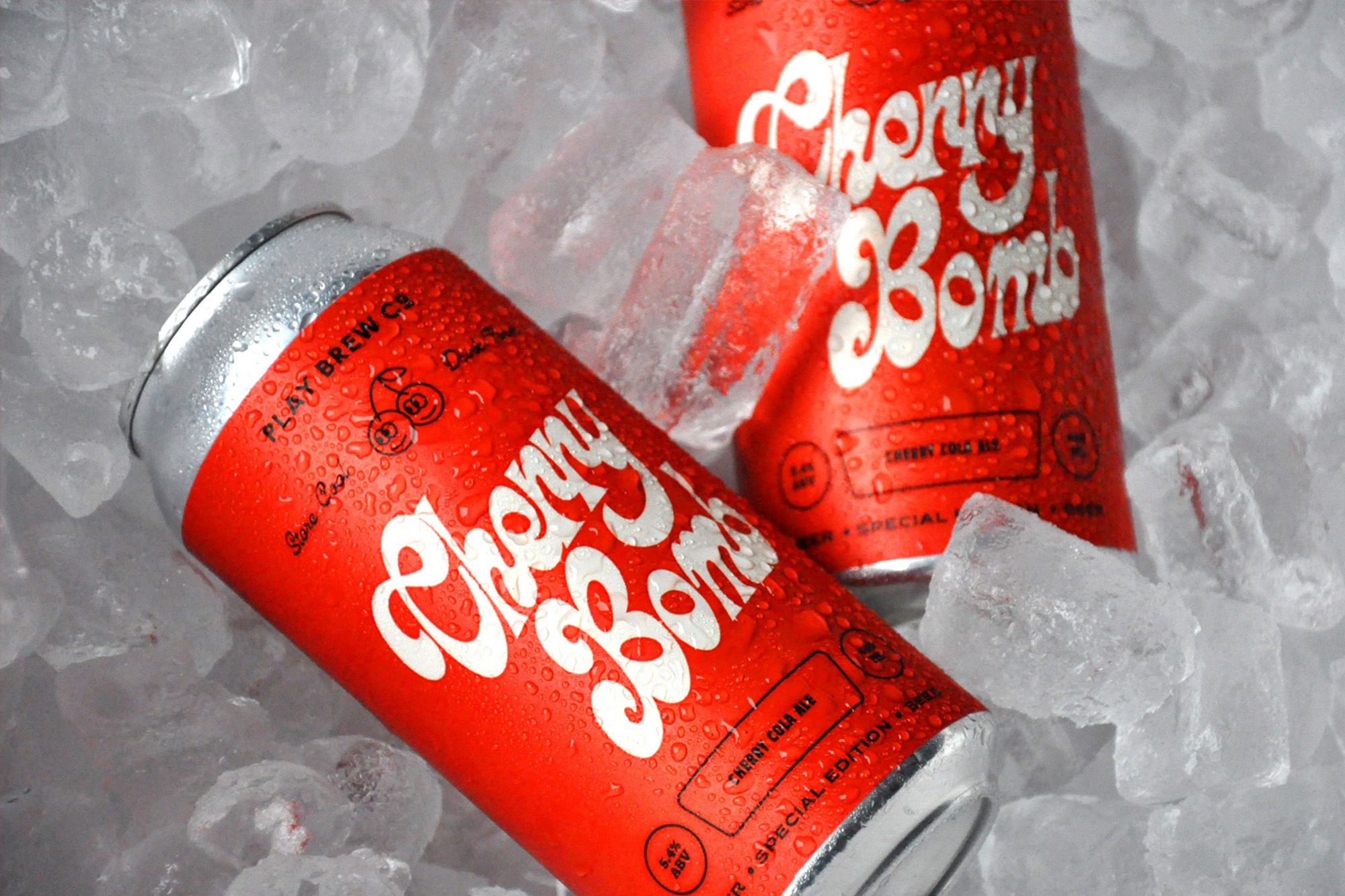
If a cherry cola deserves any kind of branding, it’s a design that leans directly into the bright red, over-the-top retro aesthetics. Alphabet Design Agency has delivered just that with Play Brew Co’s Cherry Bomb. The intensely red label and juicy typography meld together to create a packaging system as eccentric as Max Yasgur’s dairy farm in Bethel, New York during Woodstock.

Play Brew Co is a Middlesbrough-based craft beer brand hell-bent on producing exhilarating beer with a nostalgic twist, born from the influential culture of the ’70s, ’80s and ’90s.We worked with Play Brew Co on creating their second special release beer which was inspired by the vintage feel of Original Cherry Cola. As one of Play’s most experimental brews, they decided to have a cheeky bit of fun and created this mouthwatering cherry cola ale for a little throwback to a classic drink!
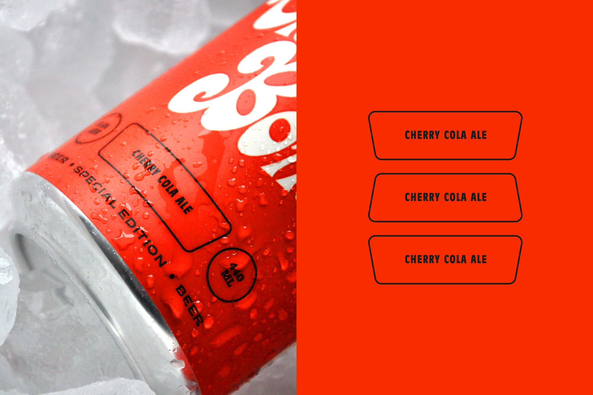
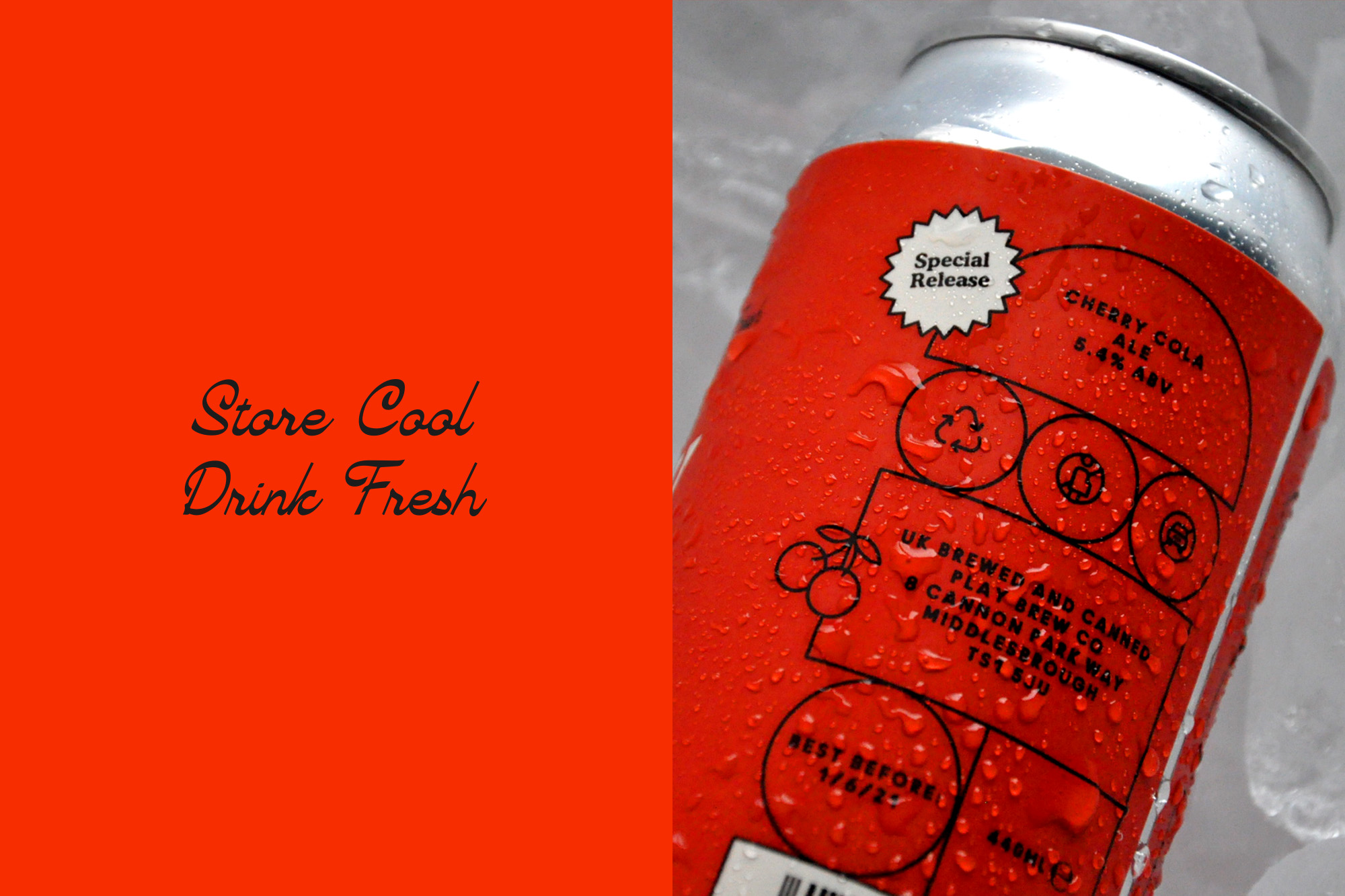
For this special release, we created a unique layout, playful character icons and a vintage inspired Cola style typeface to help the product really pack a punch on the shelves. We worked on a limited but bold colour scheme for this release with a bright red background, stone white details for the flavour title paired with a black keyline layout system to help the identity stand out across print and digital touchpoints.


