Student Week: The New Sarotti Chocolate Bars Thoughtfully Taps Into The Brand's Rich History
by Chloe Gordon on 09/02/2022 | 4 Minute Read
Student designer Ann-Katrin Bernhard created the conceptual redesign for Sarotti chocolate. Bernhard noted that the brand's current logo is receiving backlash for its racist and stereotypical representation. So, to rethink the brand's messaging, Bernhard created a brand redesign that beautifully encapsulates and represents the brand's tradition by updating the beautiful lettering and color system. The result is a sophisticated rebrand highlighting Sarotti's positive qualities and letting go of the insensitive assets.
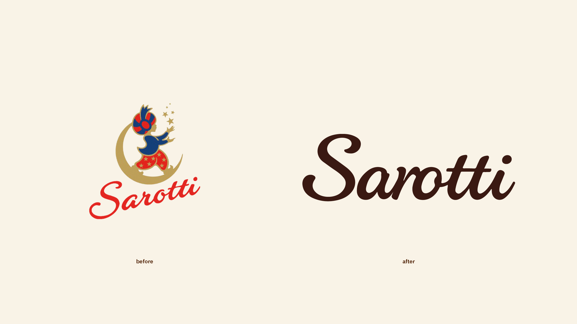
Sarotti is a traditional Berlin chocolate and praline manufacturer and one of the oldest german chocolate brands. Closely linked to its reputation and image is its company logo from 1920, the so-called „Sarotti Moor", which still represents the brand in a modified form on packaging and in advertising communication.
With today's increasing awareness of racist and stereotypical representation in branding, Sarottis’ image and logo has come under increasing criticism and the question of its justification has been raised. Due to this, I saw an opportunity to revise the brand's previous brand identity and to give the Sarotti chocolate bars a completely new design. When considering which design elements should be included in the redesign, I asked myself what the repositioning of the brand should communicate and which formative elements express this best.
In the previous packaging and in the brand logo, the long tradition of the brand and the regional reference seem to play an important role. For this reason, the traditional brand lettering and the previous color scheme have been incorporated into the new design and only details have been improved. Sarotti's chocolate range currently consists of three different product lines, „Sarotti 4 Täfelchen“, „Sarotti Excellence” and „Sarotti Fair Equador”.
These chocolate bars are currently all designed differently, so it was important to me to bring them together under a more consistent design. In the following design process, first the trademark was revised and placed present on the packaging in the new design. As the main typographic element, it is now in the foreground and thus strengthens the brand perception. Color is the second most important factor of the new design and is represented as a background element on every package. The choice of color depends on the product line as well as the respective type of chocolate bar.
The shades of the original Sarotti lines were adopted in their basic tones and only modified in their color effect and intensity. In order to strengthen the visual perception of the brand, the color surface is complemented by a shape, which is derived from the square outline of a twisted piece of Sarotti chocolate. The rhombus is the carrier for the brand logo and is placed in the centre and in the cut on the packaging, giving the packaging a valuable character through its graphic association with a diamond. For additional labelling of variety-specific information, a disturber has been integrated into the brand system as a fixed visual component. The type, content and design of the variety disruptor differ depending on the product line. The redesign of the products brings Sarotti as a brand back to the fore.
The stringent combination of color, shape and brand lettering gives the products a high signal effect and strengthens their recognition value. The new design concept works both on the individual packaging and in the overall overview of the products on the shelf, and it is precisely there that it gives the brand a presence that was previously lacking in order to stand up decisively to the variety of competing products.


- Designed By:: Ann-Katrin Bernhard