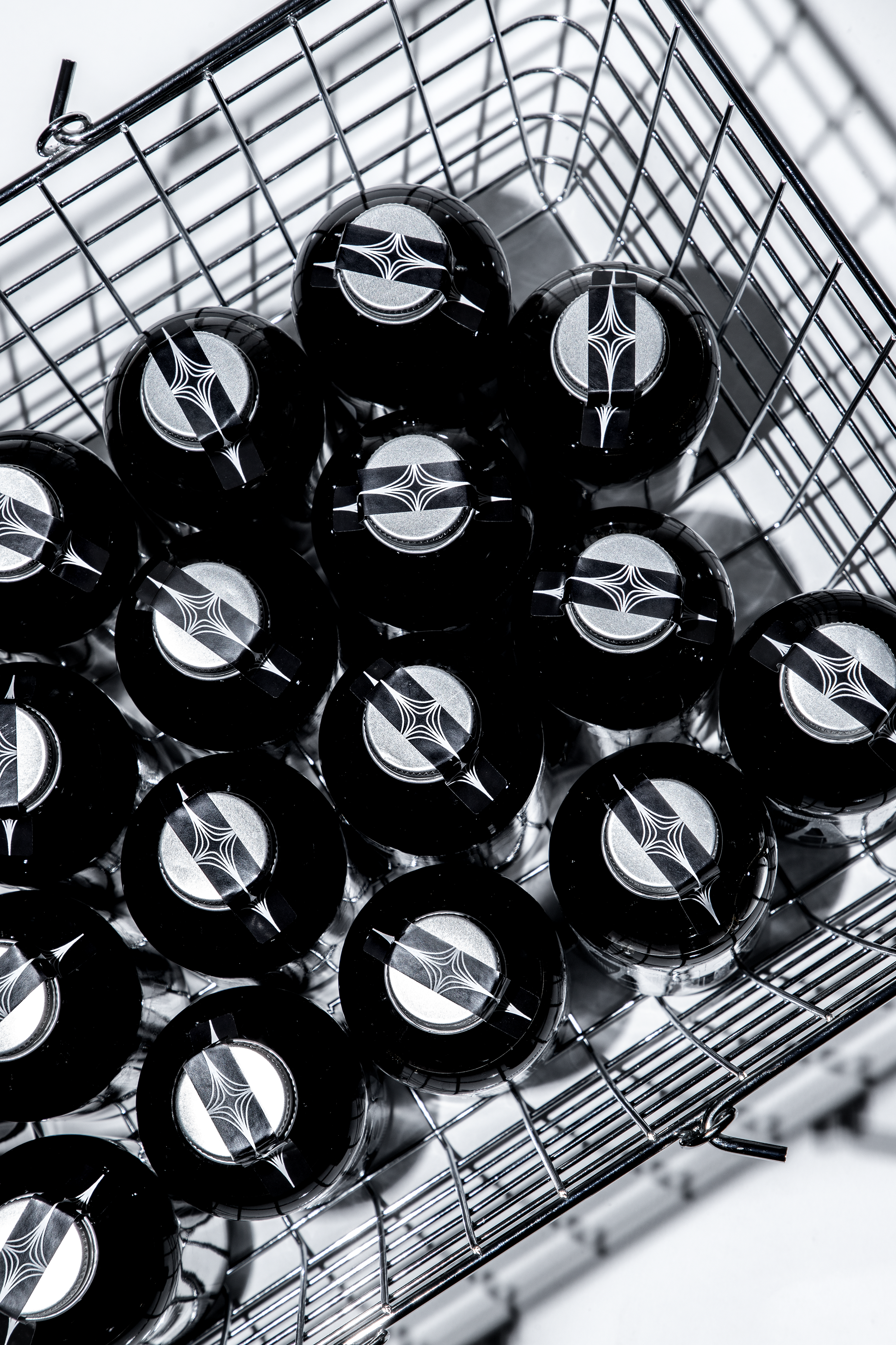
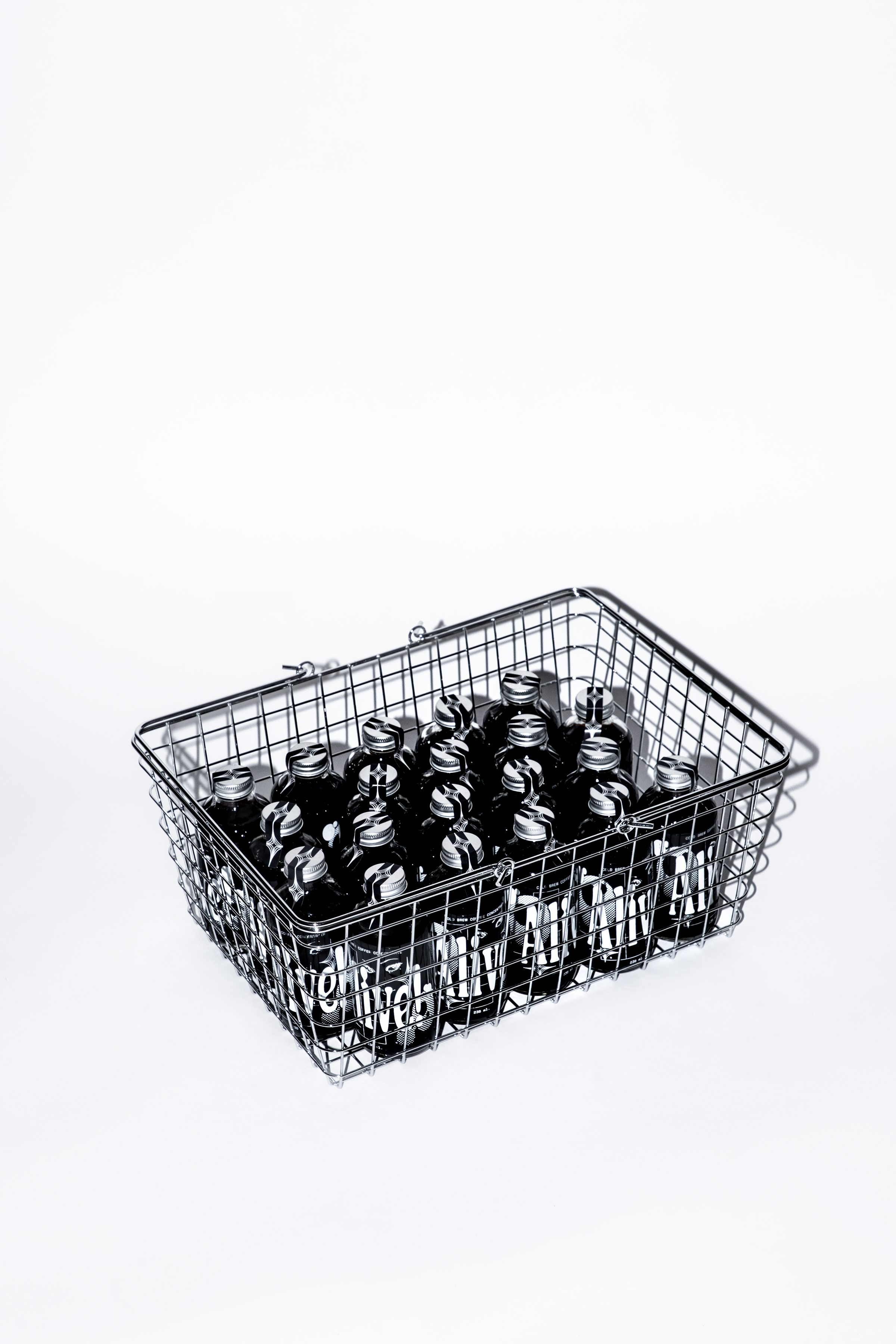
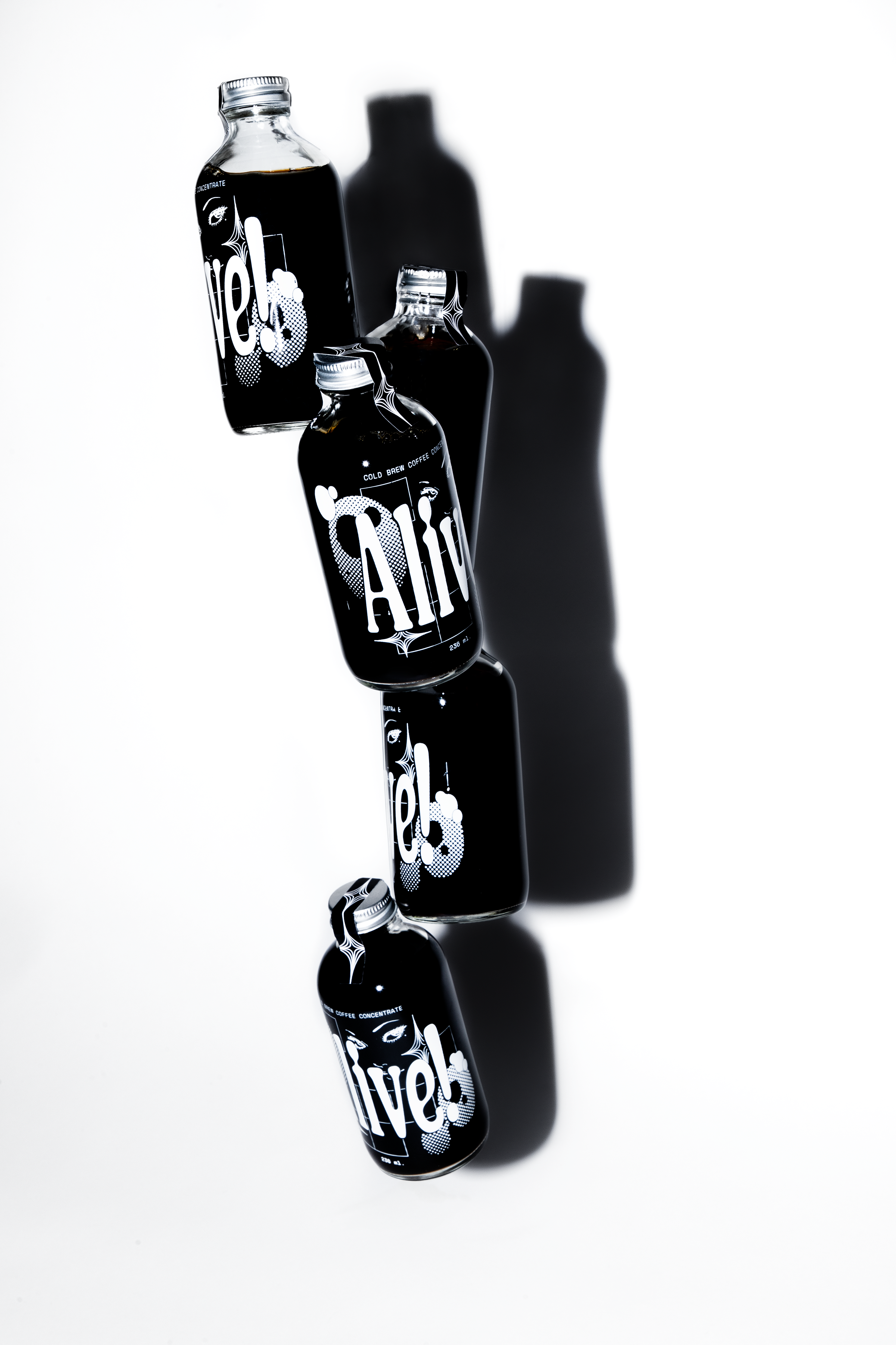
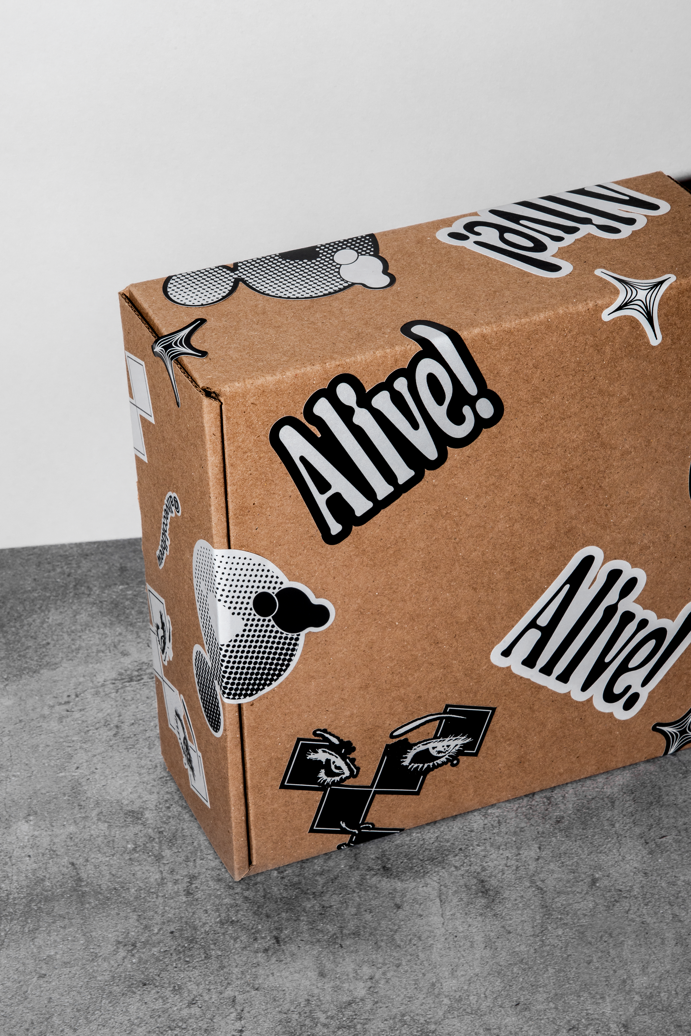
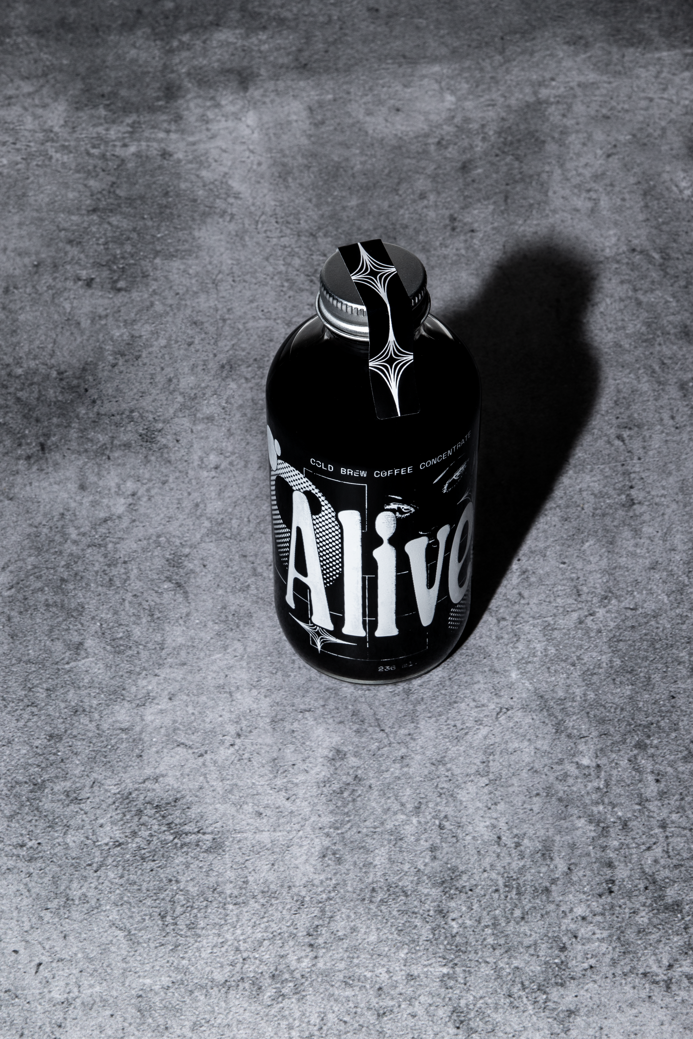
Inspired by the techniques and patterns of printing techniques, nu studio designed Alive’s packaging with grit, texture, and mystery. The coffee beverage company values new experiences, and the packaging reflects this. The 60s inspired psychadellic typography and lack of color work together to create a beautifully myserious system that begs consumers to learn more. It’s a simple design, but the textures and patterns add a sense of depth that create interest and allow this modern brand to feel charming.
I’M ALIVEEEEEE!, the first true sign of a new day starting. This is not the moment when we open our eyes, no… this is only achieved when our first cup of coffee truly kicks in. It is this particular high, when dreams finally fade, where the name Alive! comes from.
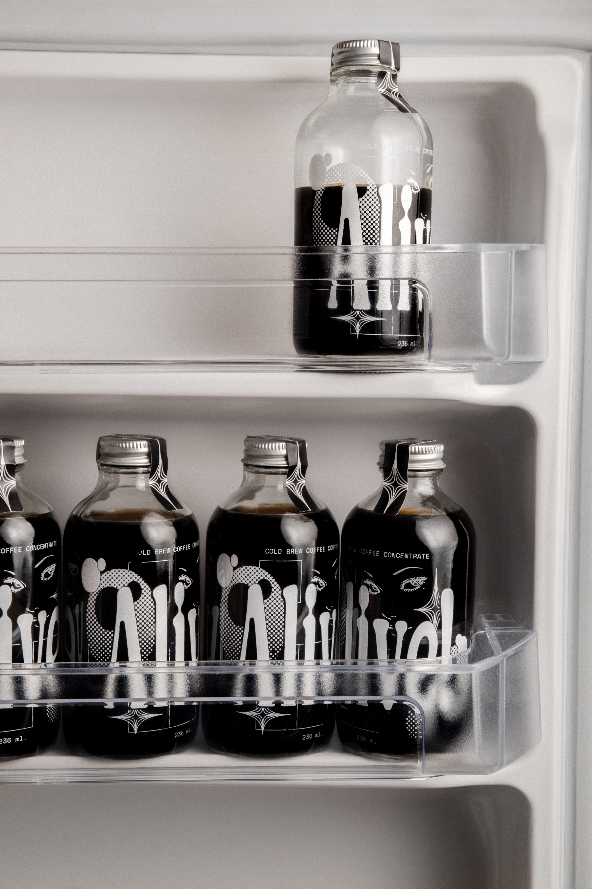
Operating in the underground for true coffee maniacs, this coffee is created with an exclusive blend of Oaxaca and Veracruz’s coffee beans. Carefully brewed at a controlled temperature for 24 hours to achieve a smooth & sweeter flavour, Alive! is an exclusive cold brew brand that offers endless mixing possibilities. For its identity, we figured that we needed to go as deep and detailed as their production process in order to match the love put into the coffee itself.
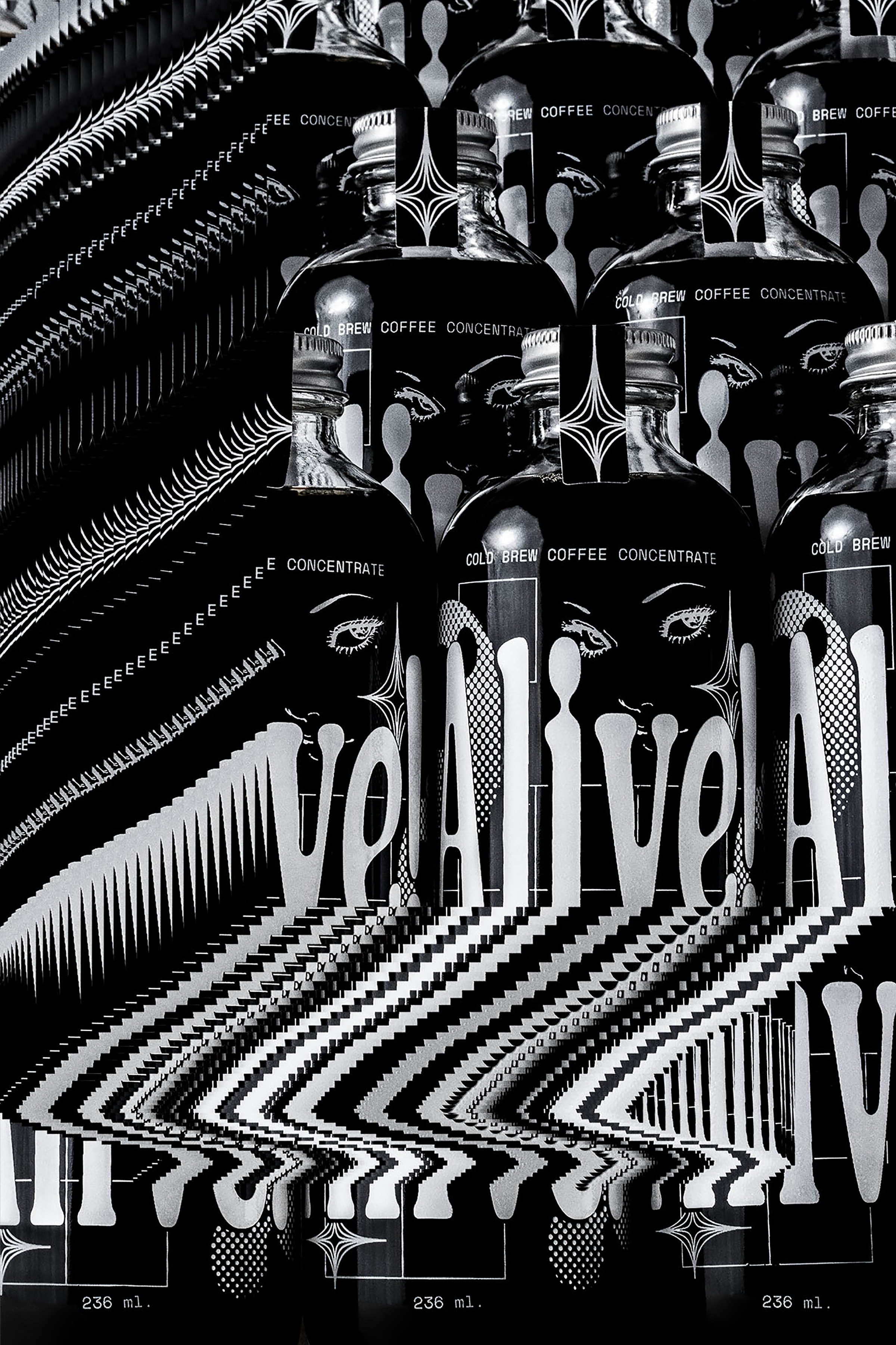
Our main visual aim was to create an unexpected expression of the traditional imagery associated with coffee. We were inspired by the textures and qualities of classic printing techniques (especially the screentone patterns of comic books!). We also combined a bit of 60s psychedelia with some turn of the century type stylings to create the logo and visual system. The aim was to achieve a familiar feel in a contemporary setting and composition, and develop a seductive and mysterious aesthetic that invites you to explore new experiences.
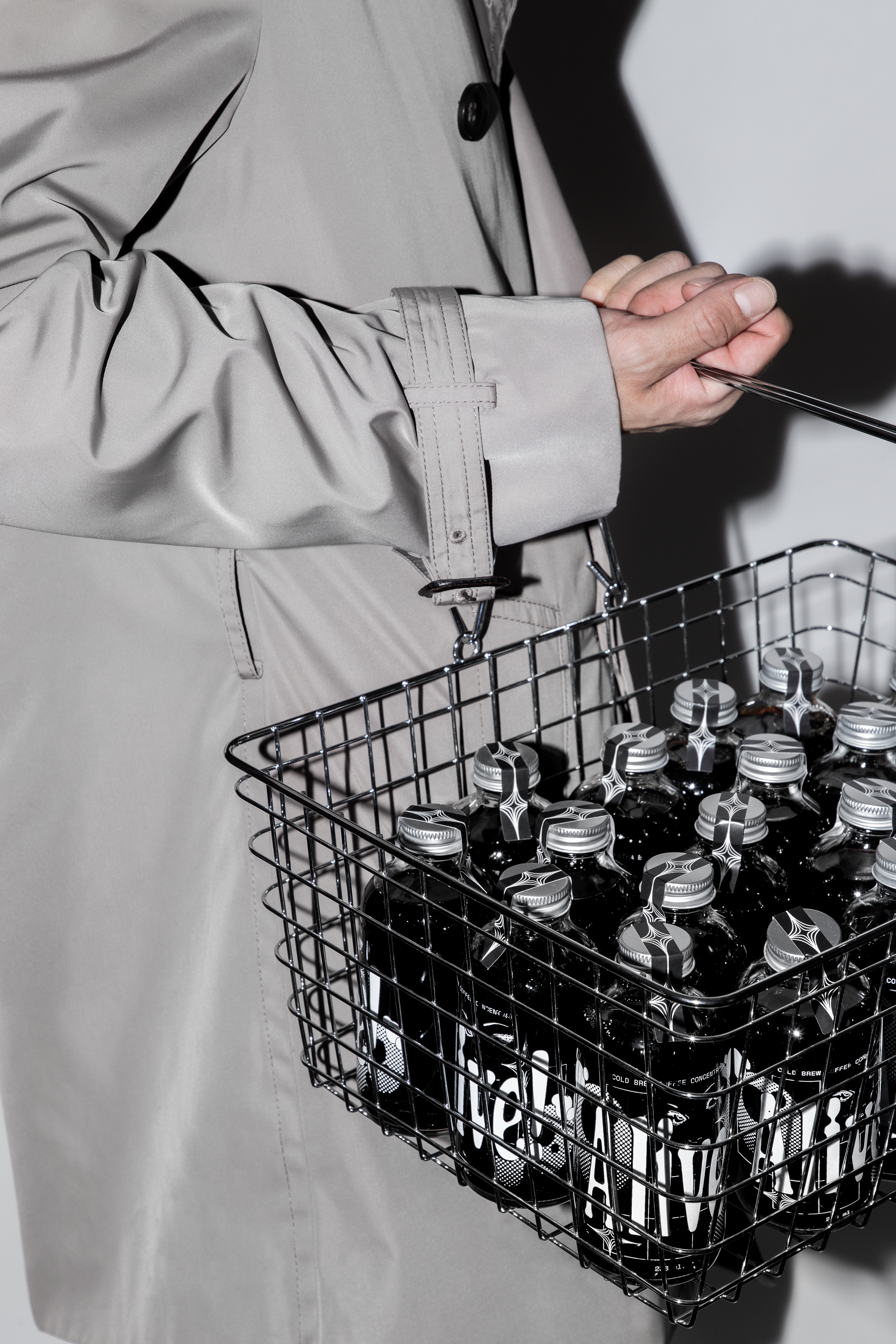
This was also achieved thanks to MUTUAL’s participation and their expertise with surreal, irresistible food photography. In short, the visuals set the tone: This is NOT your usual cup of coffee A brand identity with an unexpected expression. An inviting yet mystifying aesthetic achieved through vintage looks and funky arrangements. Wake up in the morning, taste the first sip and come back to life.