The independent wine brand reaches a younger and bolder audience with its distinctly simple design.
Experience École’s Modern Wine Design, Exactly
by Nooneh Gyurjyan on 08/23/2022 | 2 Minute Read
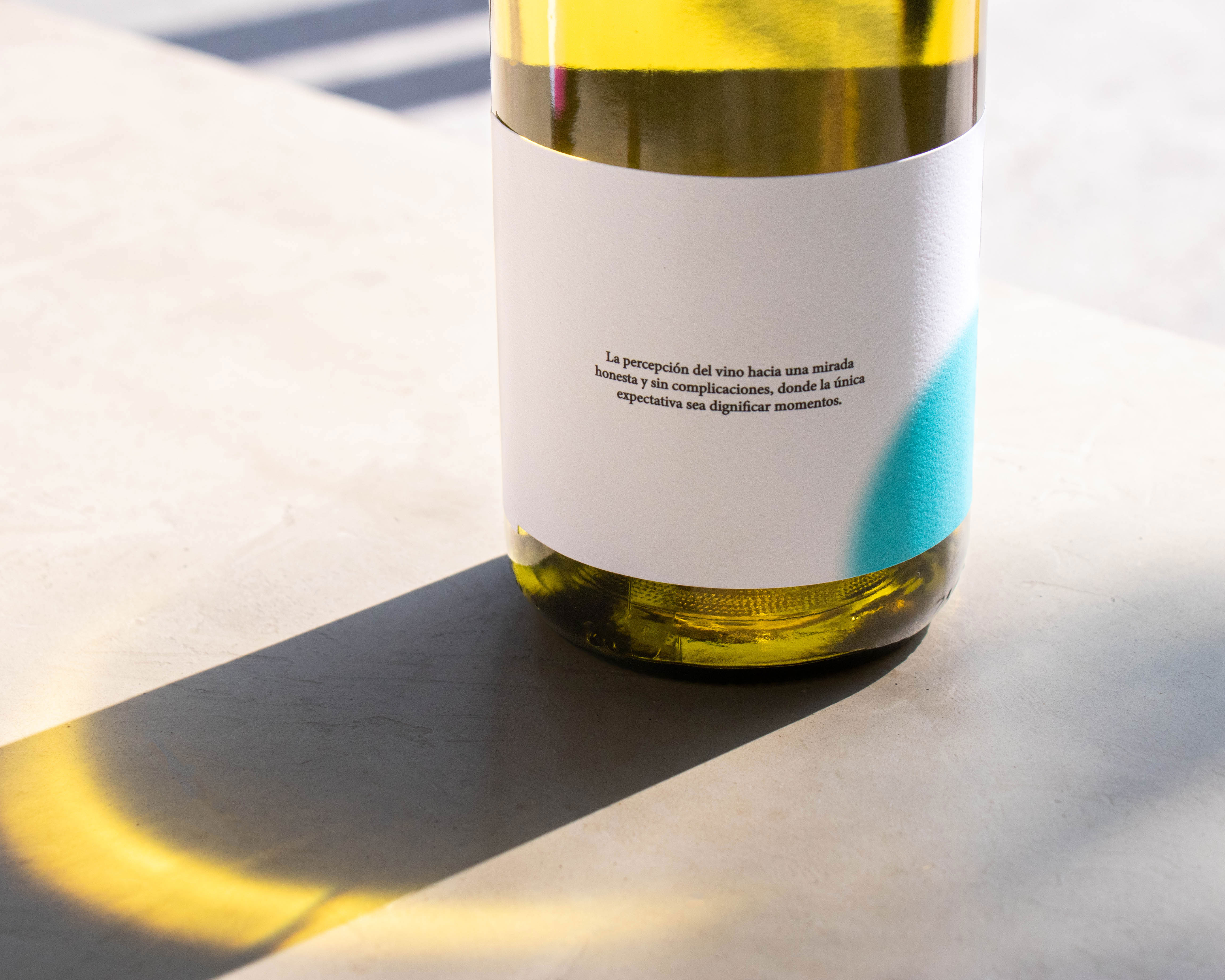
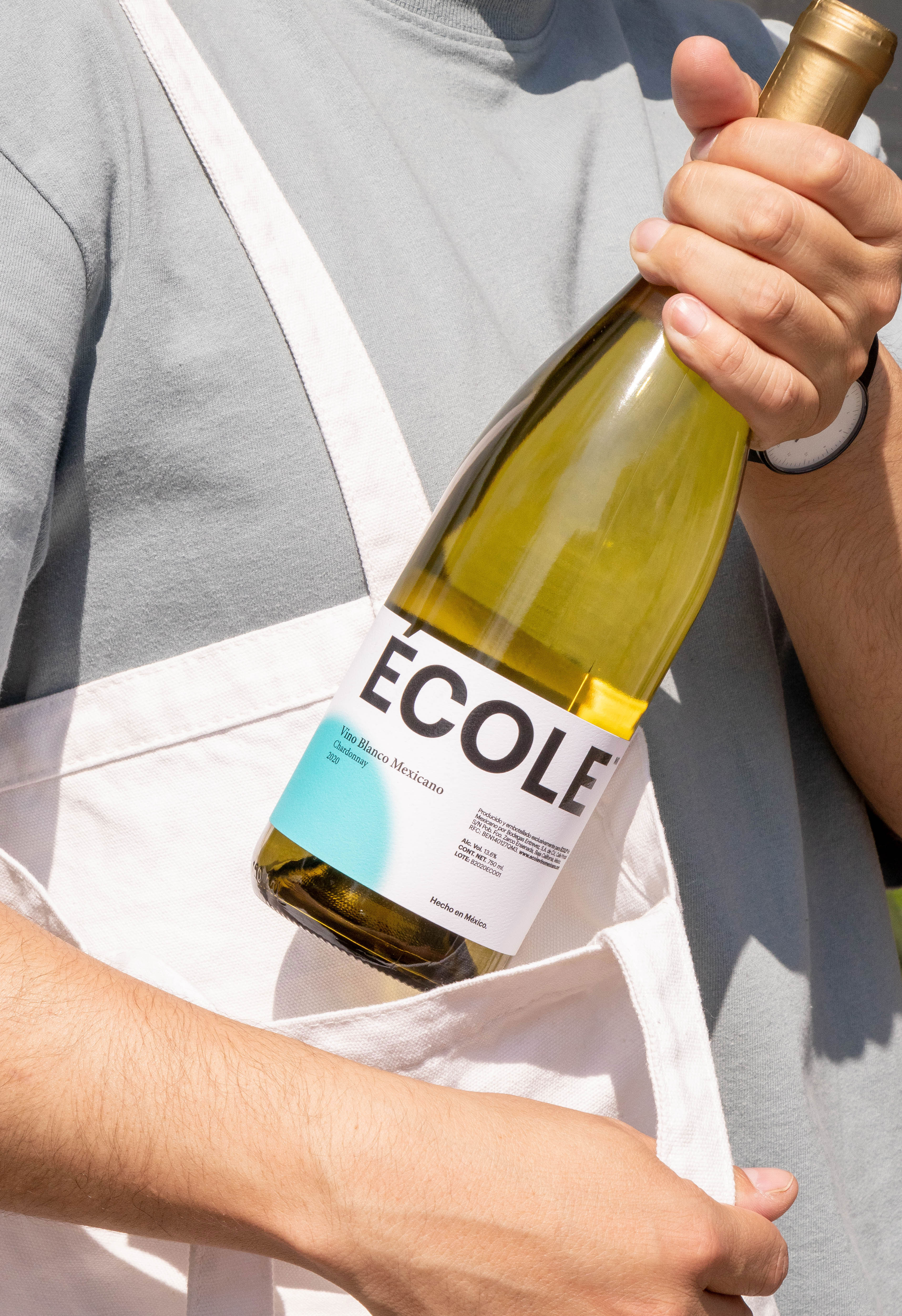
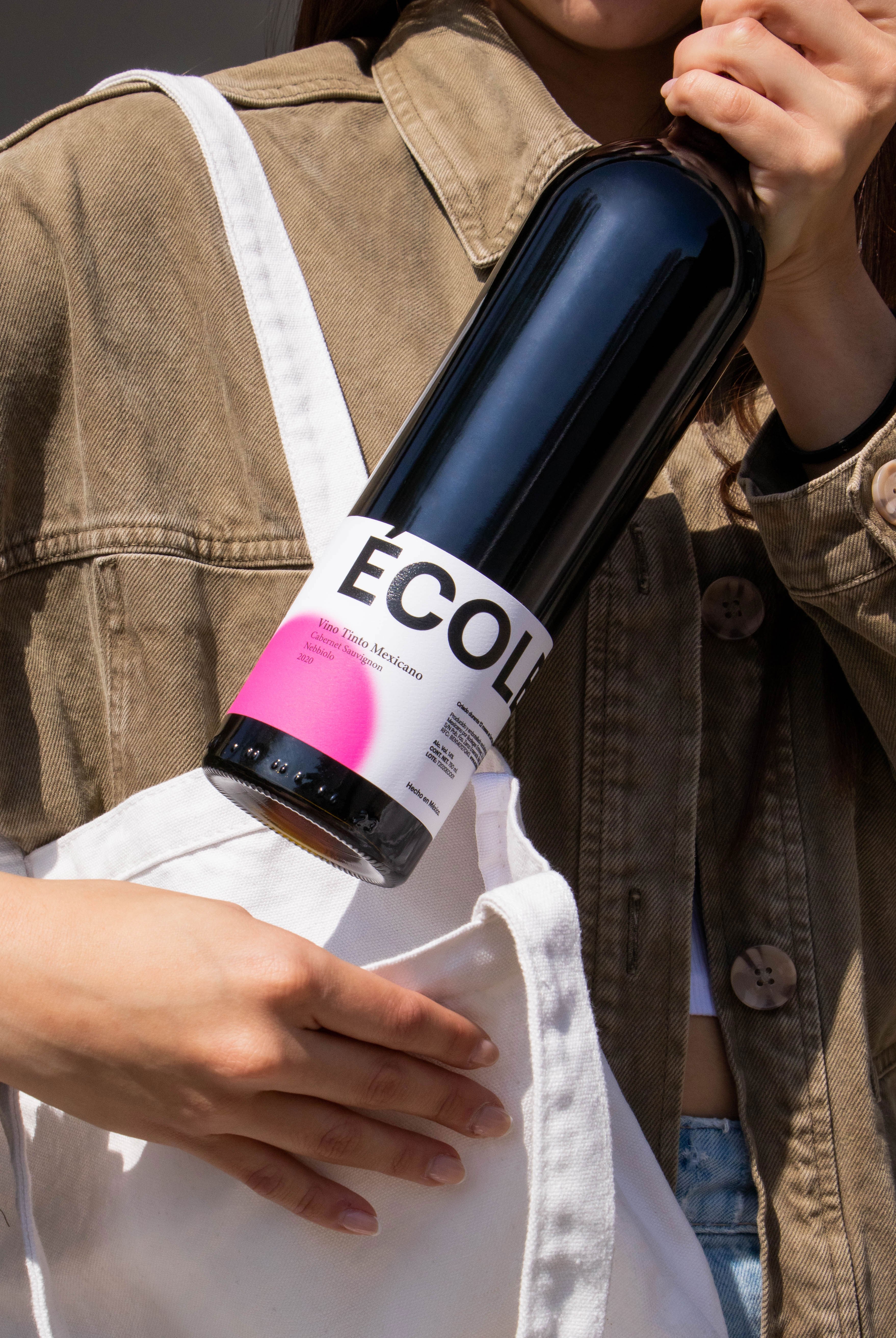
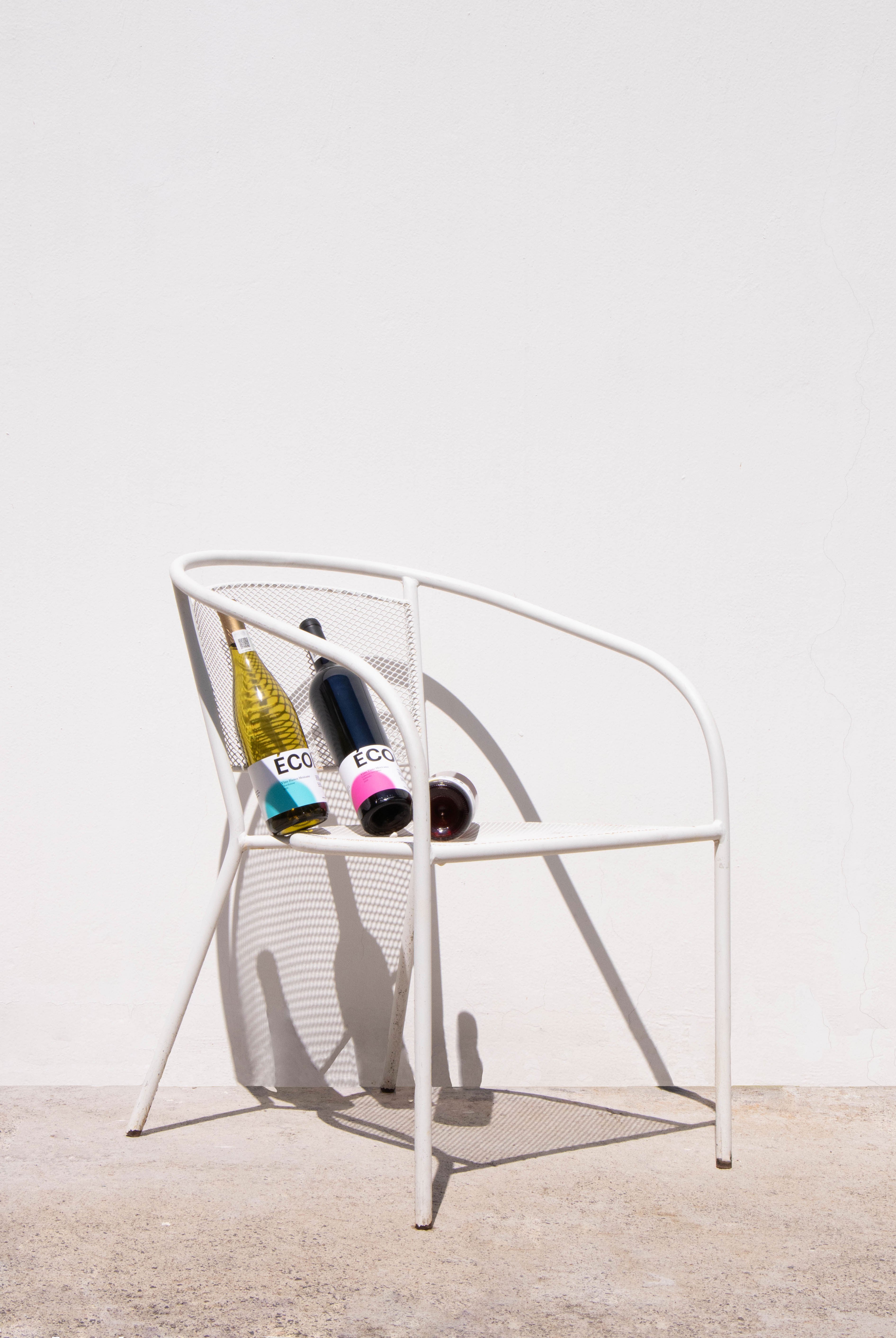
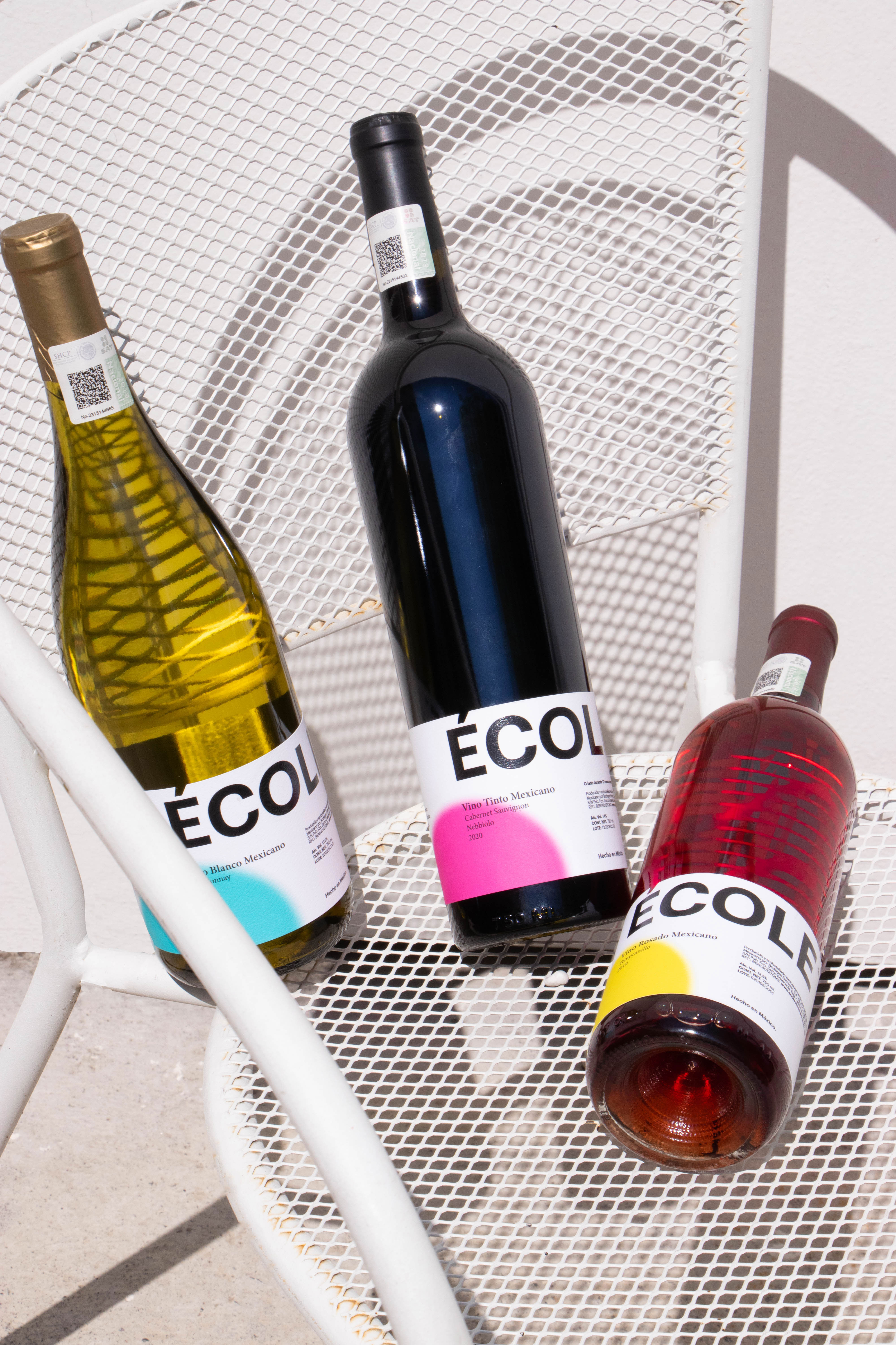
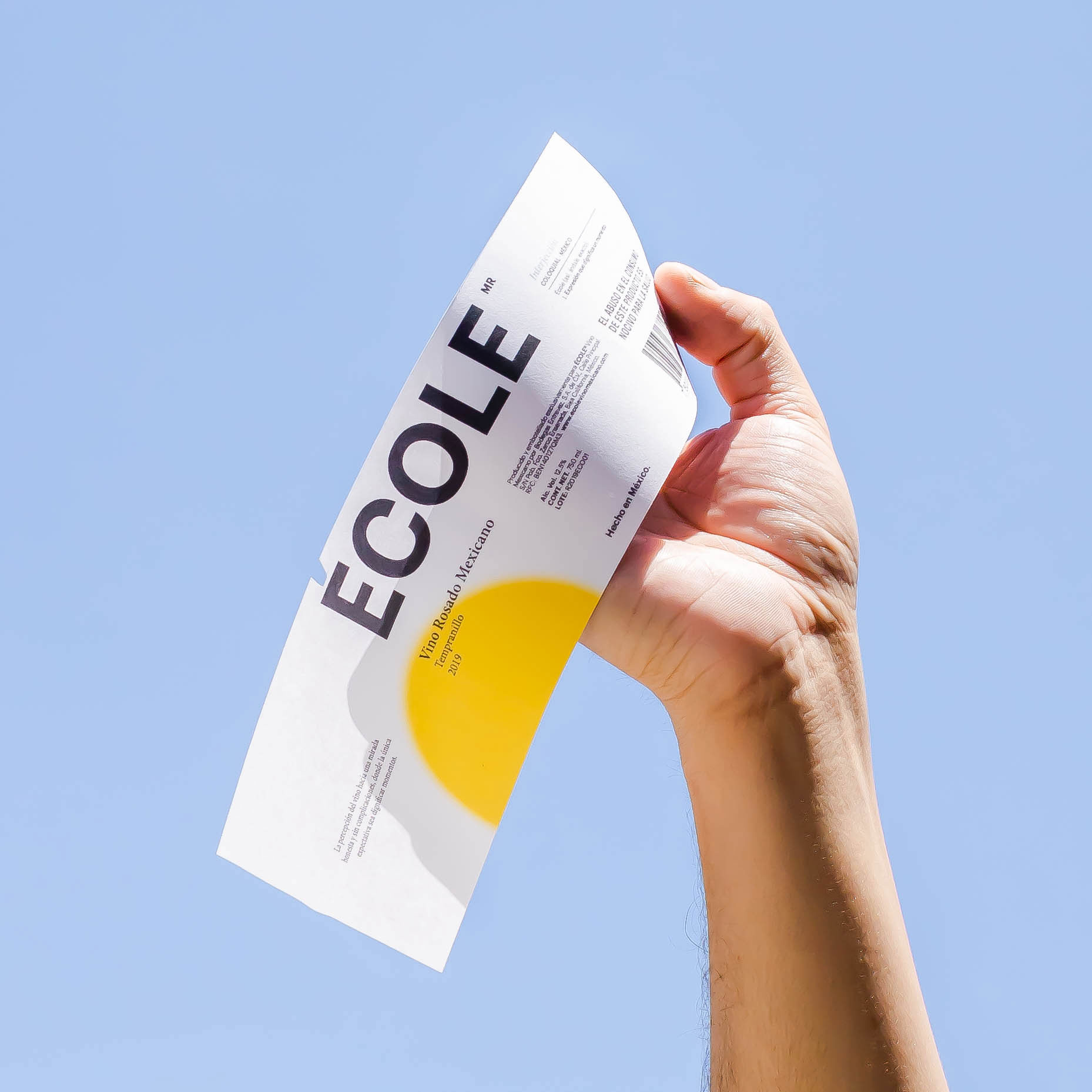
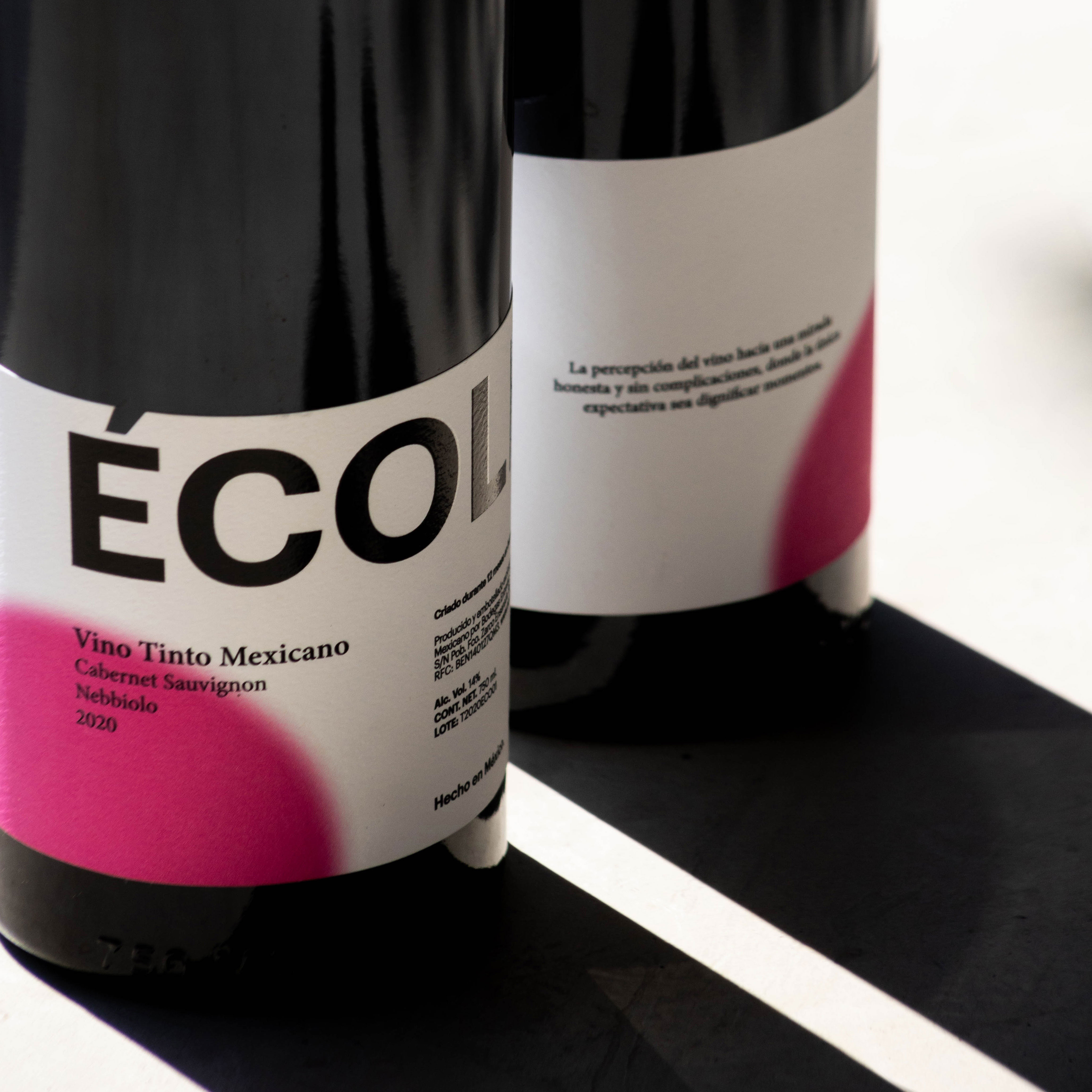
Vino Mexicano Ecole’s design is just right. The independent wine brand derives its name from a Mexican colloquialism that translates to “Exactly!” Likewise, the wine’s packaging identity done by Mingo Estudio is exactly the right combination of elements for a modern and bold feel. The distinct typography and strategic use of negative space get broken up by a single burst of color. The design is straightforward yet effortlessly striking.
ÉCOLE Vino Mexicano École is a Mexican independent wine brand with red, white and pink wine. The brand name comes from a Mexican colloquialism that means: “That’s right”, “exactly” or a pleasantly surprised expression. For the brand, École stands for an expression that dignifies a moment. We developed a simple but visually striking label system design, using typography and information texts as design elements to have a modern, bold and editorial look and feel. This visual composition give us a fresh and non pretentious product, which helps the brand to associate itself not just with a high quality and purist audience, but also with a younger and more relaxed one.
- Design: Mingo Estudio
- :
- :
- :
- :
- :