Okiedoggie Premium Dog Treats' Unique Packaging System Is Ideal For Your Four Legged Pal
by Chloe Gordon on 07/08/2022 | 2 Minute Read
I'd be willing to bet that you've never seen dog treats as vivaciously aesthetically pleasing as Okiedoggie. Moreover, the brand's packaging, designed by CROM STUDIO, is delightful and feels uniquely editorial. The poppy colors, playful illustrations, and straightforward typography create a packaging system full of wit, perfect for your four-legged best friend.
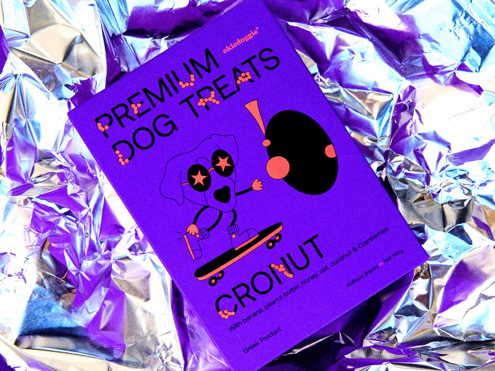
Okiedoggie is a new brand manufacturing premium homemade dog treats that can be consumed both from humans and from our beloved friends. Filled with joy, fun and energy, the brand started with a group of two friends and a question: How would it be like to share our favourite snacks with our little friends without fear?
With one of them working as a professional chef in real life, cooking for both people and his dog, and the other one splitting his time between his buddy and extreme sports, the idea quickly became a necessity and the need became a reality. All this led to the creation of this brand, remaining faithful to the principles of dog care as if it were our child, our little brother - sister, our best buddy.
As designers, we were given the task to create a package which represents all the above values, to convey the above messages to the consumer and to stand out. As dog owners - lovers ourselves, we were grandly inspired to come up with fun ideas. So we decided to illustrate our favorite dogs as teenagers’ super heroes who enjoy their favorite sports. By transforming the Aeonik font into a combination of glyphs and dog treats and creating an intergalactic black hole that extracts croquettes, we put our heroes in an endless treasure hunt game (like real life is, after all).
The above design elements combined with intense fluo colours, gave us exactly the result we had in mind. A series of packages full of movement, light, joy that provokes and invites us to enter the game.


- Designed By:: CROM STUDIO