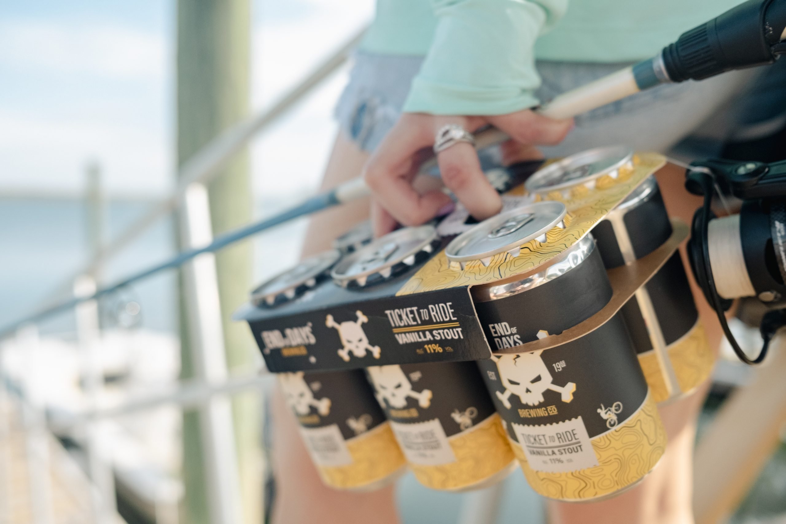
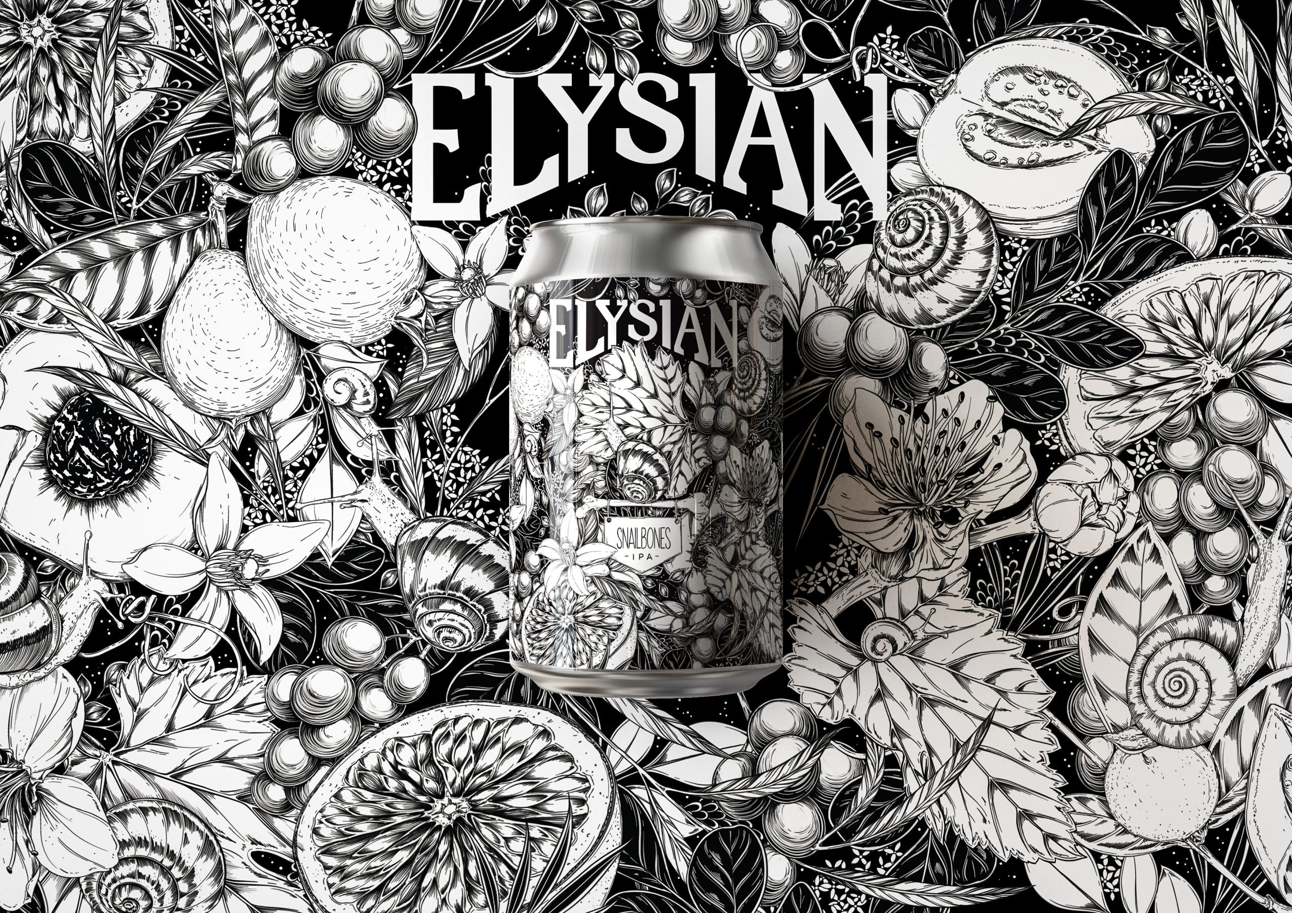
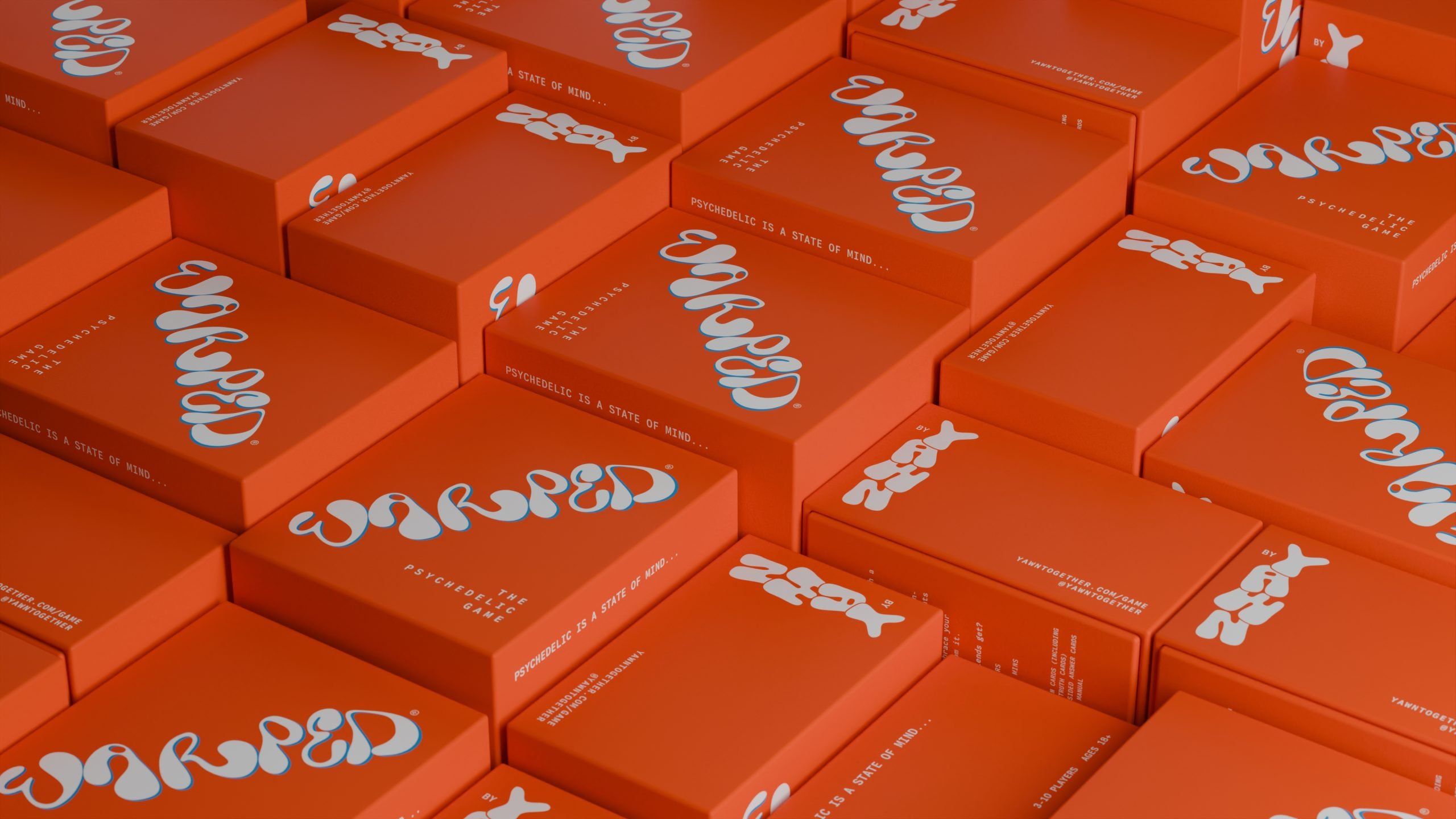
Simple black and white beer cans make a sophisticated statement, and when paired with a detailed line drawing, the experience is even further upgraded. Clairoux Studio designed the packaging for Conflit d’usage Beer that is cheerful and abstract while also raising awareness of the tension between cars and cyclists in Quebec’s Gatineau Park.
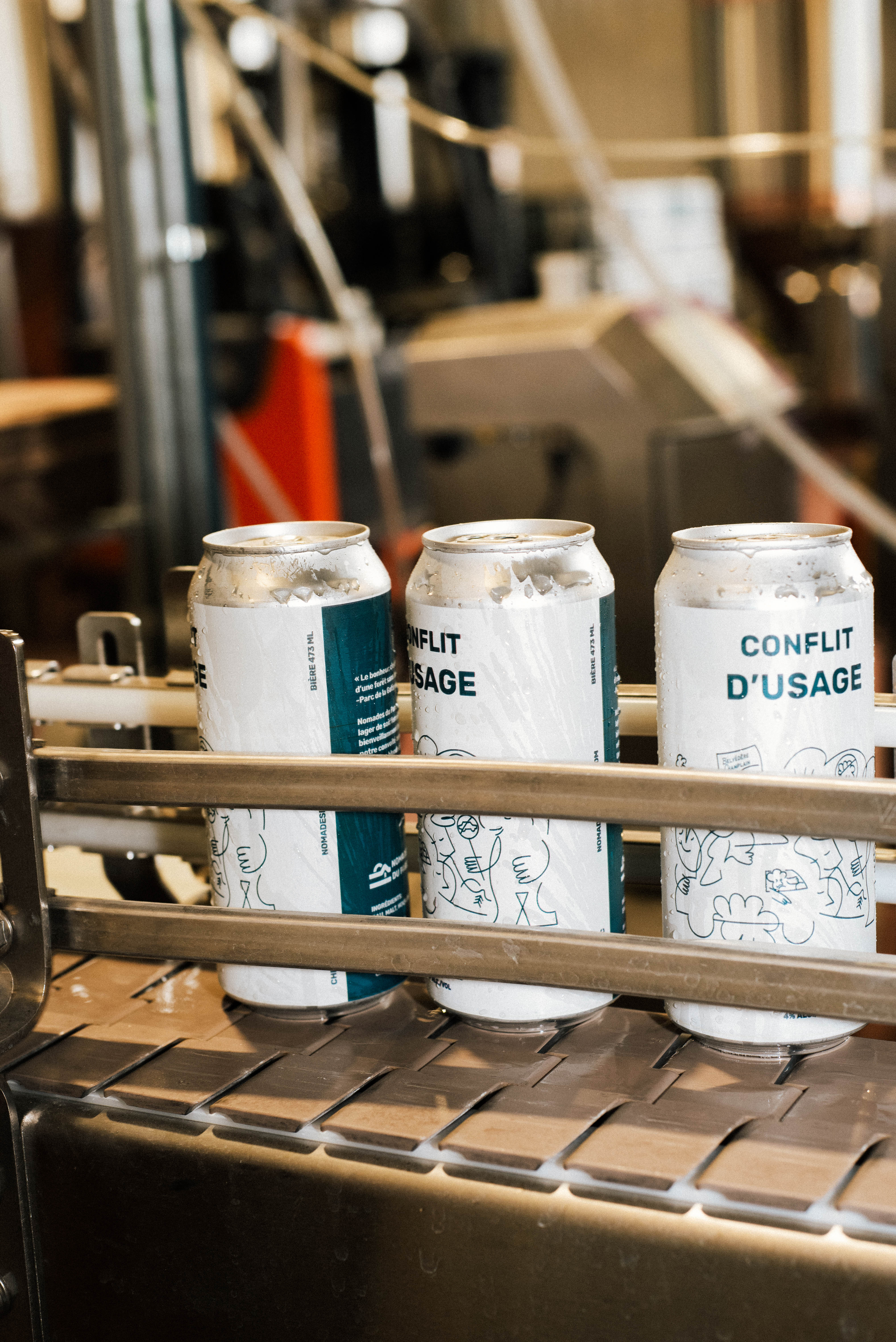
Introducing Conflit d’usage Beer – A fresh, organic, unfiltered lager brewed in collaboration between Nomades du Parc and Chelsea & Co. Our mandate was to create a packaging design system that would highlight Gatineau Park and the conflict of use between cyclists and cars in the Park. Conflict of use; an affectionate nod to the harmonious cohabitation between users of the Gatineau Park. This is nothing less than the first beer produced in Chelsea from hop to can. With this concept in mind, we developed a playful and abstract design to raise awareness with humor, as well as to create a thirst-quenching beer perfect for consumption at Nomades du Parc.
