CBD drink brand Little Rick worked with NOW design agency to reimagine the branding and packaging system. The goal was to reflect the natural full-spectrum CBD oil infused in the beverages in a way that also represented surf culture imagery. The logo and typography system is reflective of Keith Haring’s art. Additionally, the brightly colored cans are emotive of a lightheartedness that fits entirely with the brand’s ethos.
Little Rick, the London-based direct-to-consumer CBD drinks brand, has unveiled a new brand identity and relaunch campaign. The work was developed in partnership with creative agency NOW. Little Rick’s founders came to NOW to help redefine and reinvent its brand, and to create a more premium, adult identity more befitting of its highly-rated product range, which contains more CBD than any of its competitors and is made with a natural full-spectrum CBD oil rather than a lab-made CBD powder which many other brands use.

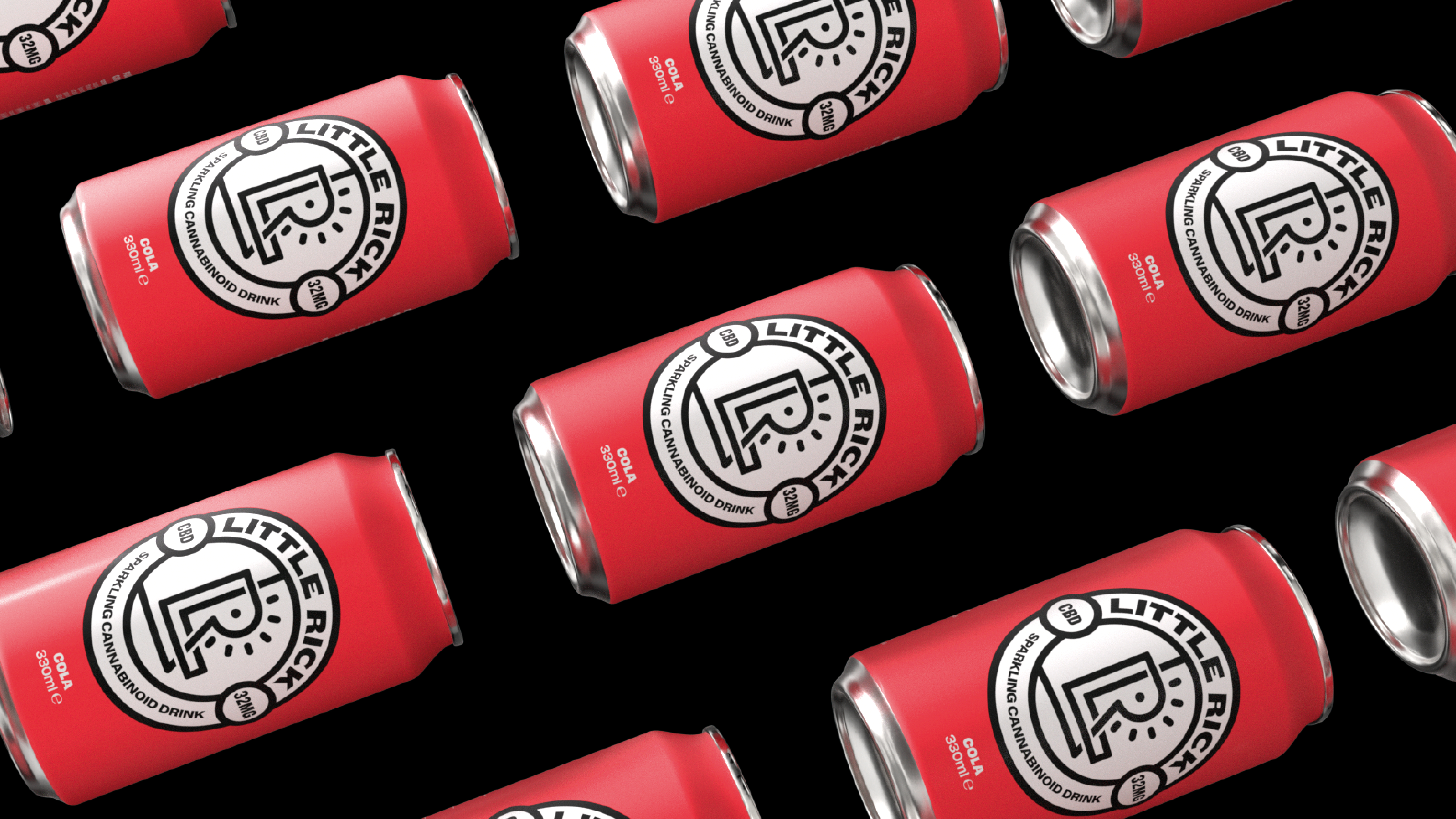
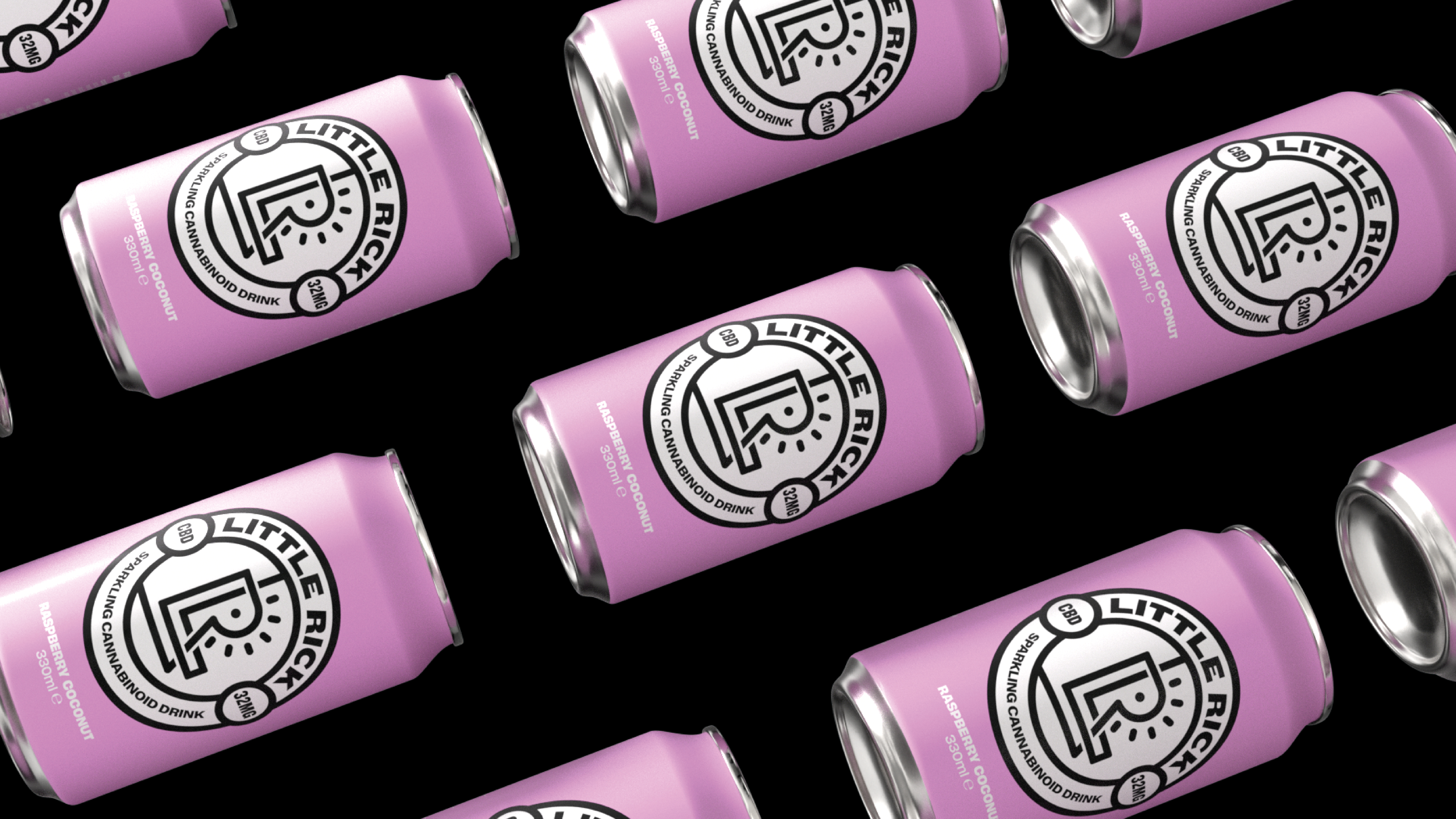
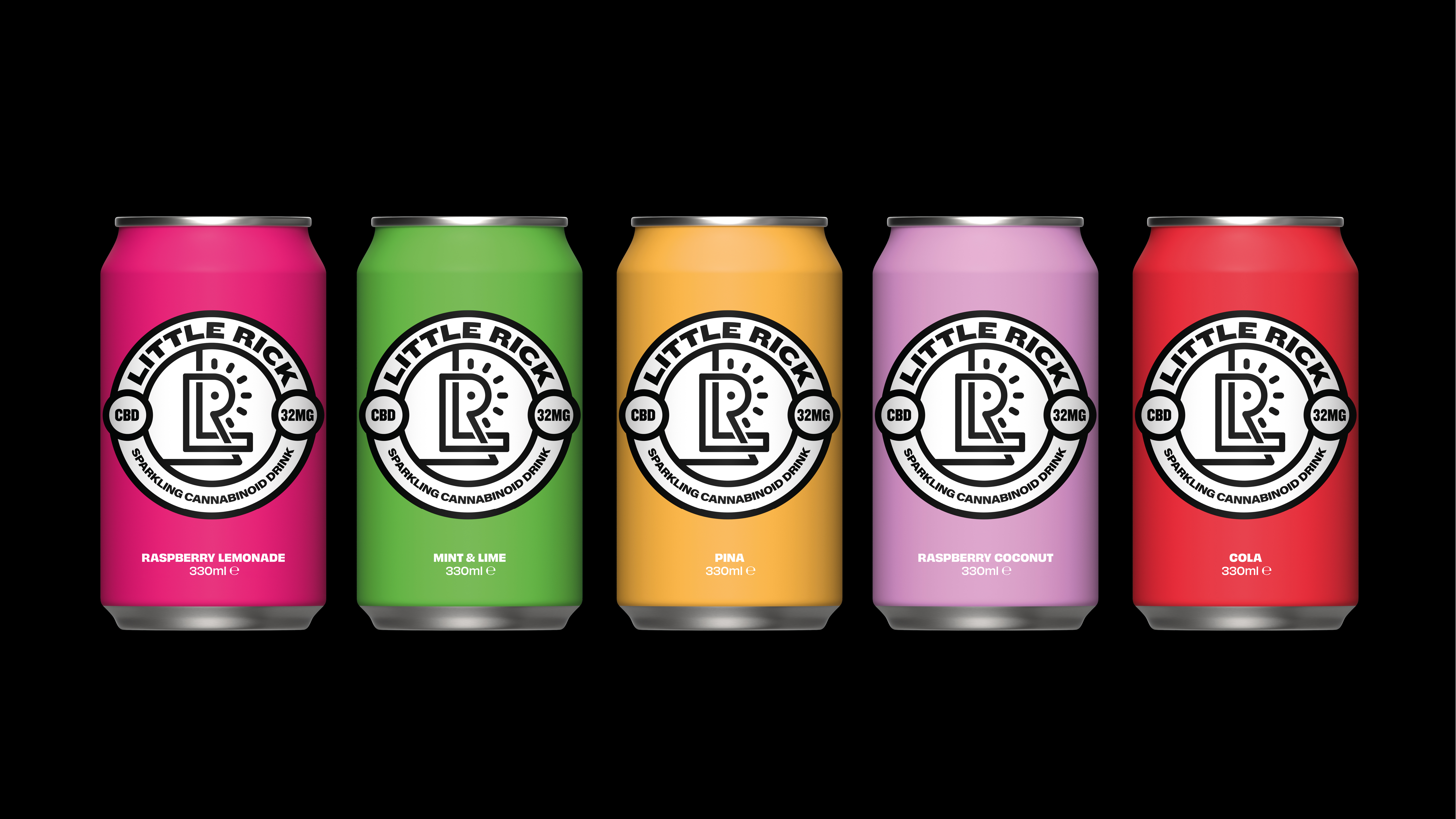
NOW has created a new brand identity that feels far more premium and adult than its predecessor, with design influences including the work of artist Keith Haring and the imagery of surf culture. Marc Donaldson, Head of Design at NOW, said: “The process of creating full-spectrum CBD takes time and care, and we saw this human-based craft element as something we could also use to inform the look-and-feel. “We wanted the product to feel grown-up, refined and bold. Something the consumer would be proud to have in their hand and felt like a statement. It also needed to be easily recognisable.” Reflecting the way in which direct-to-consumer brands live online, the new can design was created with Instagram in mind, with all additional information moved to the back so that any images of the drink would be as impactful as possible on-grid.
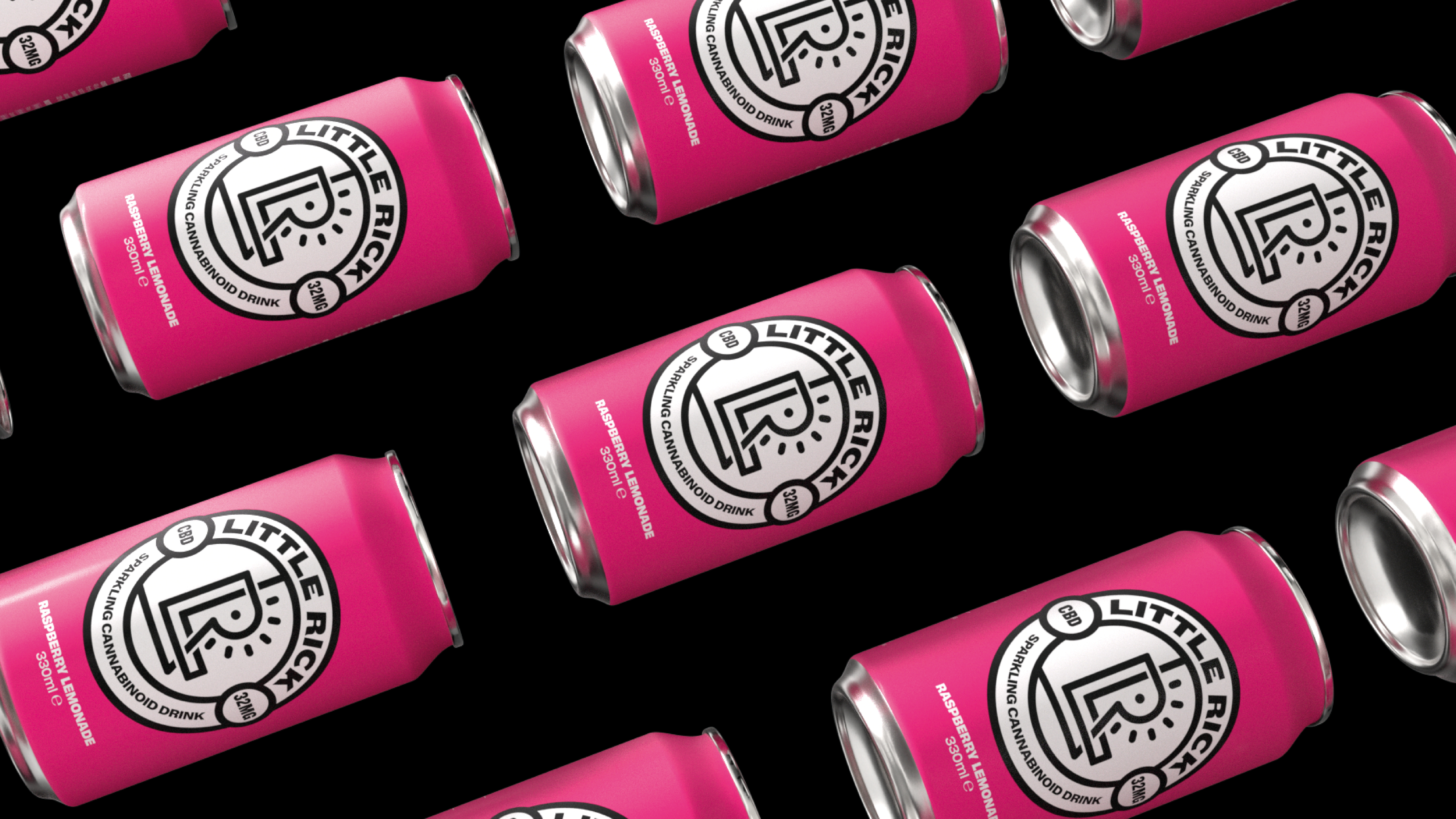
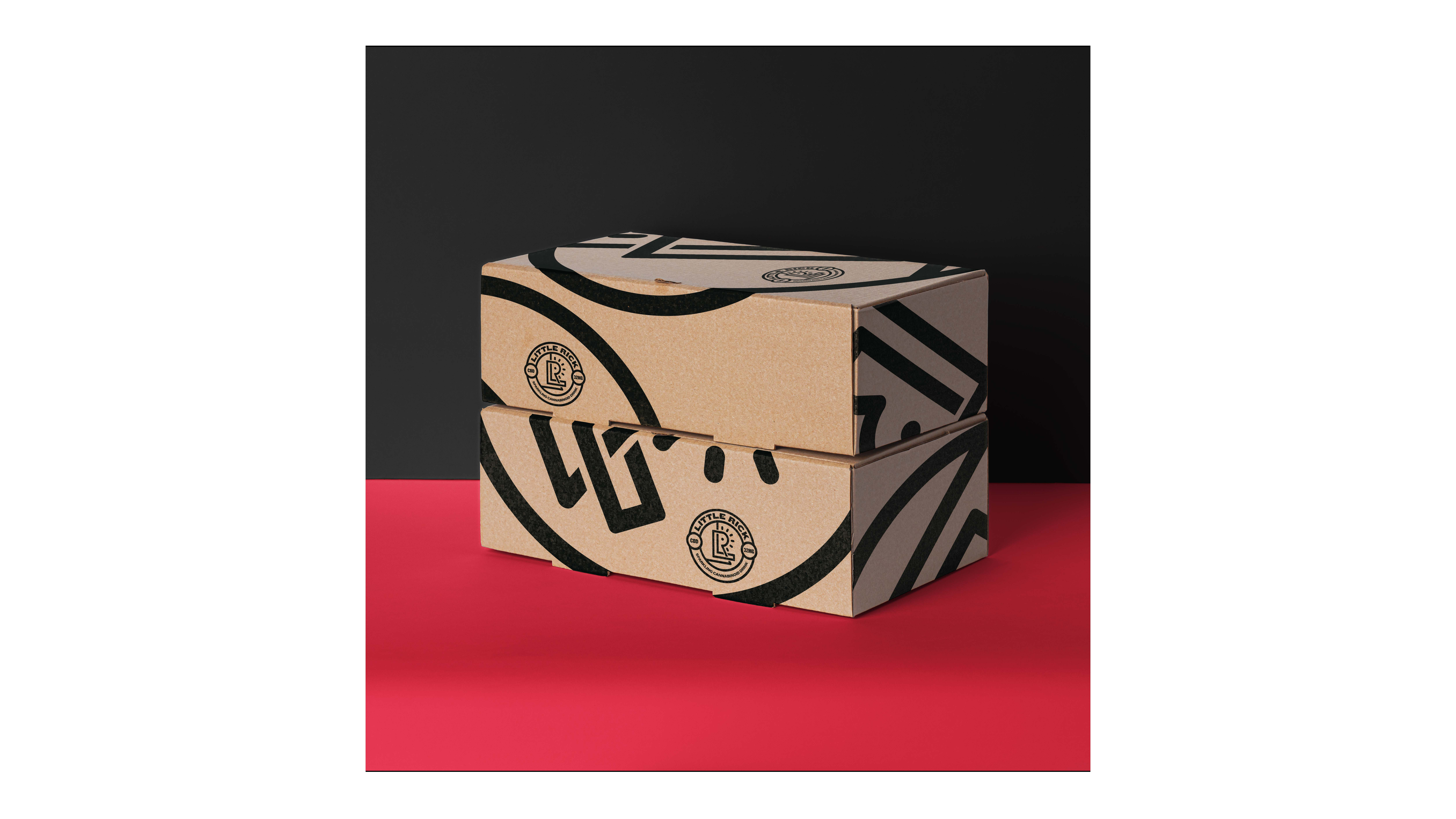
NOW created a new badge to hold all key details about the product in one, neat device. Using the ‘L’ and ‘R’ from Little Rick’s name, they designed a new mark to represent the care and time it takes to create full spectrum CBD. A dot in the ‘R’ and lines placed around it represent the product’s benefits. The brand asset will be used on social channels and across various touchpoints such as boxes, stickers and T-shirts. Each of Little Rick’s five flavours are now represented by a different bright, solid colour, to help the products stand out and to give more of a premium feel.
With the UK CBD product market expected to reach a value of £1 billion by 2025, NOW and Little Rick needed to develop a new positioning and identity which would give the brand real standout in an already-saturated space. Recognising that most CBD drinks brands have positioned themselves as health or wellness products, shying away from promoting their true product benefits, NOW and Little Rick chose to buck the trend and instead focus on the drink’s relaxing and stress-relieving properties. Following a period of discovery and consumer research, NOW developed a new brand identity and campaign which dare to tell the truth about CBD: it takes the edge off so we can be ourselves.