GudLag Creative designed Catbom’s liqueur packaging, and the result is astutely nostalgic while balancing a contemporary feel. The color palette for each liqueur is simple yet effective, using muted tones balanced with one pop of color. Additionally, the typography feels reminiscent of that used in the 20s, a subtle nod to the effects of prohibition.
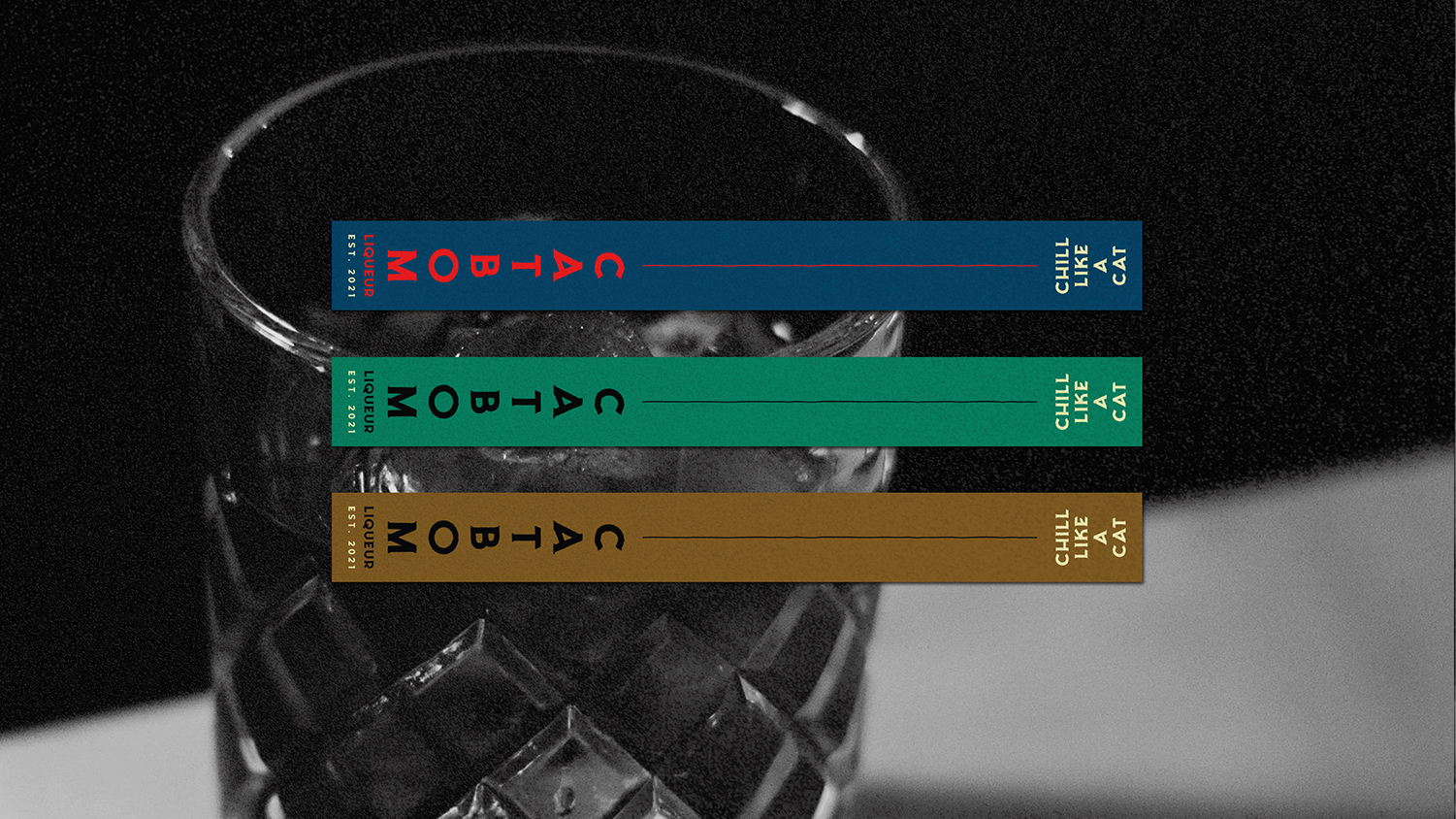
Catbom is a liqueur crafted by a friend. He brewed a very limited batch whose sole intention was to experiment and obtain a product that we could share and enjoy with buddies. Then GudLag Creative had a non-commercial project that takes inspiration from Da Lat: the branding and packaging design for Catbom Liqueur.


