Beer packaging is so fun because of the ability to be experimental with the designs. Cliffside Brewing worked with Leechtown to create beer cans that are absolutely noticeable. The stylistic typography paired with vibrant color palettes establishes a range of beers full of charisma.
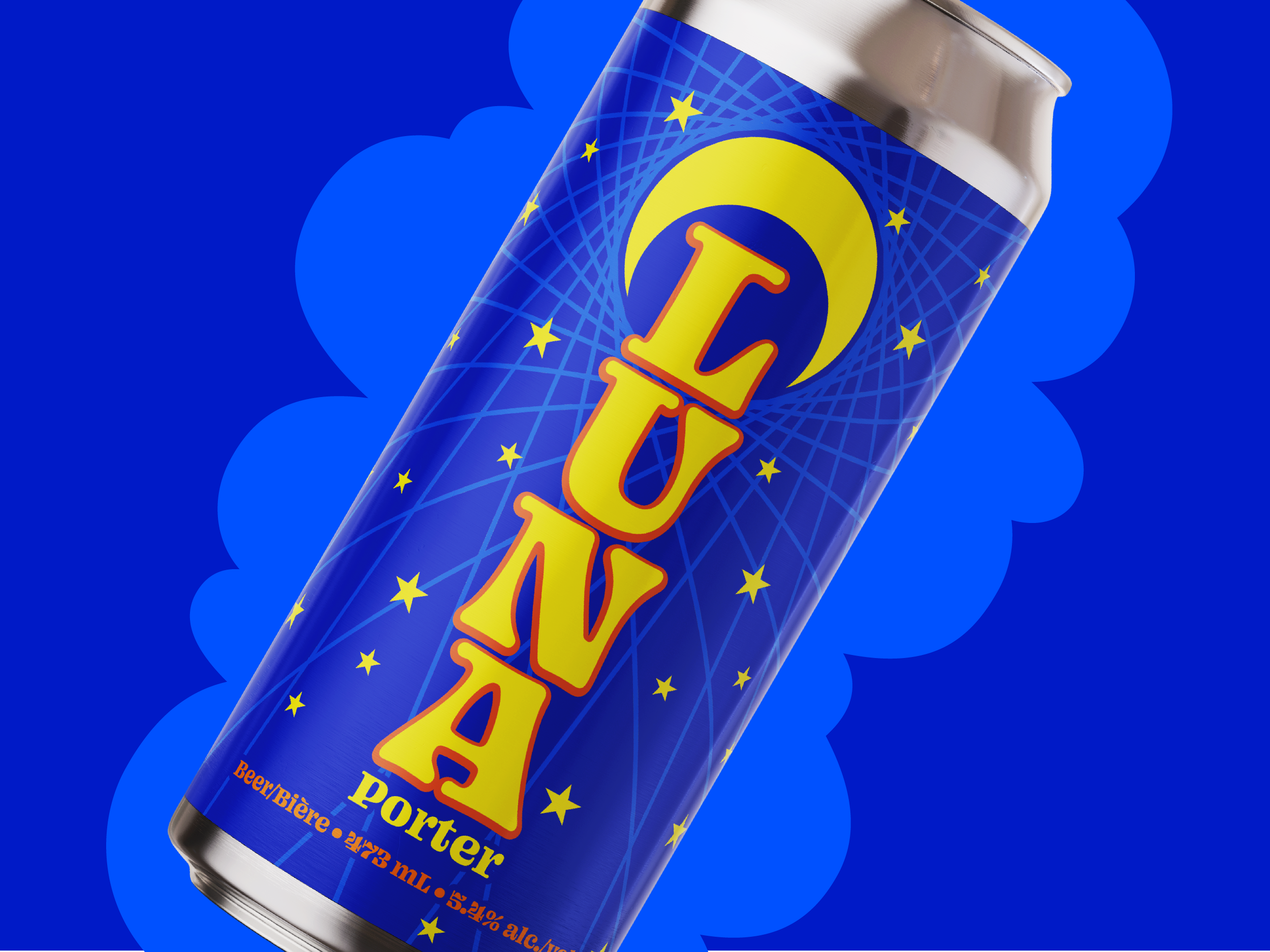
Chunky type lockups and contrasting colours established the lineupâs big personality. Whenever possible, Leechtown makes references to concepts indirectly, to put a subtle spin on the most obvious interpretations of an idea. Using textures and patterns as supporting elements kept things interesting without clutter. Statement typography did most of the heavy lifting.


