Morillas Brand Design redesigned Ruavieja’s packaging system. The goal was to bridge the gap between the Spanish brand’s history with its modern communication goals. The updated packaging features a new premium and refined tone, focusing on contemporary design. The luxuriousness also leans into sustainable choices by using a more slim bottle and a recyclable sleeve. Ruavieja’s new packaging system is sleek and refined, ideal for the modern drinker.
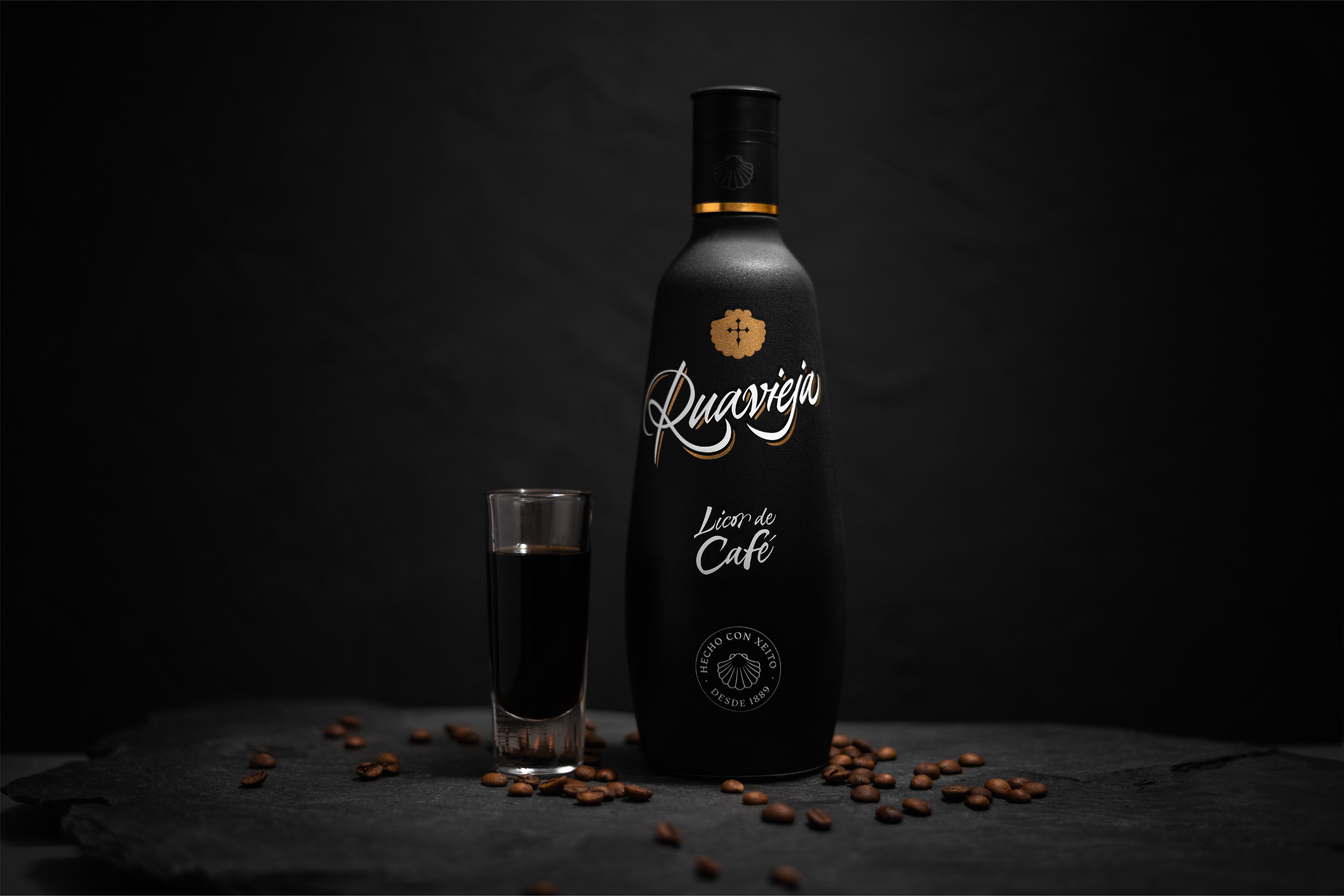
Redesigning tradition with Ruavieja Ruavieja is a Spanish traditional spirit brand that since 1889 represents special social moments between friends and family. At Morillas, we had the chance to redesign its packaging and visual identity to increase the connection with the target, while reinforcing its positioning and the connection with its territory. We were commissioned to align brand language to the packaging. Our challenge?


