Featured image for Sink Your Teeth Into Bon-fiction's Whimsical Chocolate Packaging

Sink Your Teeth Into Bon-fiction's Whimsical Chocolate Packaging

by Chloe Gordon on 05/19/2022 | 2 Minute Read

It's pretty difficult not to get excited over chocolate packaging in general; knowing what's inside is enough. But when the design is as rich as the dessert within, you've quite literally hit the jackpot. Opposite designed the packaging for chocolate brand Bon-Fiction which focuses on contemporary and eclectic design systems. The packaging showcases the luxurious brand but without feeling stuffy or overworked. Instead, the chocolate's packaging is simply whimsical, inviting consumers to take a delectable bite.


Editorial photograph

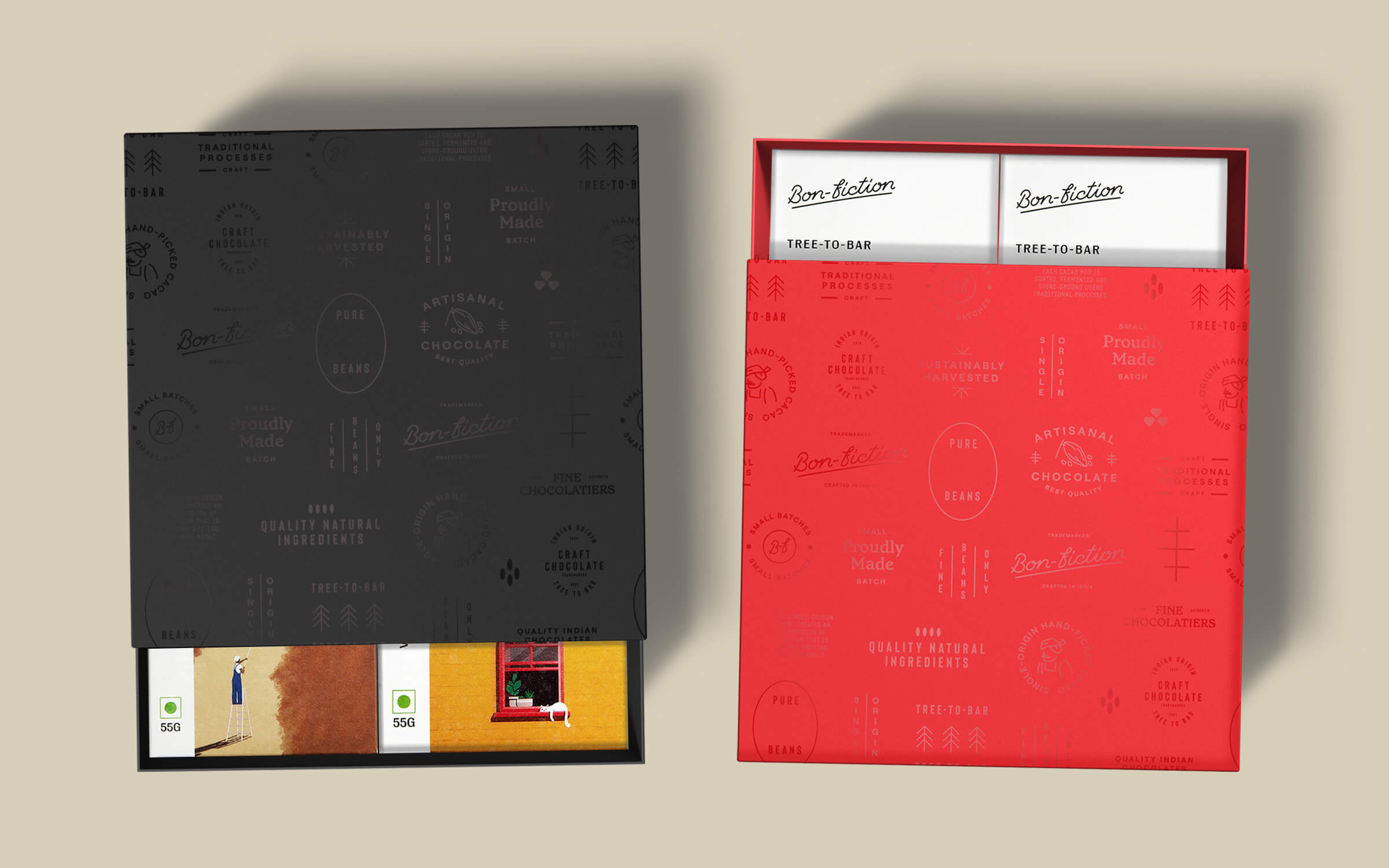
Bon-fiction is a tree-to-bar chocolatier in Telangana, India. Their cacao beans come from their own (and neighbouring) farms, grown sustainably around the river Godavari. Made using traditional chocolate-making processes, the bars are worth writing stories about!

Opposite worked with the founders to create the Brand Name, the Product Nomenclature, the Brand Identity and Packaging Design. And of course, testing and reviewing several iterations of the chocolate bars! Our approach was to create a brand that was rooted, but modern and eclectic. Comfortable in the chocolate aisle, but not familiar. Packaging that reflected the craft, but wasn't stuffy and boring. The logo is a custom-lettered typemark that reflects the craftsmanship and finesse that is integral to making good chocolate-making.

Editorial photograph

Each product is named to evoke the title of a book, while cleverly referring to the key ingredients. The packaging design uses simple layouts, paired with beautiful typeface choices and custom illustrations to bring just the right balance of whimsy and tradition to the brand.

Editorial photograph