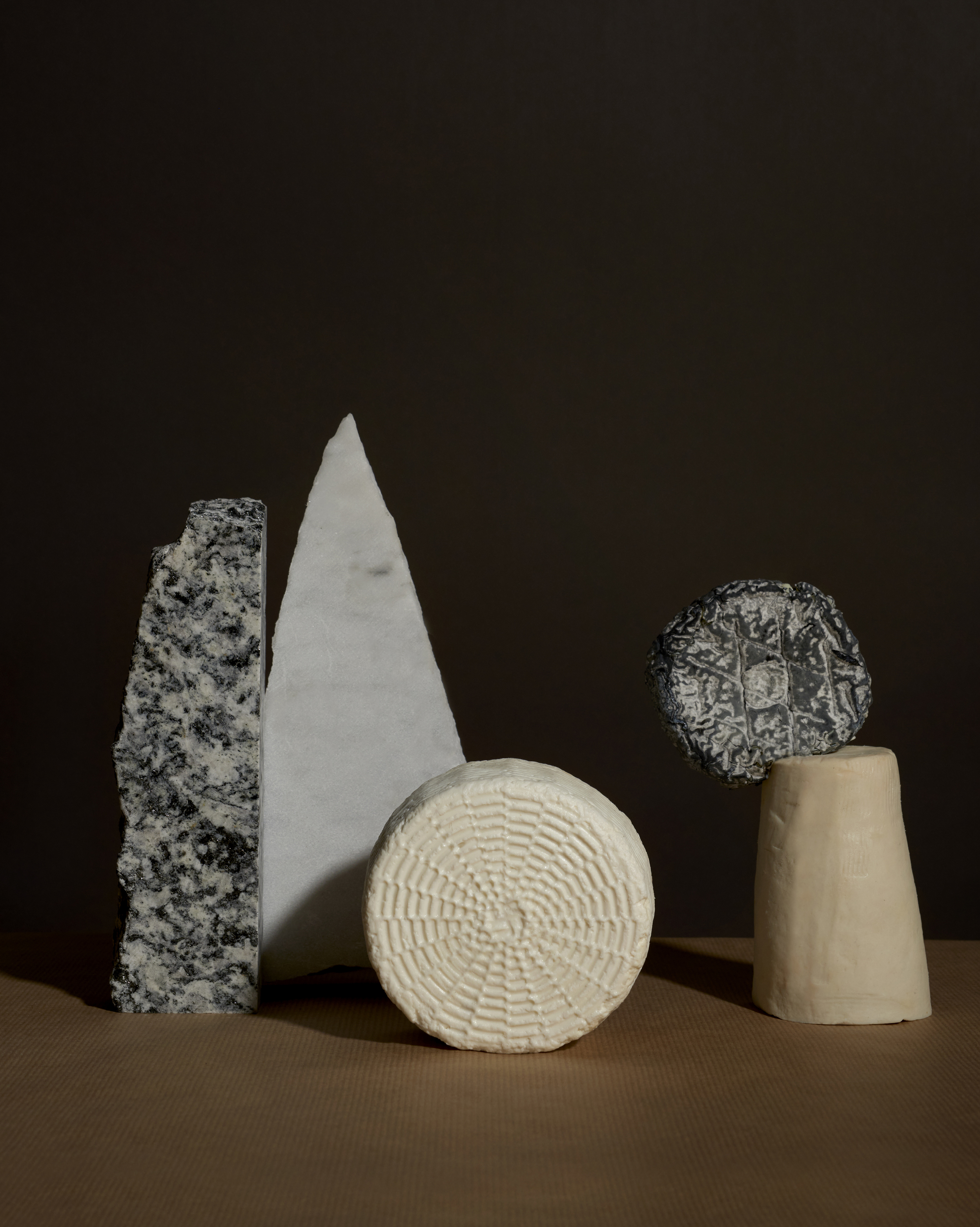
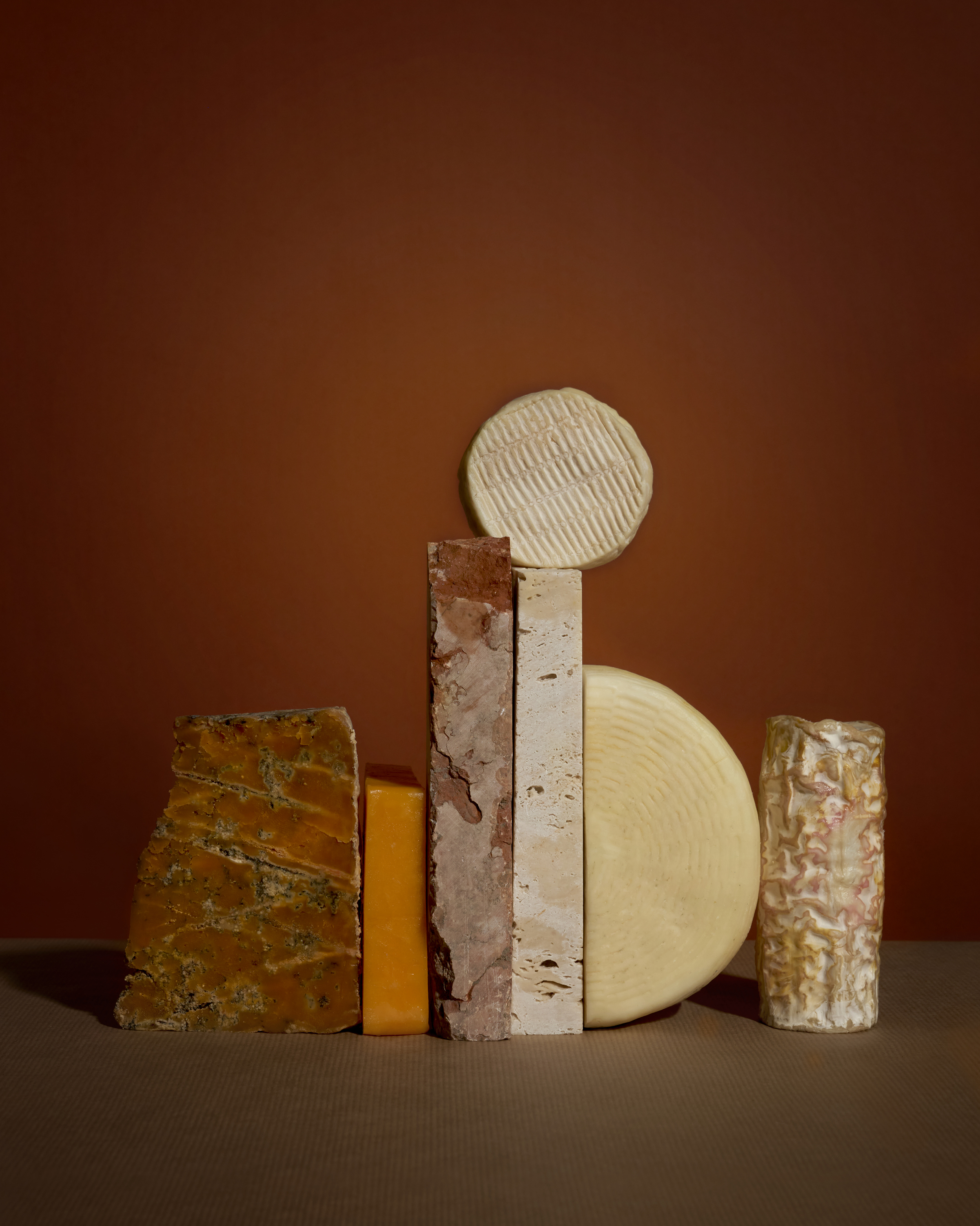
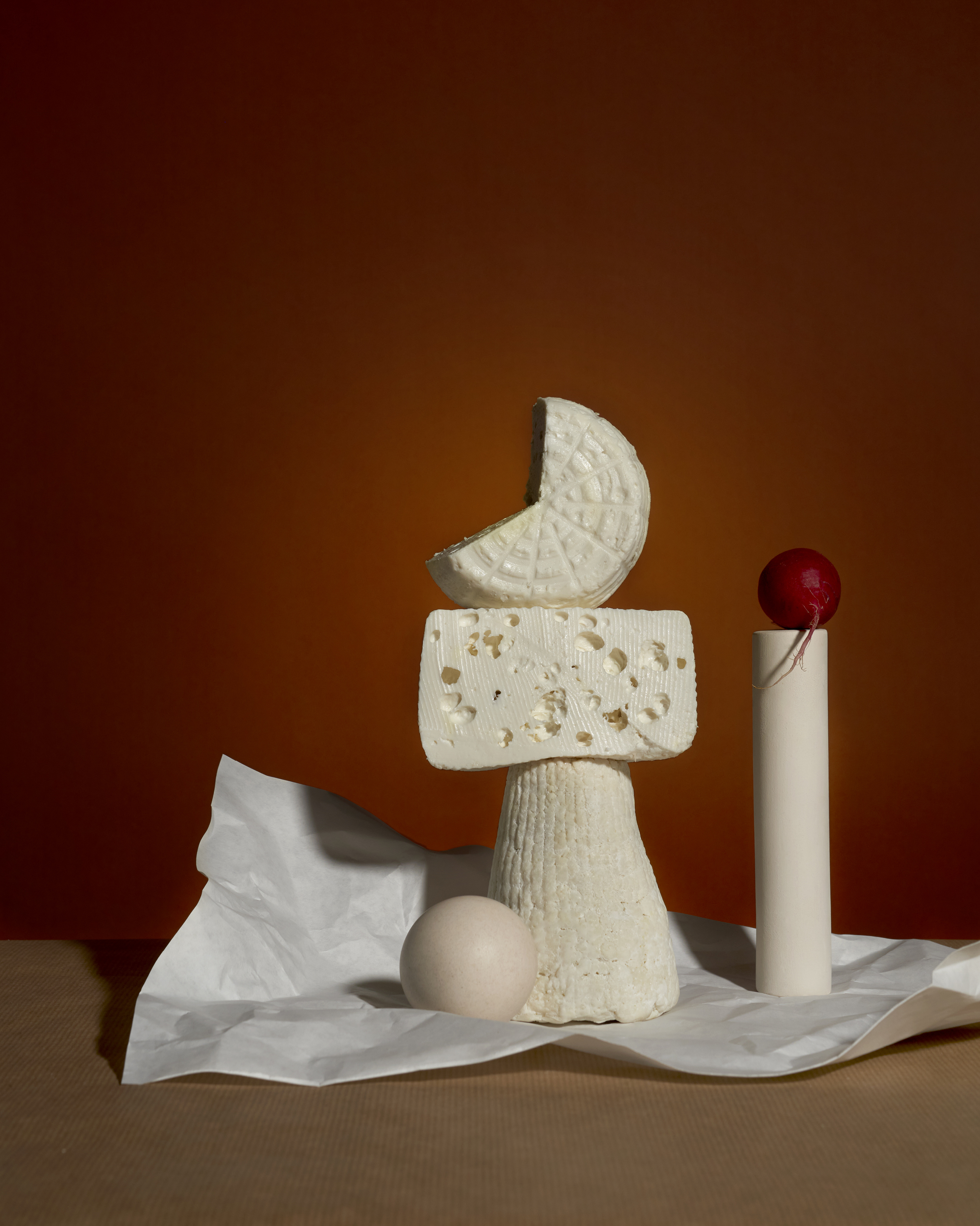
Each type of cheese has its own identity. For example, to me at least, Brie is a stoic yet approachable cheese, Manchego is plain flirty, and Blue Cheese is often pompous (despite being my favorite). You get the picture.
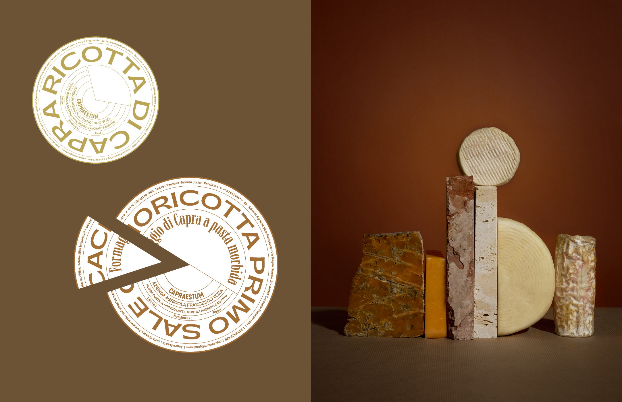
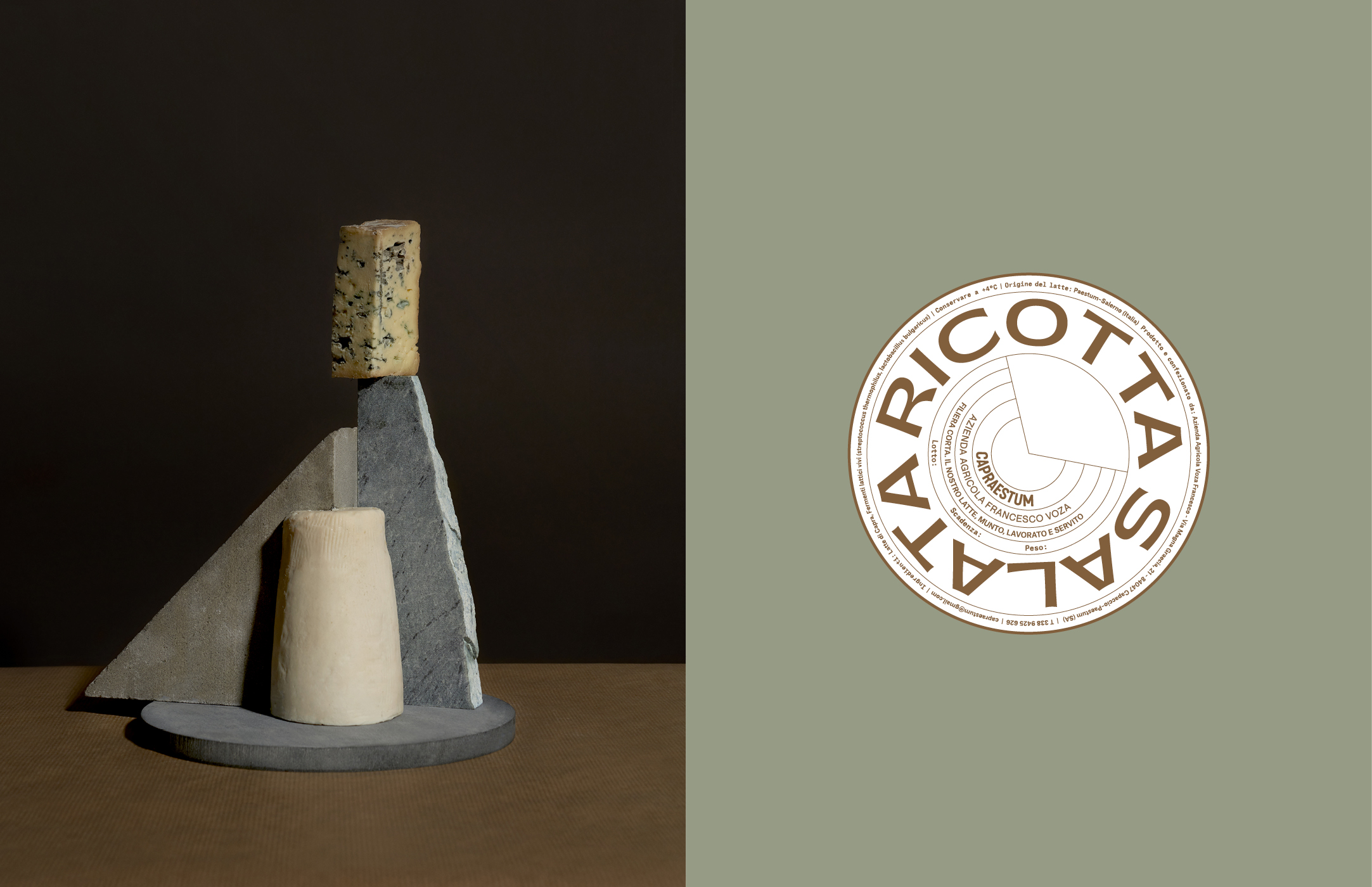
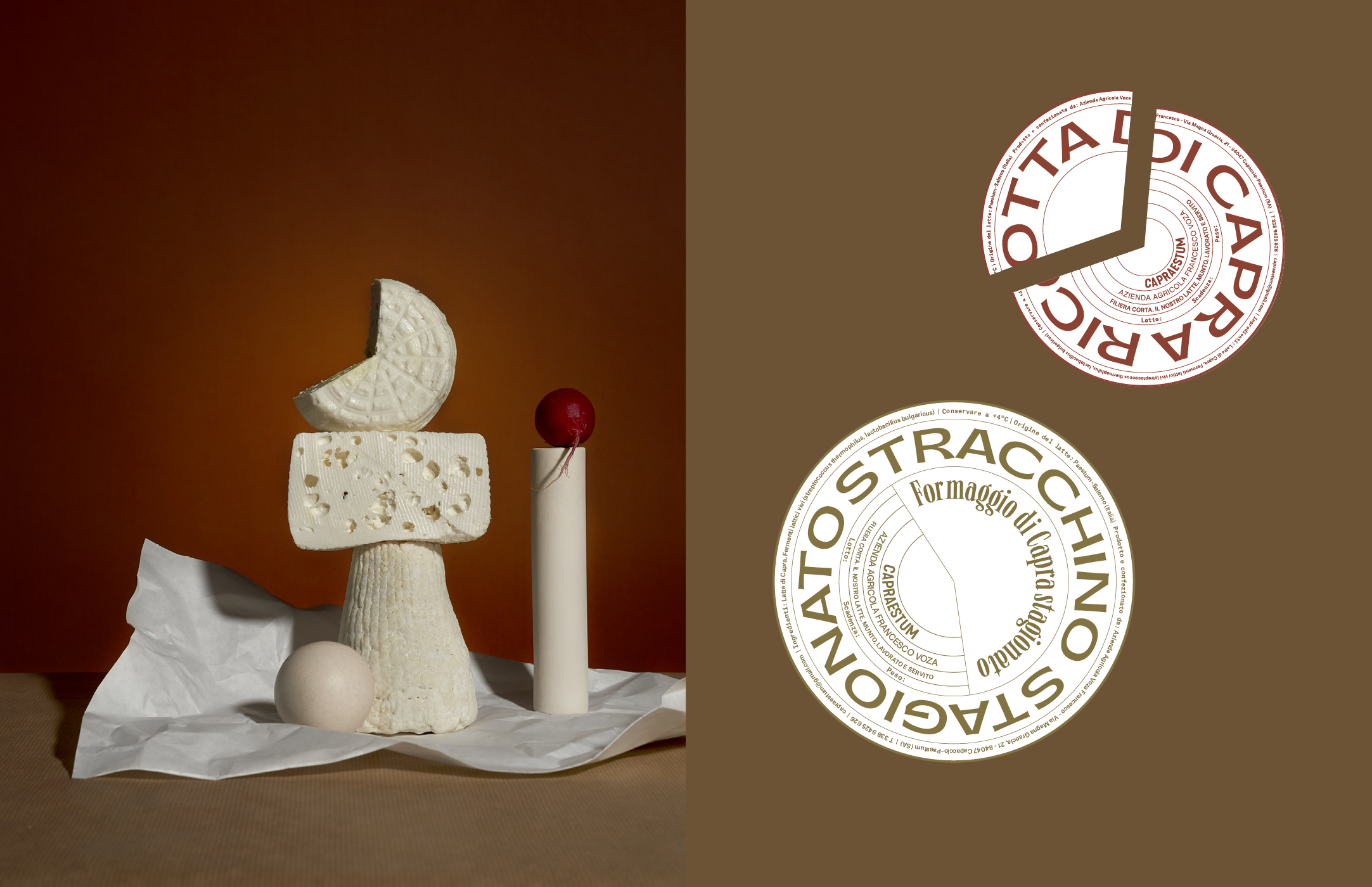
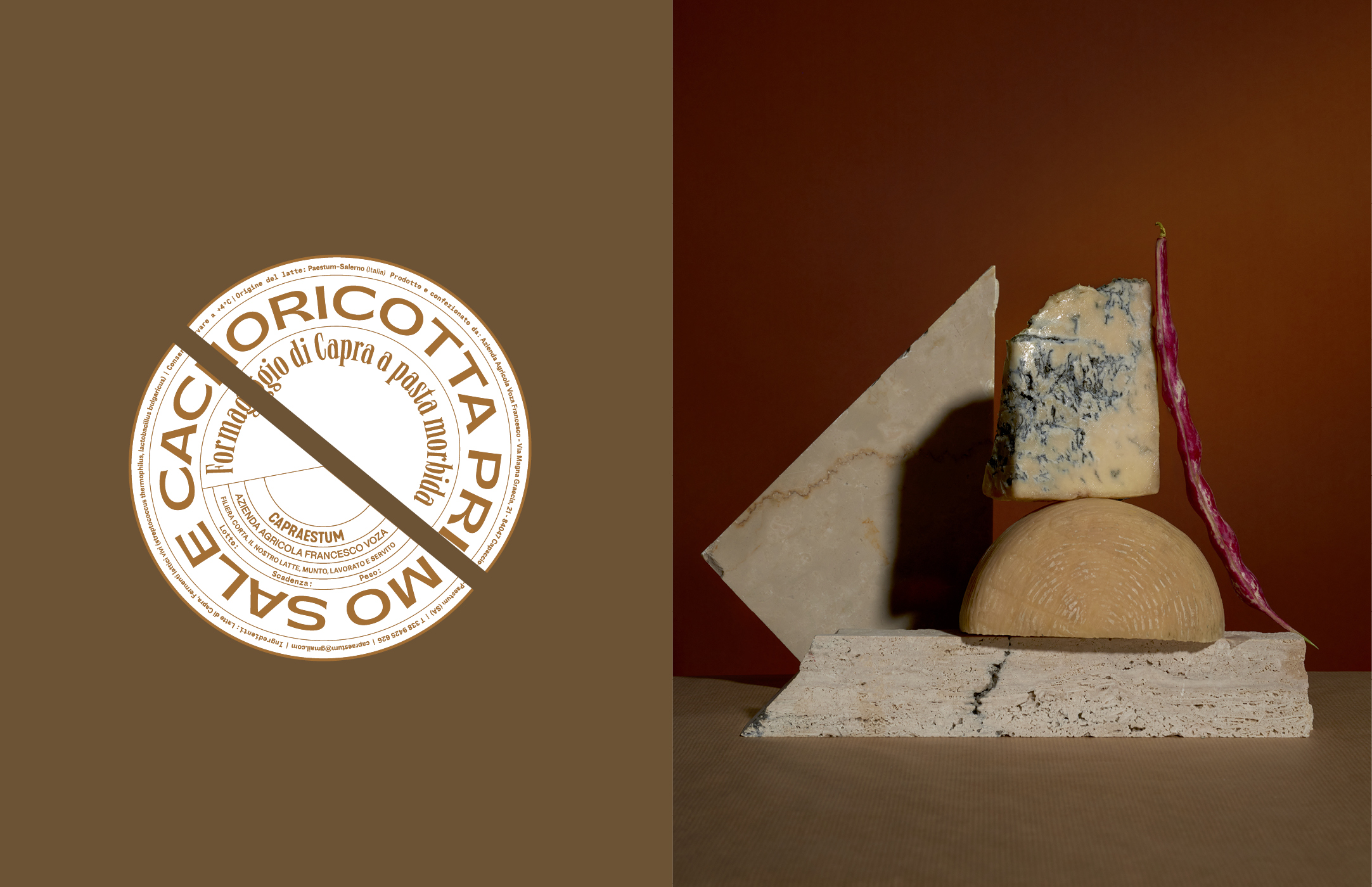
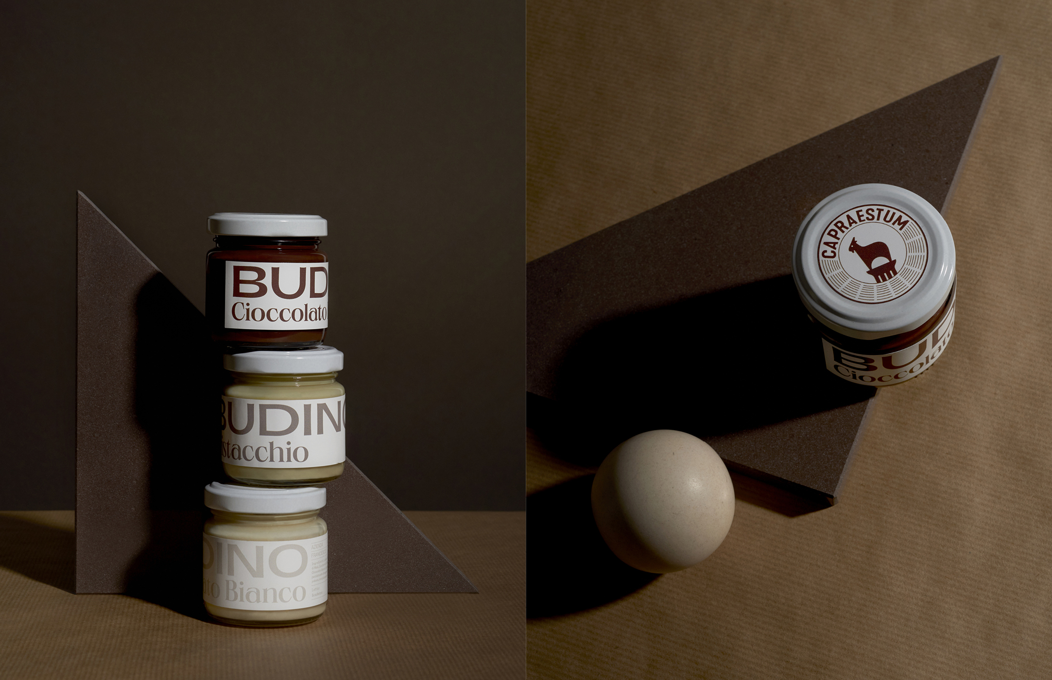
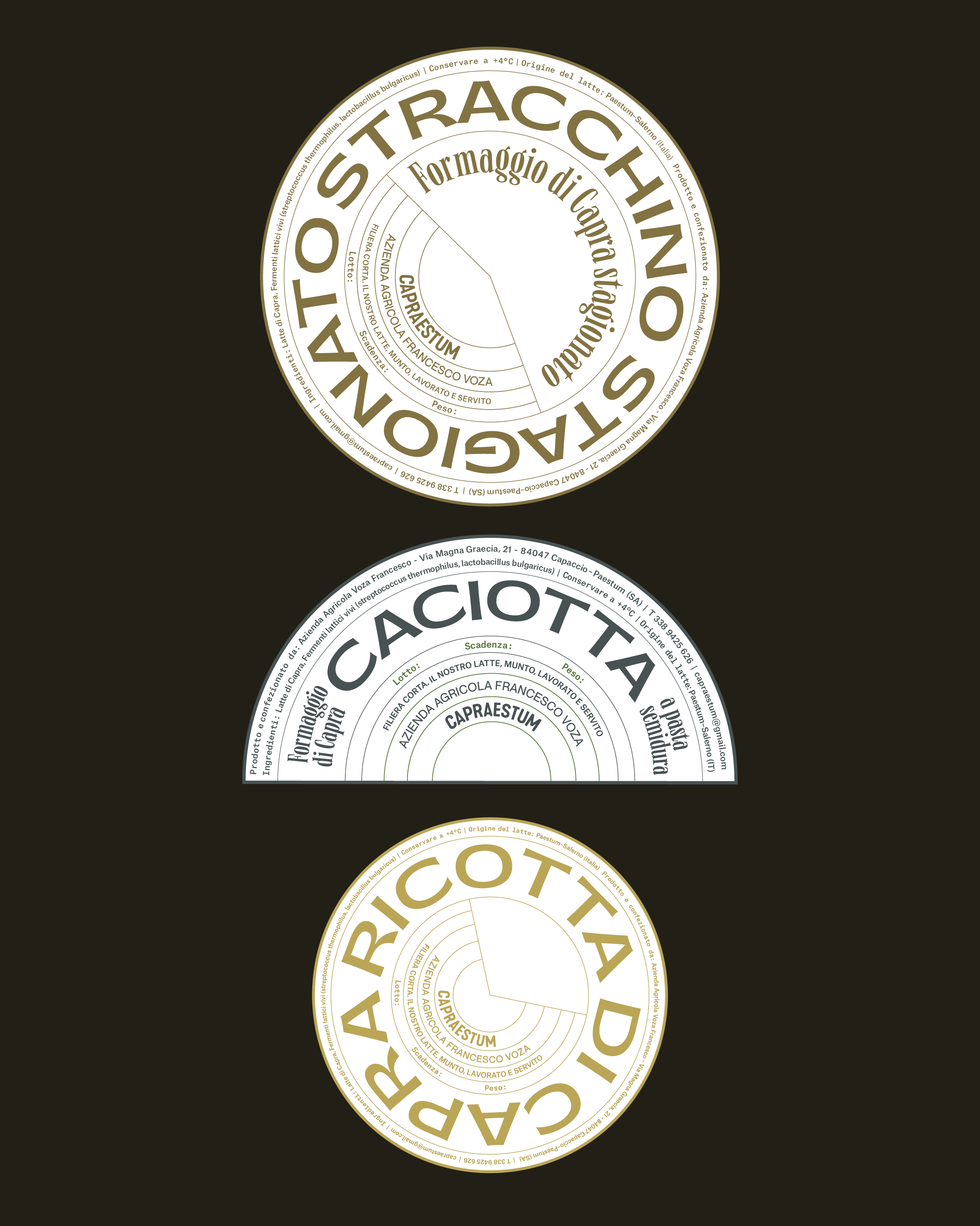
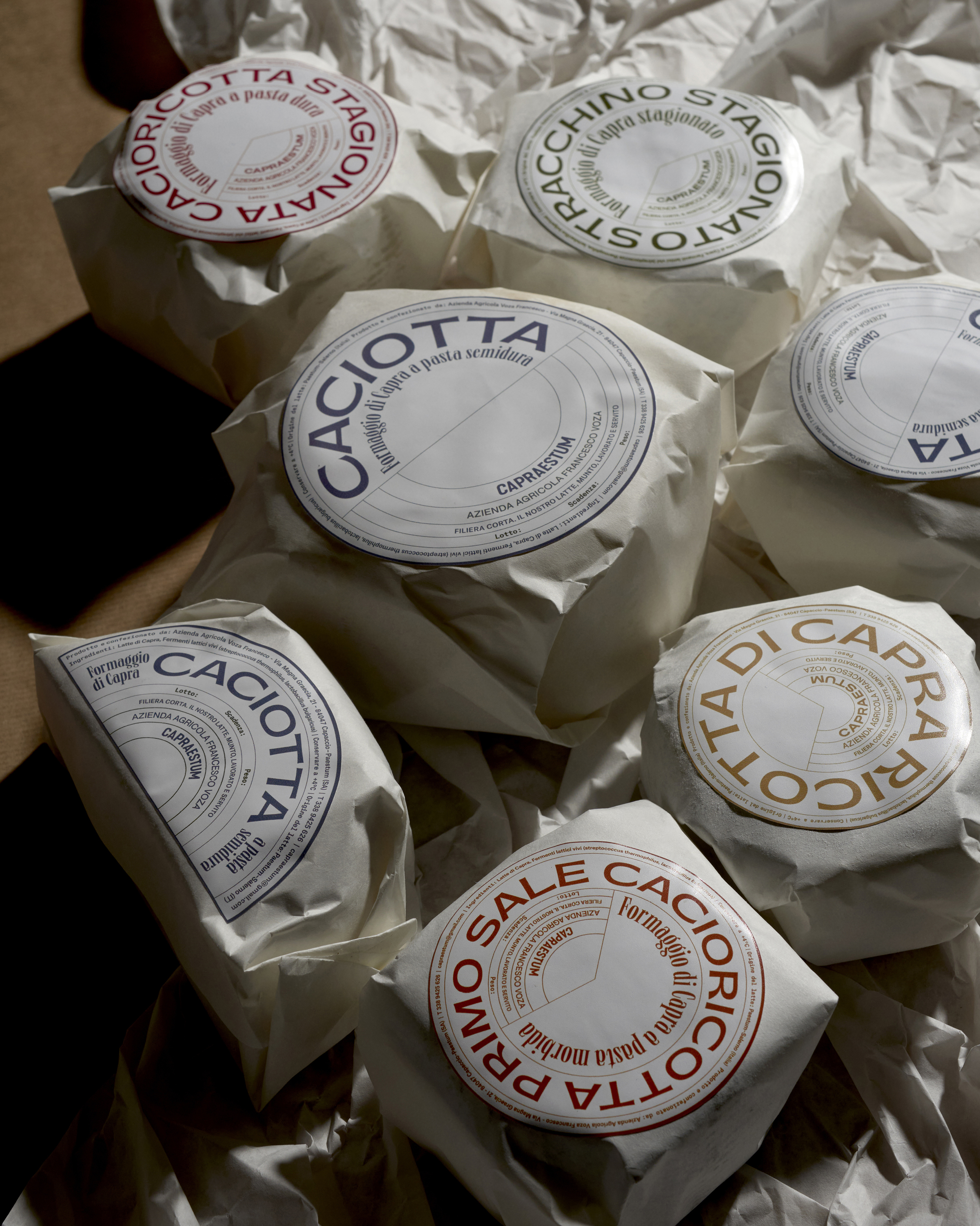
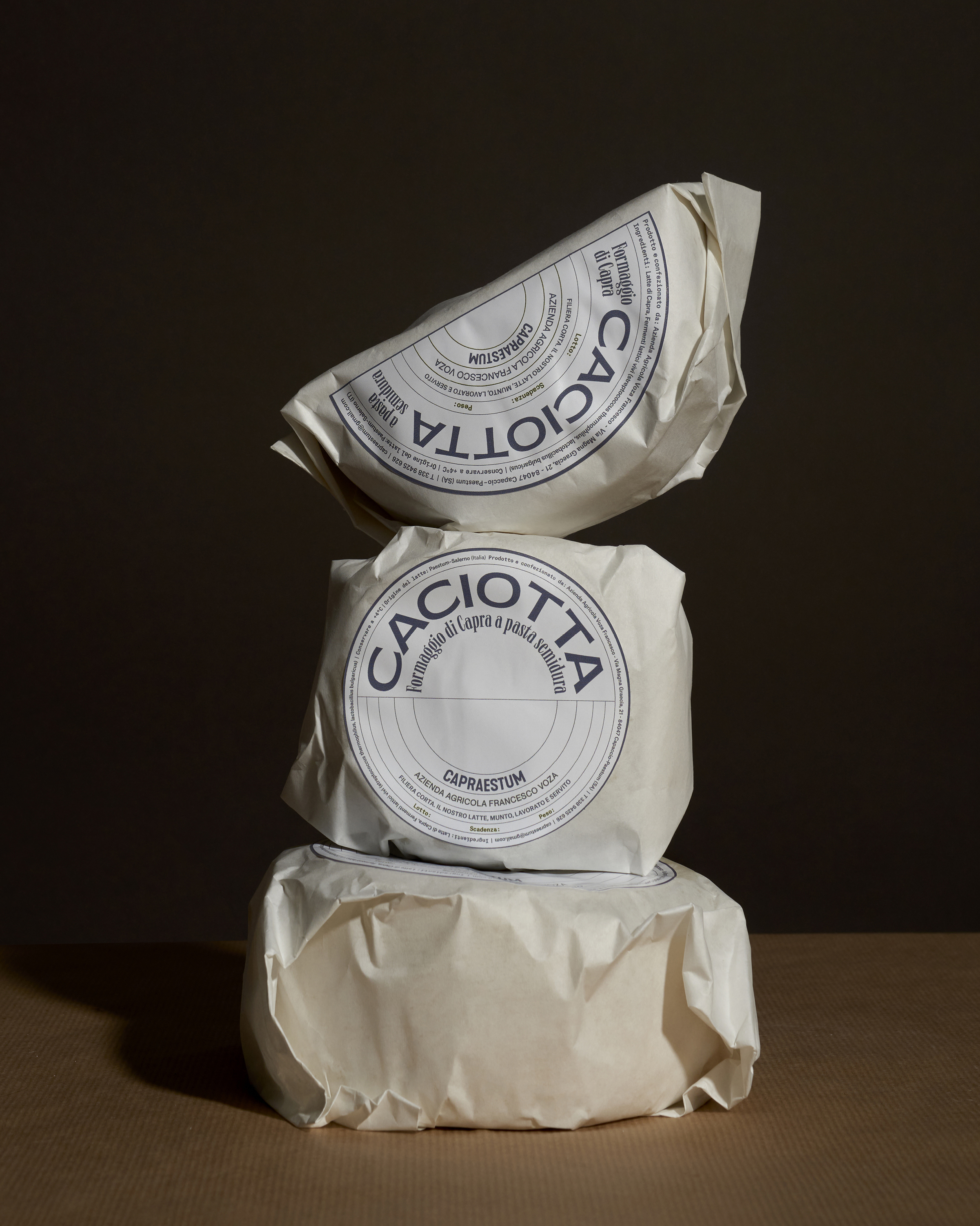
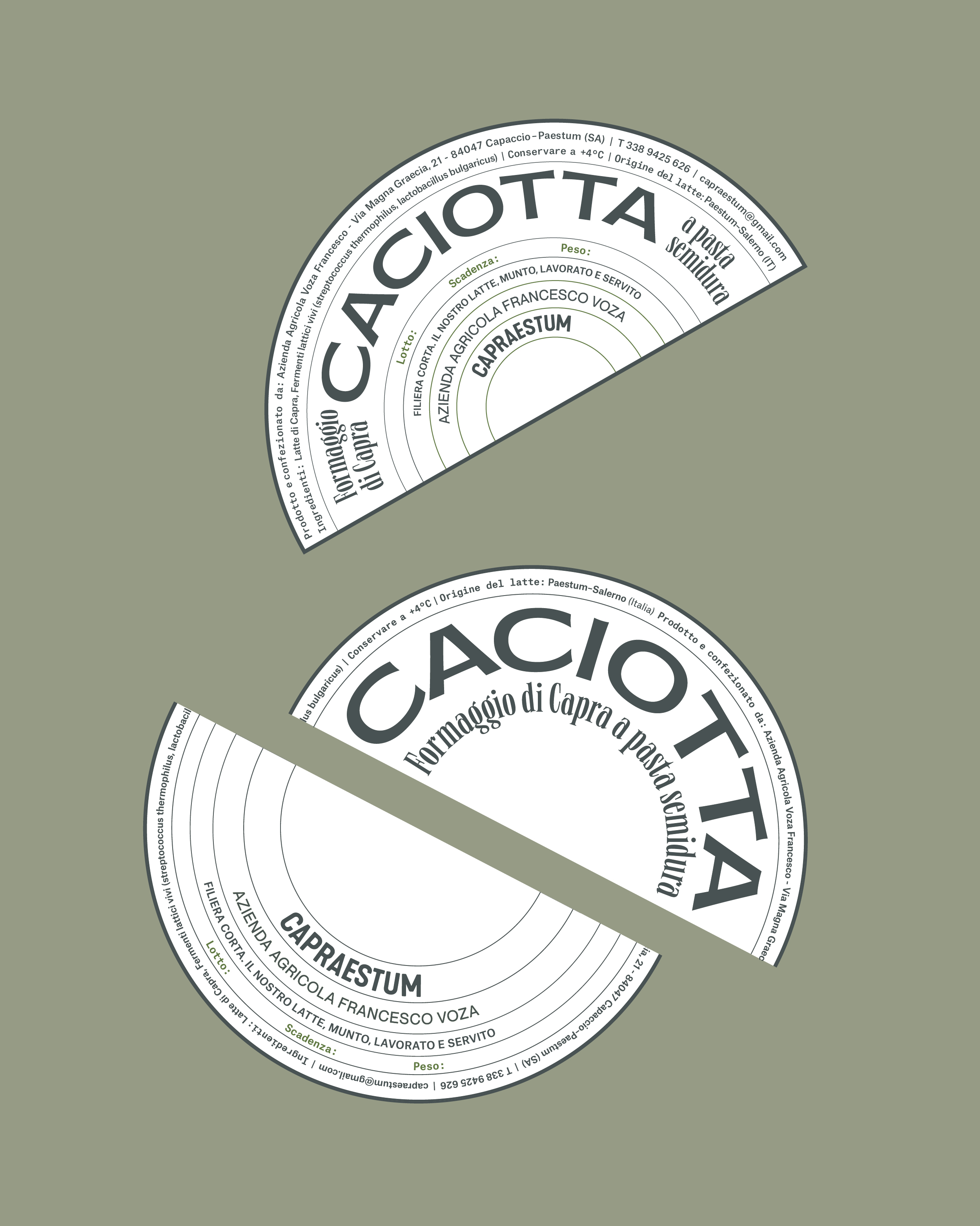
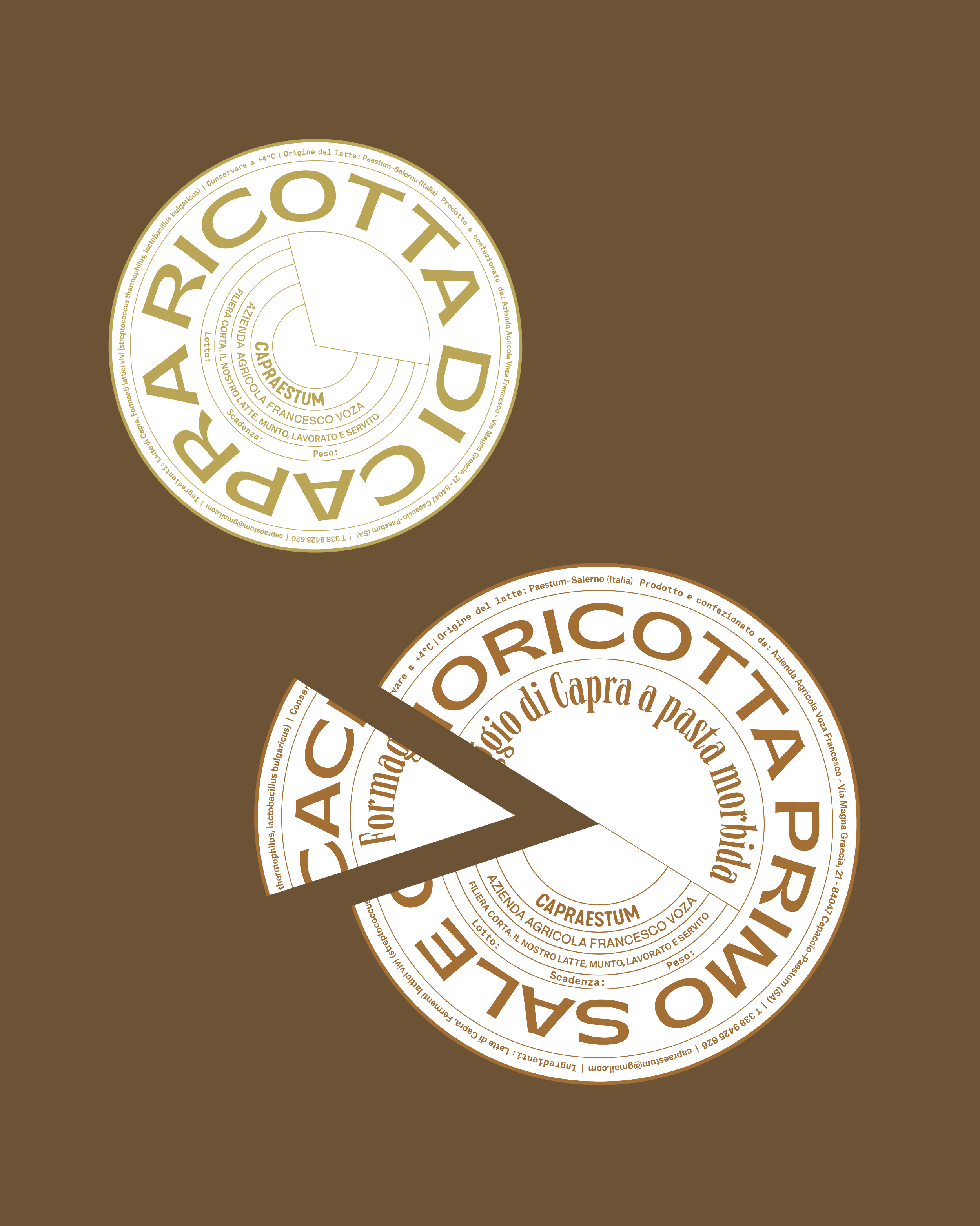
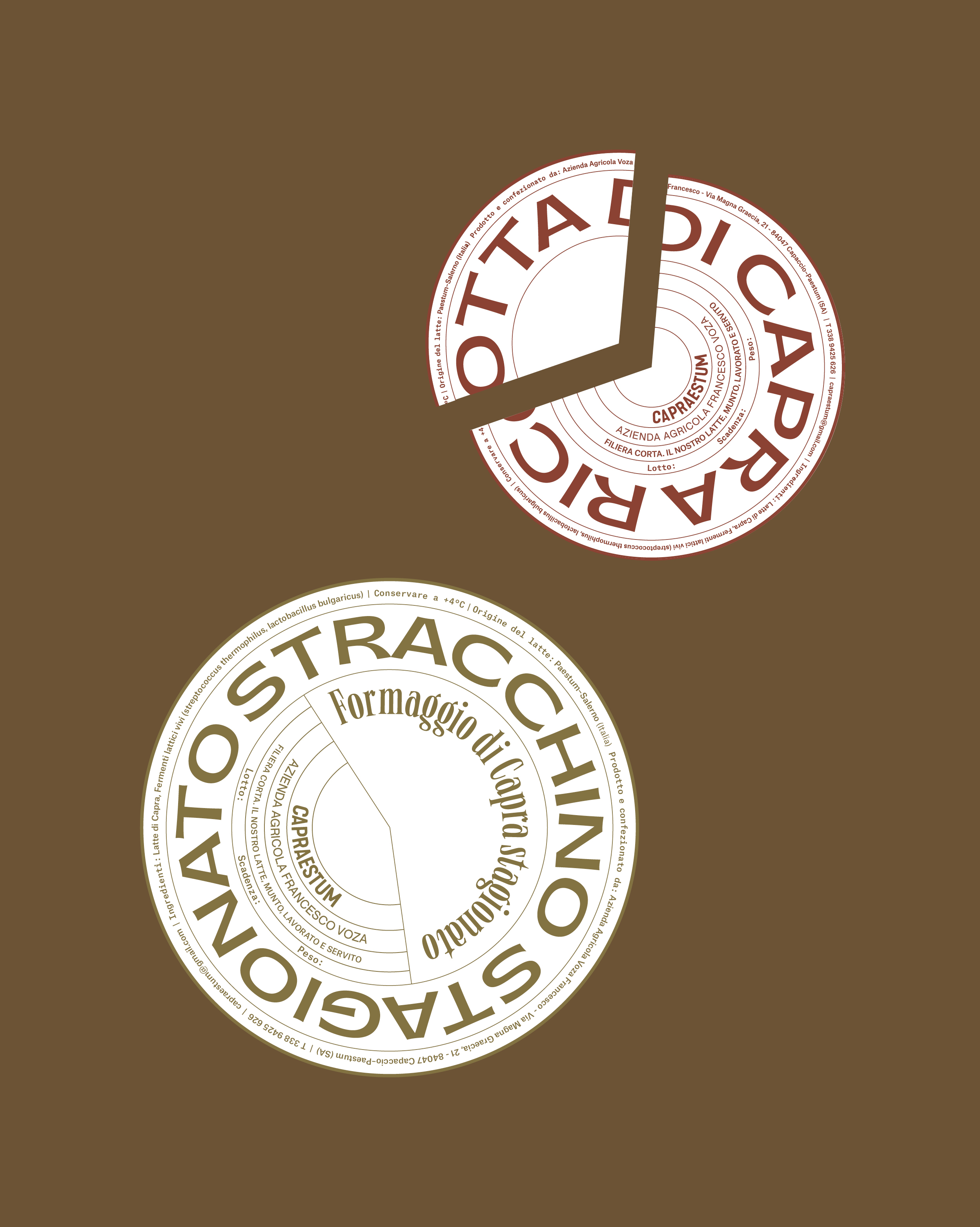
Federica Marziale Iadevaia crafted the packaging design for Capraestum, a goat cheese farm located in Greece. The paper packaging features inspiration behind the art of slicing cheese, and the circular grid displays the artful typography.
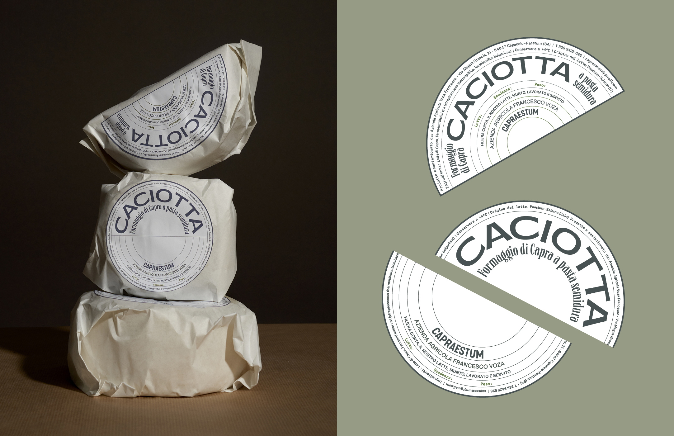
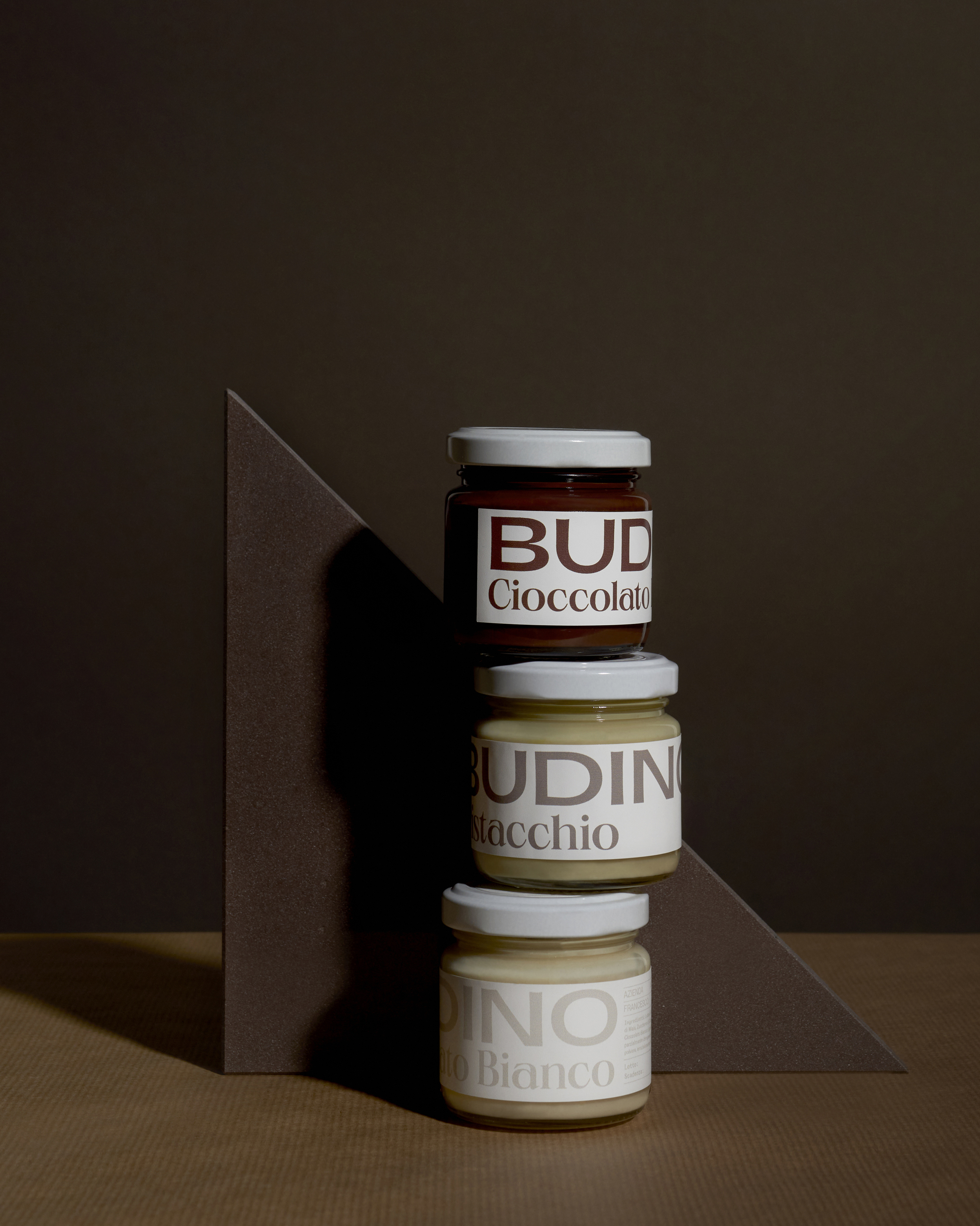
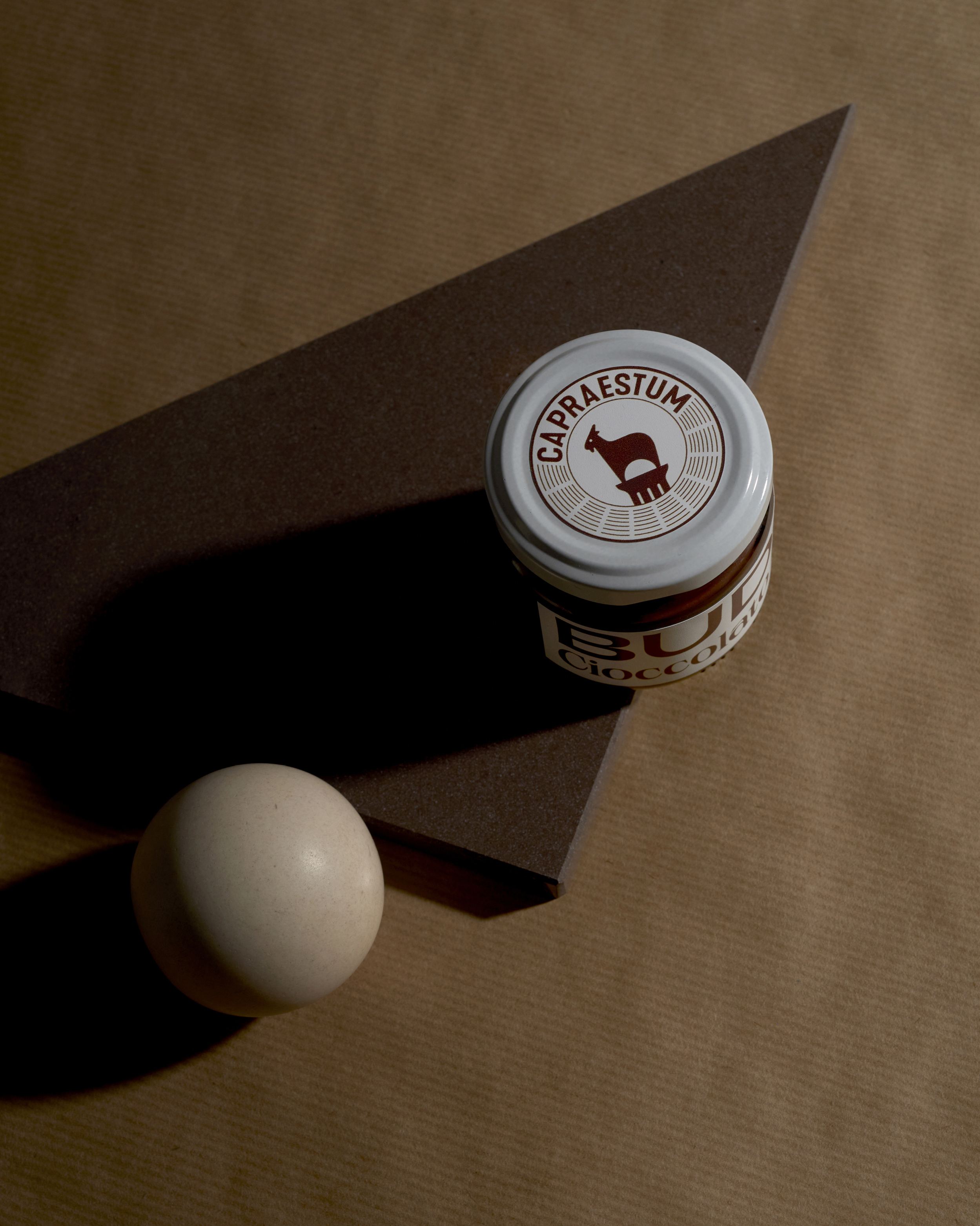
Capraestum is a branding project for a Goat Cheese Farm, Paestum-based. To keep the tradition of preserve cheese by wrapping it with paper, the project came up with the design of paper label facilitating cheese fractioning. The project revolves around the concept of cheese slicing. And the rounded cheese shape became the organizational ‘grid’ of this design. Typography-based, the labels are typeset in Neue World and Gatwick, both designed by Pangram Pangram Foundry.