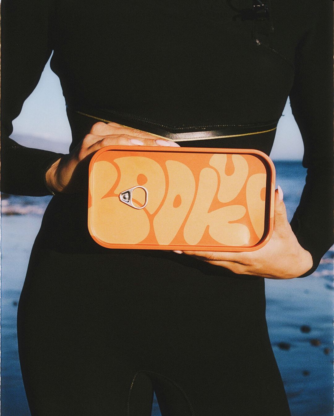
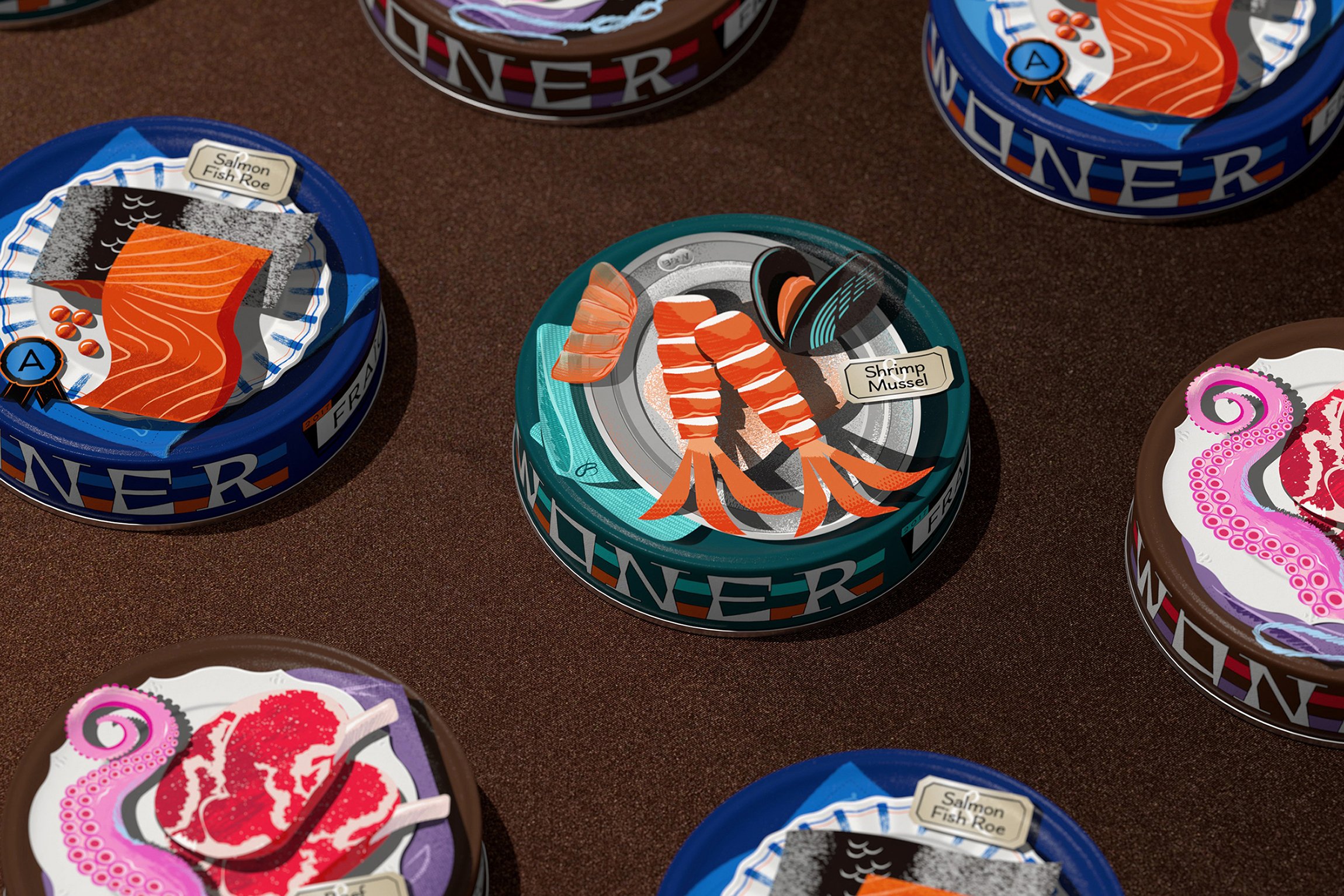
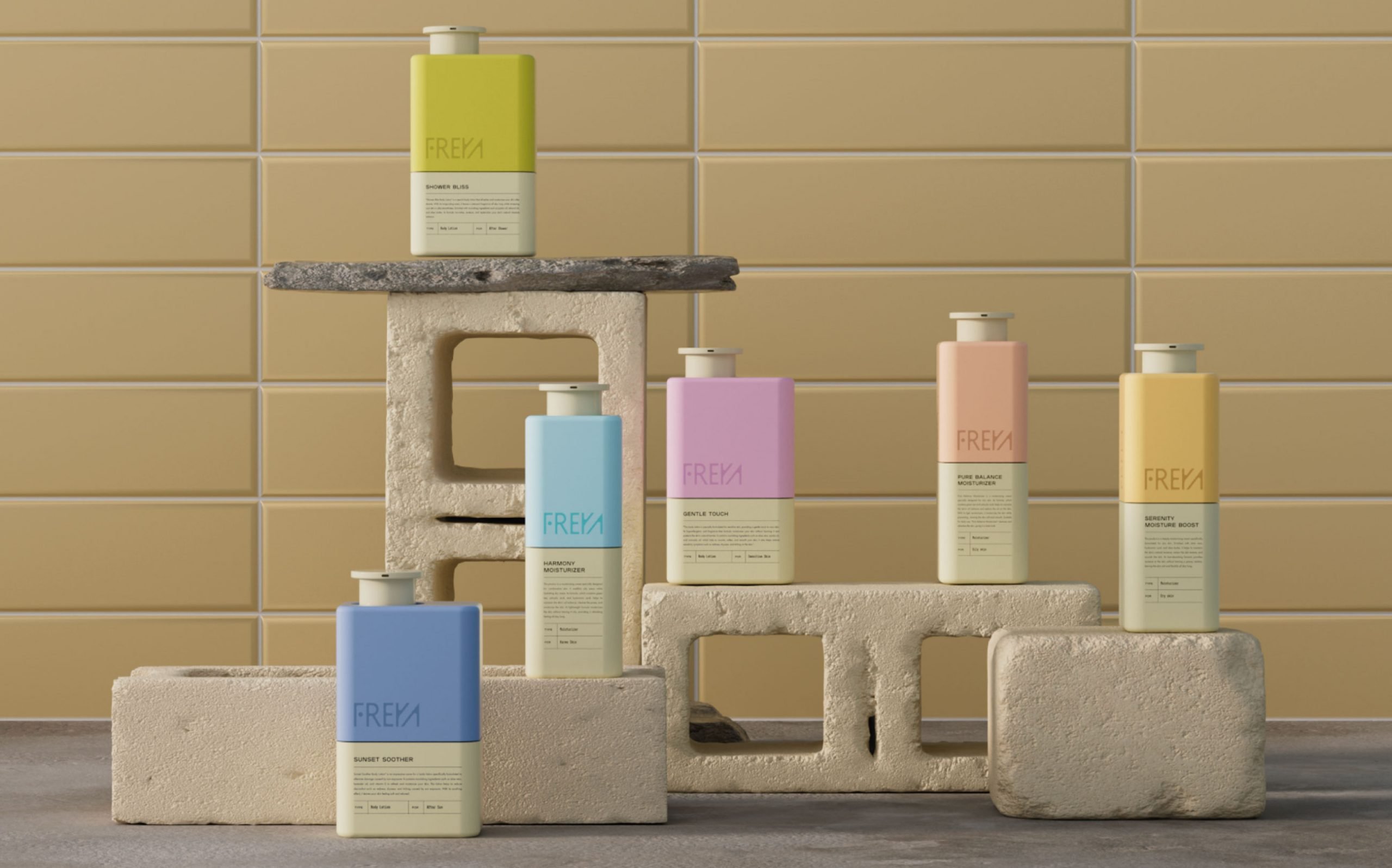
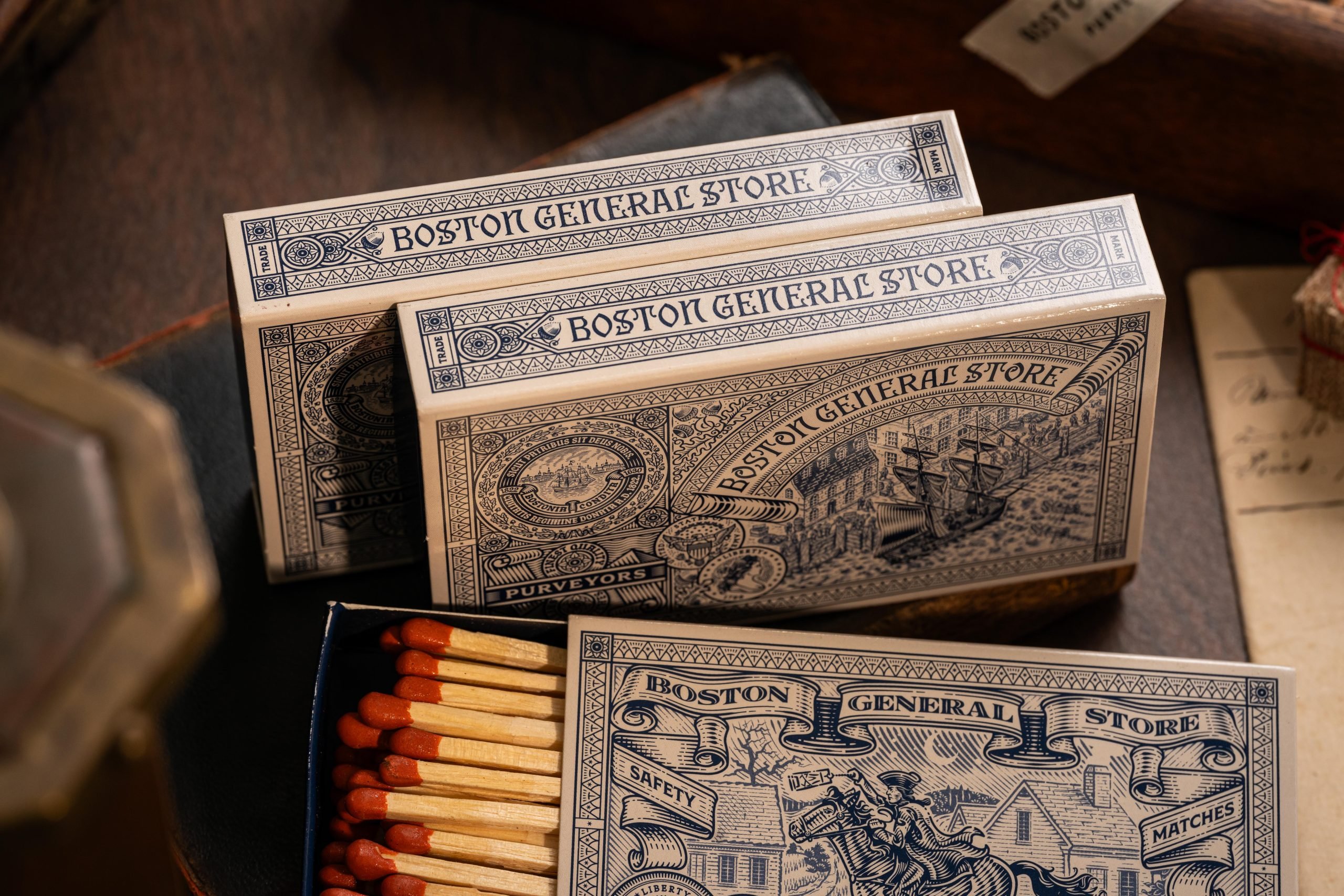
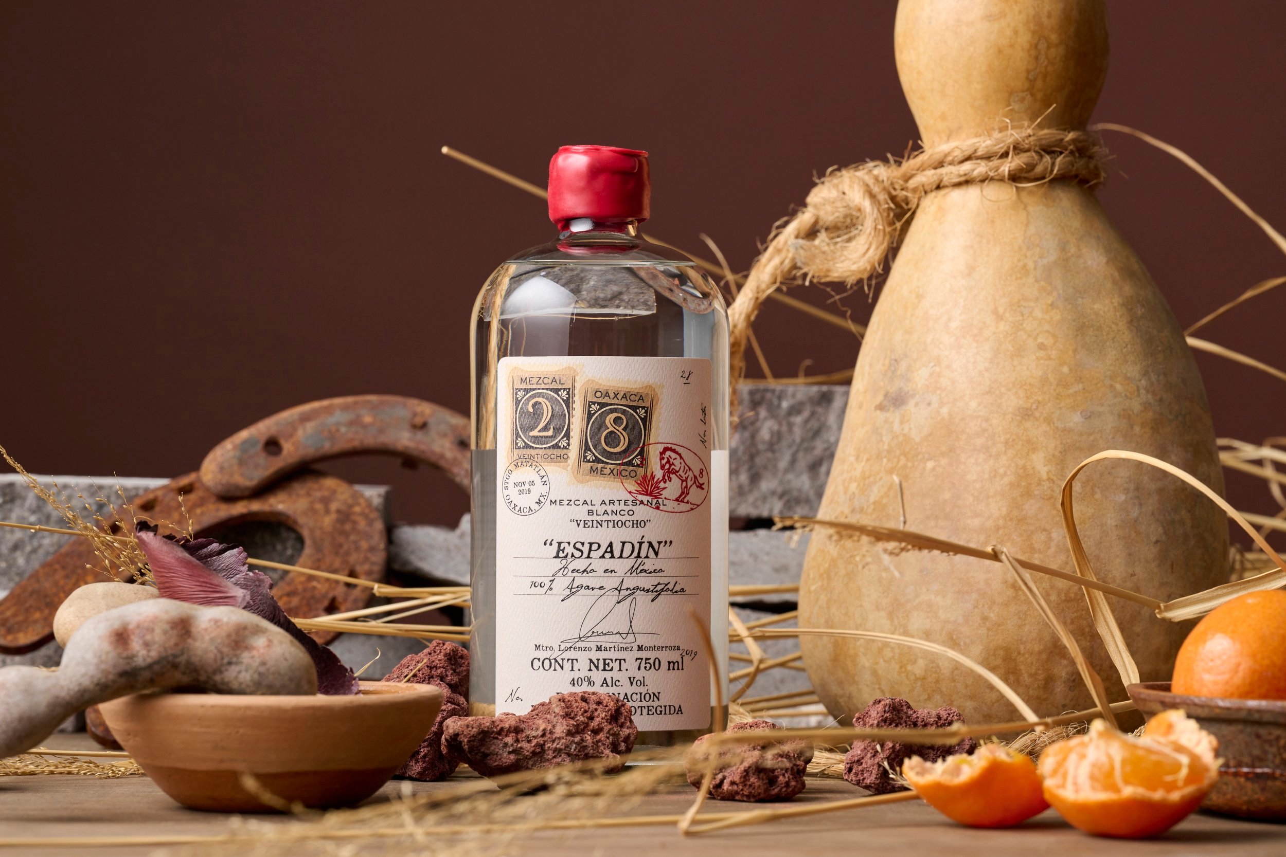
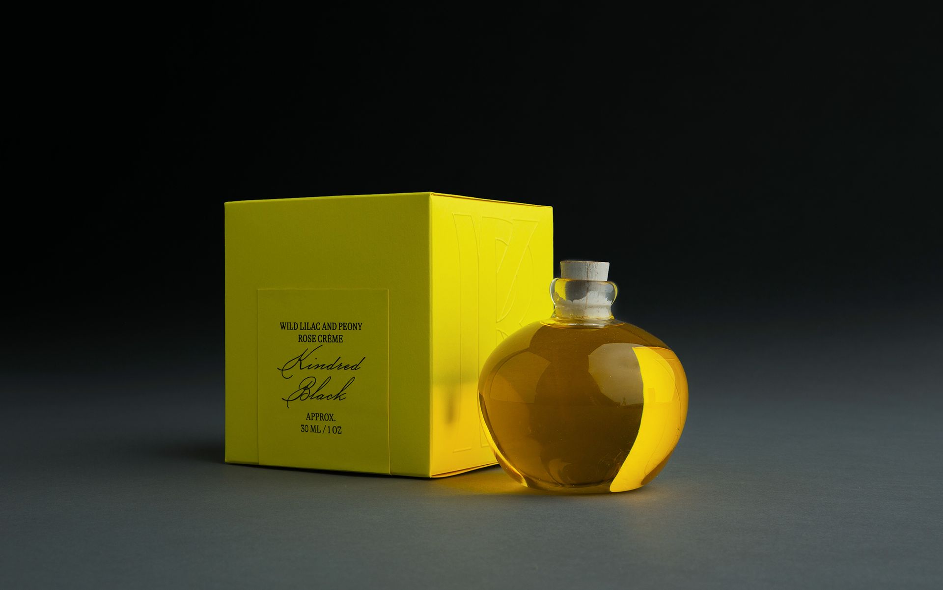
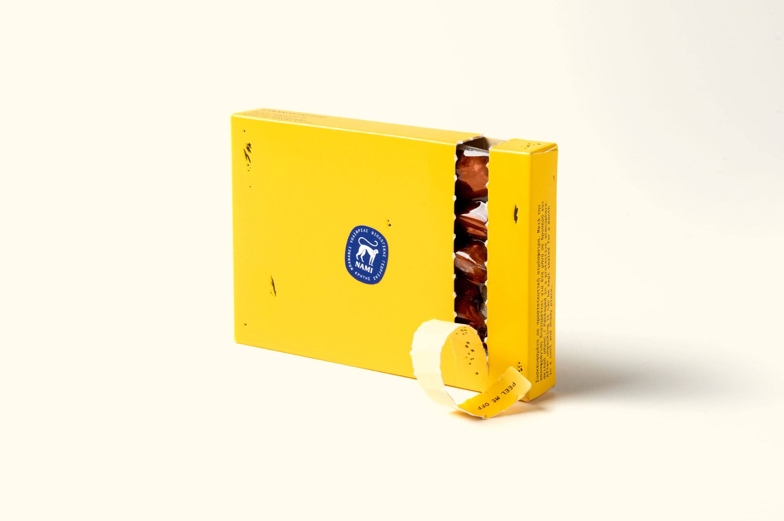
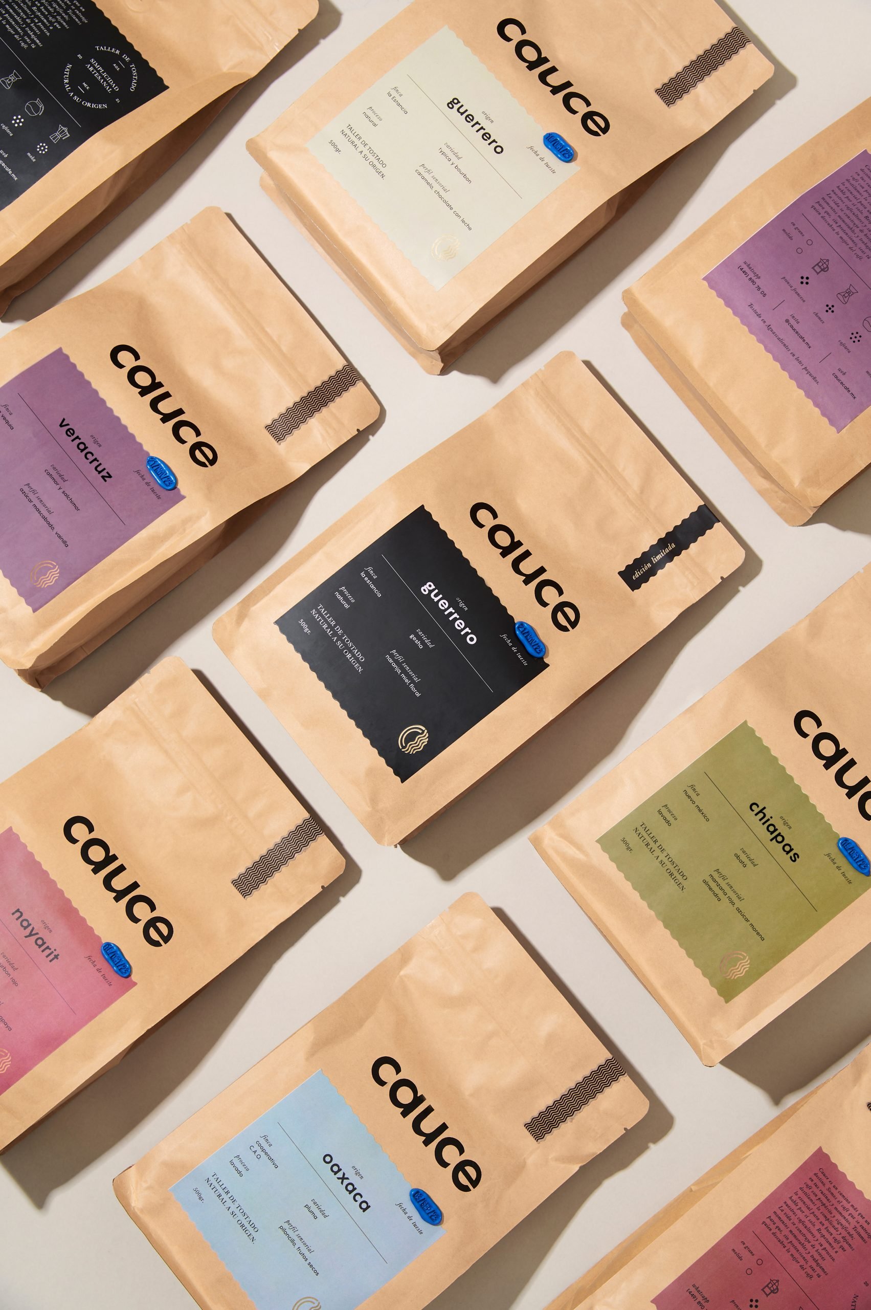
One of the most important challenges was to build a solid brand capable of combining gourmet products and traditional products or products with denomination of origin under the same packaging architecture. The proposal articulates the design through a transversal band that divides the pack into three parts and serves to organizes the information and creativity. Based on this architecture and the master brand, each family of products has a design that link with each other, but at the time respond to the specific needs of each product category.
El Corte Inglés Is Brought to Life With Clean Photography and Illustrations
By
Published
Filed under
