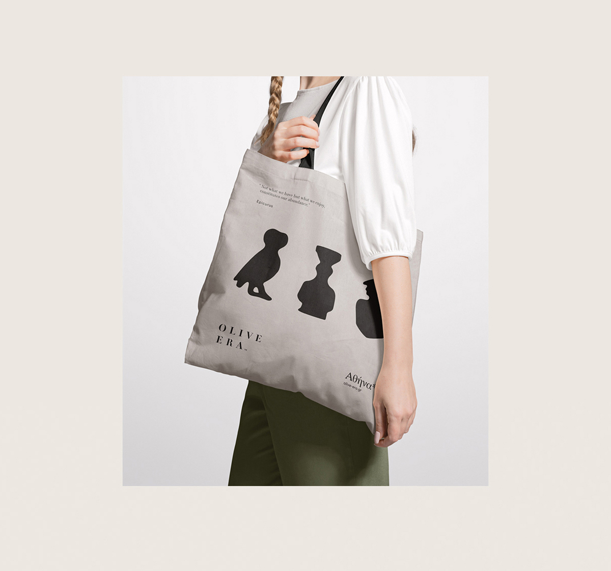
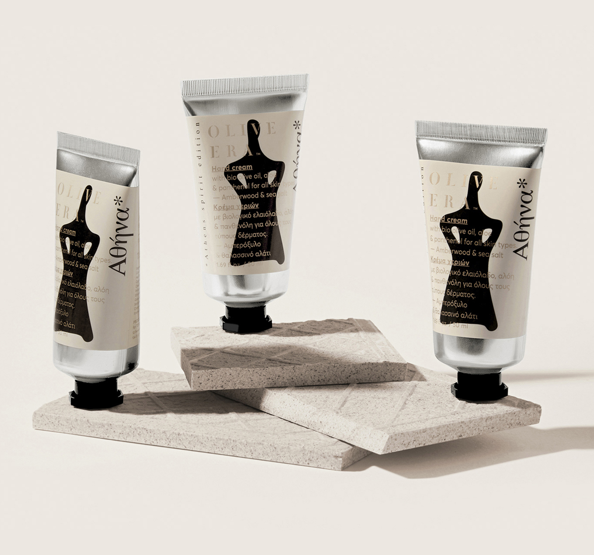
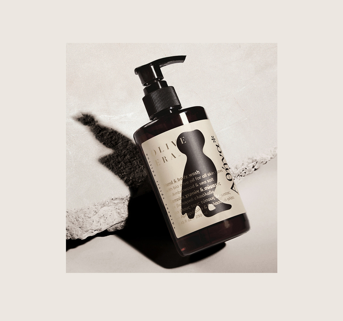
Neutrals are in, and design trends often quickly find themselves on beauty packaging by some natural cause and effect. Olive Era is a skincare line with olive oil used as the main ingredient. AGd_studio designs the packaging for the brand, and the use of bold and black illustrations layered on a light taupe label creates a design that feels fresh and balanced. Pair that with gold typography and an amber bottle, and you’ve got yourself a sumptuously designed bottle.
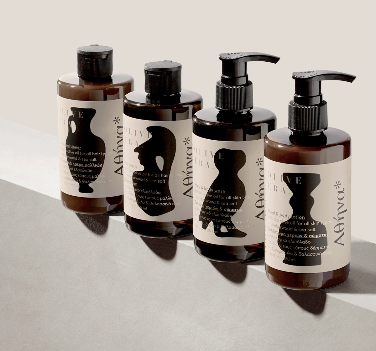
Olive Era™ is a Greek skincare company whose products utilize Greek bio olive oil as it’s main ingredient. The range includes a wide spectrum of products covering skin treatment and hair care as well as aromatherapy and hotel amenities. In 2021 Olive Era™ opened its first physical store in the city center of Athens and a shop within the duty free shops area in Athens international airport. At that time, the company asked us to design a series that pays homage to the city of Athens and it’s legacy. We used iconic symbols and items of the city to design a series of illustrations that capture the spirit of Athens in a contemporary style, applying fluid lines with slight imperfections to resemble the weathering of archeological findings that we see today.