Homethings' Packaging Is Cleaning Up The Cluttered Industry
by Chloe Gordon on 12/02/2022 | 3 Minute Read
While the cleaning industry exists to make things feel less messy, the packaging seen in the marketspace feels extraordinarily cluttered. Homethings is switching things up with its packaging designed by Here Design. By using a primary palette of charcoal and beige, with a mix of heavy graphic elements and lighter lines, the brand has a clean, minimalistic packaging system that will surely inspire a clean home and a cleaner mindset.
The world of cleaning is cluttered. Homethings gives it a freshen up. Tim Keaveney and Matt Aubrey are challenging the global homecare industry to clean up its act with their revolutionary refillable products. They came to Here Design looking for a visual identity and packaging that packs a cleansing punch: loud and proud with an axe to grind. Our strategic directive, ‘Shake things up – by doing more with less’, places them at the cutting edge of a squeaky clean category. To smash its codes, we sought inspiration from the unlikeliest places like 80s sub-culture and fashion-forward sport-tech.
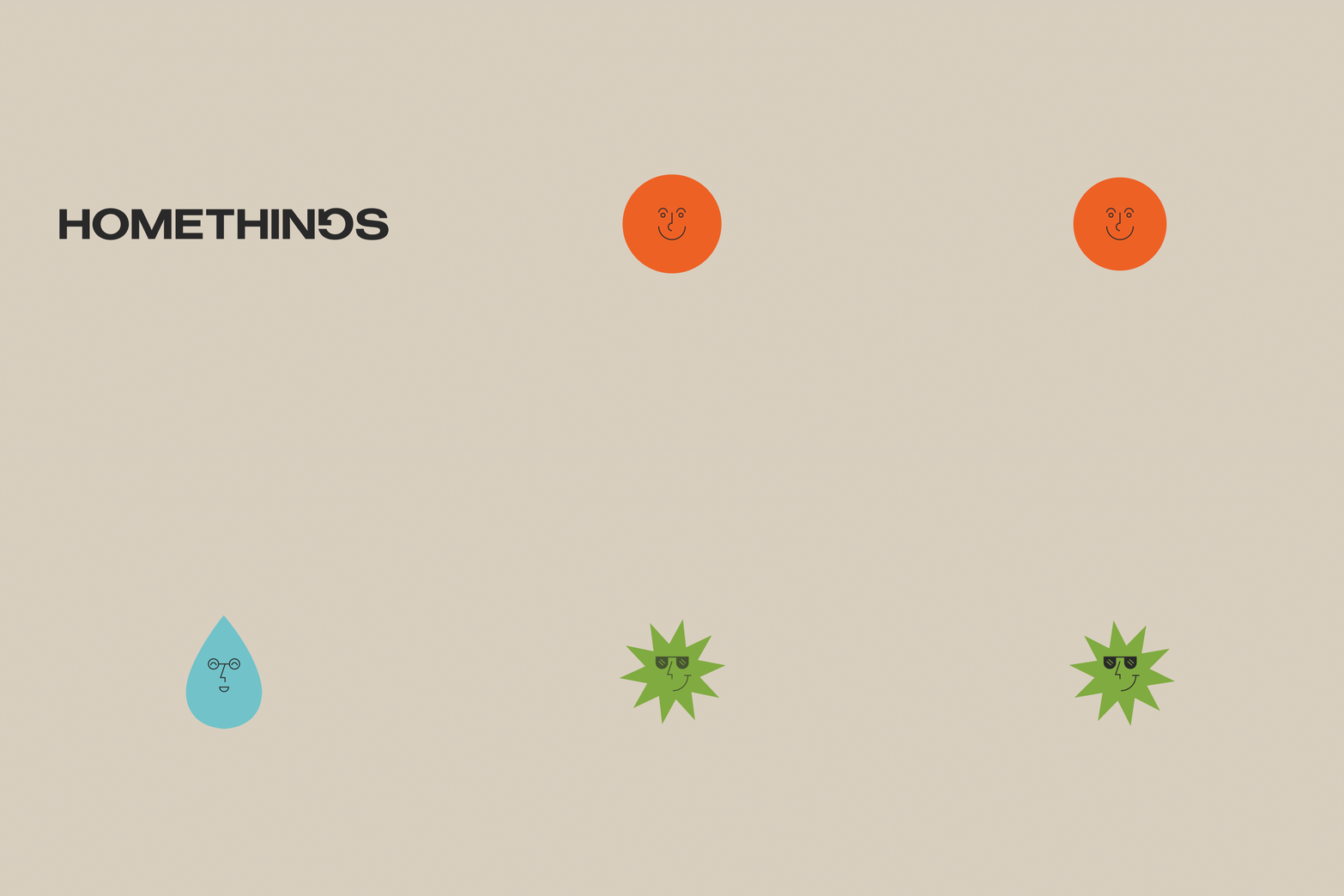
This isn’t yummy mummy lifestyle. This is eco-modern cool for those who give a damn. In balancing function and fun, we had to think about communicating efficacy in a more playful way. We started by creating a grounded, functional brand world inspired by the simplicity of IKEA, using a primary palette of charcoal and beige, with mix of heavy graphic elements and lighter lines. The wordmark was refined using a heavy typeface to make it feel bolder and more practical. So far, so normal. Then we stir things up.
To add a bonkers sense of play, we created characters using simple graphic elements for each of the products. The design of each element corresponded with use, giving each product a punch of personality while communicating function. We wanted to build a clear visual association between product and brand, so we placed the distinctive Homethings G inside a charcoal home icon to create a logomark. We then echoed this across the brand iconography, a shorthand for cleaning instructions.
The new icon set feels playful and ownable, while remaining easy to understand. The shape was also used in the bottle design, introducing a distinctive ‘house’ shape into the neck, transforming a bog-standard bottle into a distinctive brand asset. Our tone of voice is where we really stir the pot. How many cleaning brands poke fun at the status quo? None. We all know the world is messed up. Homethings isn’t afraid to say it, and actually do something about it. It’s a brand that takes mission seriously, but never itself. And that’s the kind of brand we can all get onboard with.

- Designed By:: Here Design