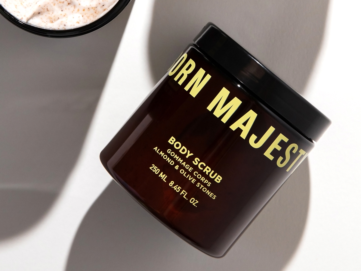
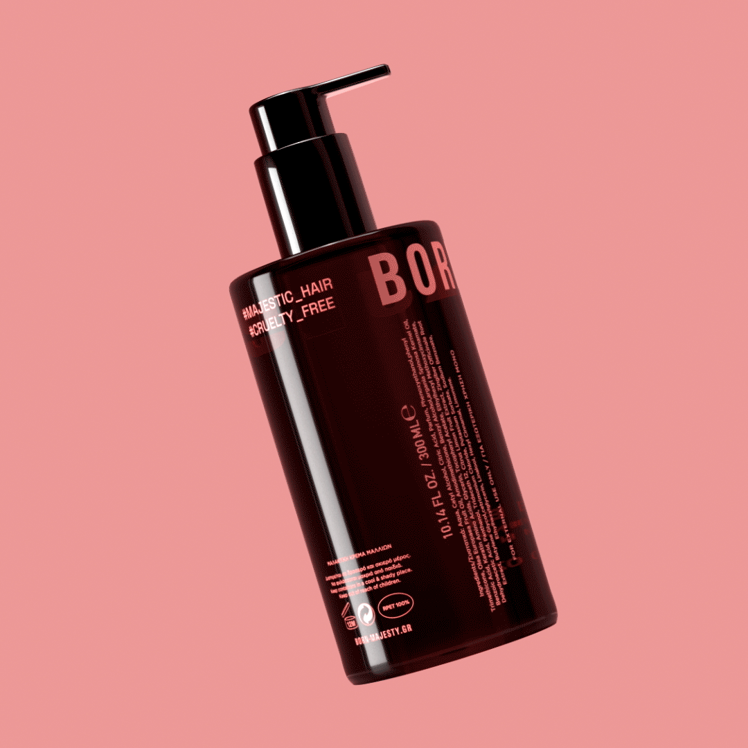
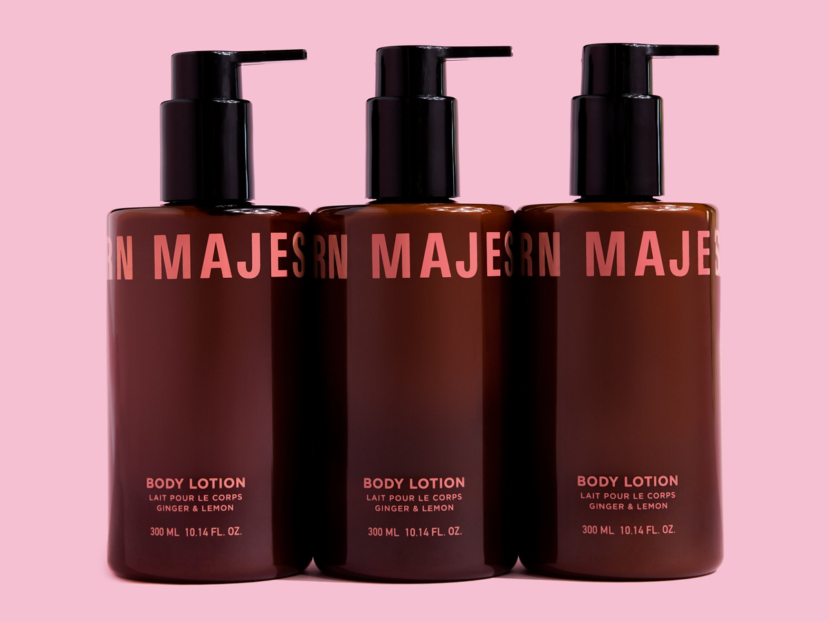
The beauty industry is overwhelming. There are hundreds of brands to choose from, but learning how to use products can also be intimidating. Gd_studio created Born Majesty Beauty from the ground up to create a brand that communicates youth and ease of use. The bright colors, use of white space, and bold, thick typeface do just that in an approachable and reassuring way.
Born Majesty ® Beauty, confidence & self care. It’s your birthright. We were asked to brand a new skincare company from the ground up, including strategy, naming and packaging design. The client’s main requirement: we want our brand to communicate youth and ease of use, addressing mainly to young audiences but without alienating women of older ages.
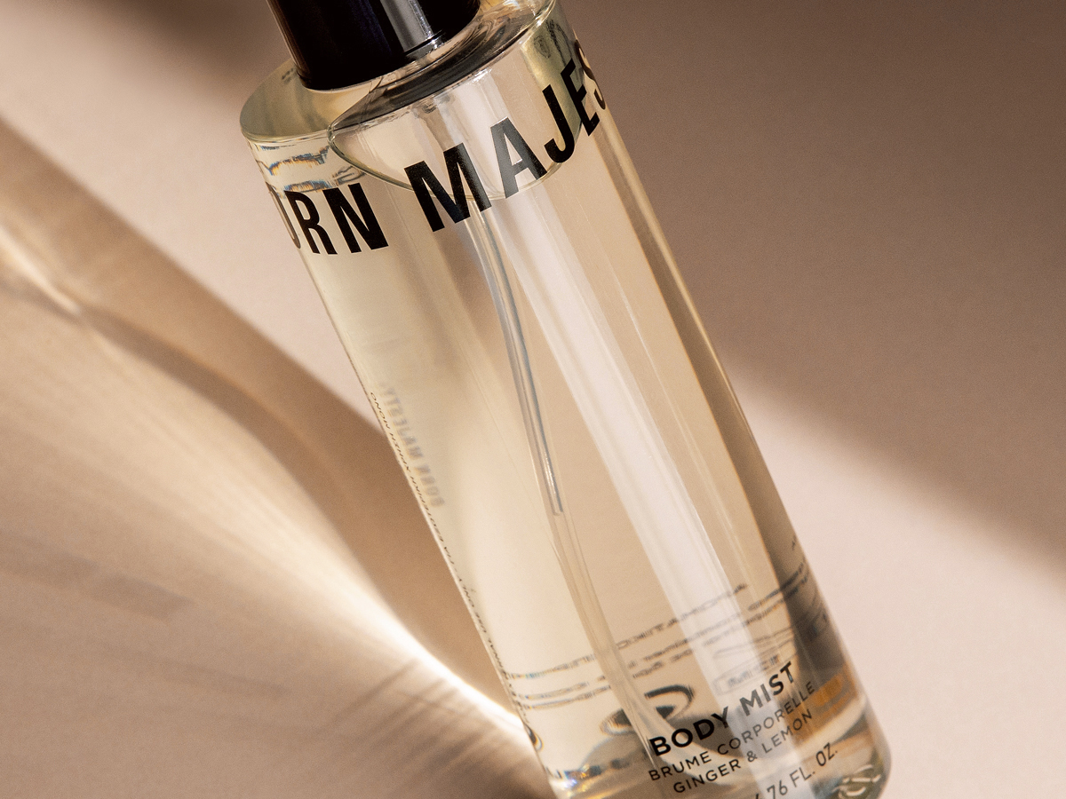
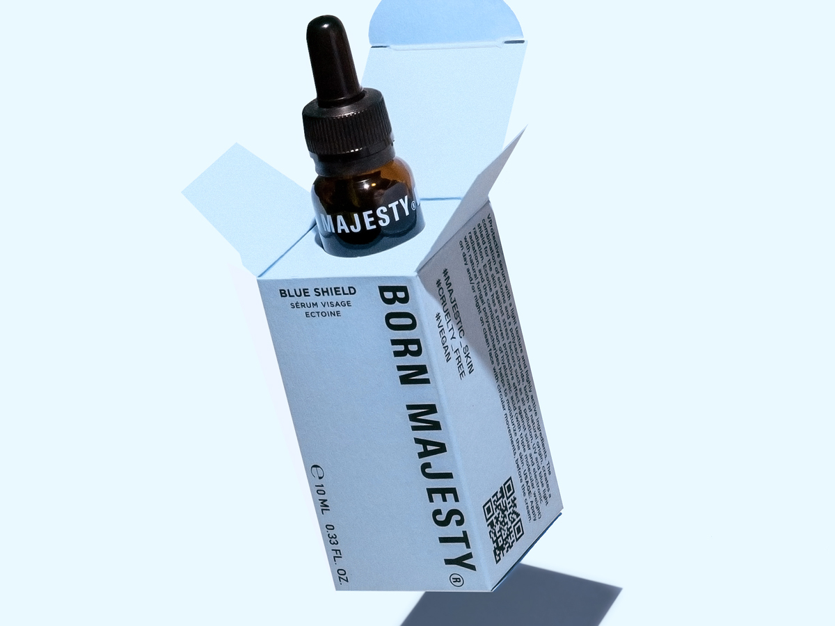
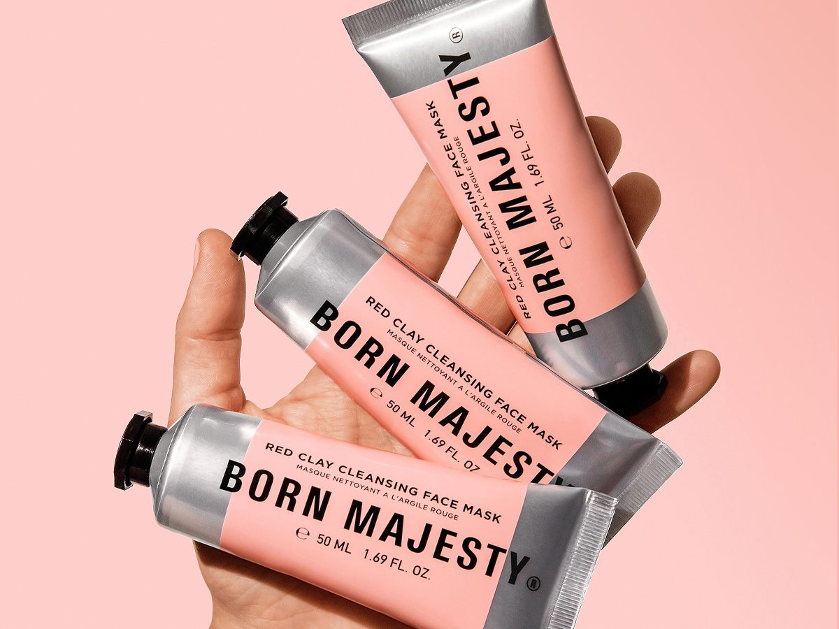
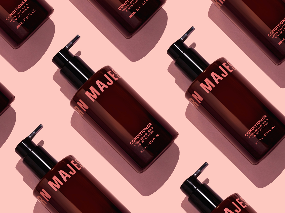
The brand is the message! Born Majesty® was created out of love for skin care and the urge to inspire women of all ages to embrace their feminine power, regardless of age, race, size, sexual preference or any other discrimination. The color pink is considered a feminine definition stereotype so we decided to turn this viewpoint around, adopting it unapologetically as the primary color of the brand’s palette in an earthy tone, paired with black lettering to create a bold statement.
A love letter to all women. Born Majesty® offers a complete line of sustainable and cruelty-free skin care products that respect and embrace every body. Fragrant and exhilarating, designed to make you look & feel majestic!