Alacrán De Sopetran's Spicy Packaging Design Turns The Heat Up
by Chloe Gordon on 11/16/2022 | 4 Minute Read
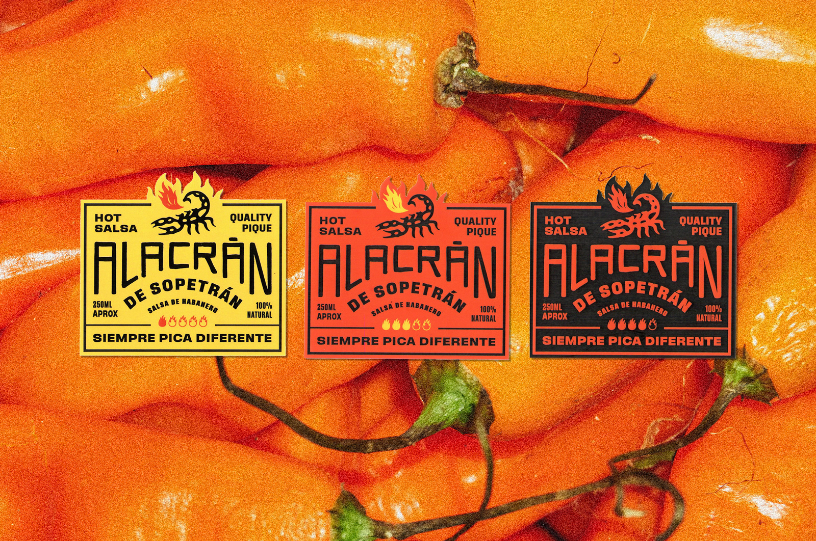
Breaking the traditional rules of graphic design, invade design created a label for the hot salsa brand Alacrán of Sopetrán. The fiery color palettes paired with the poignant type treatments and scorpion illustration create a packaging system full of flavor. The detailed fire cut-outs on the top of the rectangular label add the perfect creative touch and an unspoken touch visually representing the spice levels within. This is a brand full of personality, and it's charming to see how it comes to life through the packaging alone.
We are going to spice up things a little bit around here and for that, let's start with a bit of context. A few years ago, one of our studio members decided to move to his farm accompanied by his family to spend the COVID-19 quarantine. Between intense days of video calls, leisure moments and casual kitchen encounters, the idea of making a hot sauce using the great harvest of habanero peppers that were available at the time emerged.
Quickly, the produced amount of sauce increased and therefore, the per capita consumption capacity was off limits (within the family, of course). At that time, we decided to create an instagram account under the user Alacrán de Sopetrán with the only purpose of announcing to our closest friends that there was a sauce to give away. We were successful and excited to continue. Little did we know that what started as a hobby in the kitchen would become our brand. However, we did know that it was going to be the opportunity that would allow ourselves to break the "rules" of graphic design that we very well know; let creativity flow; enjoy handmade processes and above all, honor and exalt the richness of Colombian aesthetics. Ironically, in the beginning, we didn’t have a rigorously established identity or very elaborate graphic pieces. We had the urgent elements: a very sonorous name; a profile picture and a description on instagram; a few posts to interact with friends and a couple of references that traced our course.
Today, we have a brand with a much more consolidated identity, built from a large number of pieces, including: the Sopetrán Sans typeface, inspired by the advertisements of Colombian little towns and created with the help of Bastarda Type; labels and packaging; merchandise items; a casual tone of voice based on colloquial language; photographs, illustrations and social media posts that allude to popular expressions and insights of our daily life and lastly, a web page to redeem the discount code that you will find at the end (we only ship nationally, sorry!) With love, Alacrán of Sopetrán.


- Designed By:: invade design