Featured image for When It Comes To Olive Oil, It Pays To Be Single & Fat (and Pink)

When It Comes To Olive Oil, It Pays To Be Single & Fat (and Pink)

by Chloe Gordon on 10/19/2022 | 3 Minute Read

Olive oil is arguably liquid gold. Some brands originate from California, some from Italy, and others from Greece. Nevertheless, one thing they all have in common is their innate ability to make, quite literally, anything taste better. From ice cream to salad greens or a baguette to meat, it's a golden ingredient sent from above.  

And while olive oil is ubiquitous, discovering new brands is challenging. The market is a crowded, oily mess, and it can be tough for brands that want to differentiate themselves on shelves and online. Single & Fat, however, is a new  100% certified single batch organic extra virgin olive oil brand tapping into a more playful side of the market. While most olive oil brands are refined and polished, Single & Fat is playful and spontaneous. 
Editorial photograph

Single & Fat began with the idea of creating something loud in a typical quiet category. Founders Matt Cruz and Cristina Samper Pearl spent their childhoods with the kitchen always being the center of joy. So the branding and packaging for their olive oil reflect the cheerful aesthetic they feel a kitchen should host.  

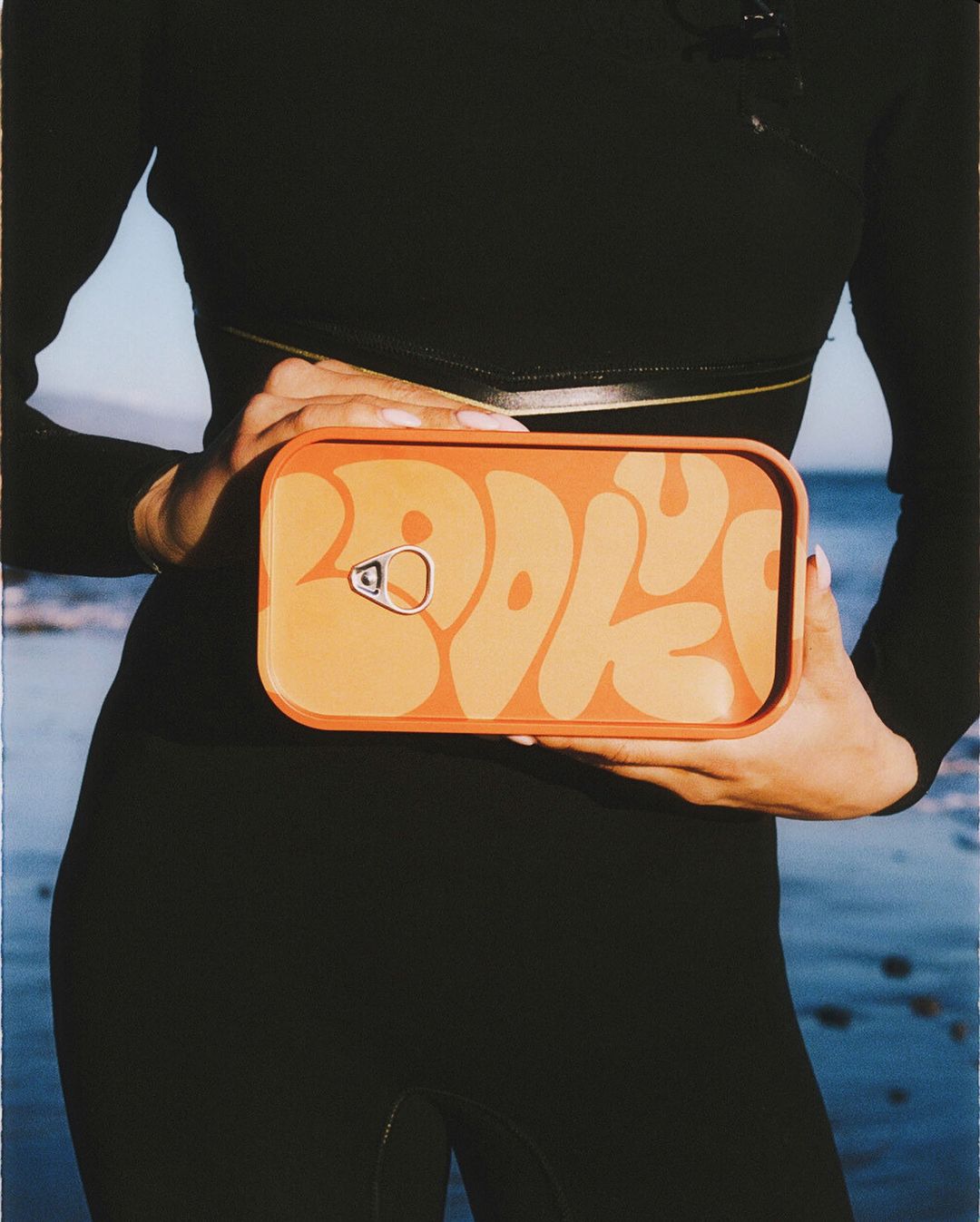
Tapping into the "healthy fat" verbiage that constantly sticks with olive oil's description, the brand's name hit on that cheeky play on words. What's more, the pink tin highlights the sunny side of the brand. "When I thought of olive oil, my brain went to golds, greens, browns, and yellows. For me, the category has always felt traditional, soft, and earnest," noted Matt Cruz, co-founder and packaging designer of Single & Fat. "I went with pink because, for me, it came across as playful. I wanted this to be olive oil that didn't necessarily act like olive oil." 

Editorial photograph

Beyond the tin's pink hue, the typography on the packaging is bold and entertaining. The typeface is chunky and mimics the 90s easy-breezy vibe with horizontal lines chopping through the word "single."

Editorial photograph

"I've always been attracted to the friction from opposing forces. So when I was thinking about the look for Single & Fat, I started with, 'what's the least predictable way to take this brand?' I ended up with the idea that it should be aesthetically treated as if it's some high-performance/country club brand," mentioned Cruz. "I grew up in the 90s, so bringing in the lines that are an homage to New Balance, Adidas, and other athletic brands from that time, amused me. I knew that the words 'single' and 'fat' have these very lethargic or immobile connotations, so imbuing them with a sense of movement and 'active' sensibility felt like a fun and unpredictable space to play in."

Before Single & Fat, the olive oil industry had a plethora of similar packaging designs with similar color palettes. This brand, however, hurls a splash of color at an otherwise monotone category, inspiring consumers to look beyond the ordinary and purchase something new, spontaneous, and a little bit bold. 

Editorial photograph

You may also like