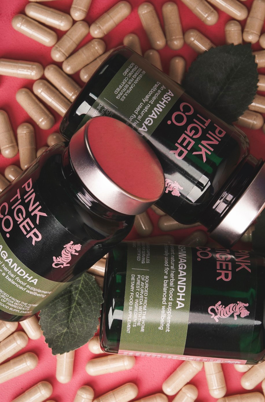
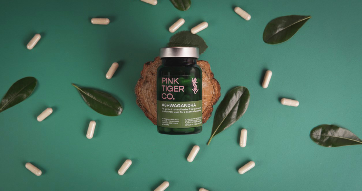
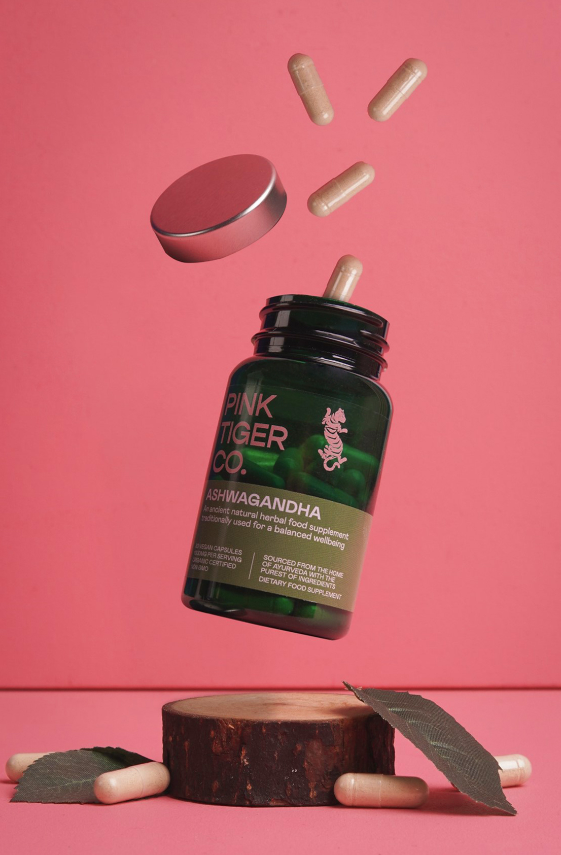
The goal for Pink Tiger Co.’s packaging was to appeal to the health-conscious client while still allowing space for a modern brand. To tackle this goal, Feed the Eyes designed a classic bottle with apothecary-inspired green, paired with a revamped pink logo system. The vibrant colors add an element of playfulness, while the classical typography grounds the overall design.
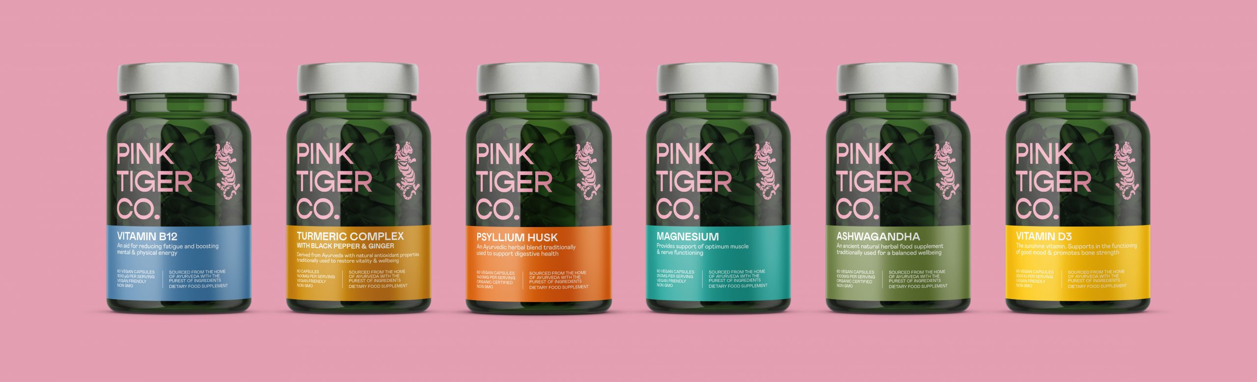
Pink Tiger Co. is a health and wellbeing company that is Ayurvedic inspired, an indian practice of natural and herbal medicine that dates back over 3000 years. I redesigned the Pink Tiger Co identity, delivering a traditional look with a modern twist, to stay true to its roots, but also appeal to todays health concious consumer.
A vibrant new logo brings the name to life, with the labels using a bold palette of colours that sit on top of the rich green bottle, combinations are reflective of the culture that inspired the products. For the bottles, we choose an opaque material that shows the product inside, with a solid banded area to contain the important information.