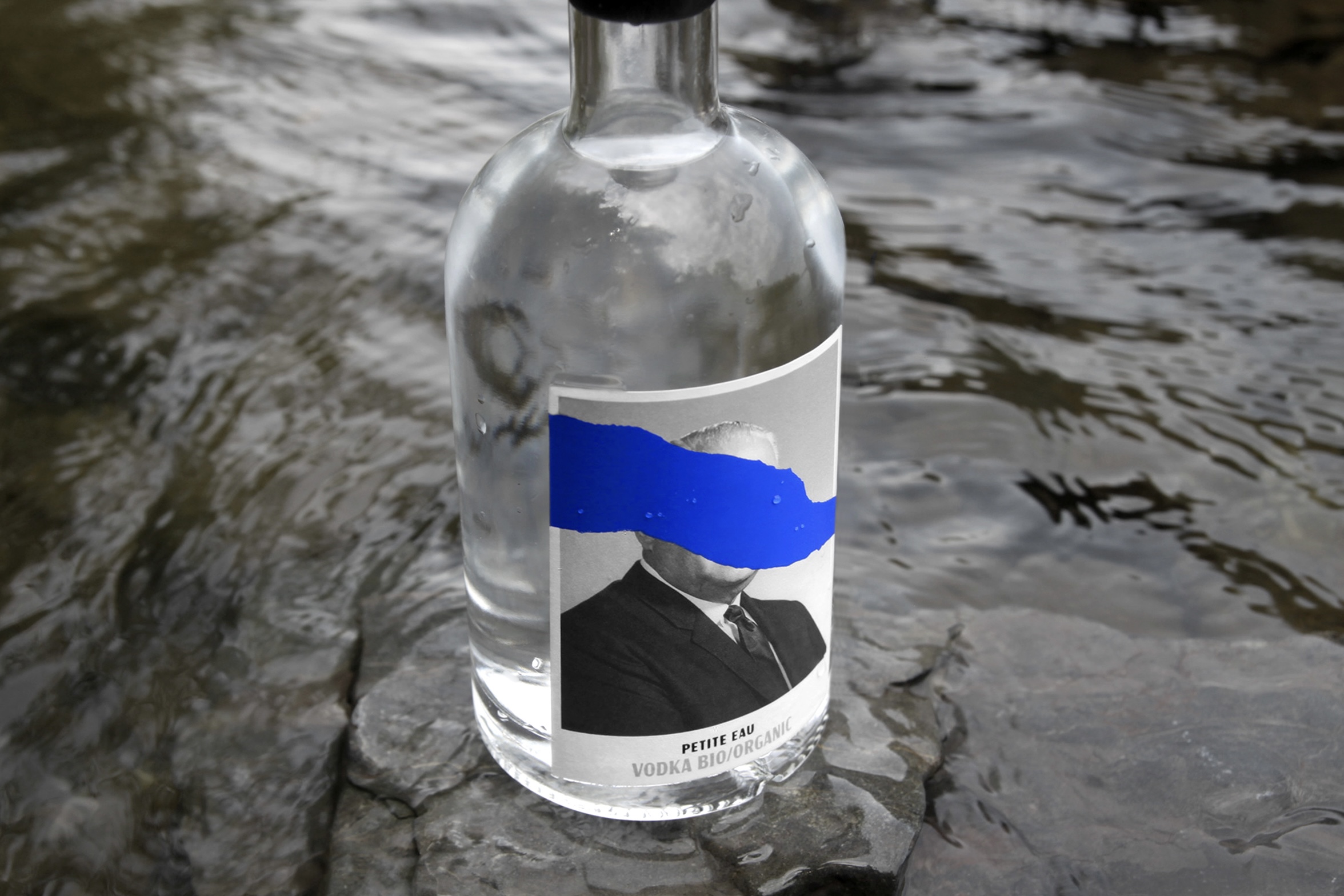
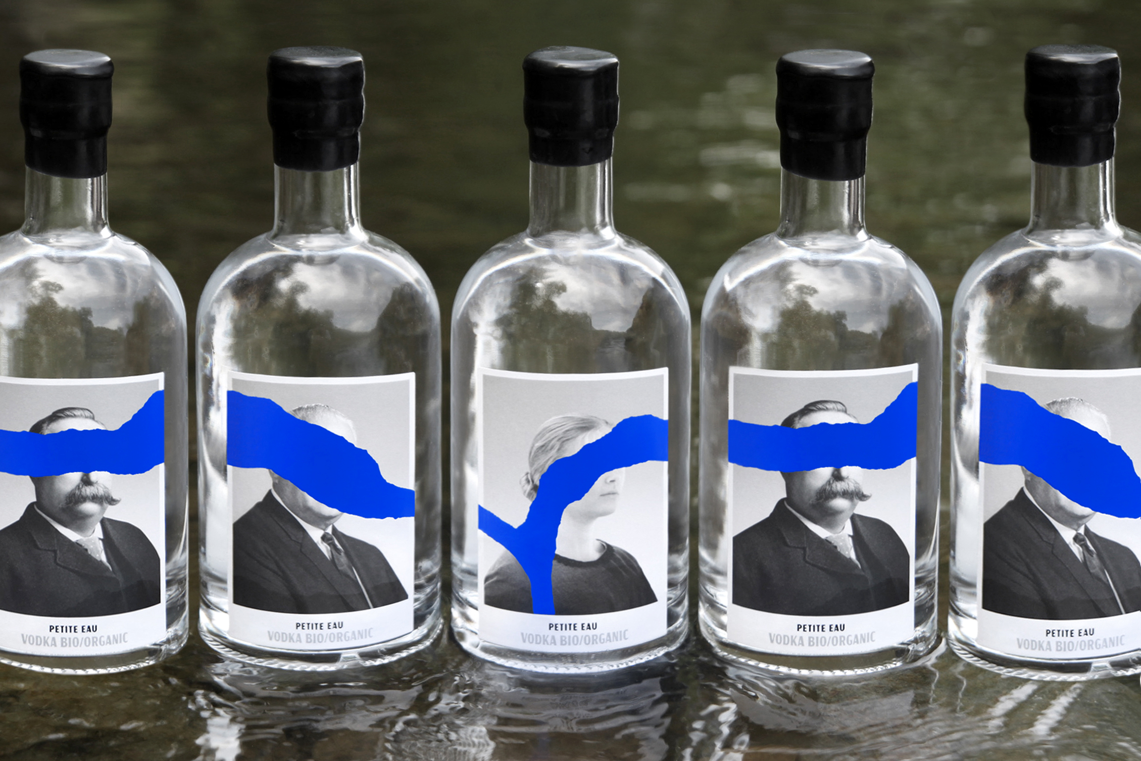
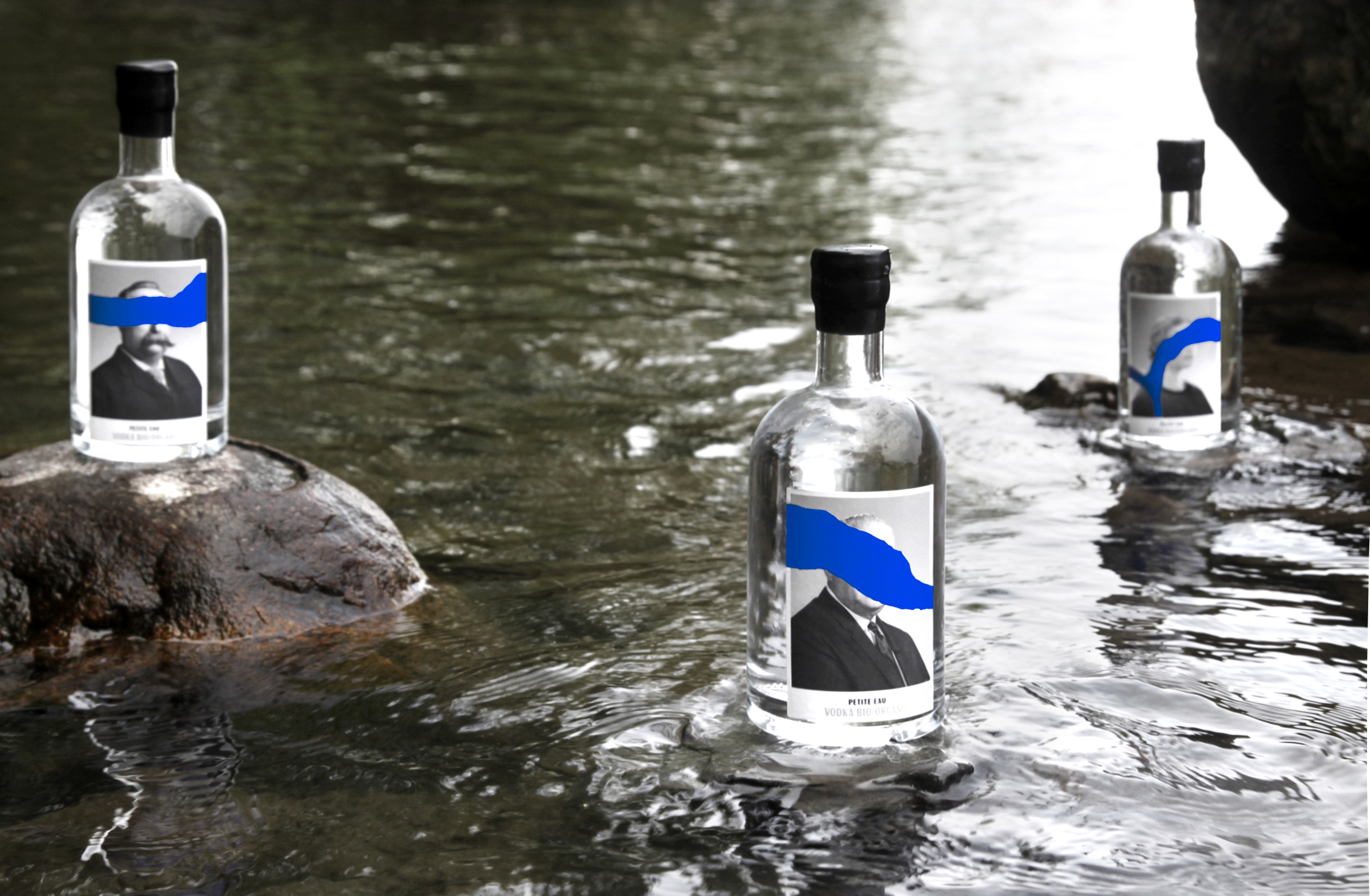
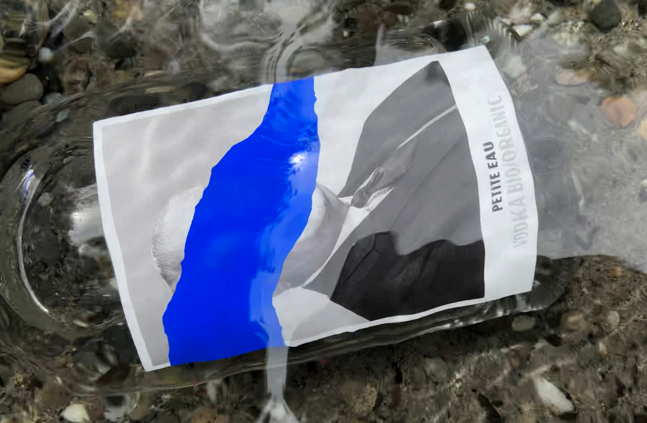
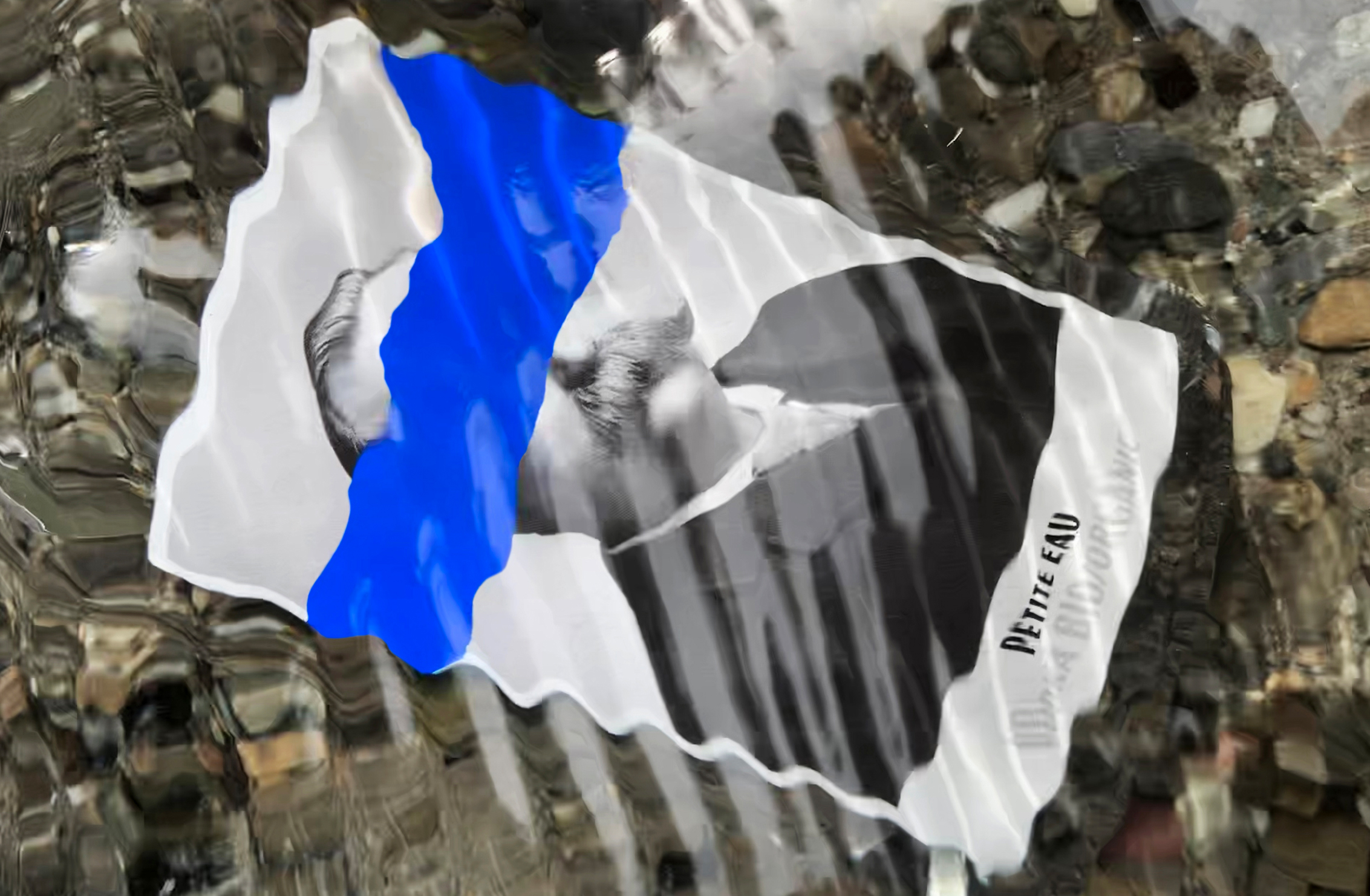
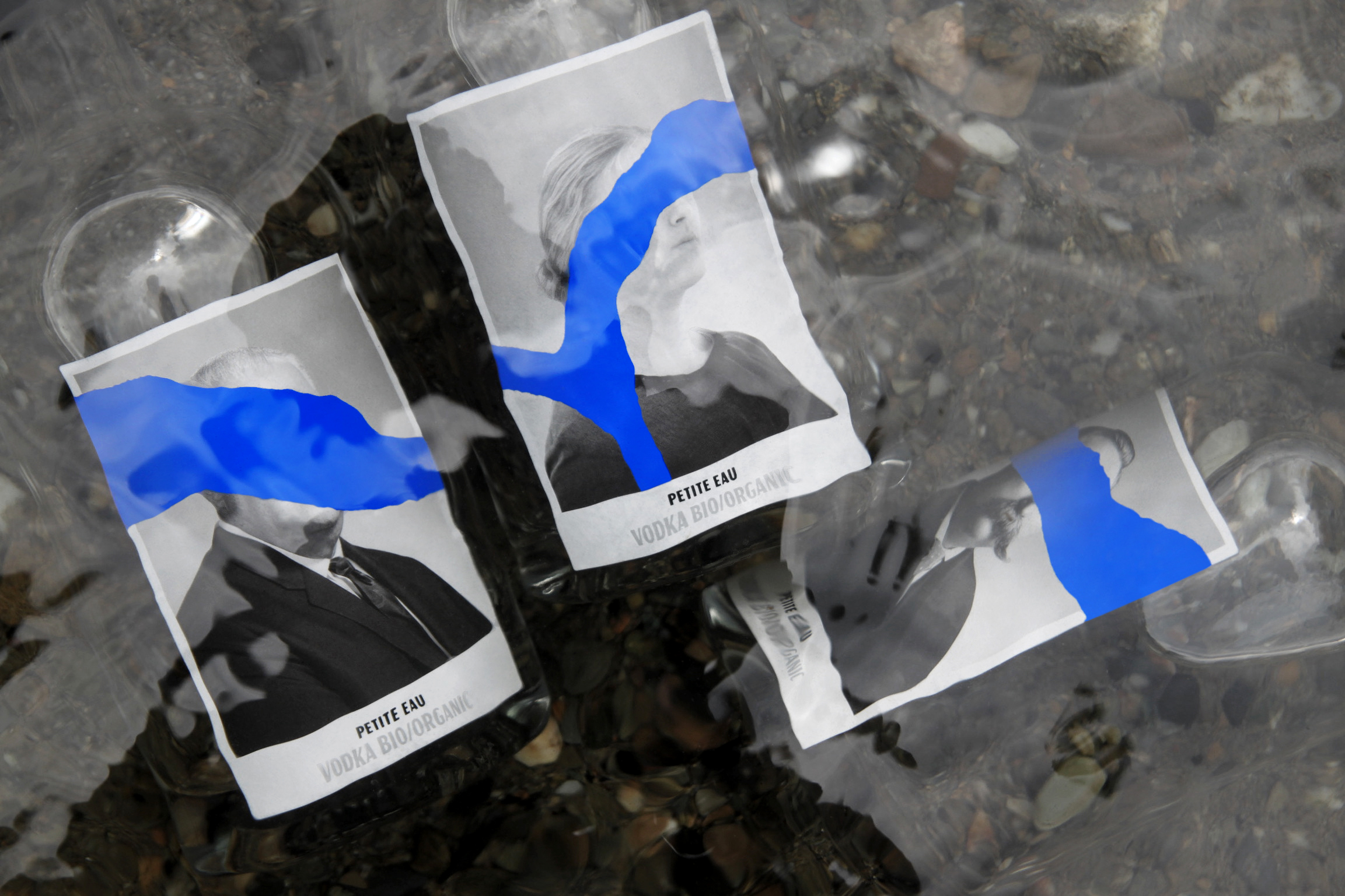
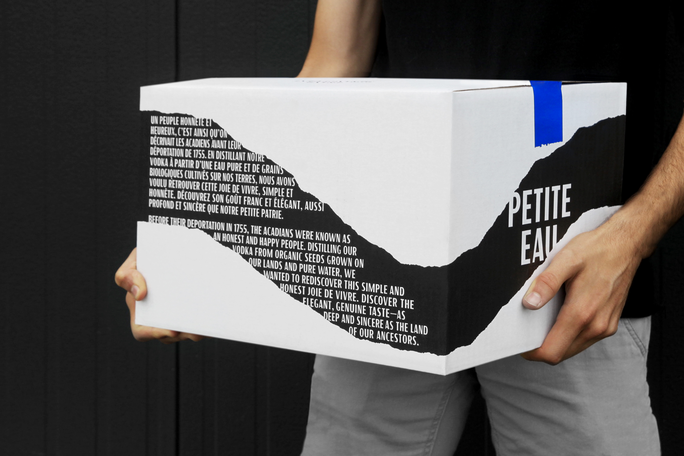
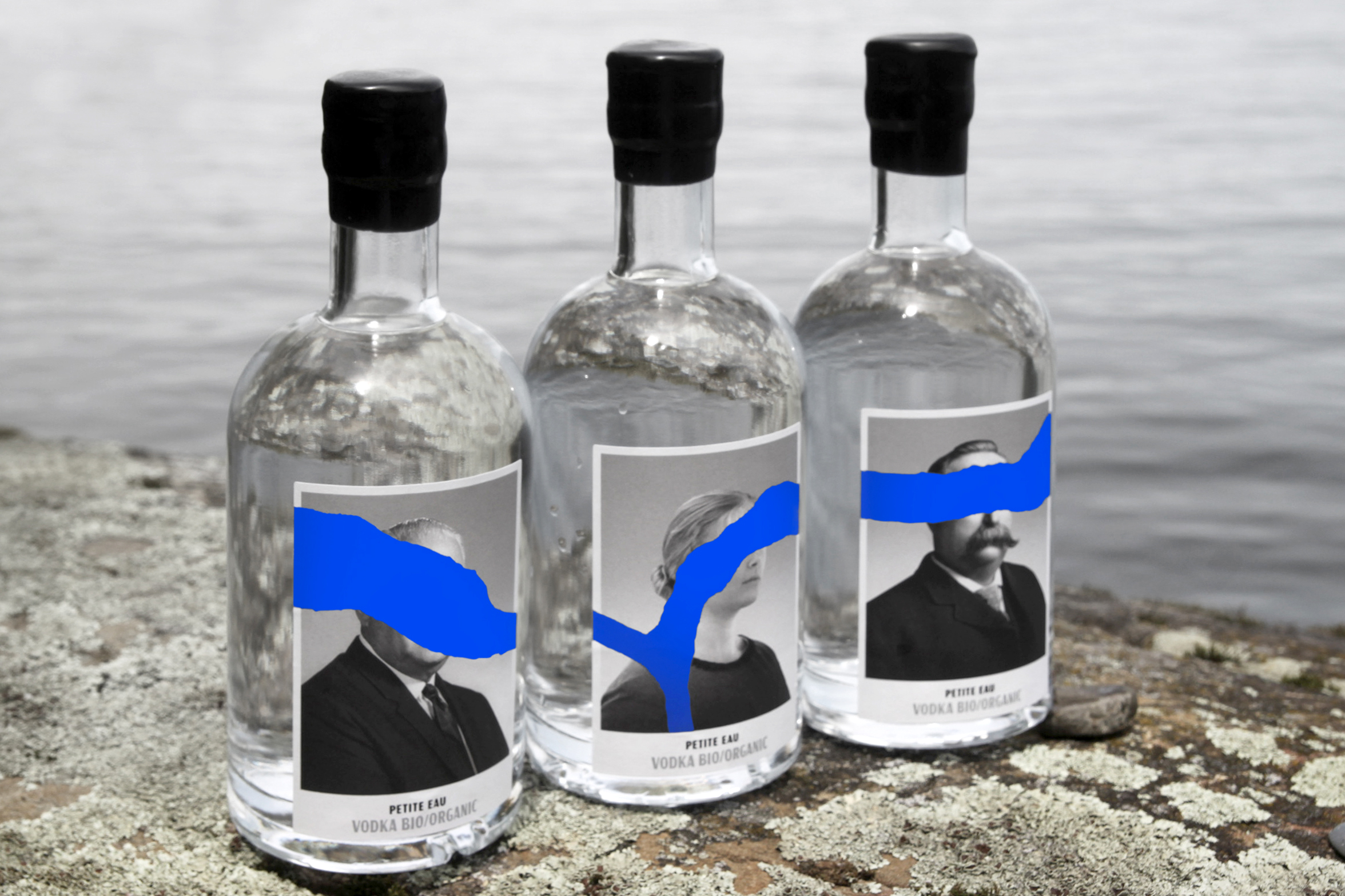
The graphic design agency Paprika has once again designed a visual identity and packaging that goes against the grain in the best possible way. Not only is their design for Petit Eau unique, but it’s rooted in history and overflowing with intention. The faces on the label are images of deported Acadians, the descendants of the French who settled in Acadia during the 17th and 18th centuries.
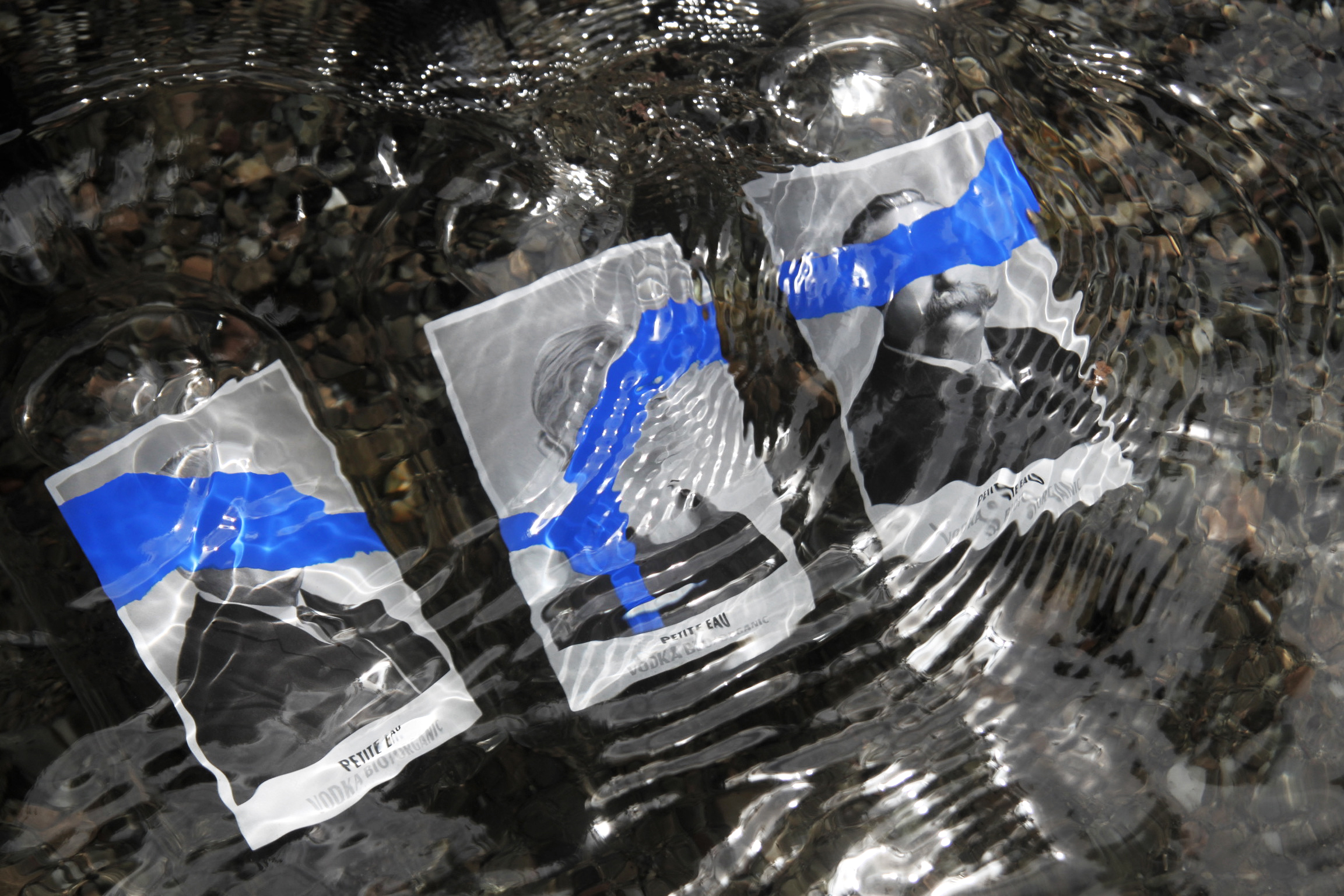
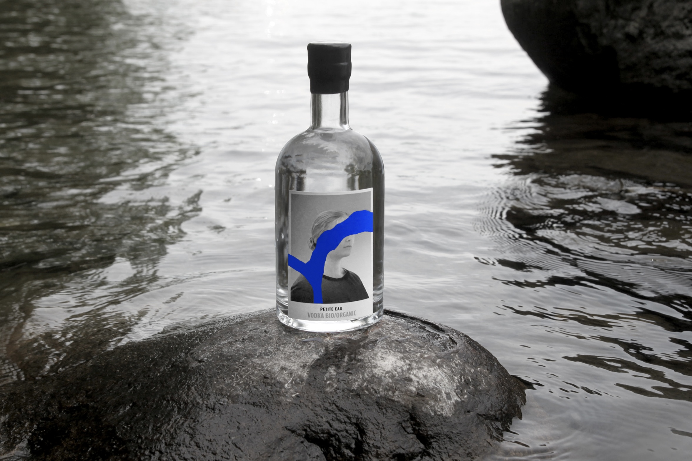
The packaging intends to pay homage to the pioneers of New Acadia and Paprika through the mysterious veiling of the images through the stream of water that extends from one bottle to the next. In addition, the wax-sealed bottle cap further establishes the product’s handmade character and respect for heritage and is DGD’s distinct signature.
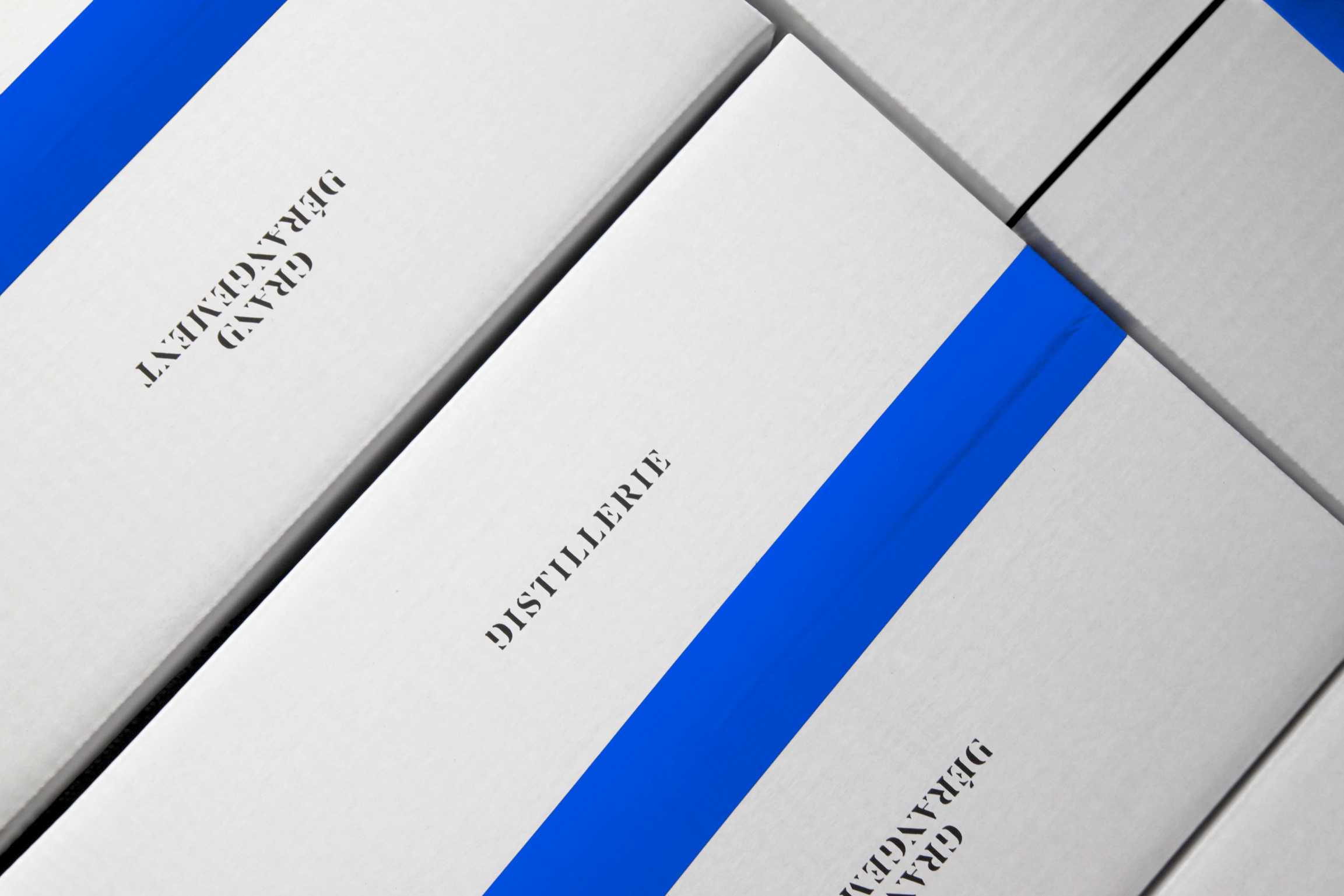
Based in Lanaudière, Distillerie Grand Dérangement perpetuates the memory of the deported Acadians and pays homage to these pioneers of New Acadia; it exults from this land of high quality organic products, from grain to bottle. After the launch of SAGA Grand Gin, Distillerie Grand Dérangement is back with Petite Eau, the first organic vodka in Quebec. This one draws its inspiration from the very origin of the word “vodka” which literally translates as “small water” – petite eau in French.
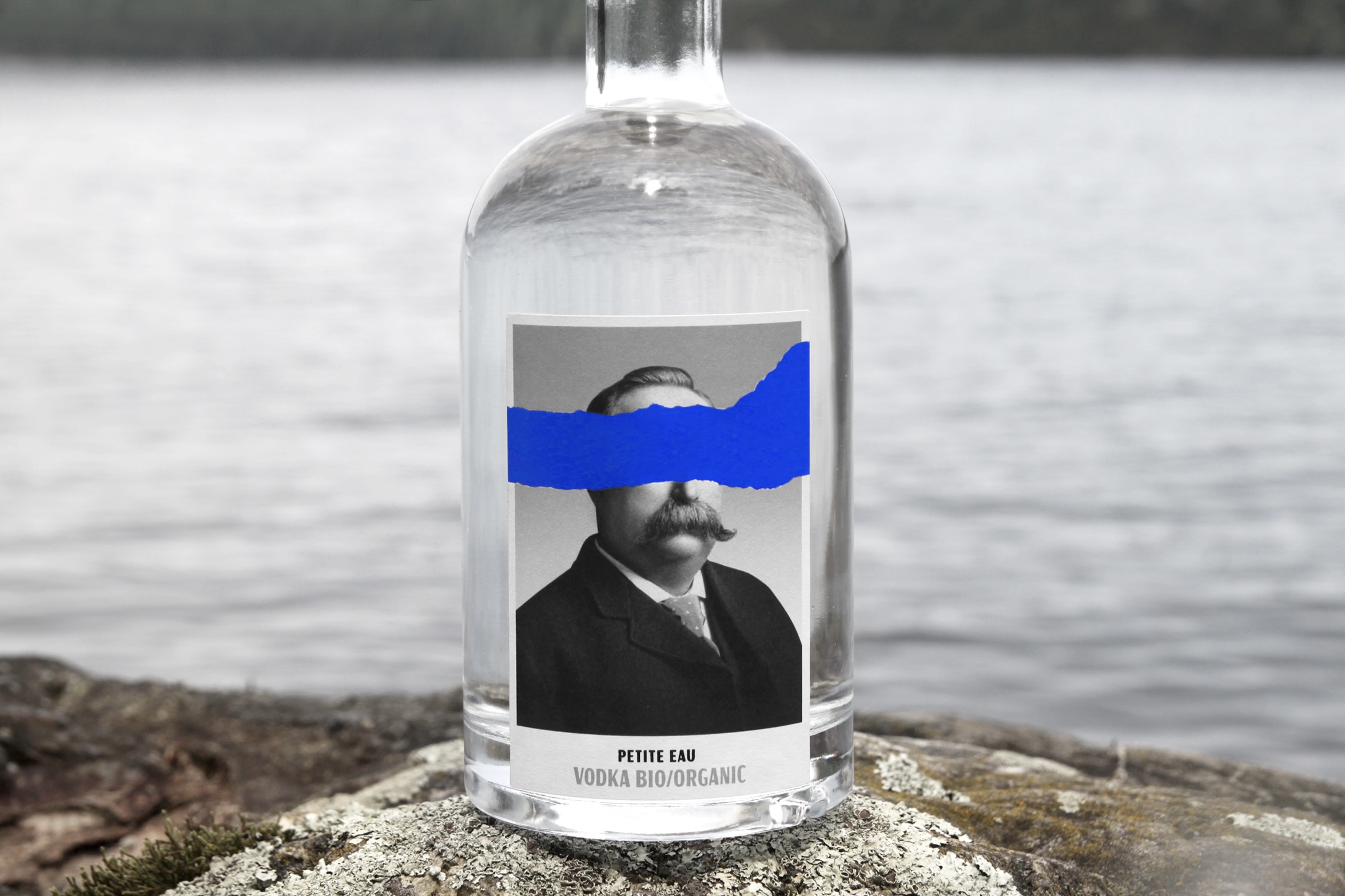
As these new-acadians settled on the banks of rivers and streams, these springs were invaluable for the irrigation of the land. It seemed appropriate to us to put this precious source in the foreground, the same one that ensured the high quality of the vodka. A water of a royal blue, symbolizing the French fact in Lower Canada. Here again, as in SAGA, the faces of the Acadians in this new saga are veiled in mystery by this stream of water that extends from one bottle to the next. A wax-sealed cap, establishing the product’s handmade character and respect for heritage, as also DGD’s distinct signature.
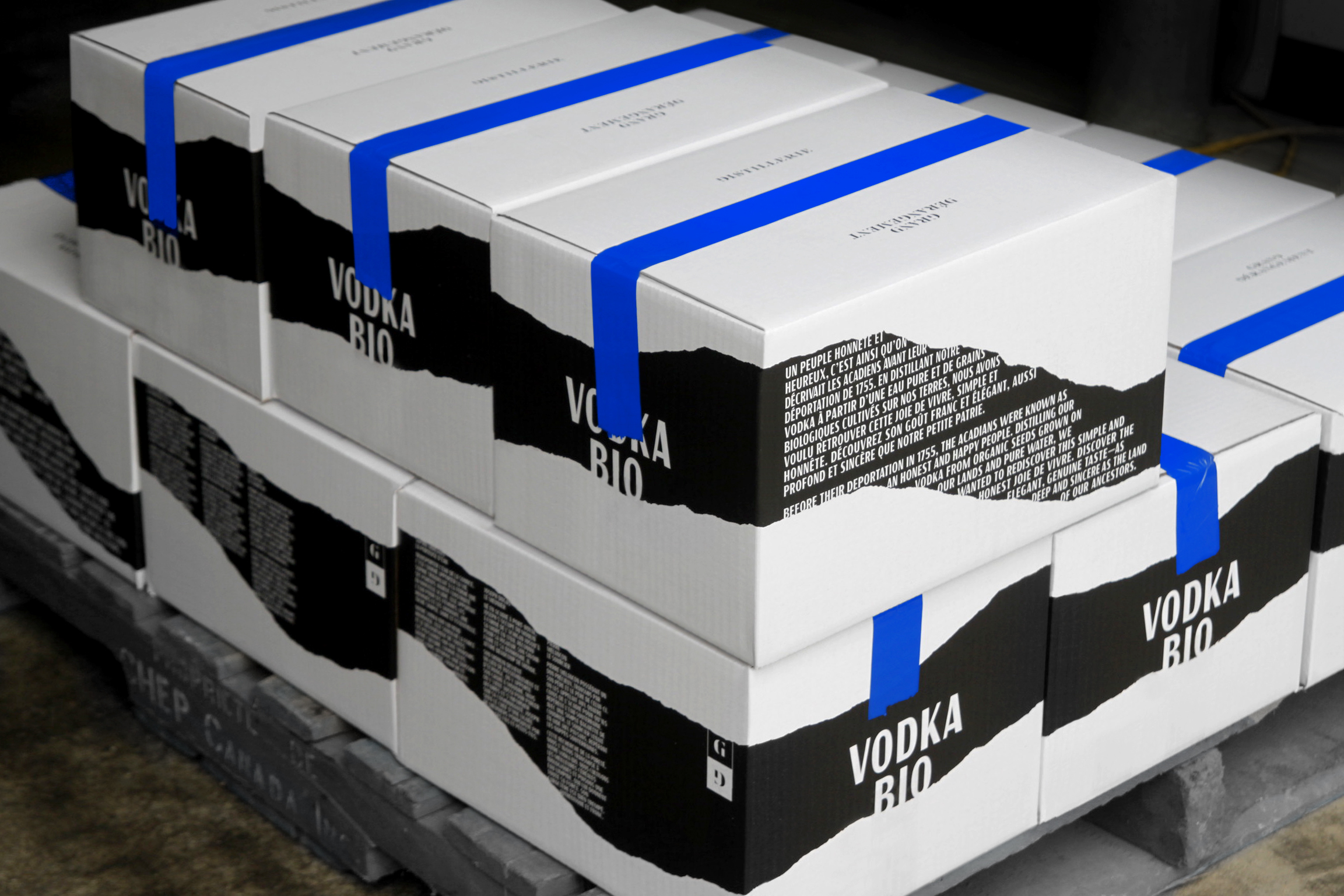
Carving out a place in the Quebec spirits ecosystem, particularly for vodka, which has a large supply here and elsewhere, can be a significant challenge. Our desire was to design a visual identity and packaging that would go against the grain and have great potential for variation, with a concept that is deeply rooted in its territory.