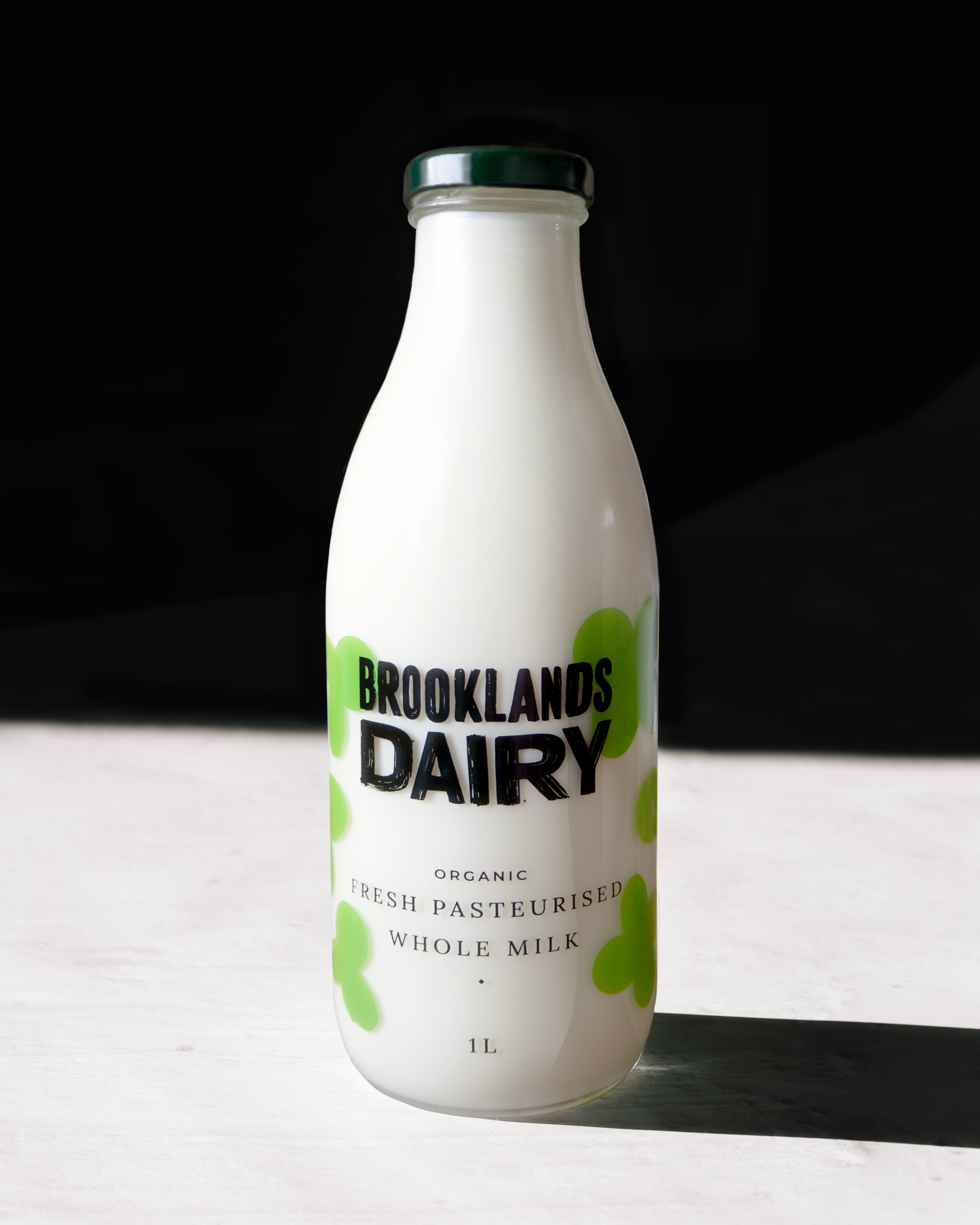
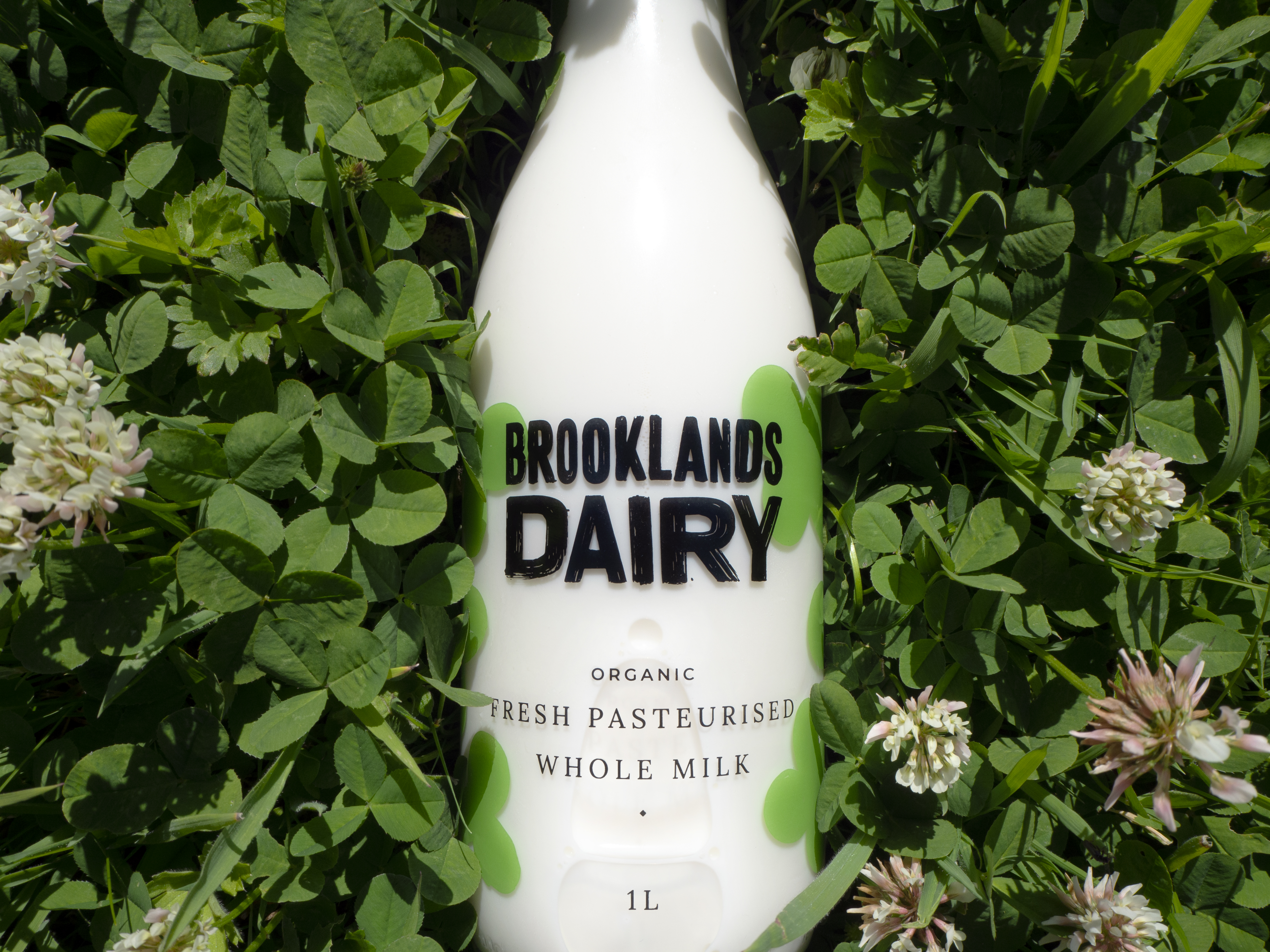
Studio Unbound is a branding and packaging agency in Glasgow that recently worked with Brooklands Dairy to mimic the design of old-school glass milk bottles that were delivered daily to your front porch. The green clover illustrations artfully mimick the fields the cows graze in to prove that this small dairy farm knows the meaning of farm-fresh. The chunky font used in the logo is friendly and warm, and when balanced with the elegant serif font that describes the milk within the bottle, you know that you’re drinking the most wholesome dairy there is to offer.
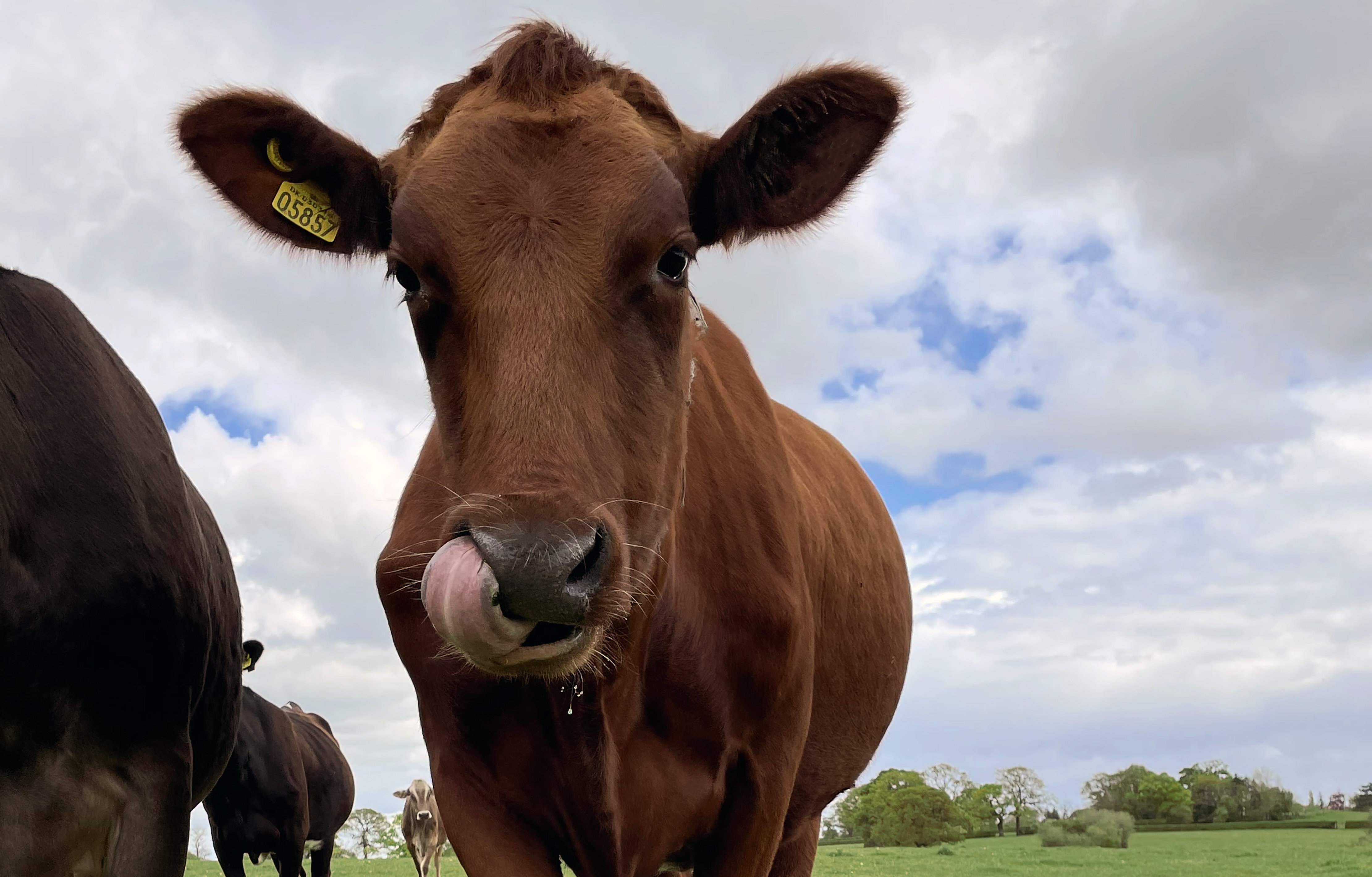
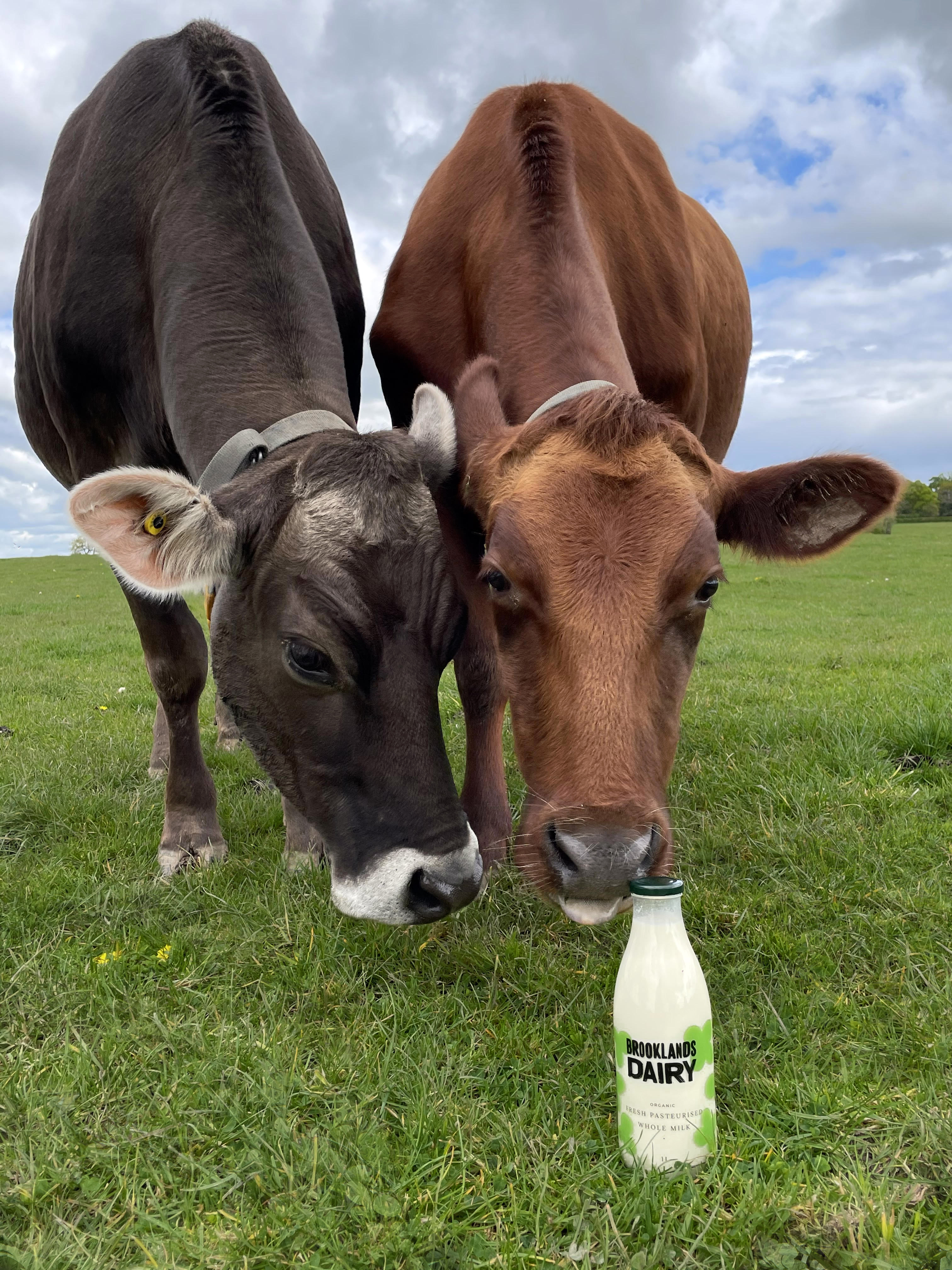
Studio Unbound are interested in working with like-minded brands who stand for something and who work to make a positive impact. Brooklands Dairy is working towards being more environmentally conscious and this is evident in many deliberate aspects in the way they approach things. Their farm is biodynamic, meaning there are no pesticides used on the fields. This results in a landscape of diverse flora and fauna and is better for the wildlife living there. There is an abundance of clovers growing in the fields which are rich in protein for the cows grazing, giving them valuable nutrition to produce great tasting milk. The clovers also take nitrogen from the air and into the soil – which feeds the other flora.
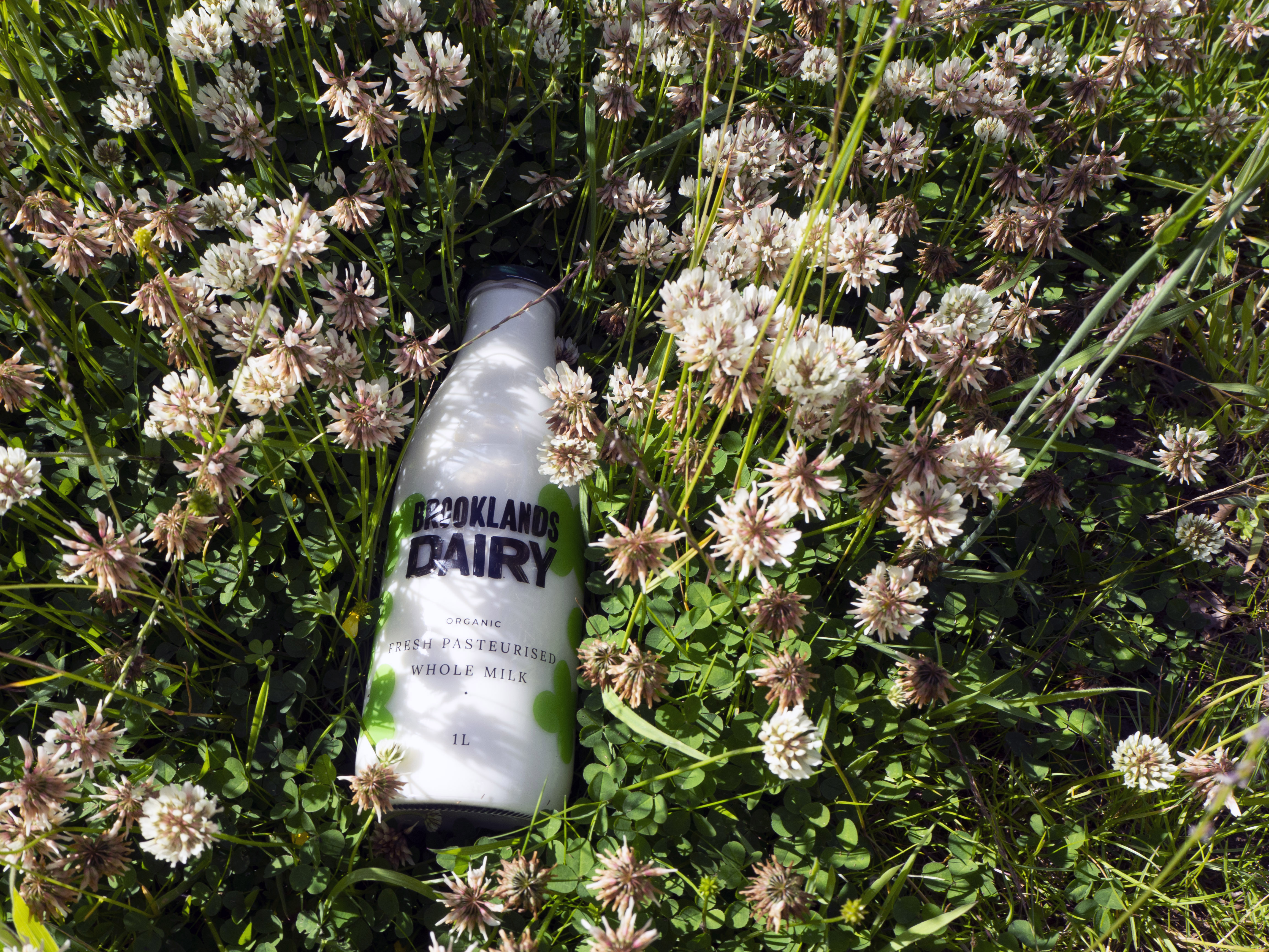
Brooklands Dairy’s fresh pasteurised whole milk is dispensed by a vending machine on the farm in refillable glass bottles. Together, Studio Unbound and Brooklands Dairy decided to deliberately mimic the glass bottles of milk that used to be waiting outside your front door, delivered straight from the dairy farm.
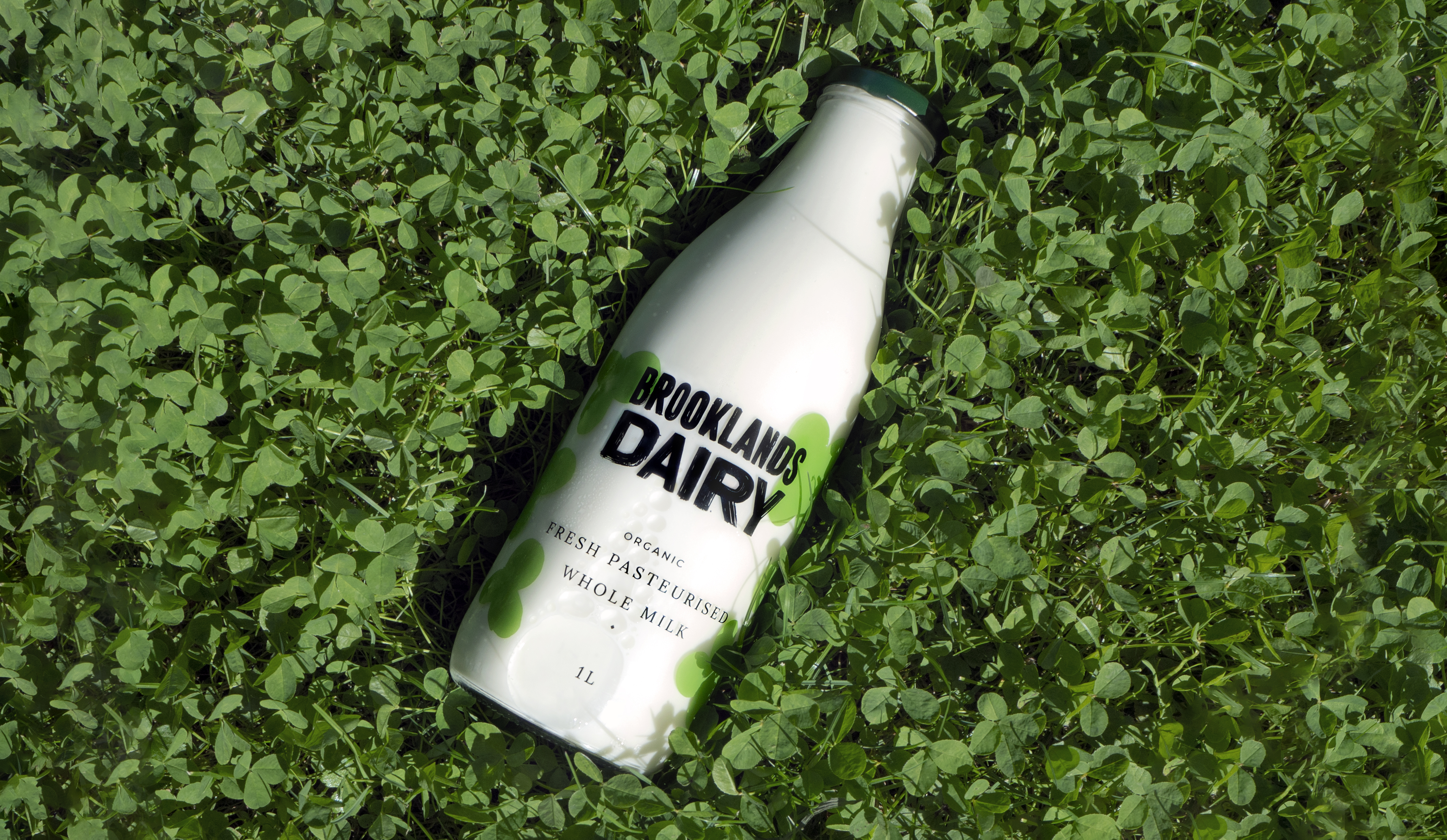
The green clovers of the fields are honoured by being featured on the glass bottle. Giving the bottle a contemporary and collectable feel to it. Something you would be proud to place on your breakfast table.
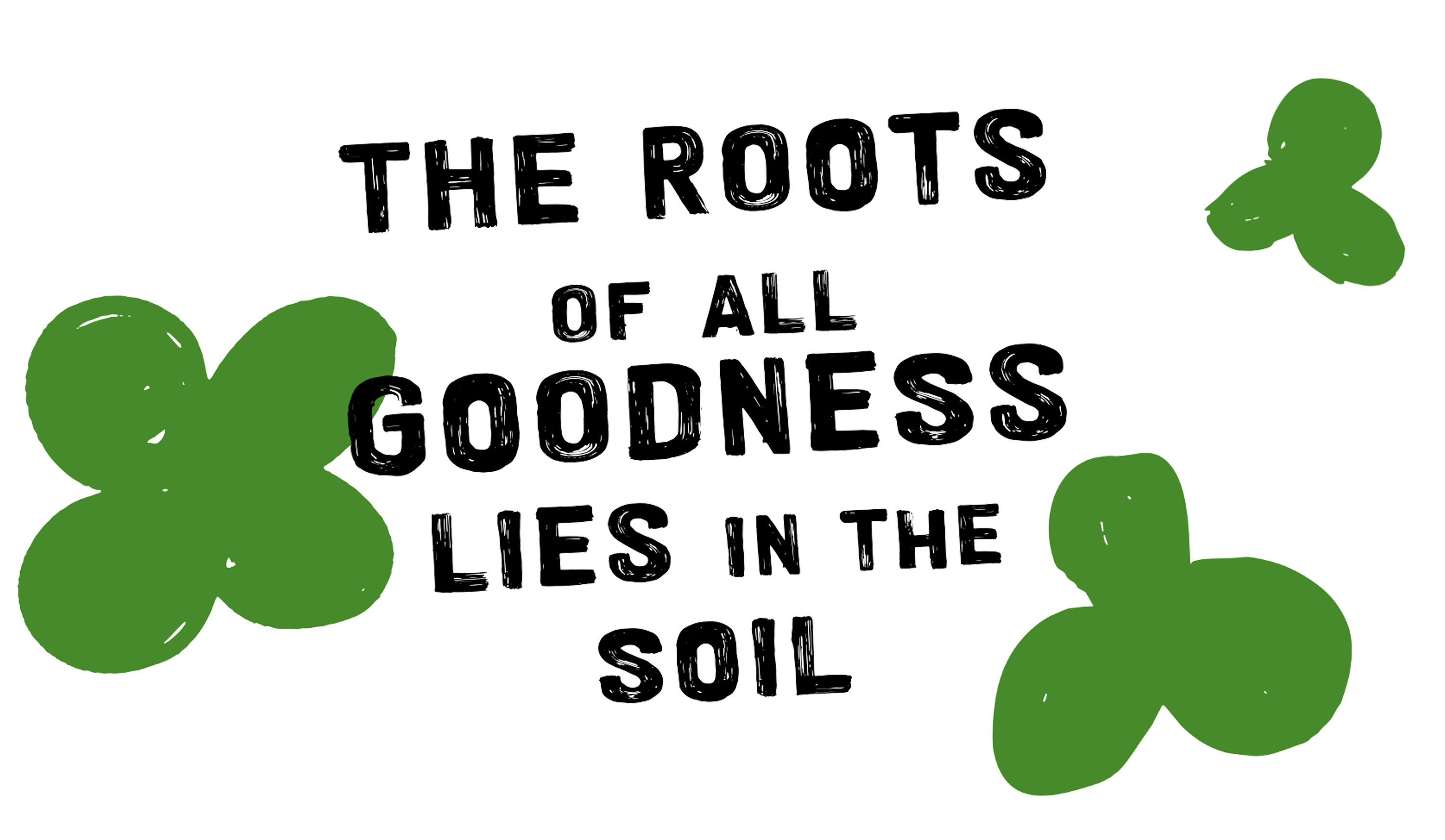
The Brooklands Dairy logo is inspired by those hand painted signs we all see at the side of country roads. We’ve all been driving along a country road and seen the signs for ‘fresh eggs’ at the end of a driveway. As well as giving us that warm fuzzy feeling, it sends a clear message that the product comes from a traditional small farm rather than a mass industrial machine.
This hand painted logo also highlights Brooklands Dairy’s produce as being honest, organic and trustworthy. You can be confident that it is produced in small batches with care. This is echoed throughout the brand with their own custom hand painted font and illustrations. All counteracted with a premium sans serif to give the brand a level of sophistication.
‘We’ve had many positive comments about the branding and the bottles, and I’m sure that has really helped us to get such a good start (since opening their doors).’ Says founder Helen Cripps. This new brand is certainly churning up a feeling of nostalgia, with the invitation for customers to come along to the farm and fill up your glass bottles of fresh milk to take home, have a gelato or even enjoy a cheeky milkshake whilst you’re there. Having this physical place for people to come helps to educate children as well as adults of the importance of where and how their food is produced.
Studio Unbound is a small-but-mighty branding studio that works with aspiring founders of FMCG brands. They always try to deliver work that’s a little different, breaks the mould, and demands to be noticed.