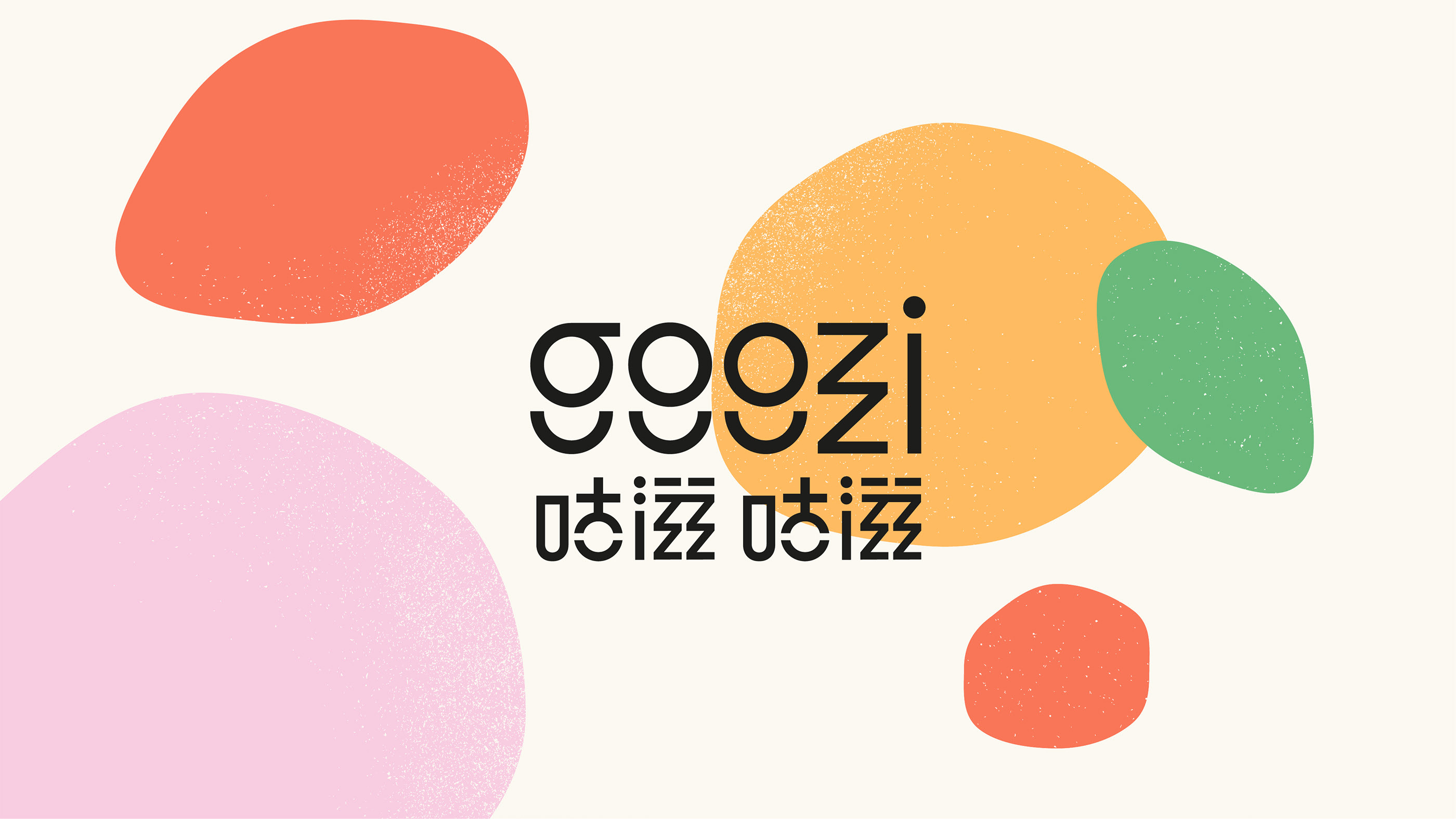
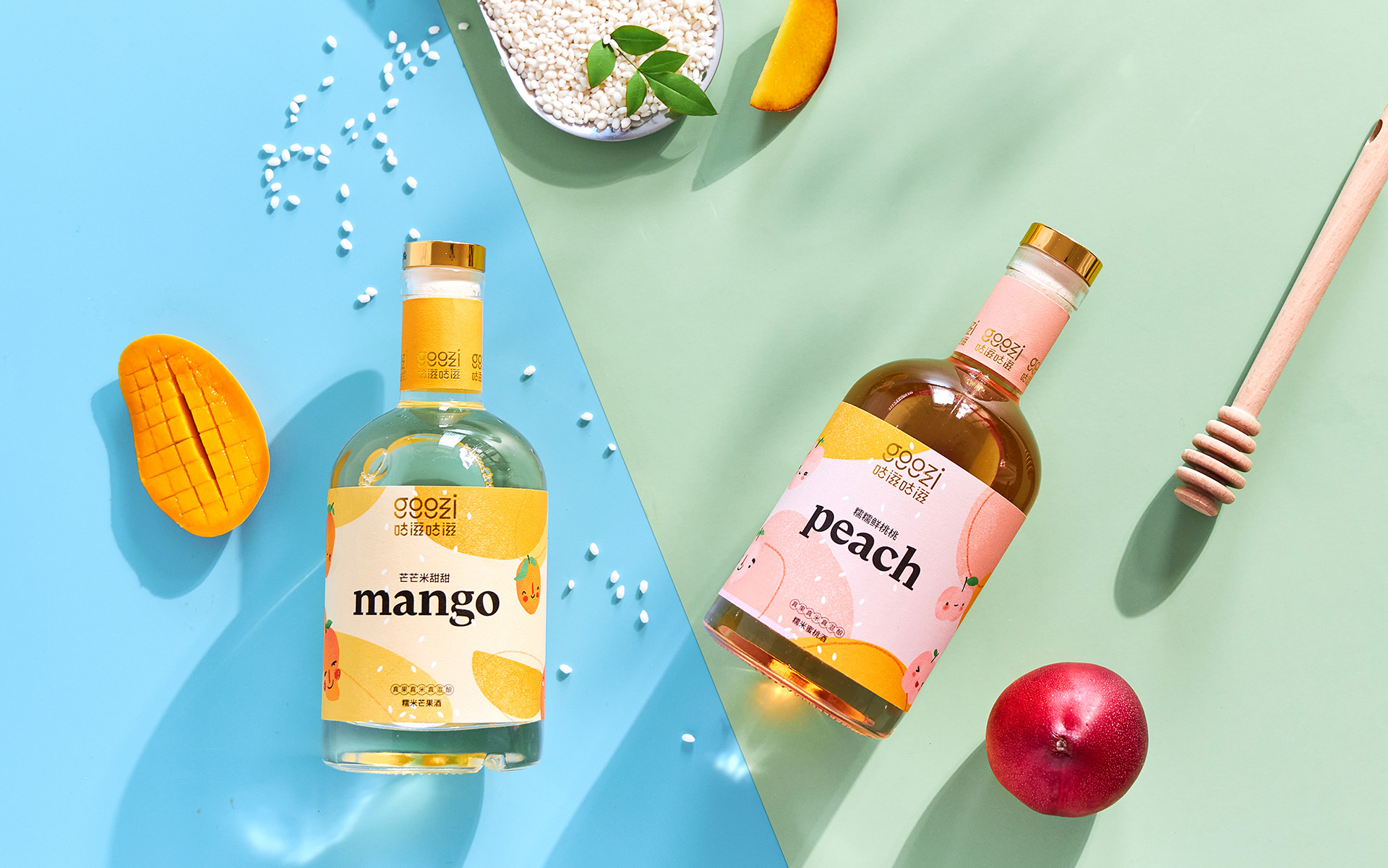
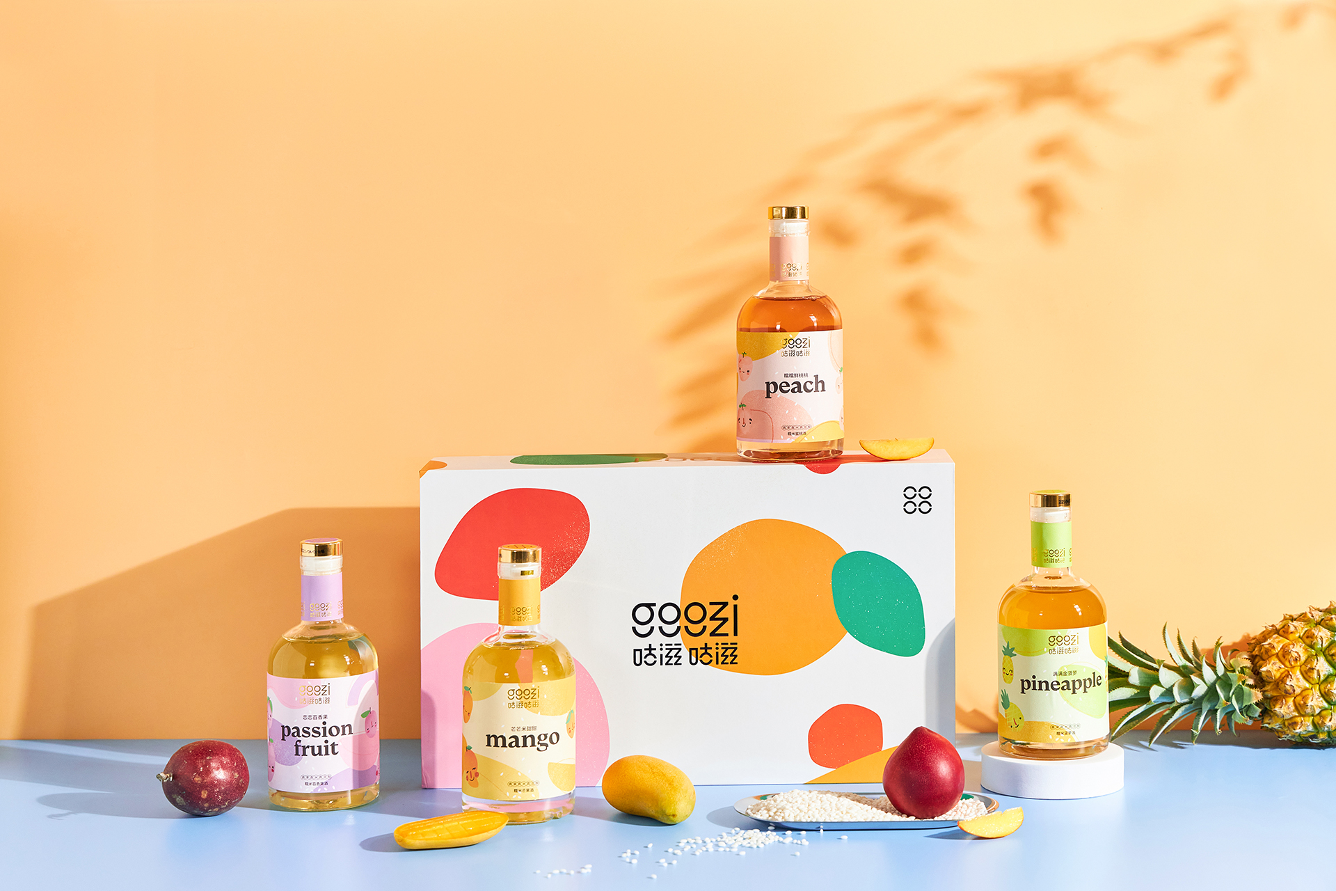
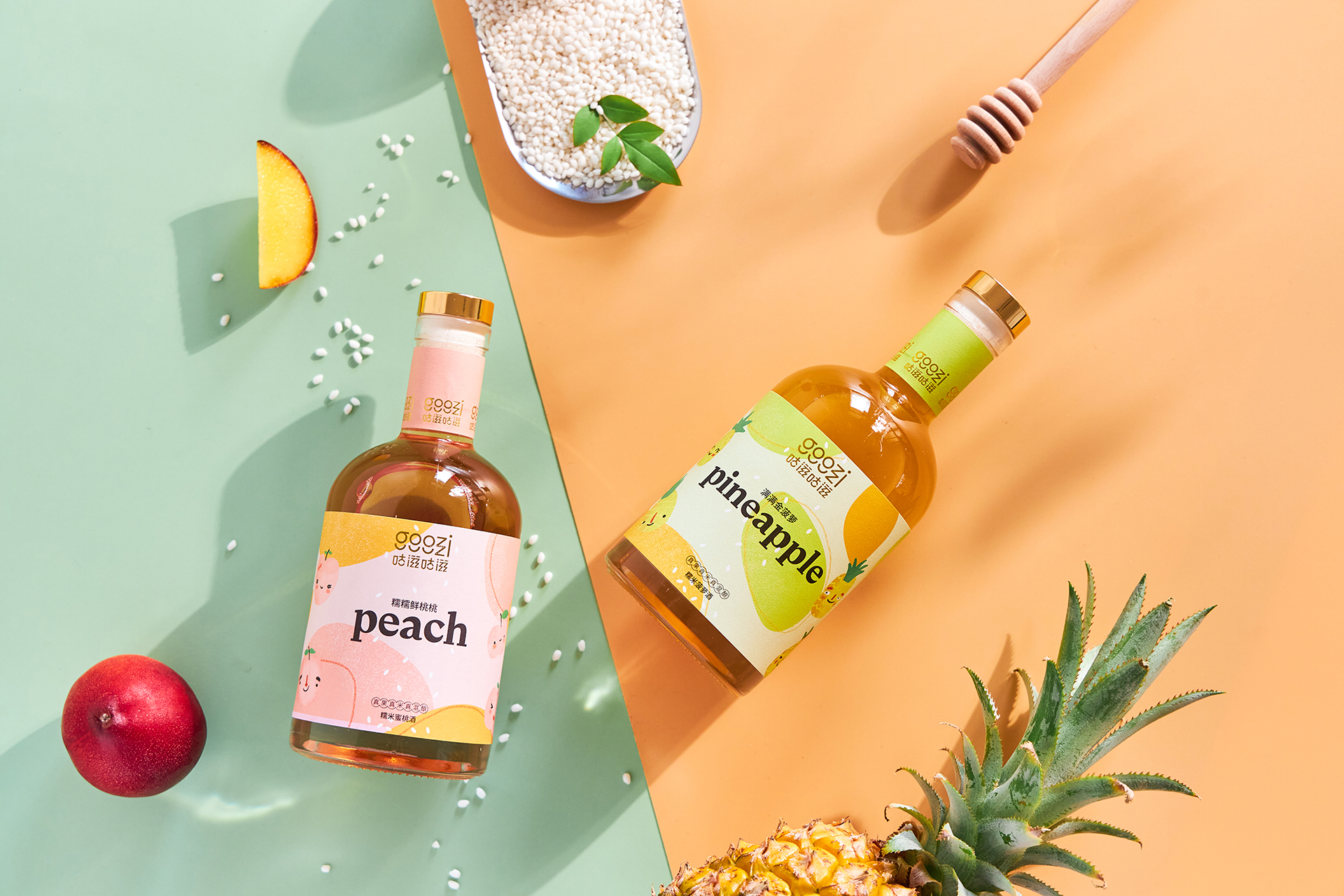
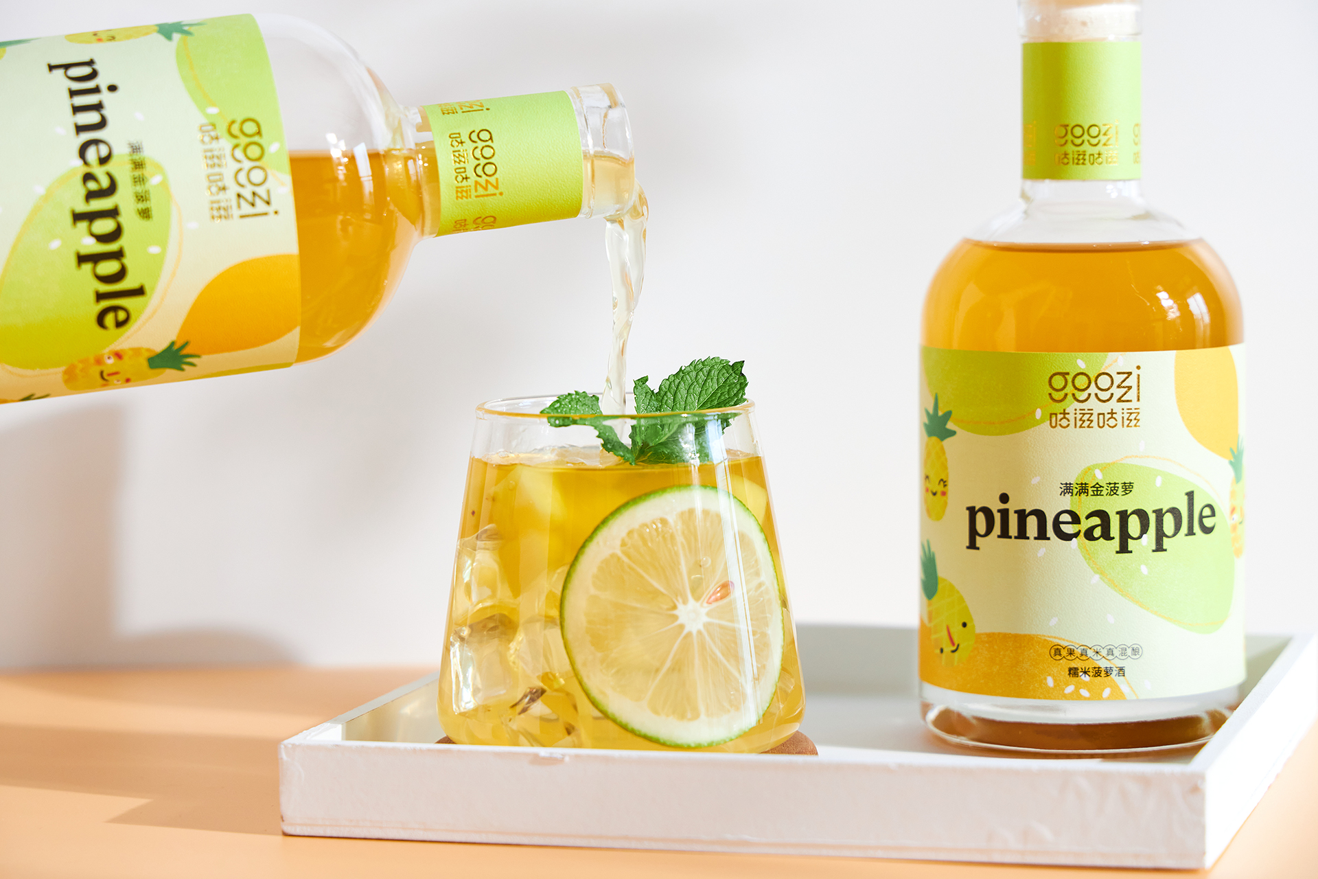
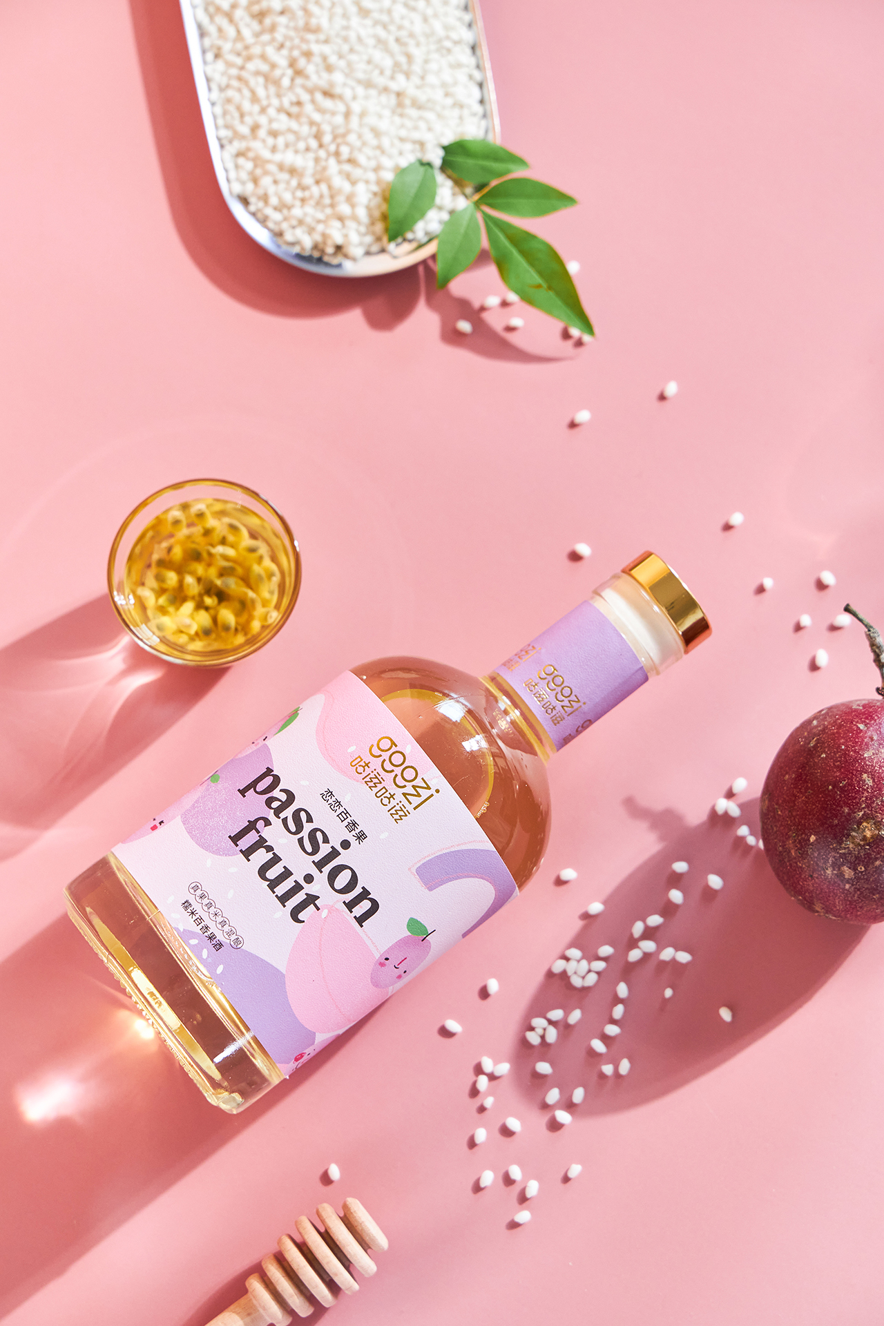
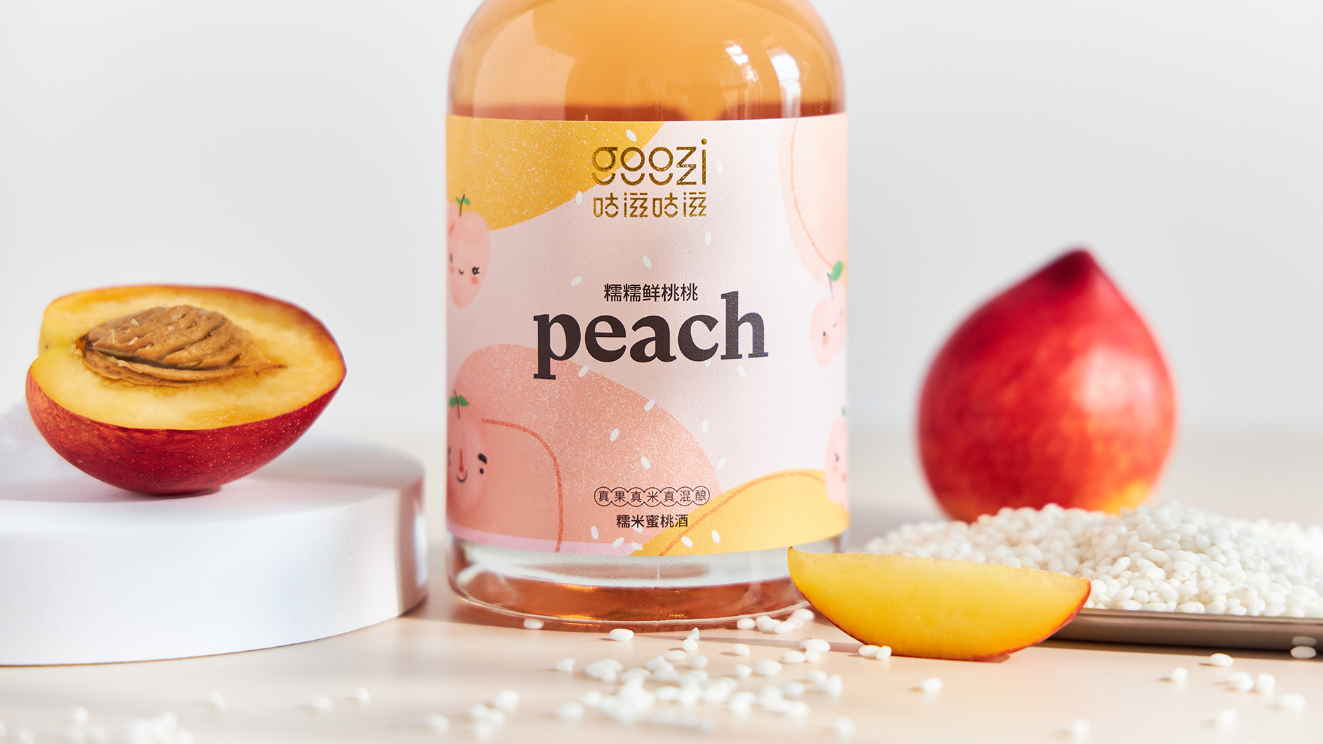
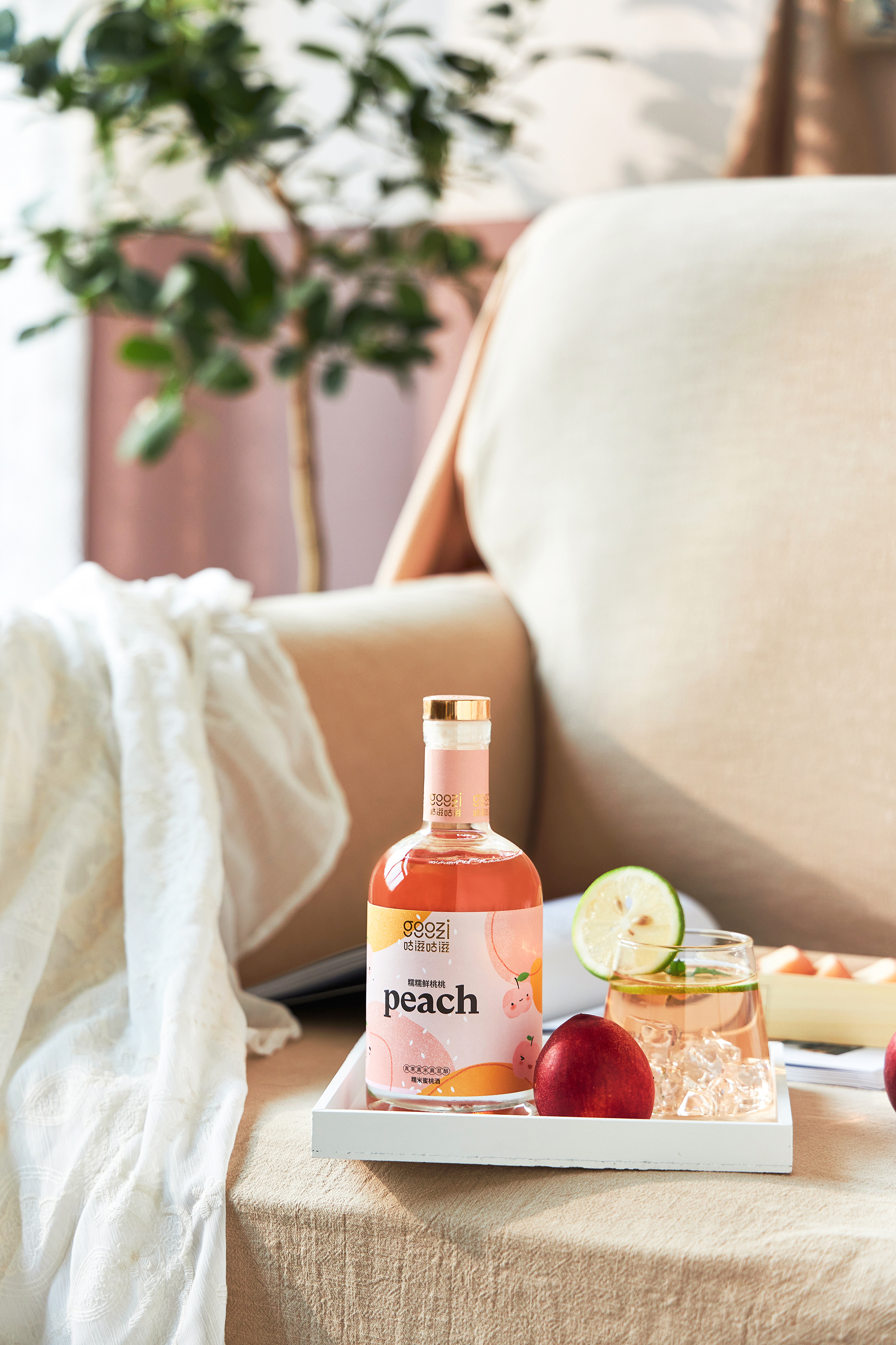
Goozi Goozi is a low-alcohol rice liquor with packaging that’ll bring a smile to your face. This is a drink for the Chinese market, but the brand wanted to implement a more Western spirit.
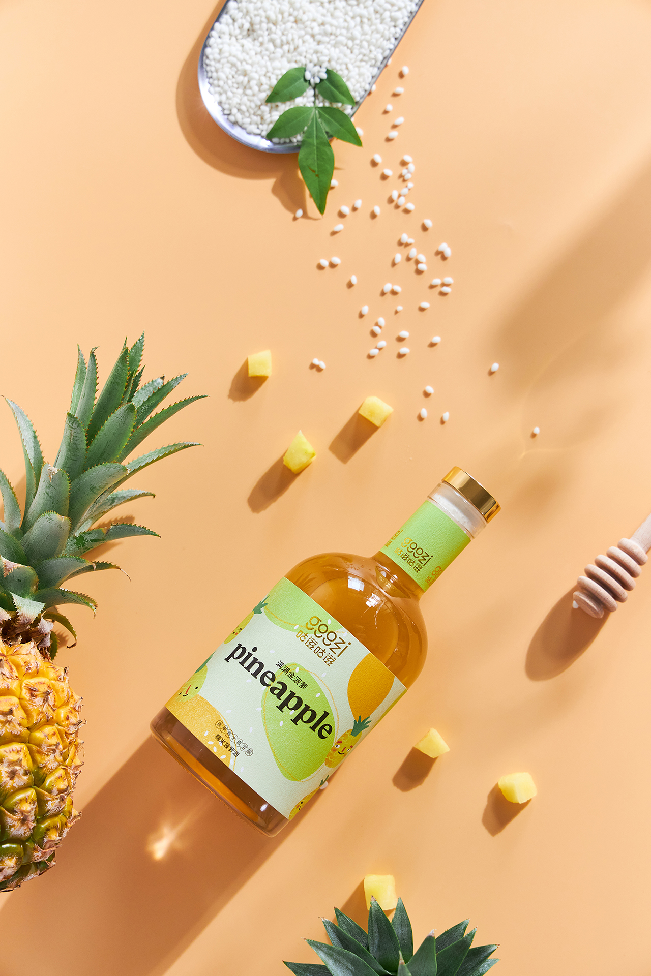
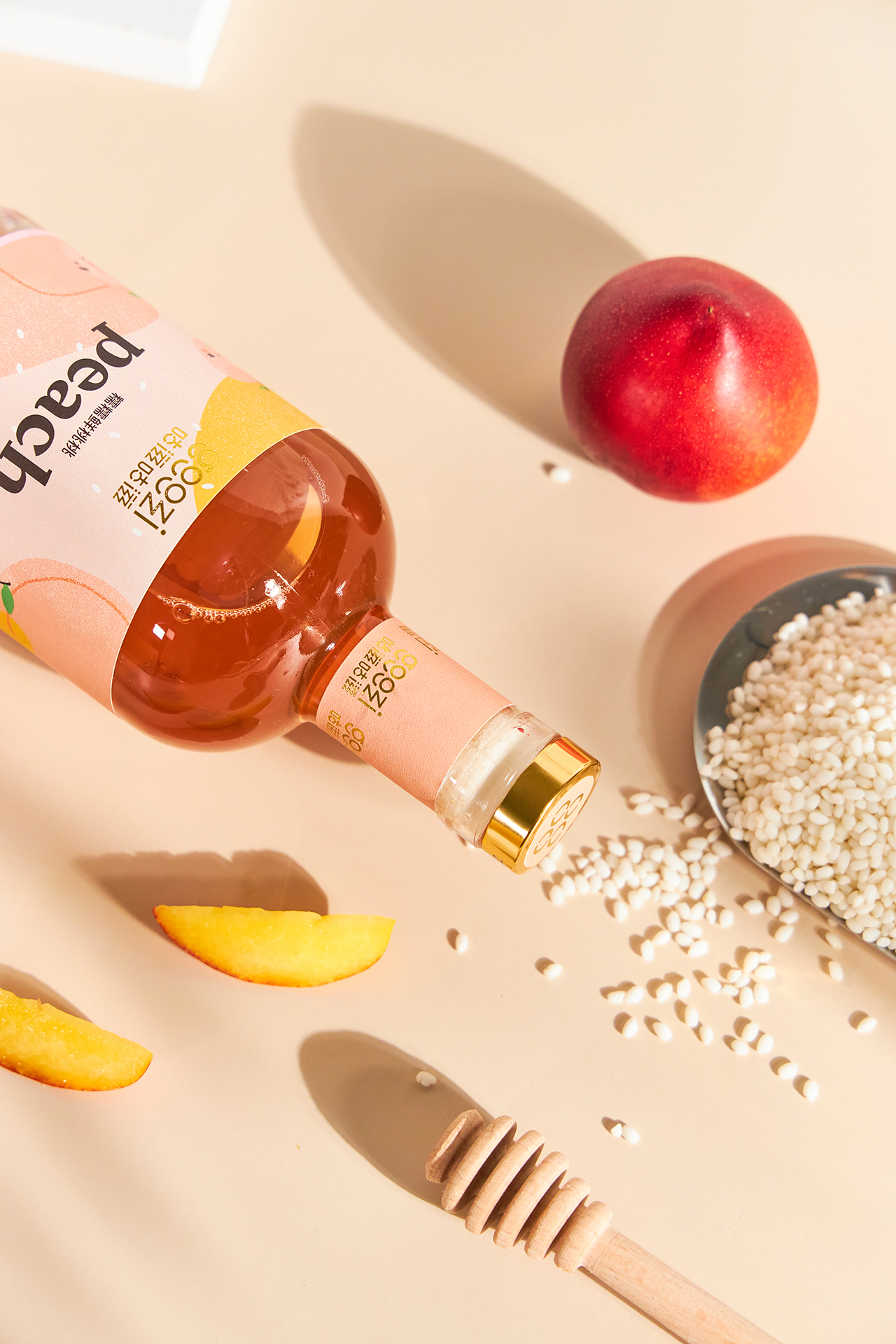
Alex Monzó and Brandsummit have created a packaging system that’s light-hearted through pastel colors, approachable typography, and illustrations that are simple and sweet. Despite being an extremely playful package design, there is still a sense of elegance throughout it all.
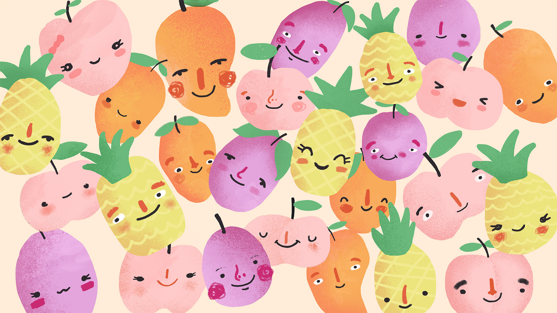
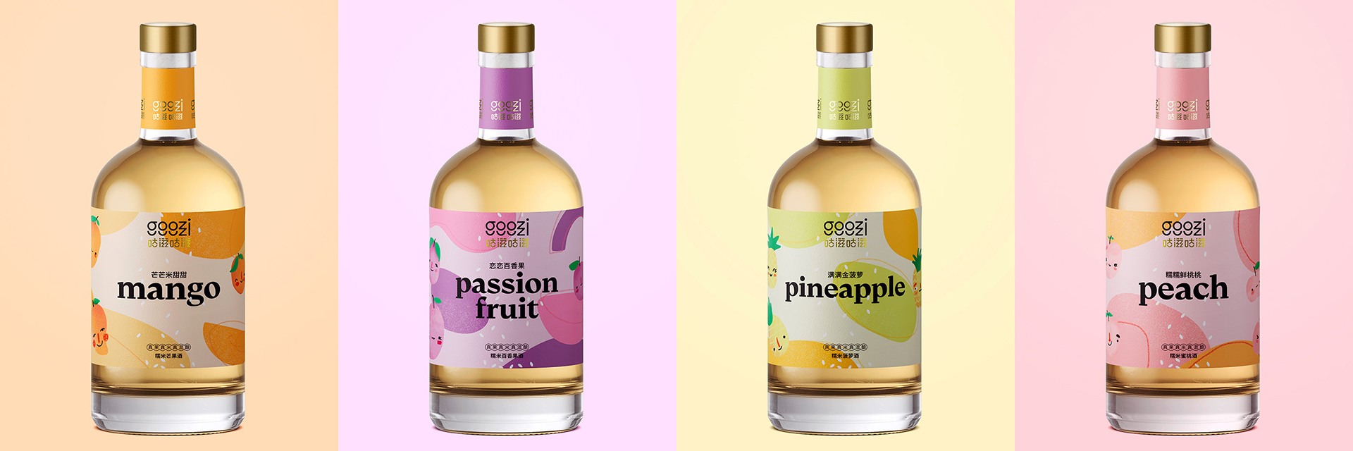
Kind, colorful, beautiful and very elegant, this is how this low-alcohol rice liquor should be. A new beverage for the Chinese market that was looking for a western aura, that clearly differentiate its four varieties, while unifying the entire family of products with an aesthetic that thought of and understood its eastern consumer. Thus, GooziGoozi was born.
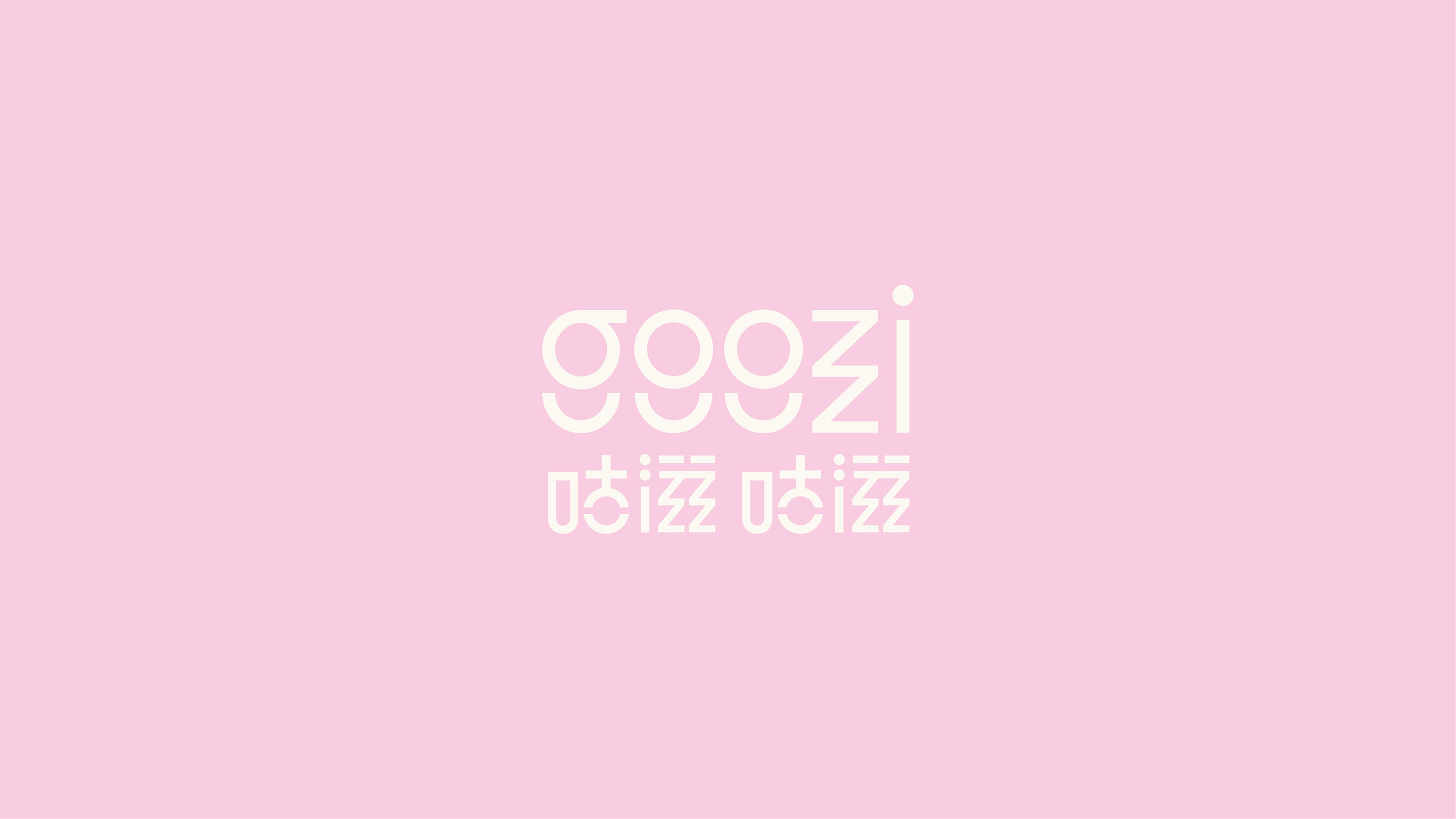
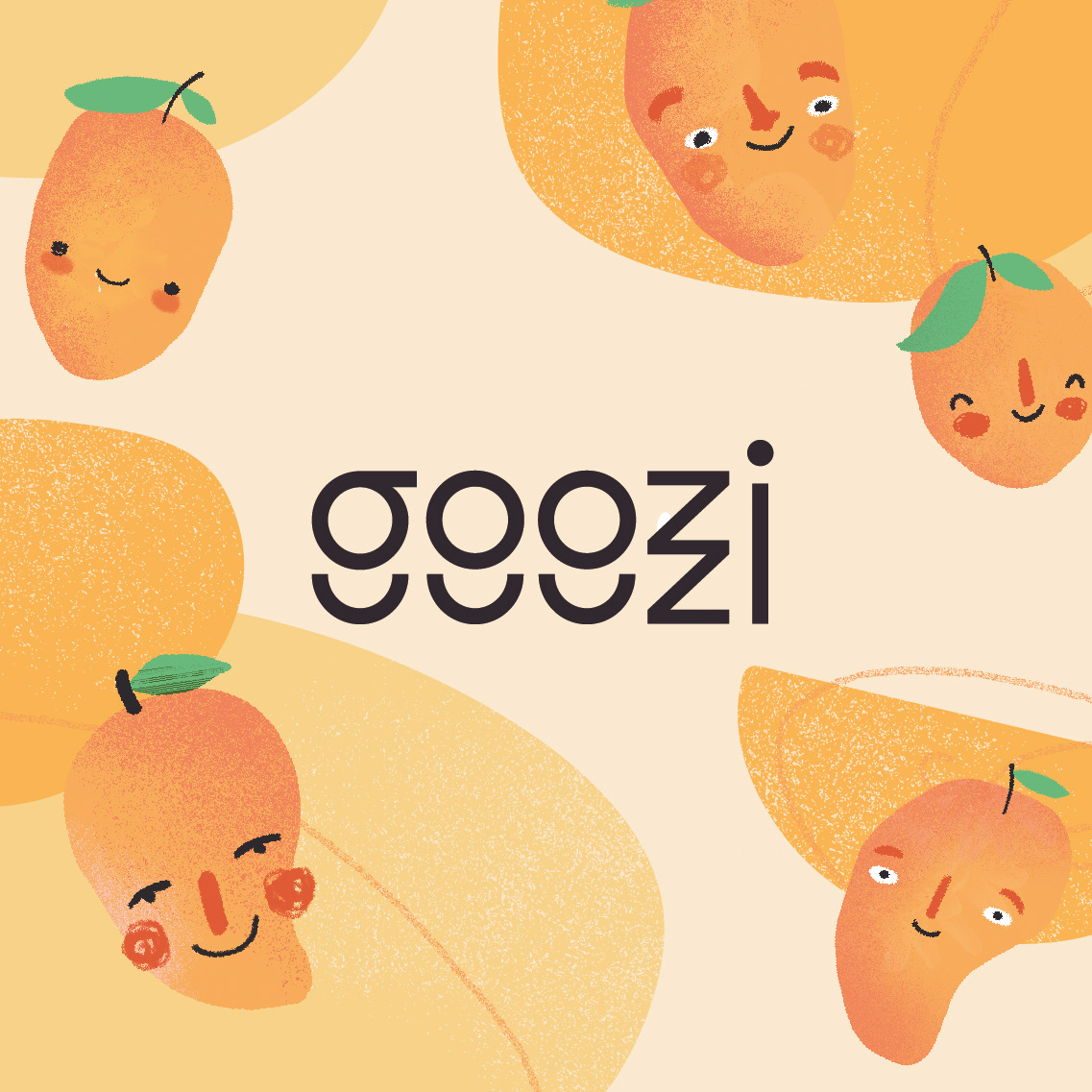
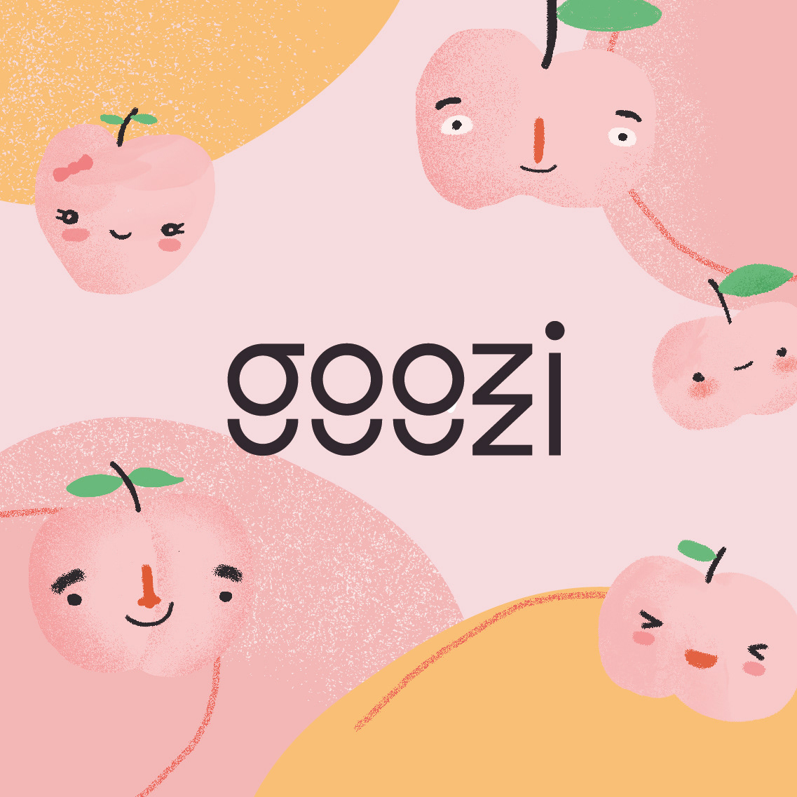
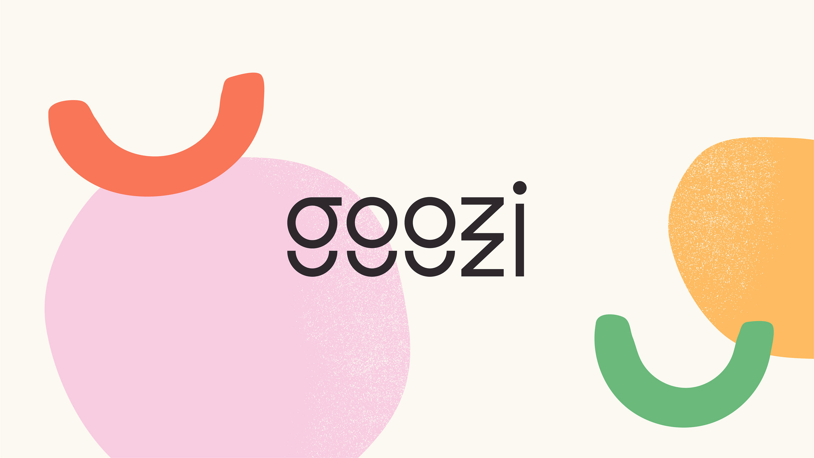
Four rice liqueurs in pastel colors, playing with textures and organic shapes, gives life to a series of very natural illustrations that dress each one of the bottles and balance them in a fun way with the elegant and stylized logo, which was a challenge because for the first time in our studio, we had to design in two versions: international and in Chinese characters.