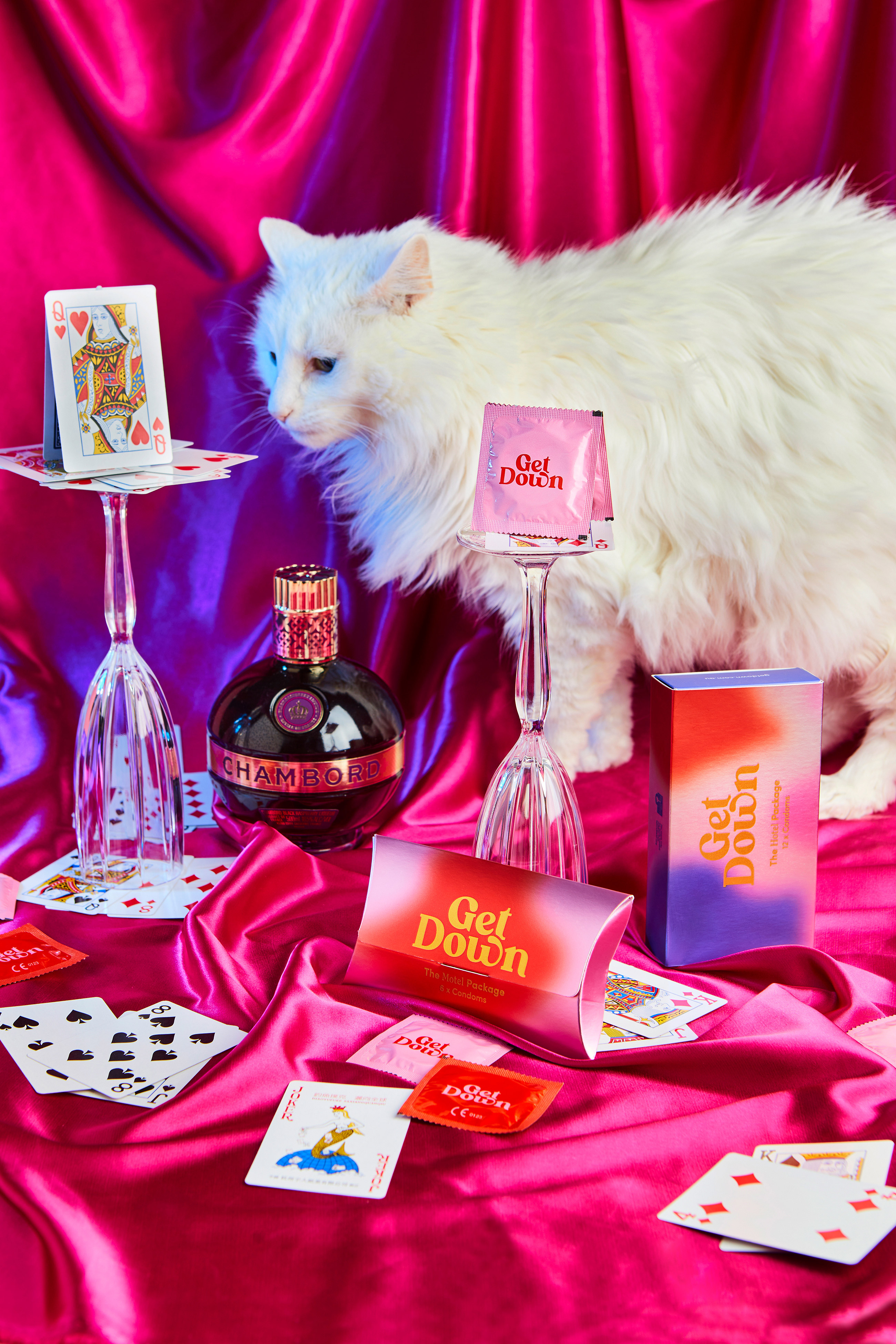
There’s no denying that there’s a stigma surrounding women purchasing condoms. In fact, condoms are often advertised towards a male audience, even though it takes two to tango if you catch my drift. Get Down condoms, designed by Maria Romero, are condoms that are changing the entire market. The packaging for these condoms is something we’ve never seen before, through its visual aesthetic inspired by the retro vibe of the 70s. Not only does this packaging empower women to take charge of their sexual health through beautiful design, but it also does so in a relatable, thoughtful, and insightful manner.
Concept, branding, visual identity, packaging and social media content for GET DOWN, a condom brand aimed at centennial empowered girls. The condom landscape (a.k.a man-scape) needed a game changer! Women don’t feel empowered by the non-hormonal birth control on the shelves. Specifically, condoms. In fact, women feel uncomfortable altogether when it comes to condoms.
Get Down empower young women to take charge of their sexual health.
Get Down is inspired in 70`s decade, a tumultuous time. After decades of repression, society flourished and claimed rights and equality.
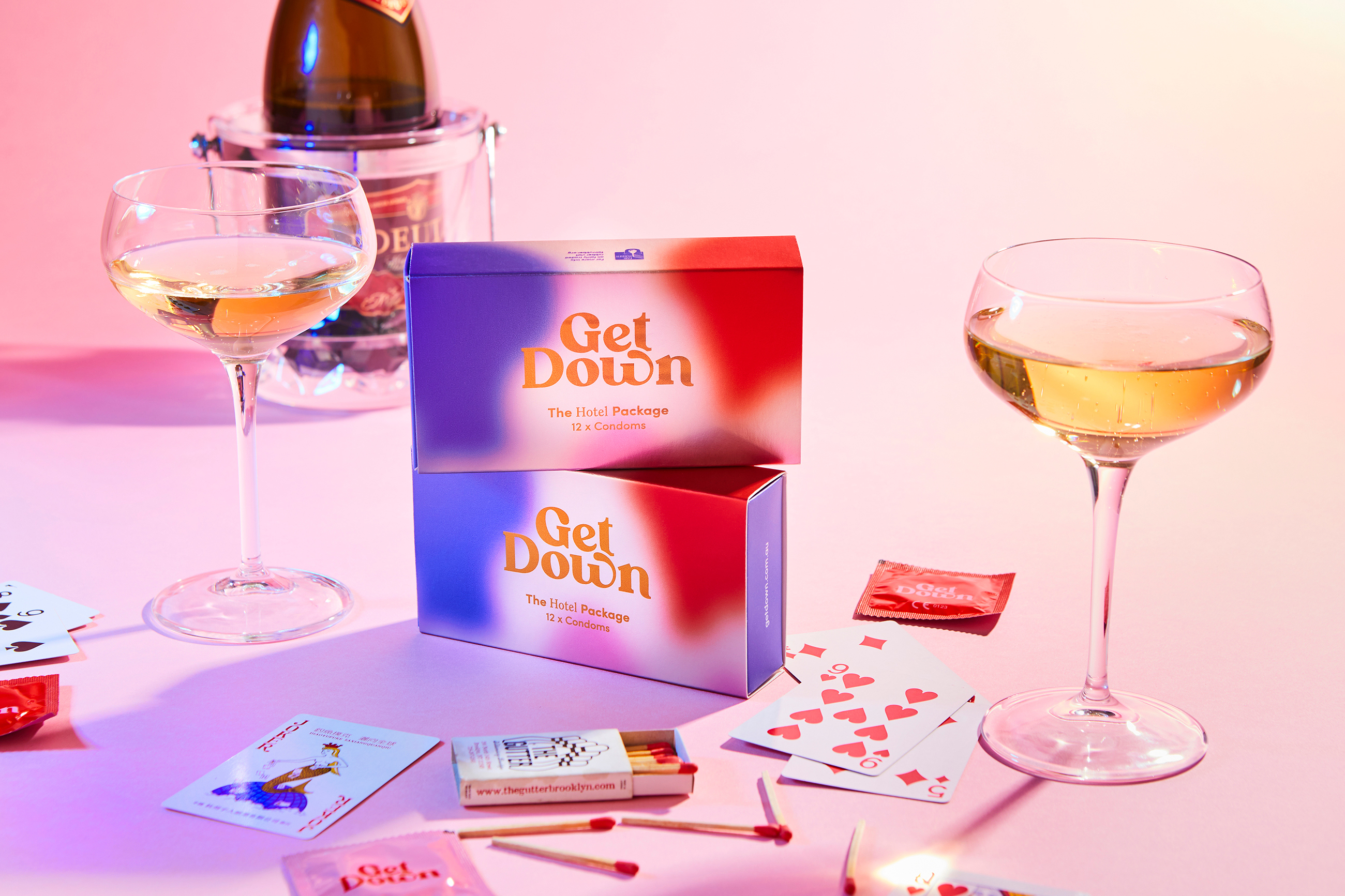
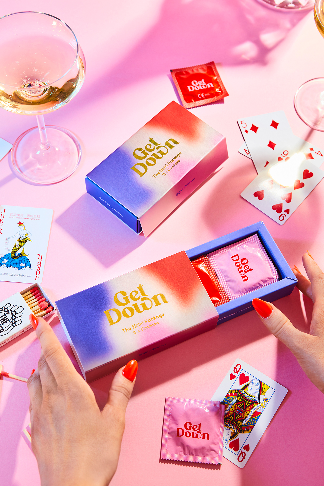
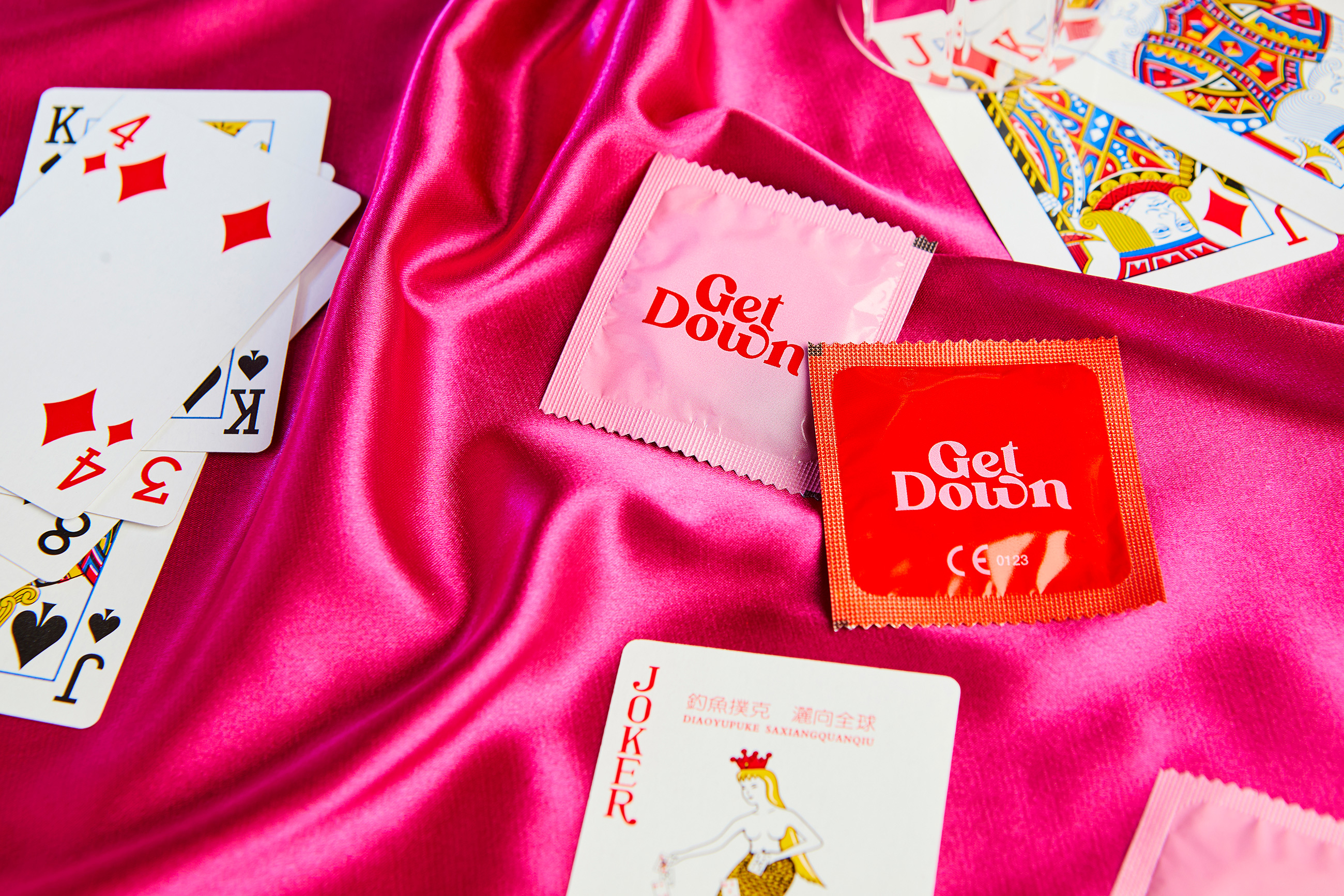
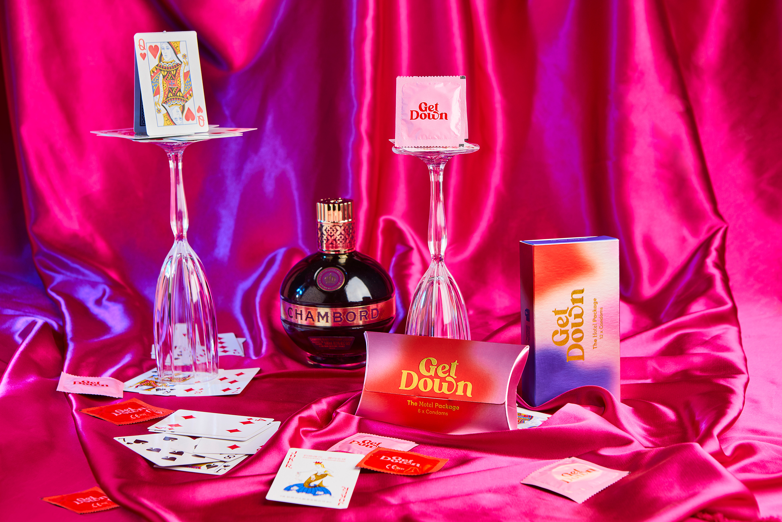
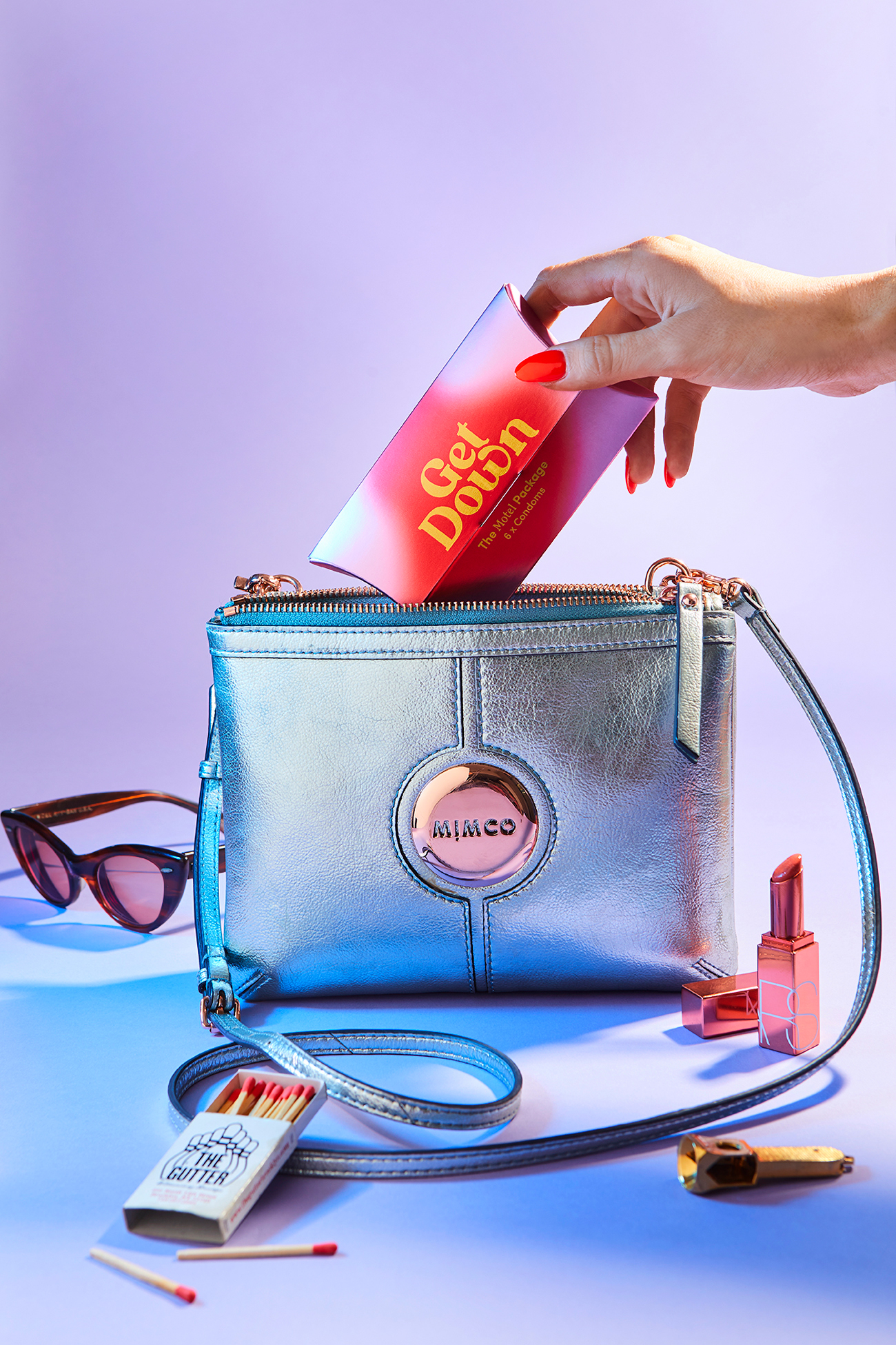
Get Down visual identity tries to mix 70’s style with centennial aesthetic. Packaging is easy to carry on and put inside your purse. It has a glamorous look and discreet shipping boxes.