CALCE’s Metodo Classico Brut Packaging Is Minimal Yet Sophisticated

Published

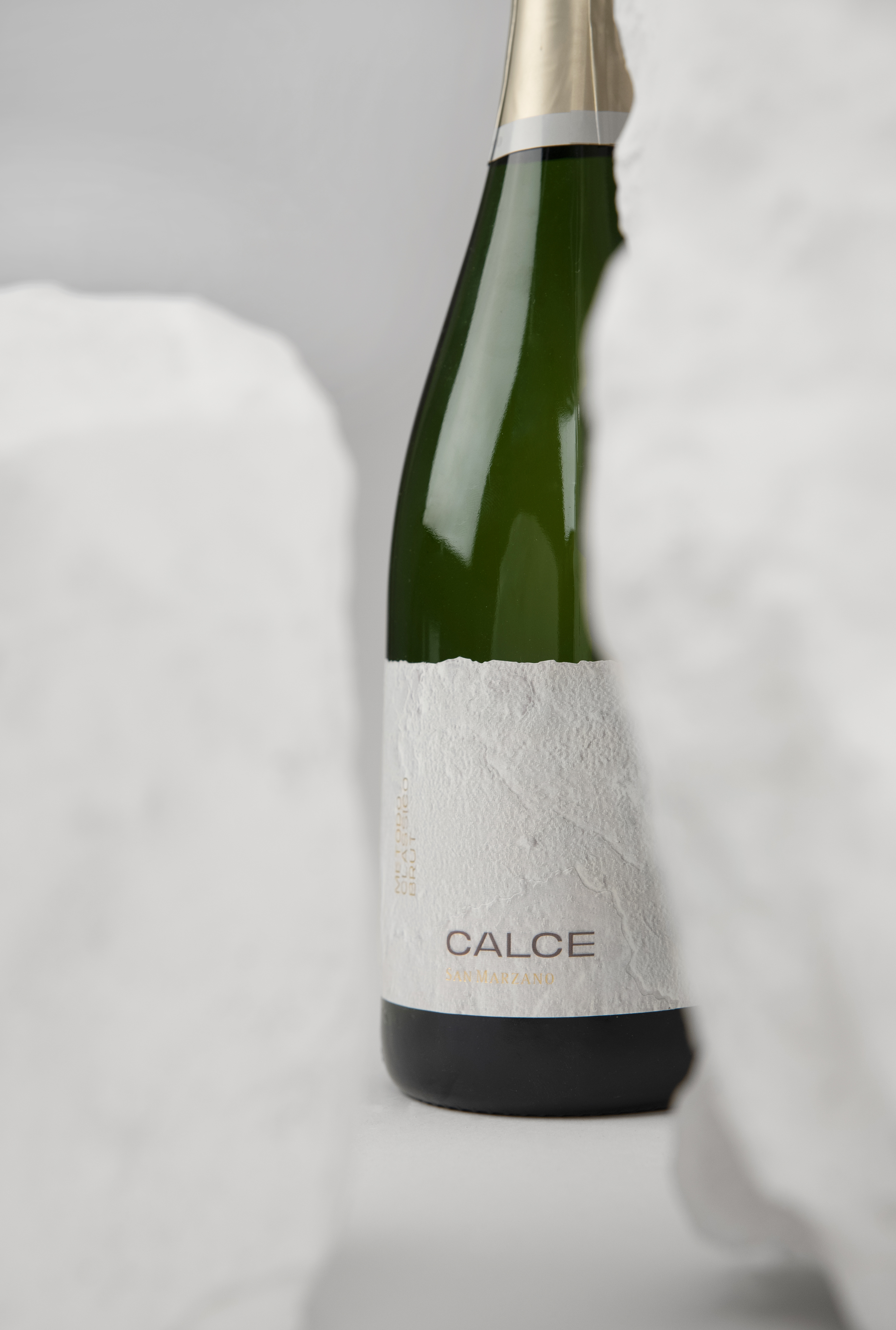
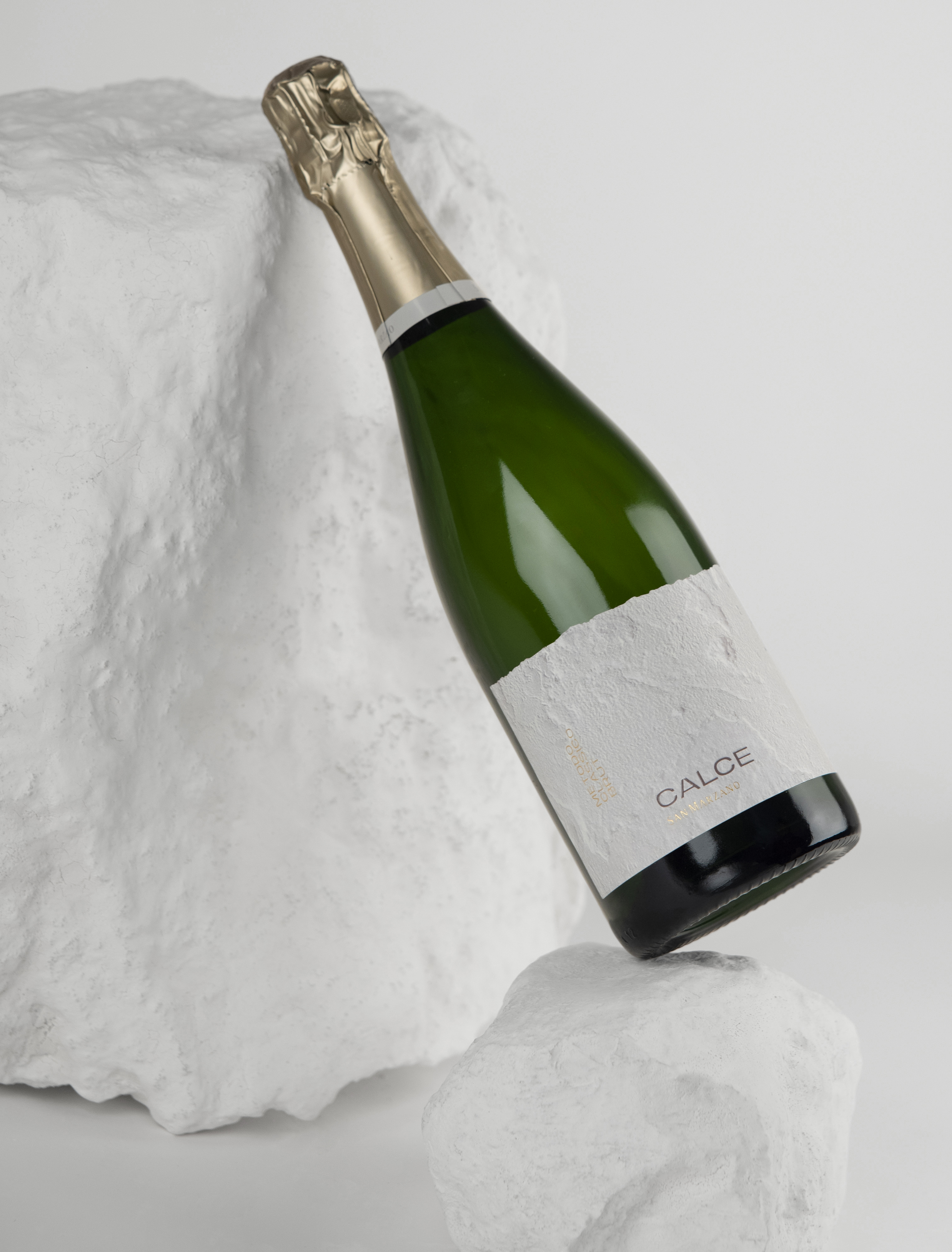
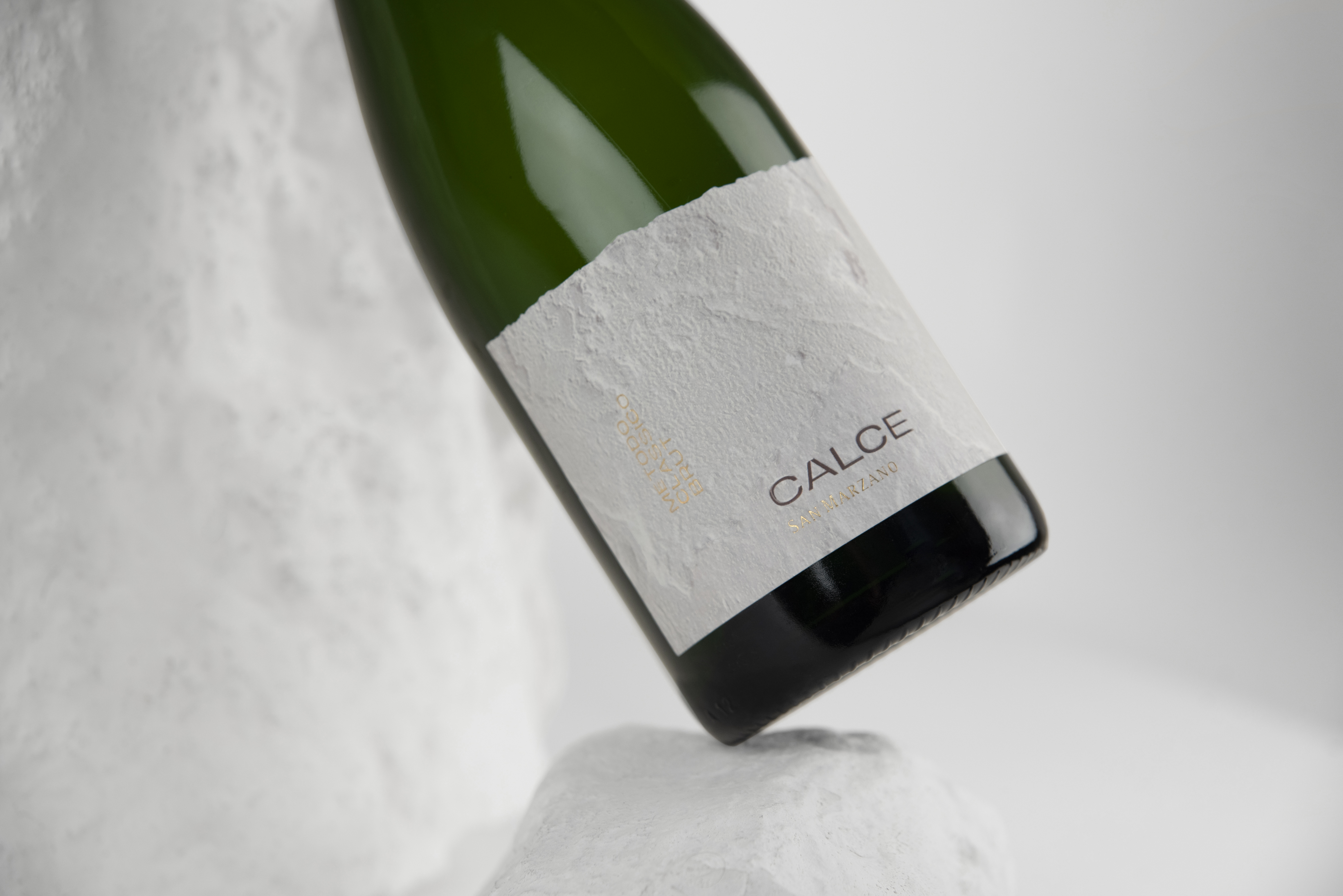
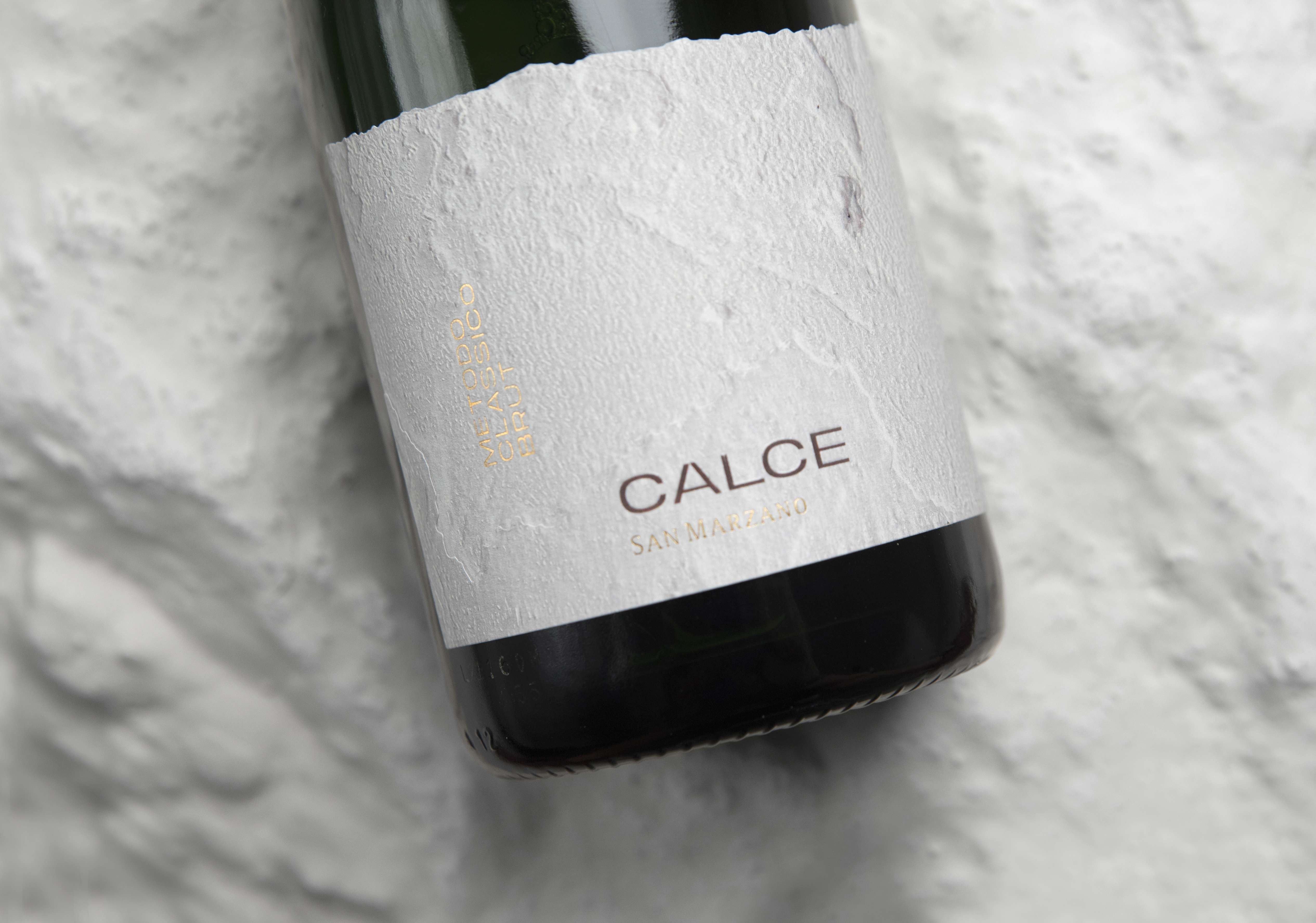
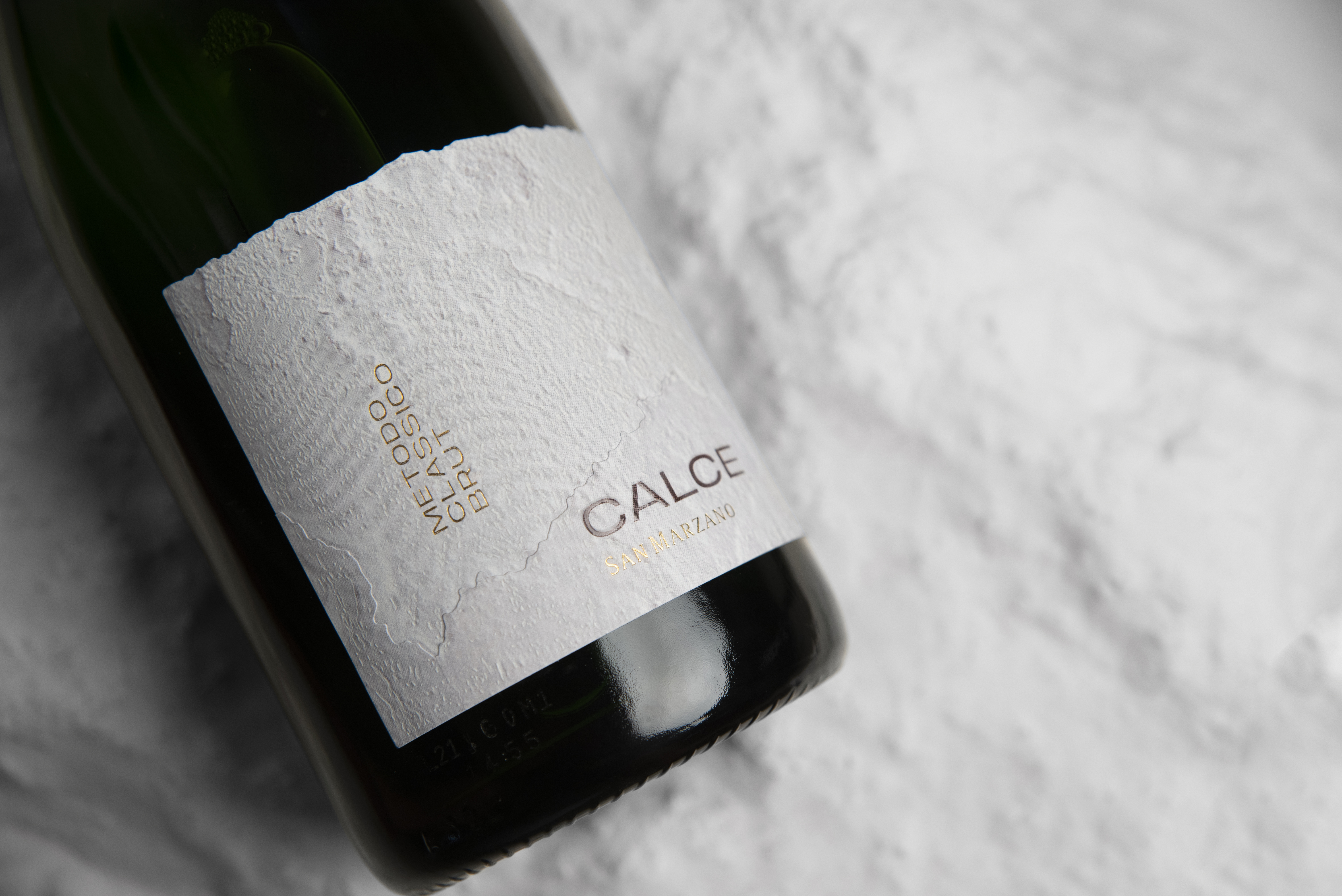
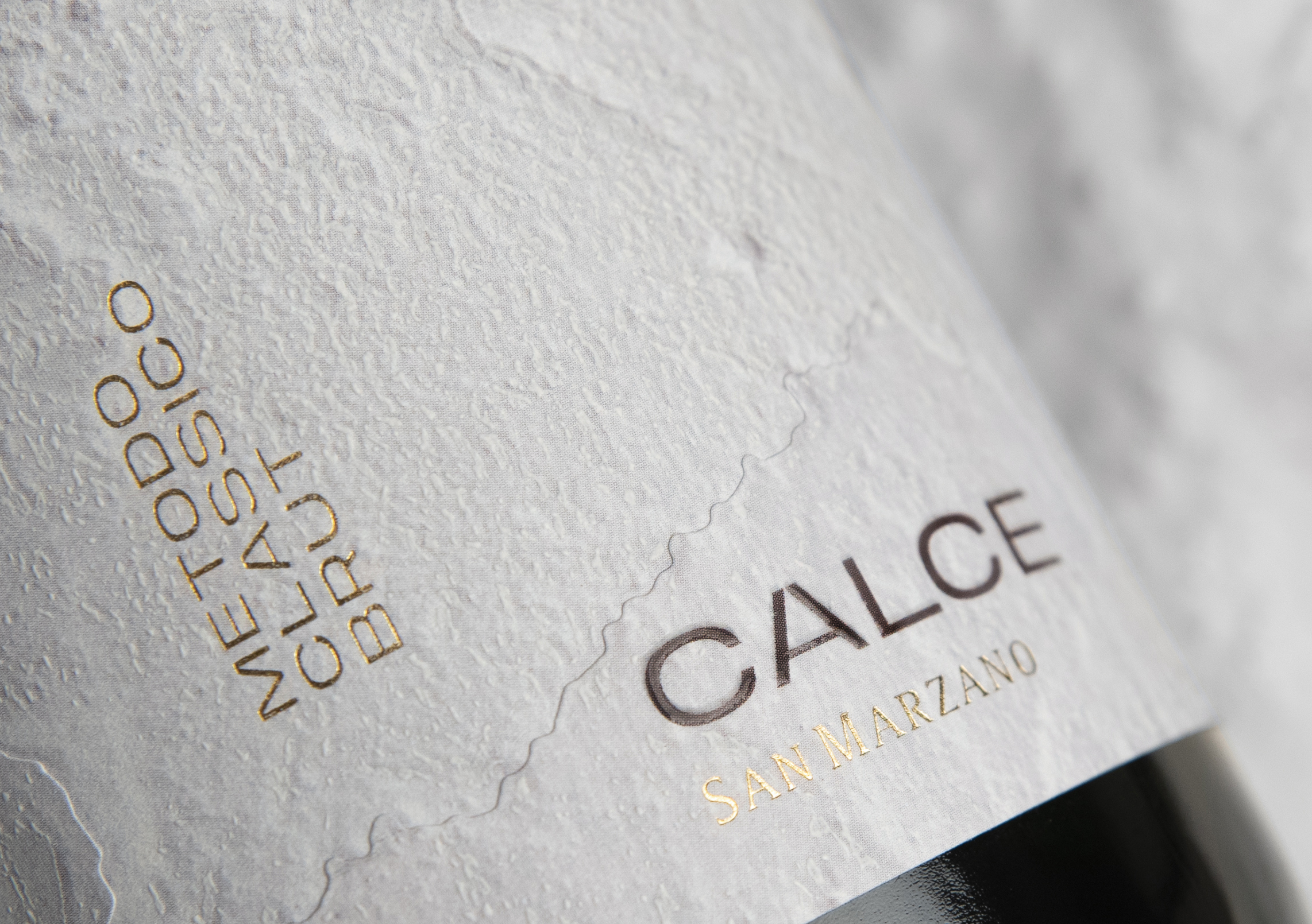
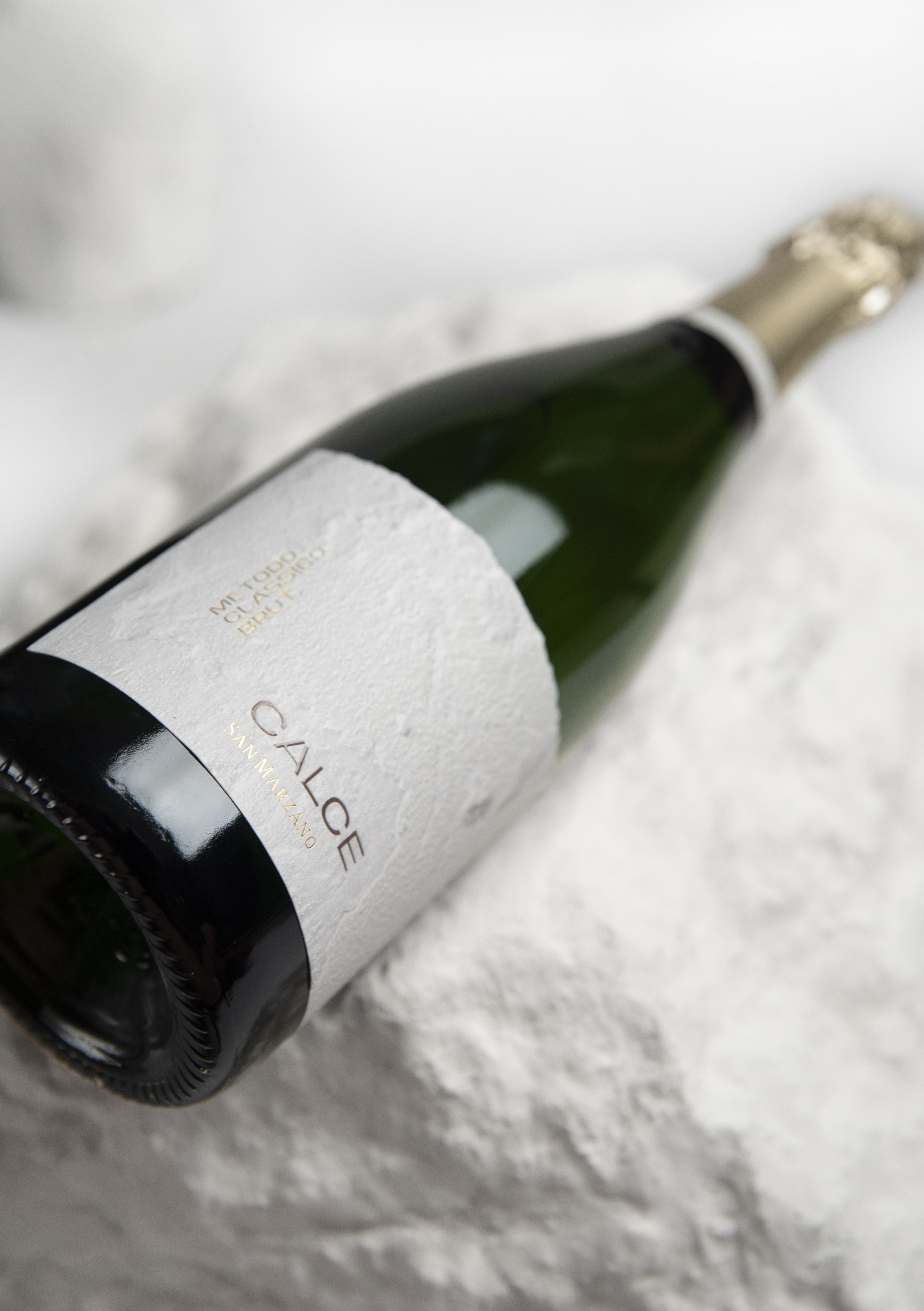
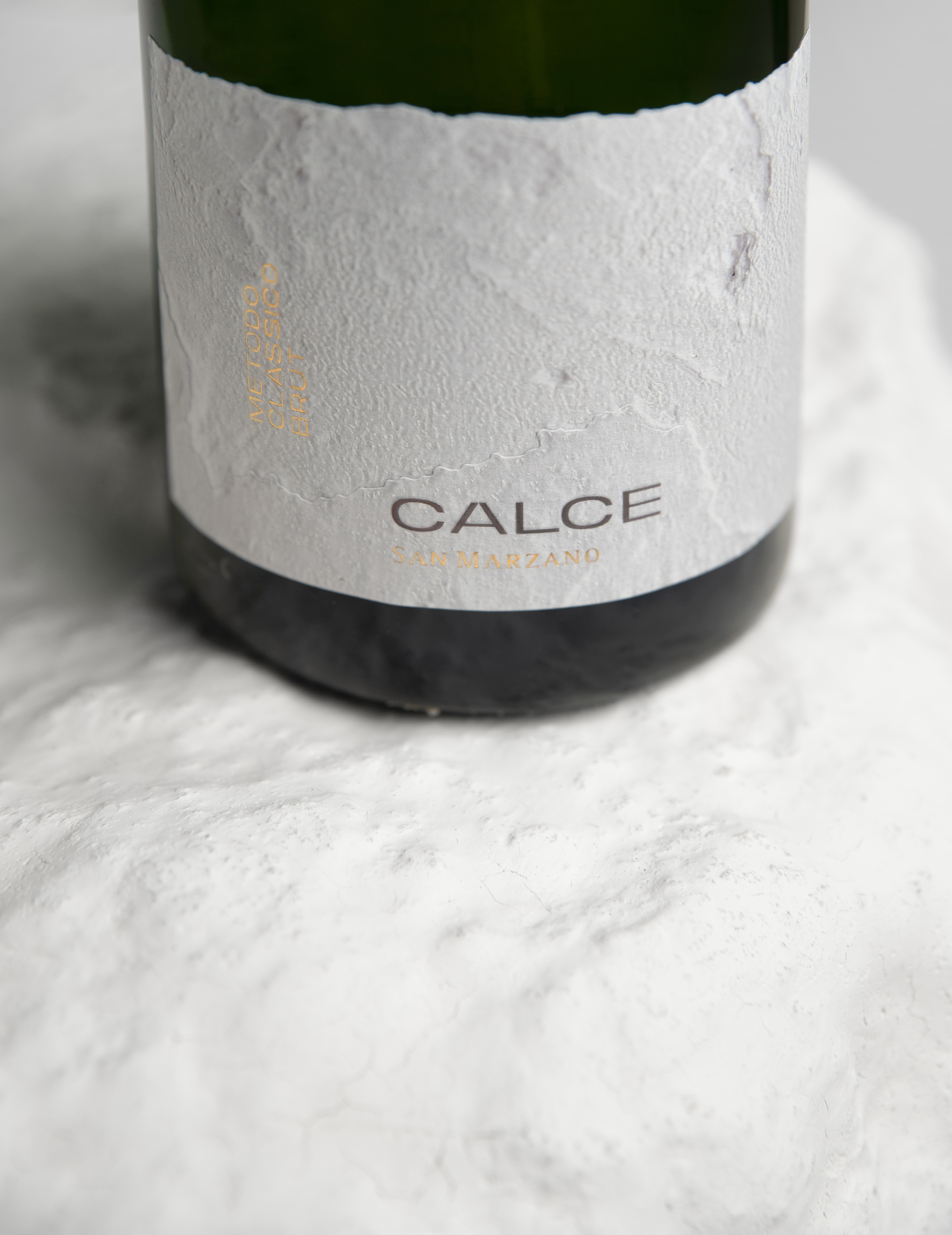
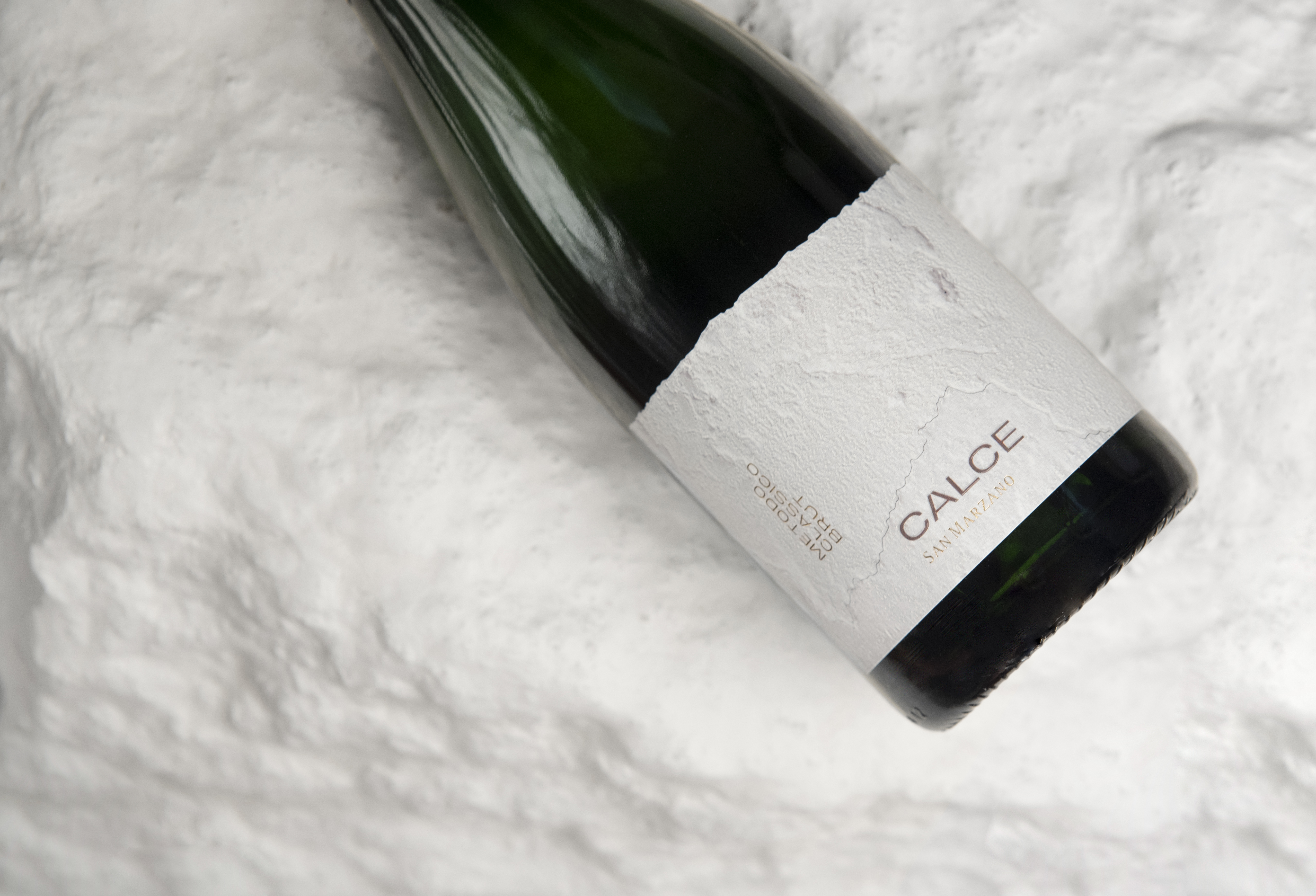
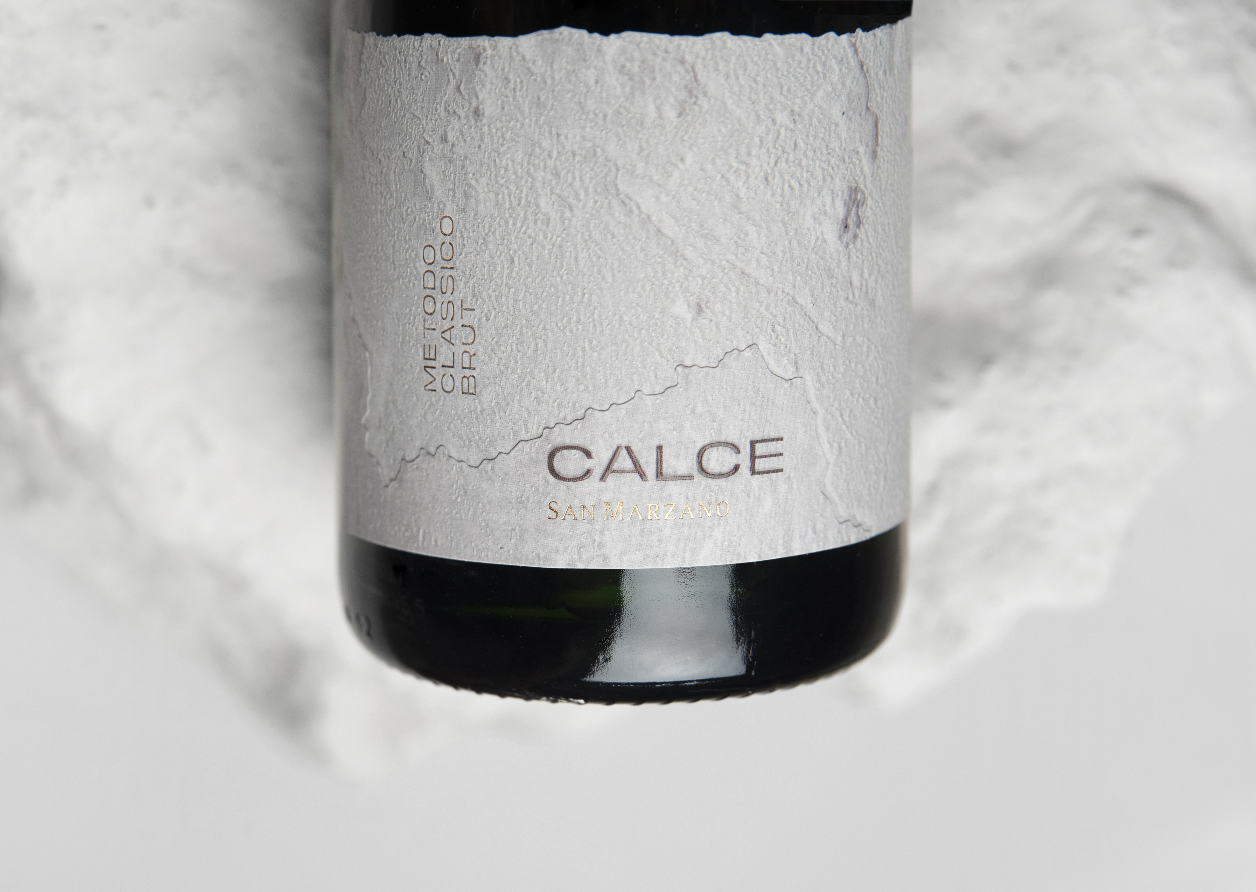
Sometimes, when everyone is designing using one particular style or trend, it makes sense to go the opposite direction. CALCE’s whitewashed bottles do just that, thanks to the design created by the design agency Usopposto. The textured, overlapping paper paired with embossed elements produces a crisp yet compelling label design. The minimalism draws you in, and the textures of CALCE’s label leave you wanting more.


Editorial photograph

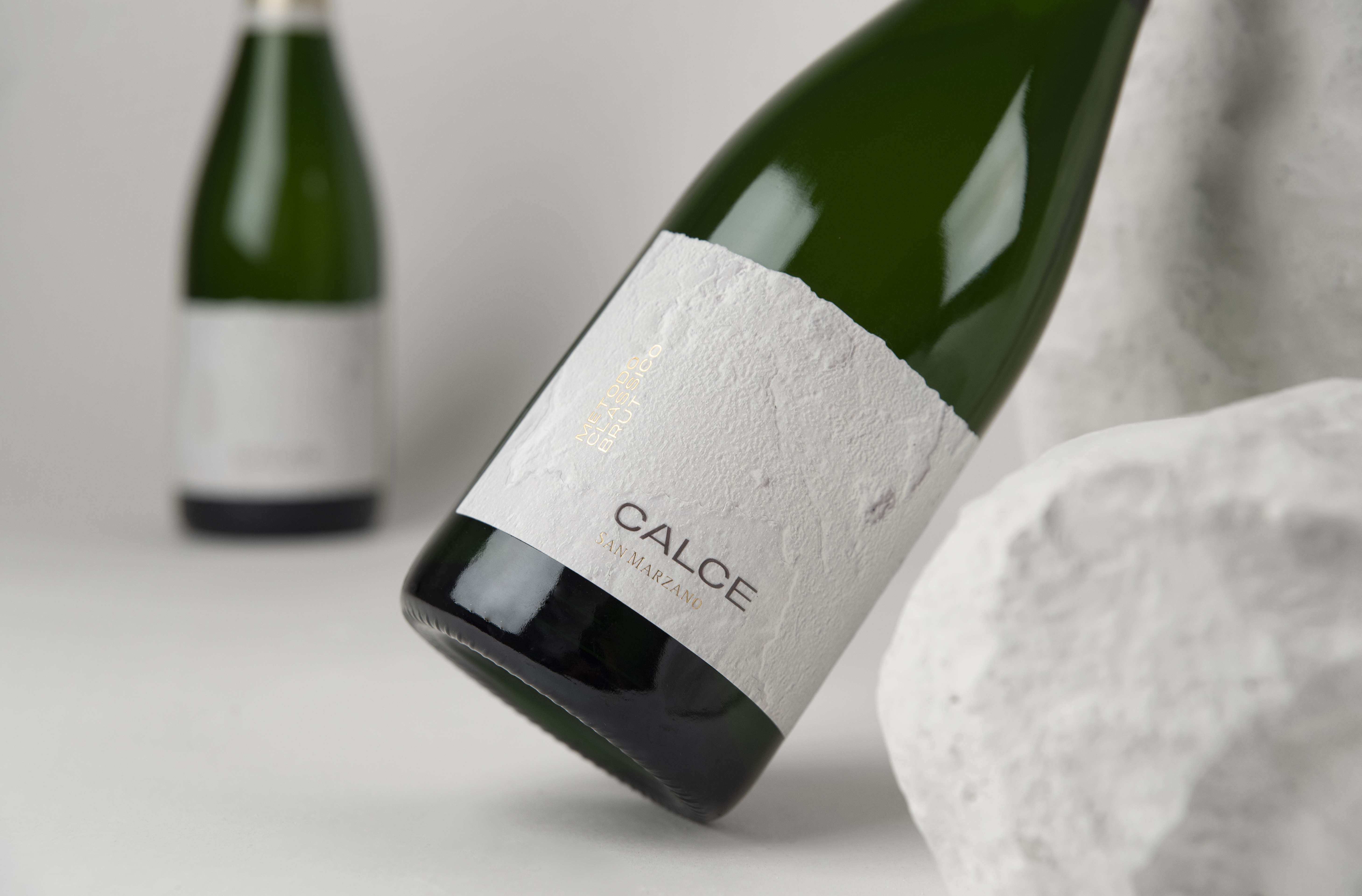
?Whitewash a bottle? Done! With CALCE, the colour white encompasses all of Apulia’s simplicity and sophisticated elegance Doble overlapping paper, with debossing and embossing embellishments, matte polishing and gold foil.

Editorial photograph

This placeholder is removed when the ad slot is configured.

This placeholder is removed when the ad slot is configured.

This placeholder is removed when the ad slot is configured.

This placeholder is removed when the ad slot is configured.

This placeholder is removed when the ad slot is configured.

This placeholder is removed when the ad slot is configured.