This placeholder is removed when the ad slot is configured.

This placeholder is removed when the ad slot is configured.

This placeholder is removed when the ad slot is configured.

This placeholder is removed when the ad slot is configured.

This placeholder is removed when the ad slot is configured.

This placeholder is removed when the ad slot is configured.

It’s All In The Name With HIP Water

Published

Filed under

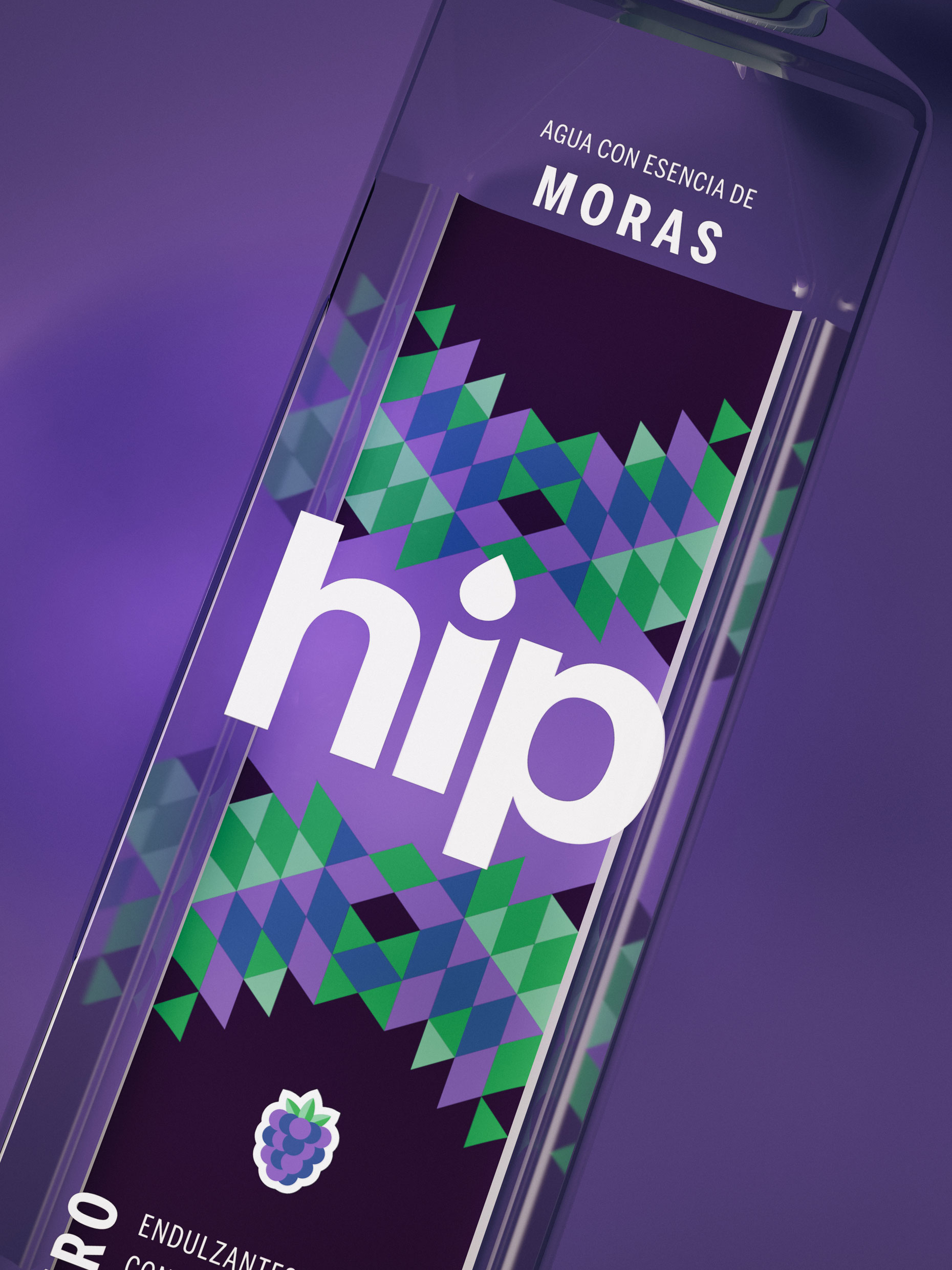
HIP Water might be hip, but at its core, it’s just water. And we mean that in the best possible way. It’s free of sweeteners, preservatives, and calories, and while the water is clean and pure, the packaging design created by Ancla Studio is much more fun and striking. The bold sans-serif typeface on the front of the label initially grabs the consumer’s attention, and the funky geometrical pattern above and below the logo keeps the recognition there. The vibrant colors pair well with the translucent label as they give the consumer a feeling of three-dimensionality and personality without relinquishing the importance of this beverage’s simplicity.

Editorial photograph

At Ancla Studio we had the task of developing a new label for a family of drinks with natural flavor.

This placeholder is removed when the ad slot is configured.

This placeholder is removed when the ad slot is configured.

This placeholder is removed when the ad slot is configured.

This placeholder is removed when the ad slot is configured.

This placeholder is removed when the ad slot is configured.

This placeholder is removed when the ad slot is configured.

Keep reading