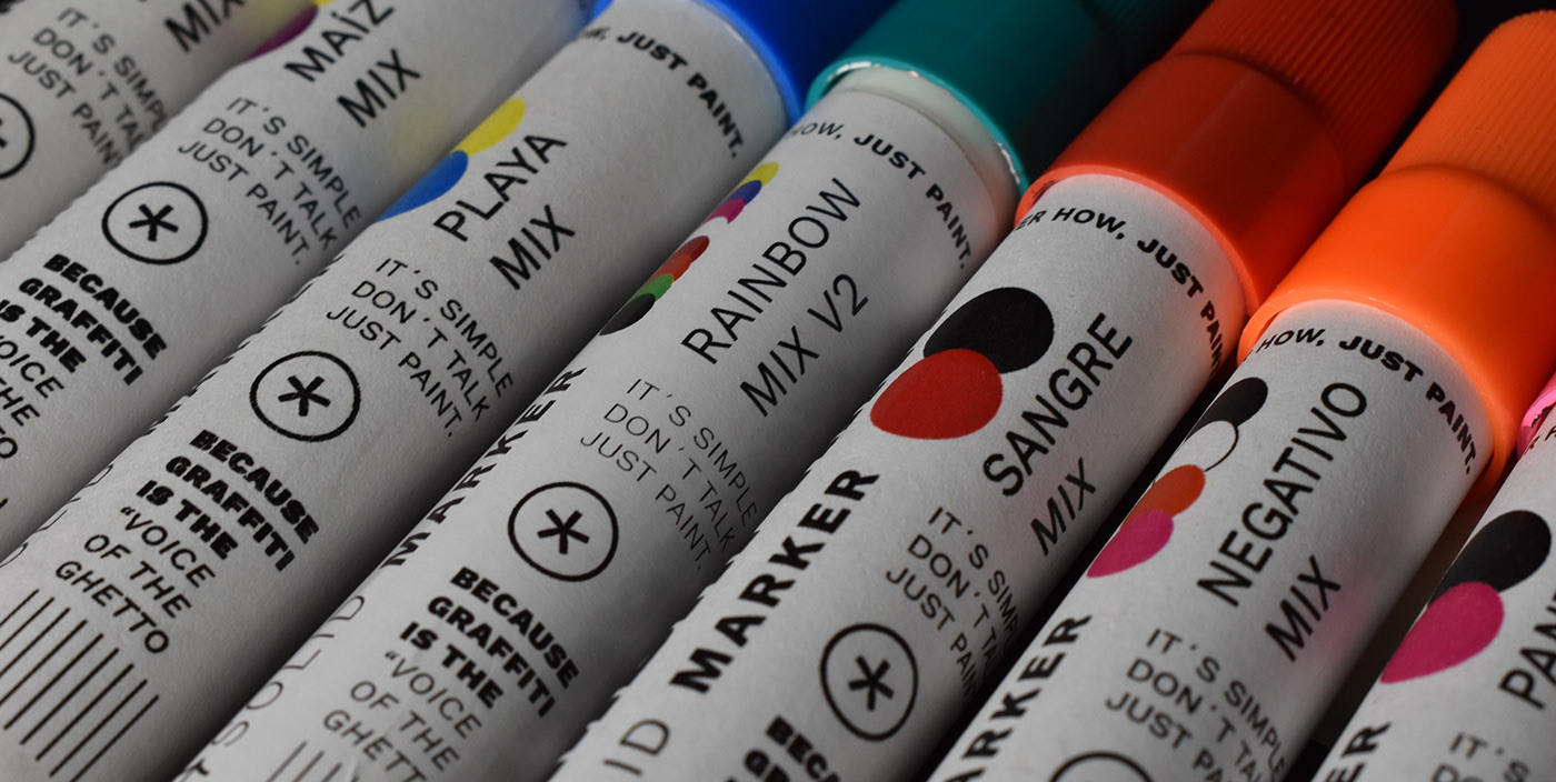
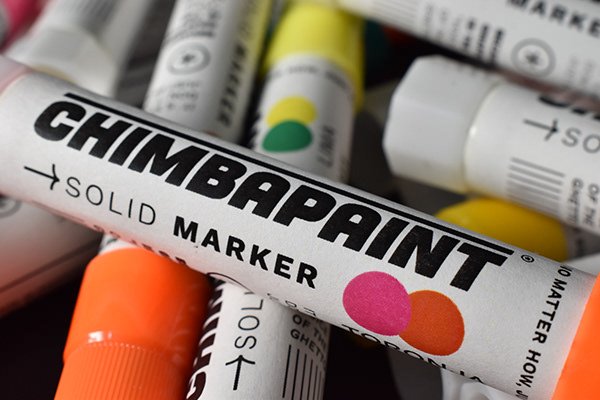
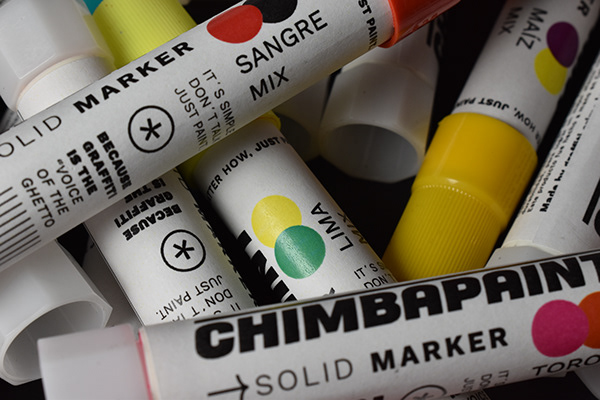
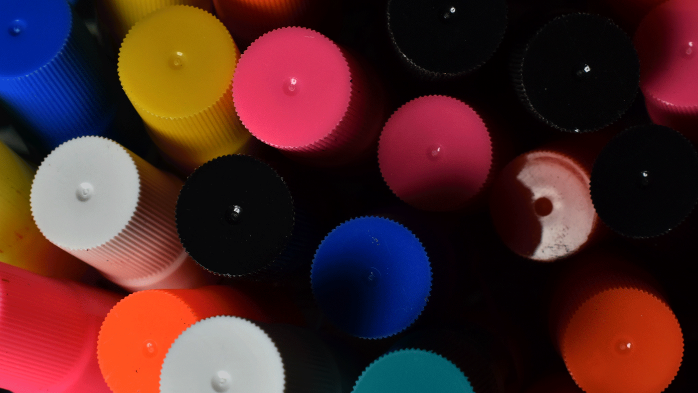
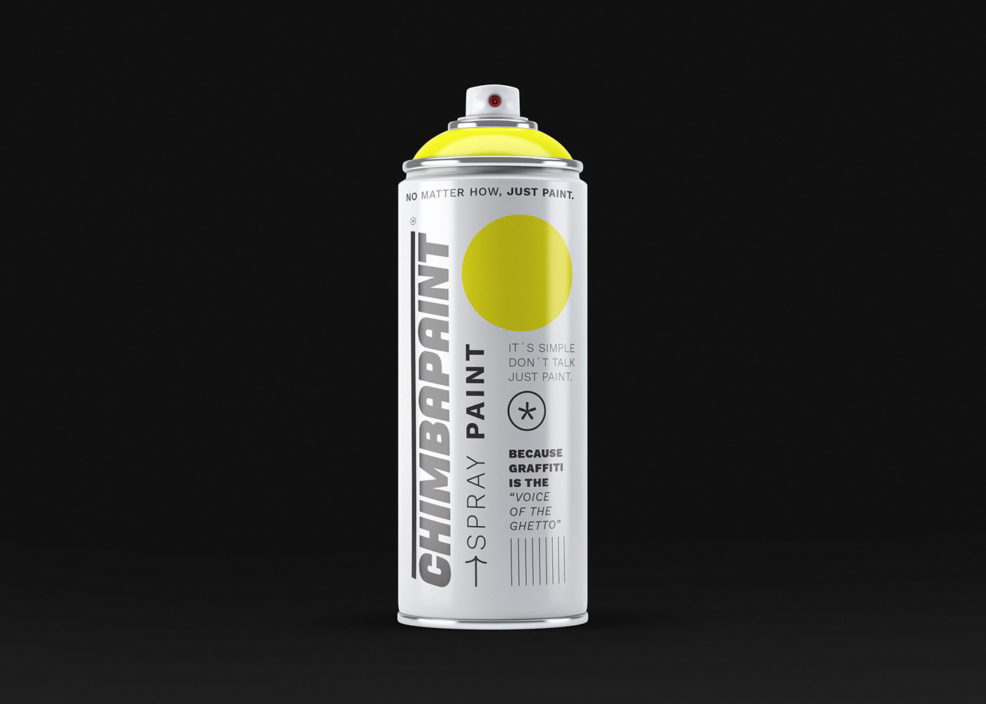
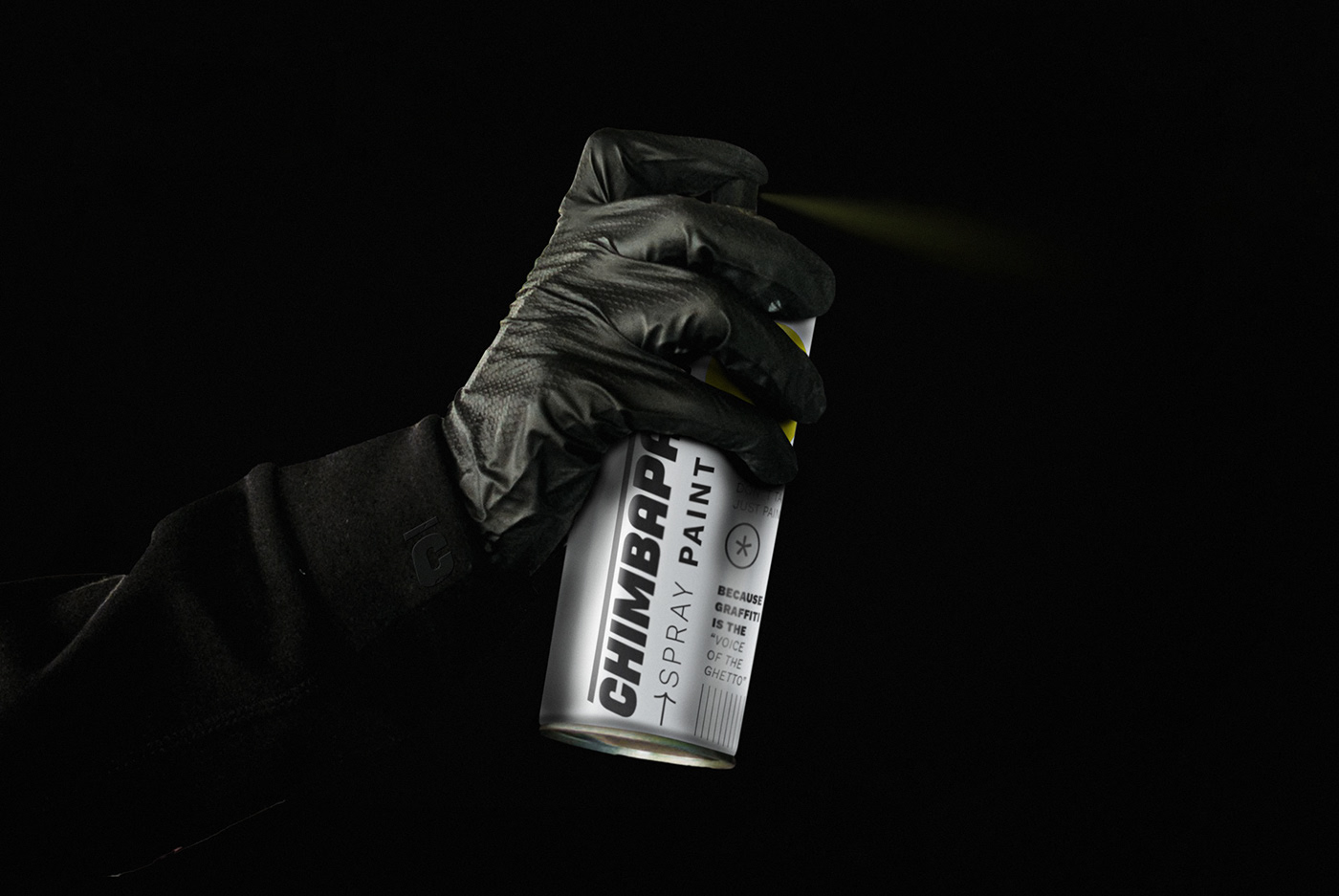
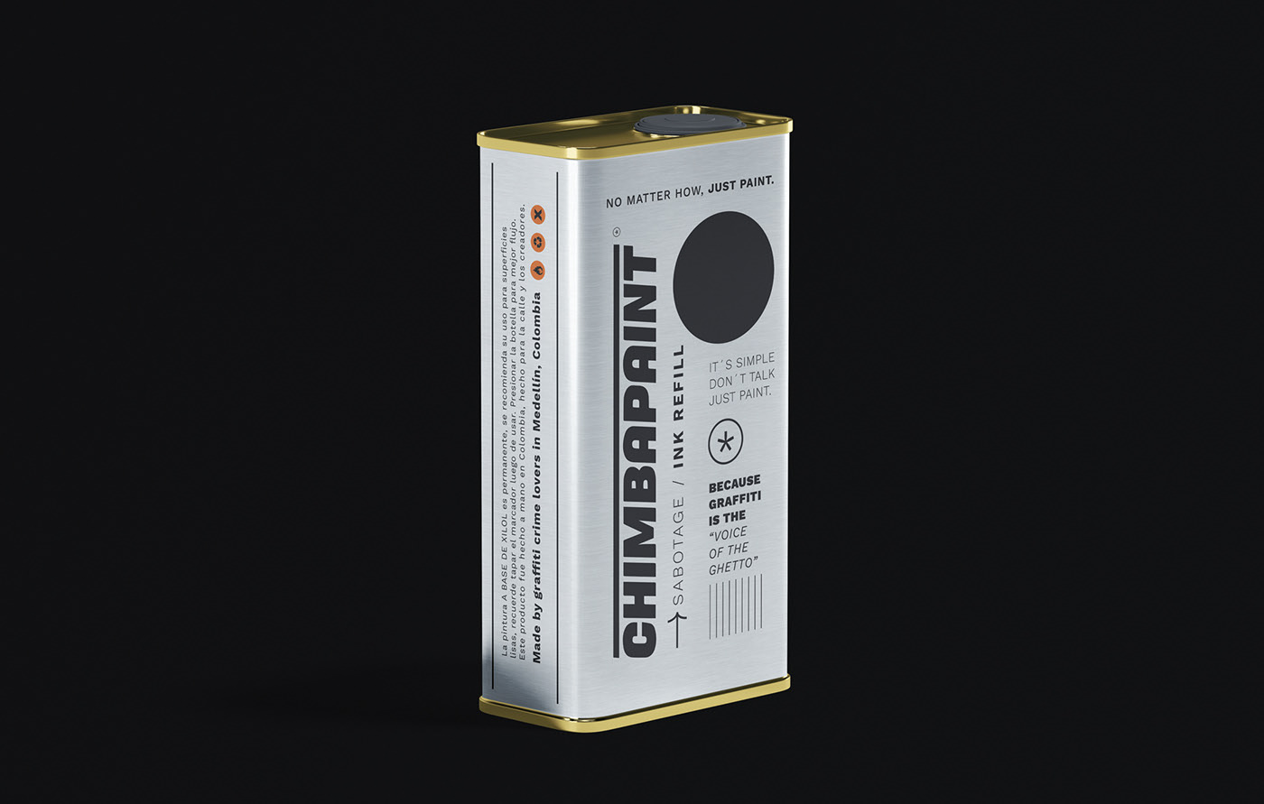
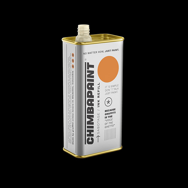
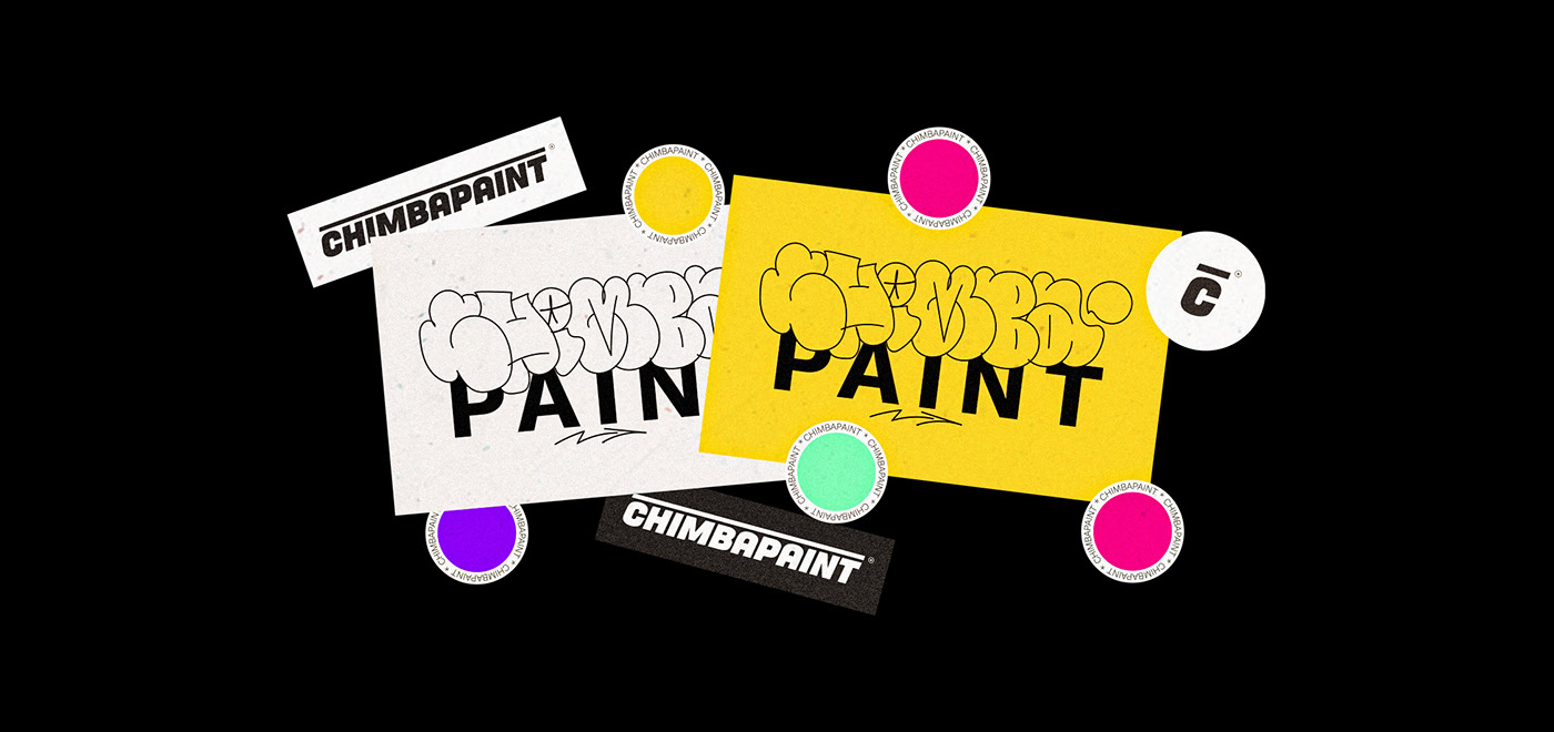
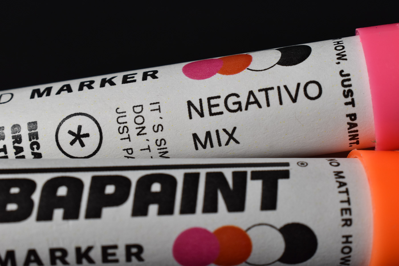
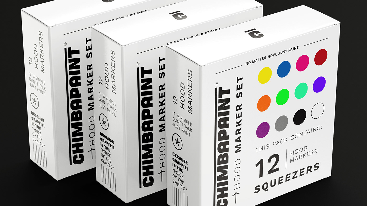
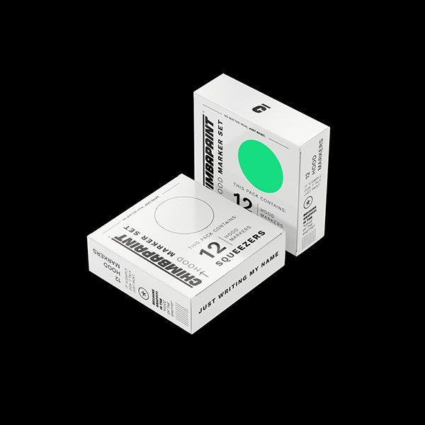
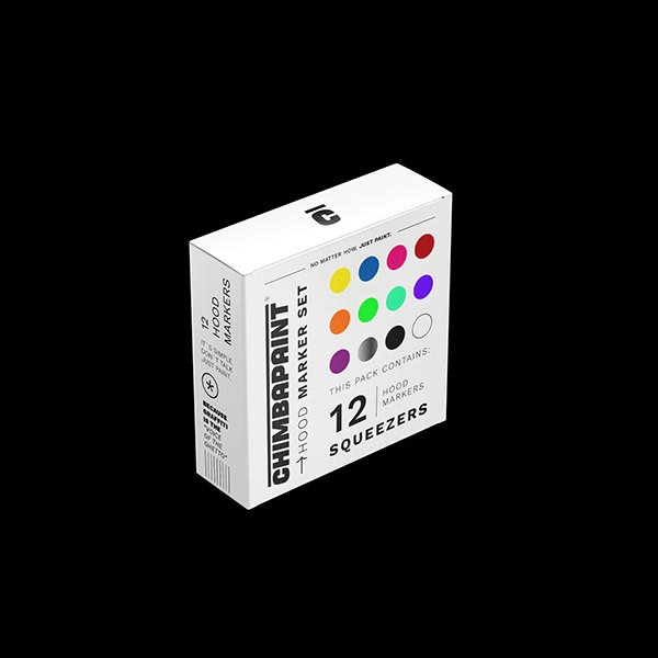
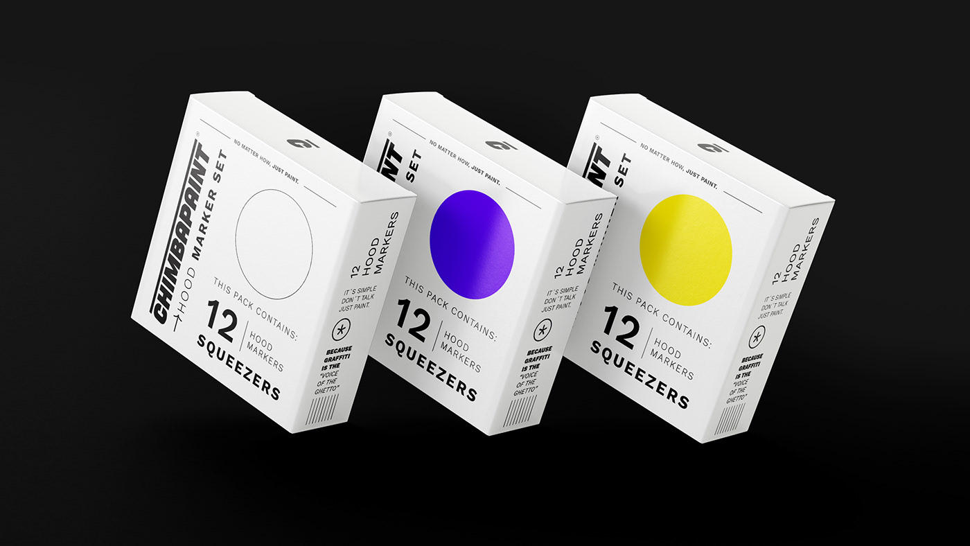
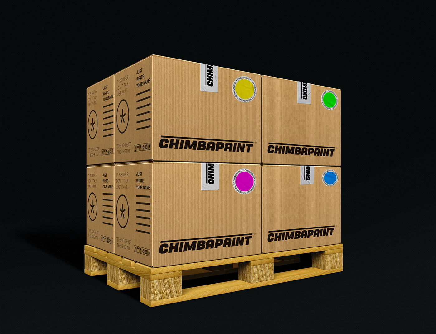
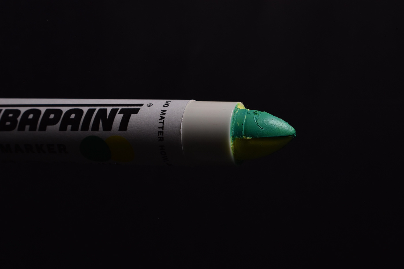
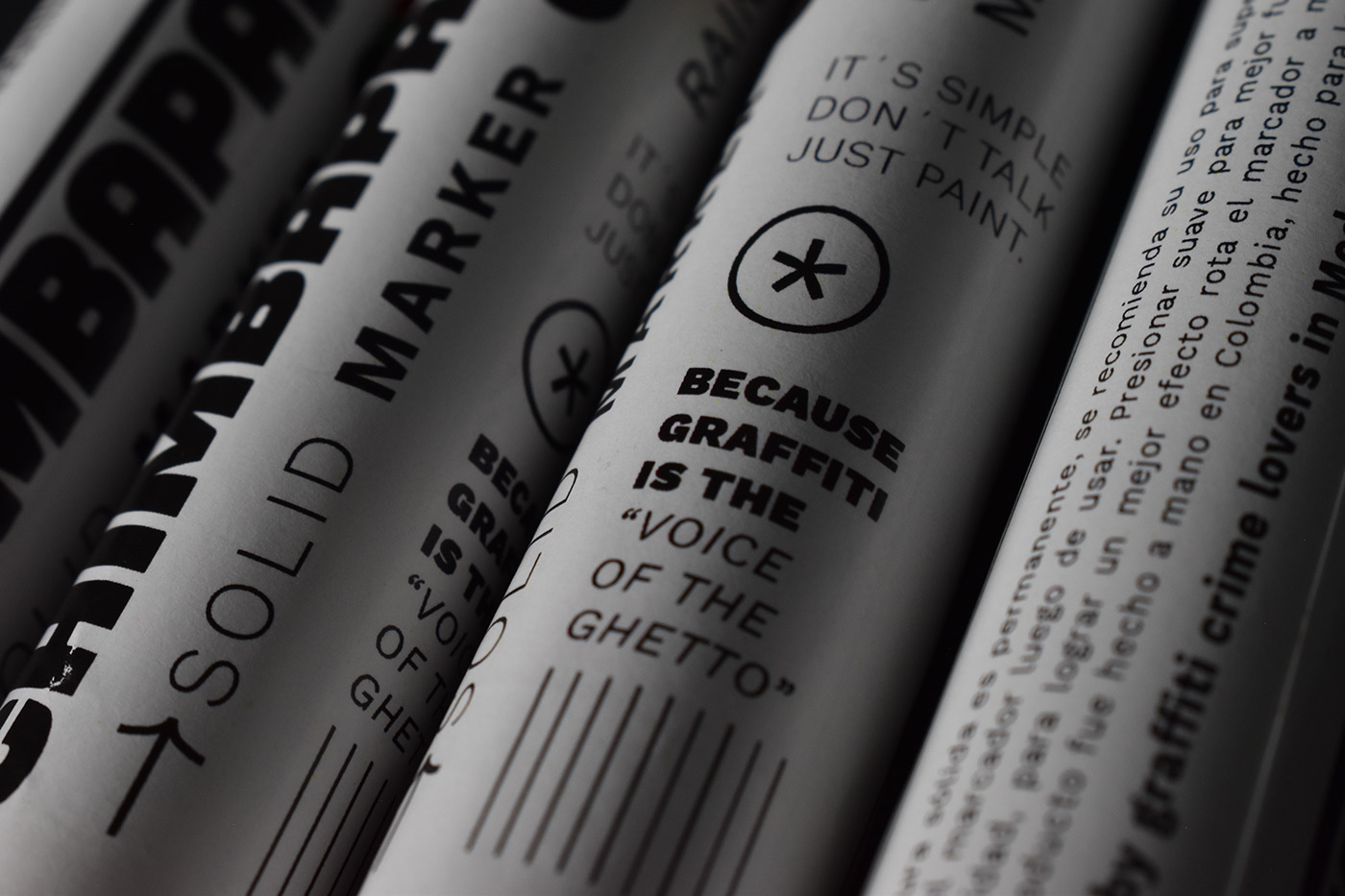
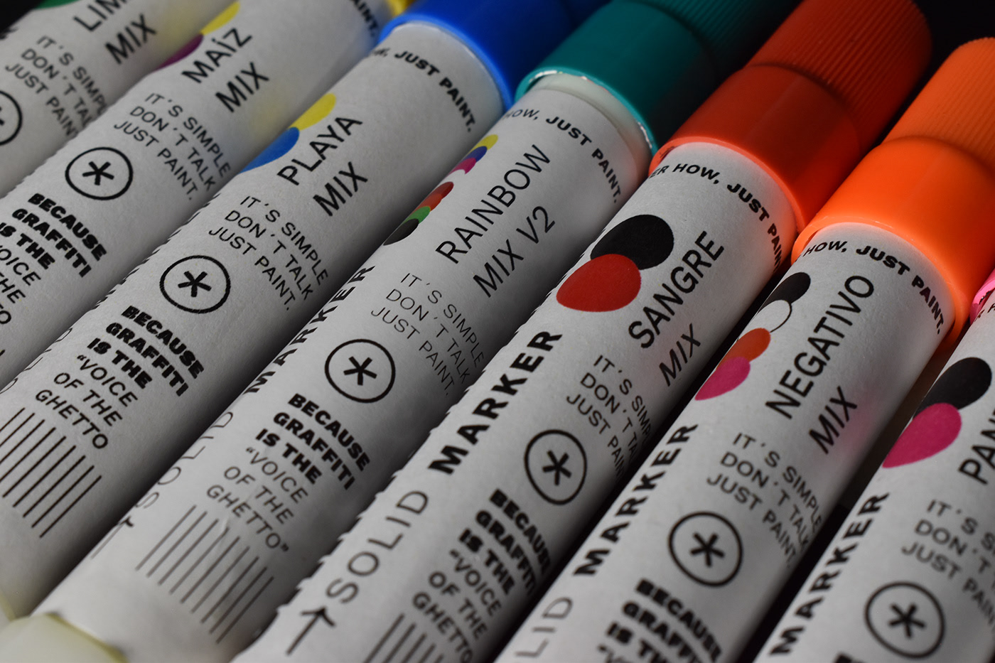
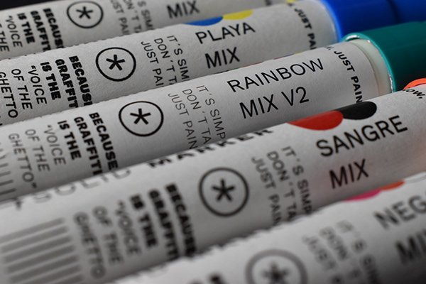
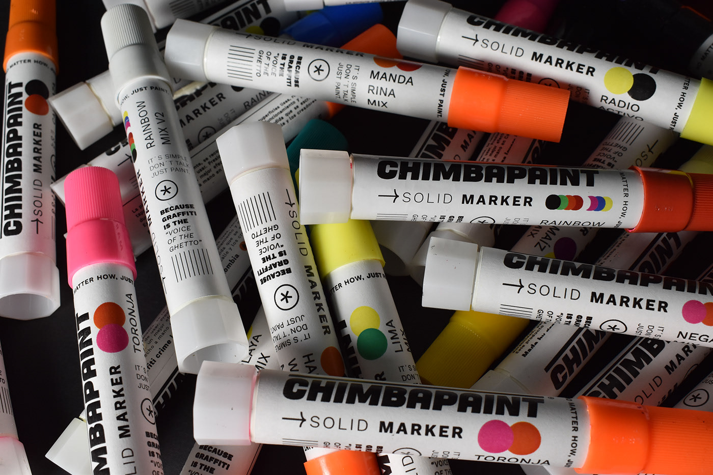
The goal of Chimbapaint’s packaging design was to differentiate itself from competitors at first glance. Nicof Maya is the mastermind behind the design and created the visual system that takes inspiration behind the art of graffiti. The packaging is neat and modest while still maintaining a streamlined look and feel. The color that lies within is clearly stated on the outside of the packaging to allow for an uncomplicated guide.
Chimbapaint is an emerging brand from Medellín, Colombia, which seeks to create through typical elements of the region, tools for high-level graffiti with an international projection.
After investigating the competition, it was concluded that graffiti brands are full of clichés, because the first thing they have done is to use graffiti itself and they have not taken advantage of the possibility of abstracting its most representative elements. Chimbapaint seeks to differentiate itself at a glance, but it was also important to be clear and concise with the product information. To carry out this need it was necessary to be clean, such as an empty wall that begins to be painted or filled with information, in addition, despite the fact that many of its processes are made by hand, now they are looking for a more industrial appearance to compete next to large international paint companies.
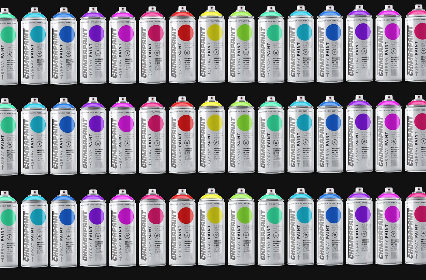
For the development of the logo, the starting point was a bold and simple typography, the most basic element when writing graffiti is the line, which is why it was used to highlight the name. The graphic system is accompanied by popular elements within graffiti taken to their minimum expression, asterisks, stars and arrows are abstracted as the most representative elements when painting. The brand has an industrial look and feel, clean but colorful when it is displayed in the shelving, its cleanliness makes the colors stand out more and this helps decision-making when buying and choosing the product.
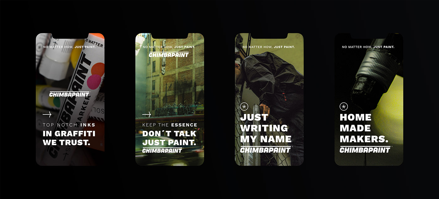
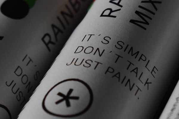
All the colors and names are clearly arranged, in such a way that the coding is almost instantaneous, this was thought due to its wide portfolio of products and its vision of creating many more in the future. In addition, different Copy were created for the deployment of the system and brand communication, inspired by real life stories of graffiti writers, their philosophy and popular sayings within this culture.
