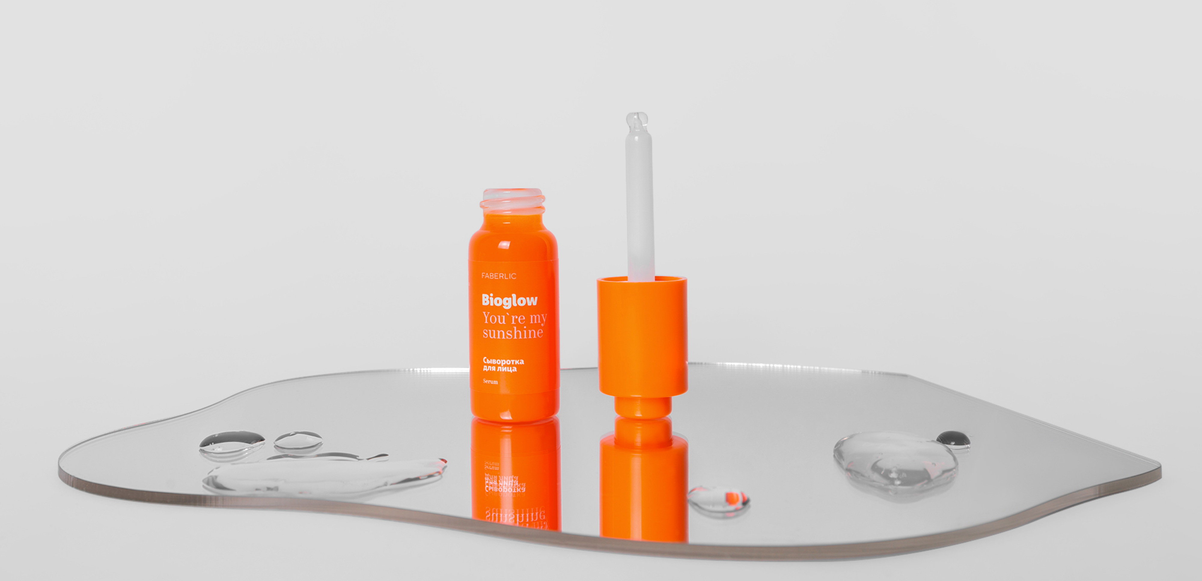
Beauty brand Faberlic’s packaging, designed by Redo Bureau, is artfully orange. The vibrant creamsicle hue is paired with clean and minimalistic typography that’s inspired by street signs. Everything about this packaging is clear and straightforward, leaving room for the product to speak for itself. And while the color orange usually packs a punch, used for this packaging, it’s coming across as more of an effortless neutral.
Since 1997 Russian brand Faberlic is expanding its product range, notoriously finding new ways to serve its customers all over the world. So, when they offered us to create a package for a new line of skincare we were thrilled to jump in.


