The main theme for the natural cosmetics brand IOSSI was “honesty.” The concept is seen throughout within the messaging, formula, strategy, and packaging. Utilizing an extremely minimalistic packaging system allows the authenticity and aesthetic philosophy of the brand to shine through in all its forms. Keeping the bottle and tube white and contrasting it with black typography and a black cap adds a hint of contrast while still adhering to the minimalistic approach. IOSSI is a clean and pure brand in more ways than one.
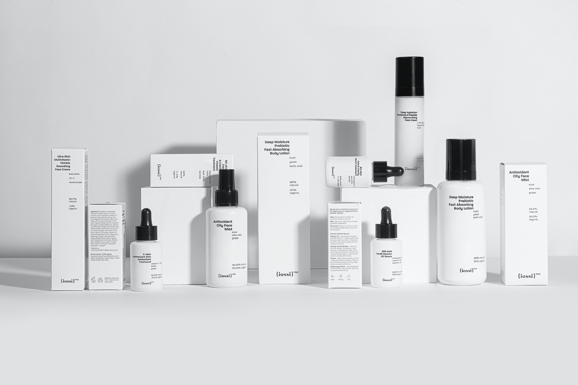
IOSSI is a Polish natural cosmetics brand, appreciated and awarded by numerous trade votes. After creating a classic line of products, which became a customer favourite, IOSSI decided to launch lighter formula cosmetics. Our goal was to design a visual identity and a graphic design of the packaging of the new premium line: IOSSI PRO â plant based functional cosmetics.


