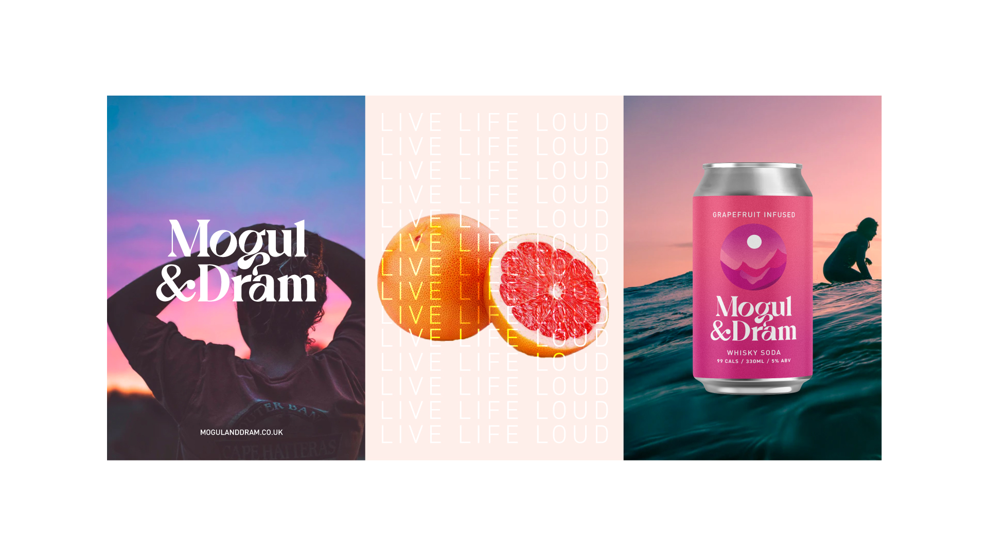
ORCA, the Bristol-based creative agency, designed the colorful and disruptive packaging for the whisky seltzer brand Mogul & Dram. Through ORCA’s research, they discovered that 90% of seltzer brand’s primary color is white. To stand out and ditch the trends, they’ve utilized full gradient color on the labels: yellow to orange gradient for the Lemon Infused and pink to magenta for the Grapefruit Infused. The typographic logo is both simple and refined and features a minute droplet in the “g” to represent the whiskey’s dram. Mogul & Dram’s packaging is flawlessly sophisticated while also elevating the seltzer world’s packaging.
Mogul & Dram is a new, challenger RTD whisky seltzer brand, born out of a love for adventure and promoting a healthy, active and balanced lifestyle. At less than 99 calories, and made with natural fruit flavouring, Mogul & Dram is a healthier, sugar-free alternative to most hard seltzers and soda mixer drinks available on the market today. Younger generations are demanding healthier, more convenient alternatives to fit within their busy, active lifestyles.
A new wave of British brands, including Mogul & Dram, are daring to challenge conventions by disrupting these age-old spirits categories. With consumers more attuned to what they are drinking and more curious about process, Mogul & Dram wanted to created a brand and a range of products which were transparent and honest about their values, ethos and processes. Leading with whisky was a bold move, but one that the founders new worked, having explored a similar Soda based drink called a ‘Suntory Highball’ while visiting Japan in 2019… and so Mogul & Dram was born.
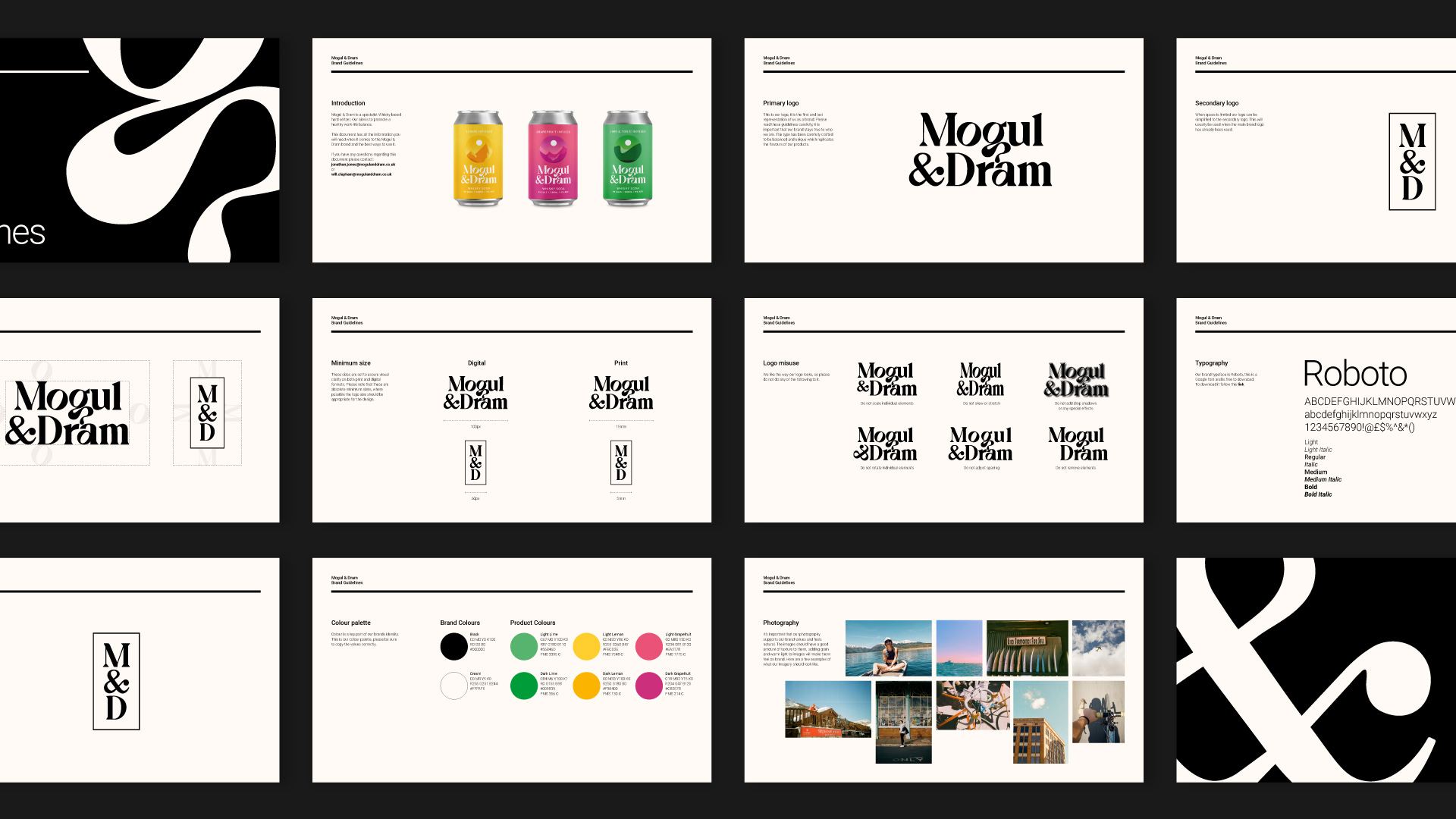
Originally an unnamed brand, Mogul and Dram commissioned ORCA to develop a name, refine the brand story and develop their full brand identity, alongside a suite of packaging for their initial drinks range. Breaking down the name, Mogul relates to the two founder’s love and shared interest of skiing, while also portraying the constant hurdles and challenges faced in life and how we can overcome them by exploring new experiences. Dram is a measurement of whisky, or the idea that a drop of something new and exciting adds balance and intrigue to your life. With the brand name set, ORCA went about developing a visual identity to help propel this new challenger product and launch it into the market.
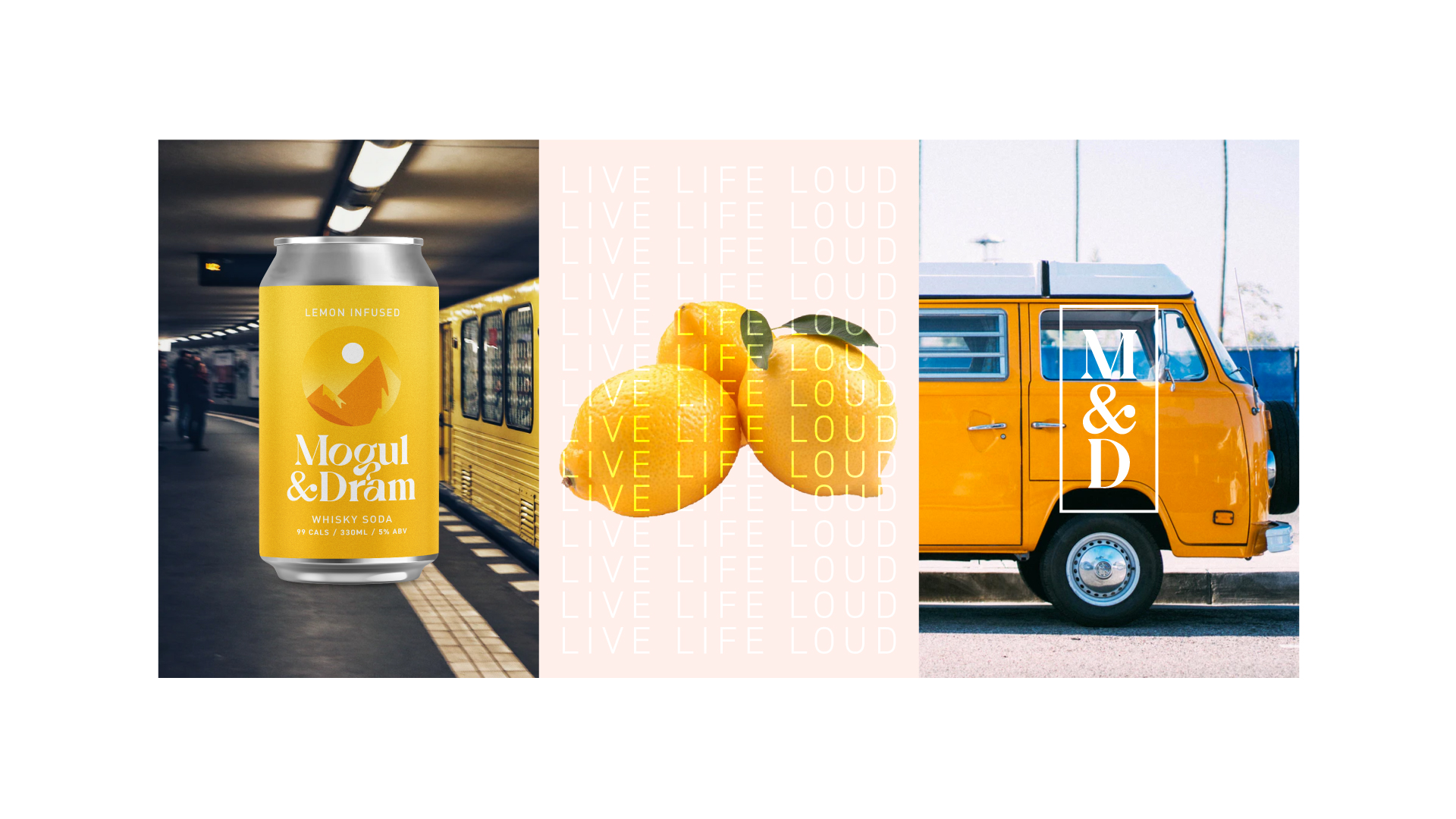
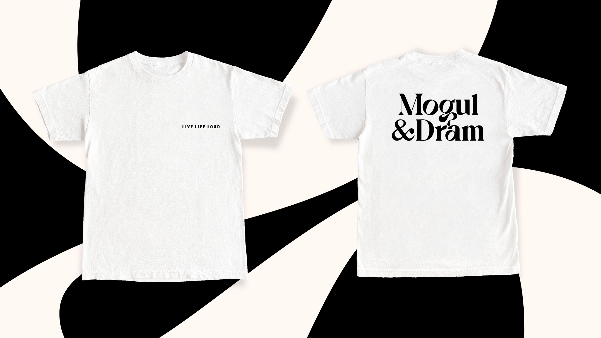
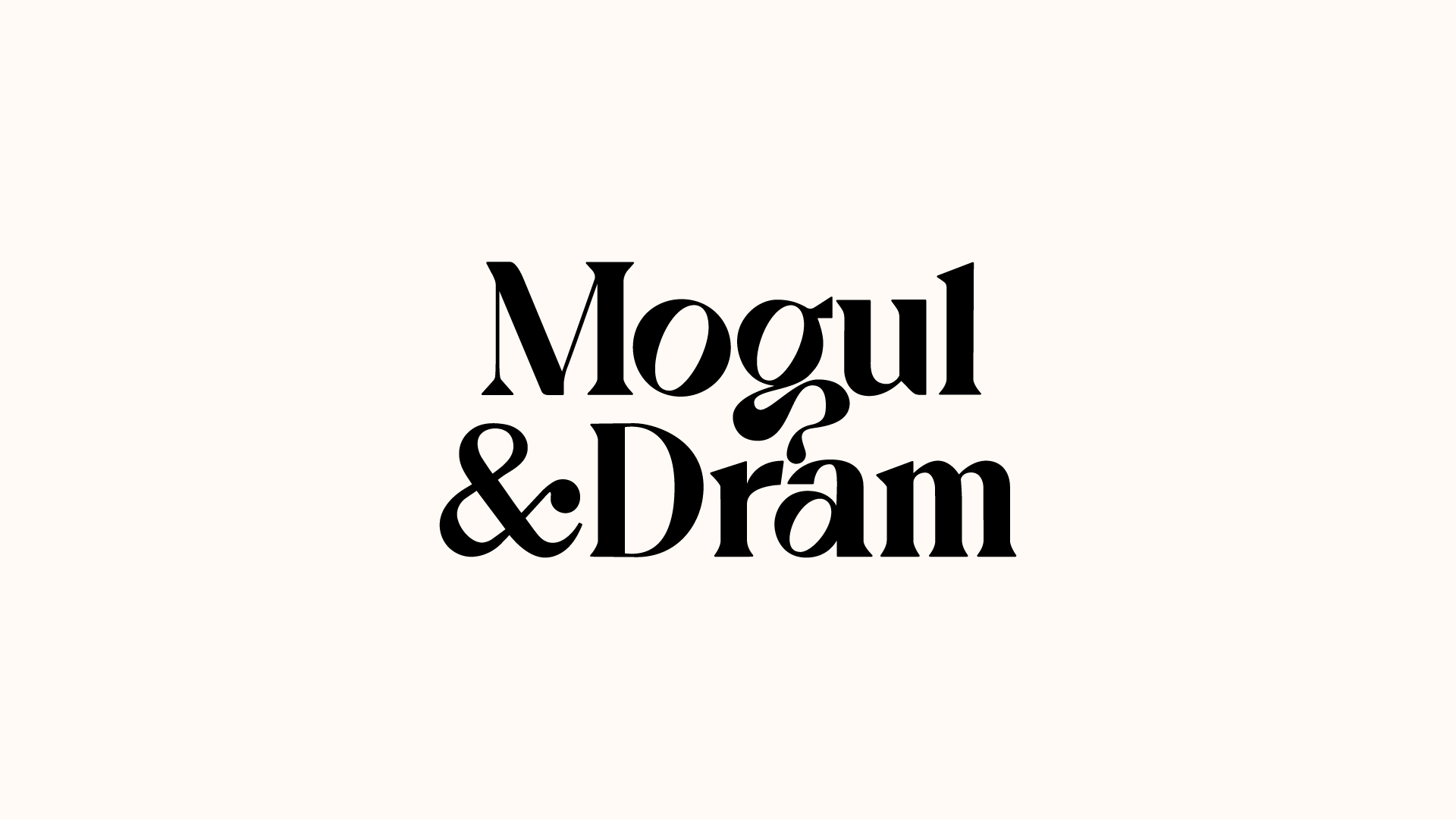
We wanted to create a modern representation of a traditional whisky brand, utilising a hand drawn, custom typographic logo which is both elegant and sophisticated while also being playful and progressive. The logomark features a subtle droplet within the ‘g’, to represent the dram of whisky. Leading with the slogan LIVE LIFE LOUD, we created a series of illustrated scenes which represent adventure and experience, while offering a subtle nod to the brand’s namesake. Through our market research we noticed 90% of seltzer brands lead with white, so we wanted to buck the trend and really stand out by championing full gradient colour on the labels. The new brand is a creative translation of where two worlds collide to create balance.