The clay studio, Green & Bique, recently rebranded and needed packaging to match. Because they’re already an artistic and creative company, it only makes sense that the packaging would match. With unique hand-drawn patterns and eclectic color palettes, this Pasadena-based studio is doing everything right. The boxes alone tell a welcoming, creative, and whimsical story, further proving the power of packaging.
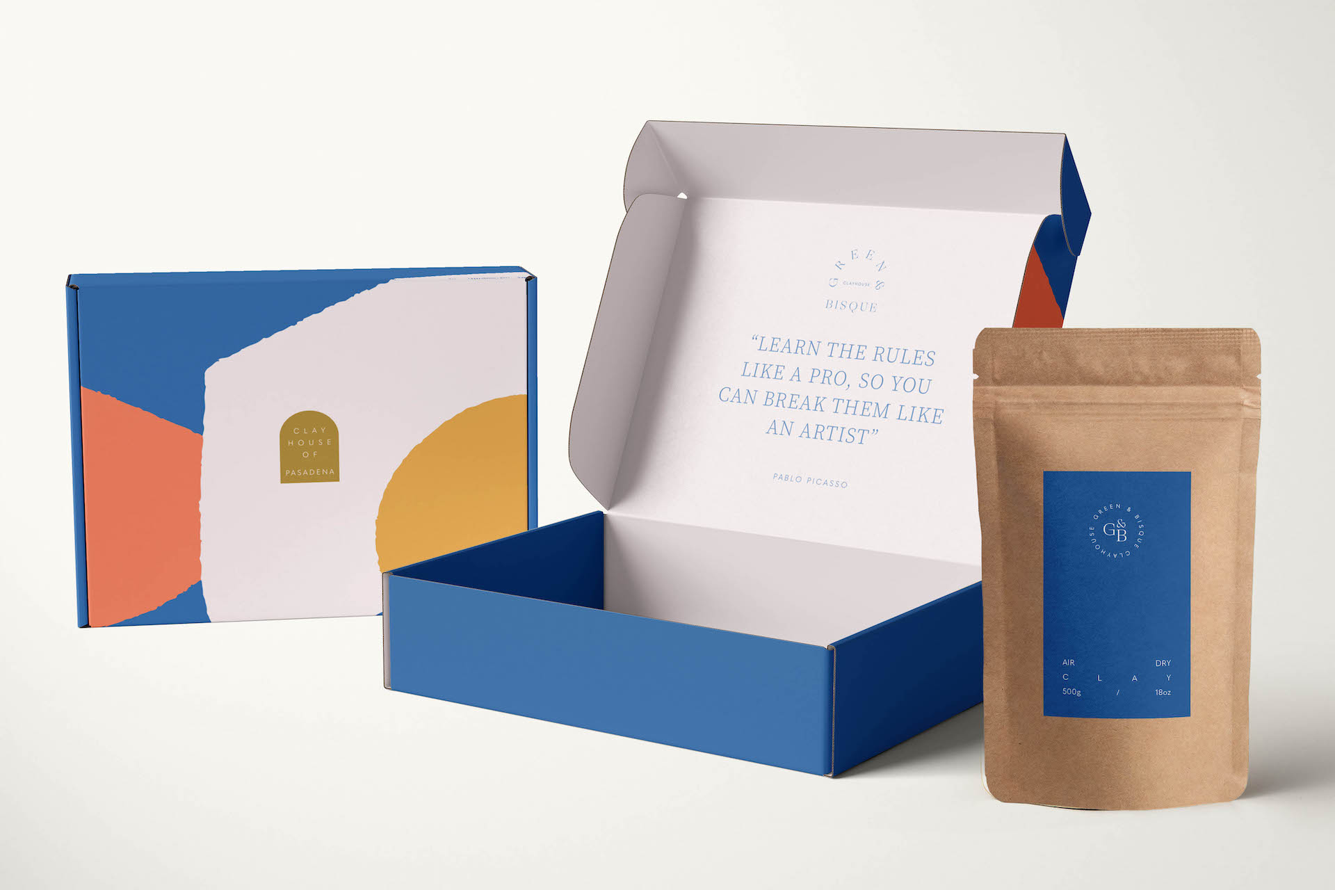
Green & Bisque is a gold standard clay studio based in Pasadena, USA. Having come under new ownership, the complete re-brand included developing an identity that felt playful, welcoming, warm and unique. We created a range of hand-drawn patterns to bring an artistic and creative soul to the branding, and looked at unique ways to visualise the logo across different platforms, embodying a sense of professionalism while welcoming people from all works of life to experience the clay studio.


