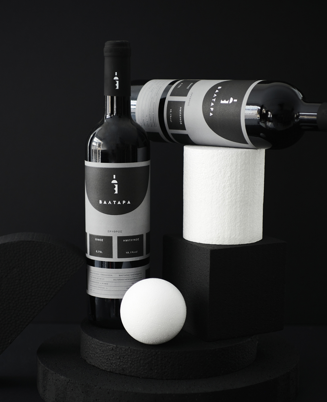
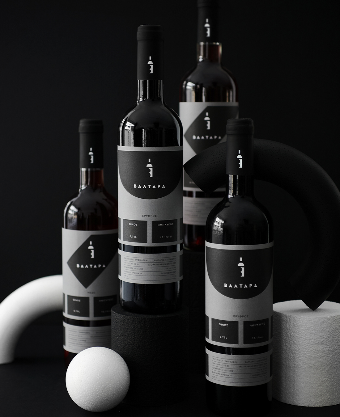
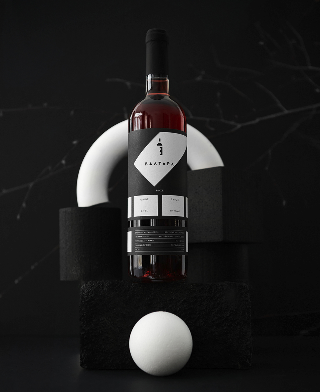
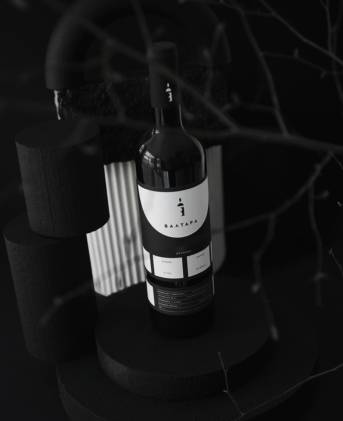
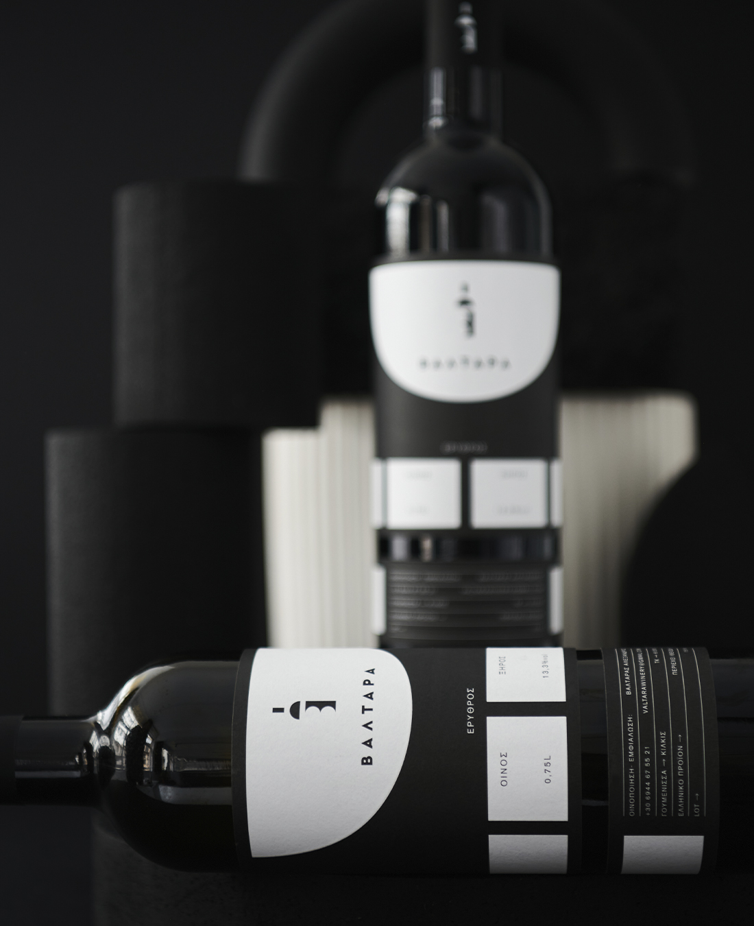
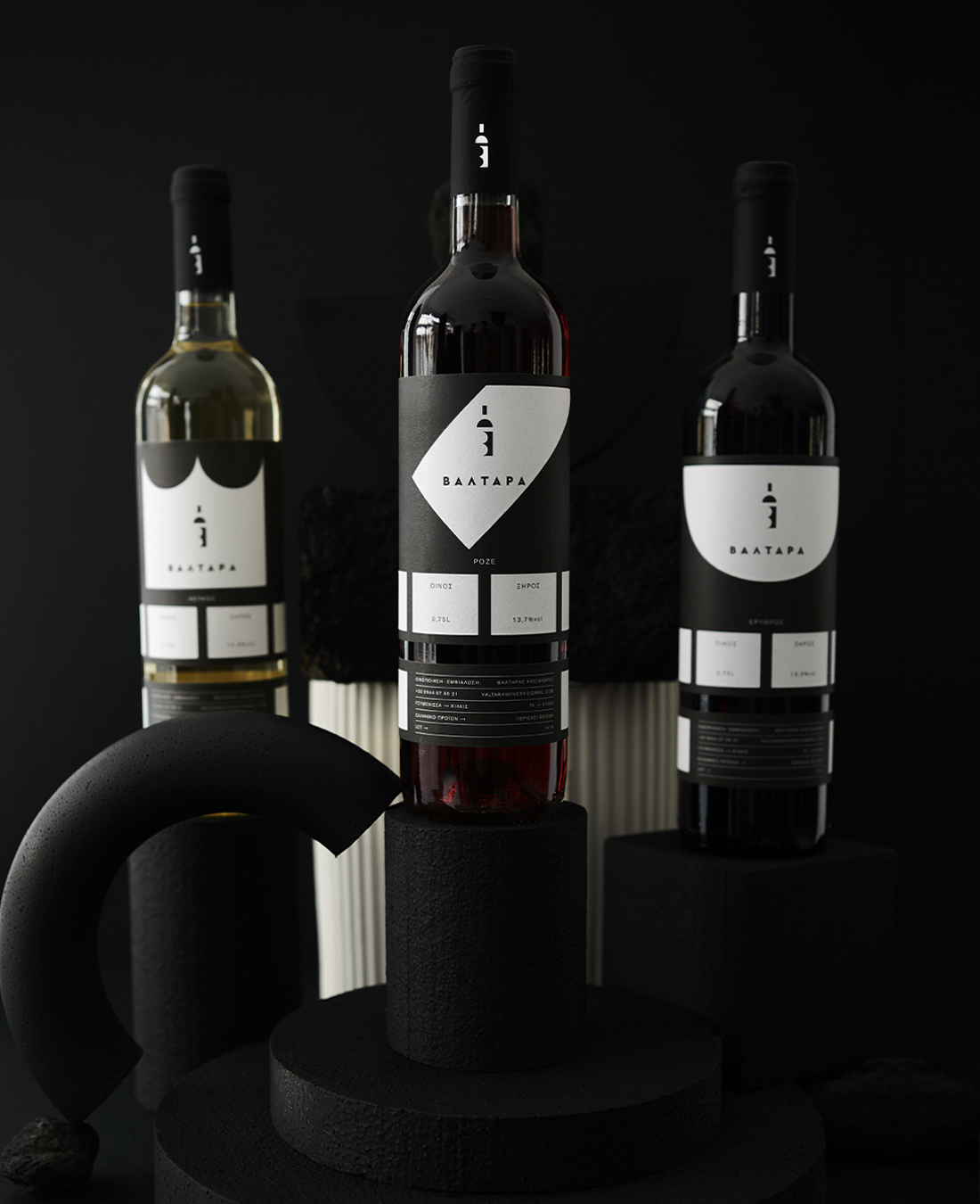
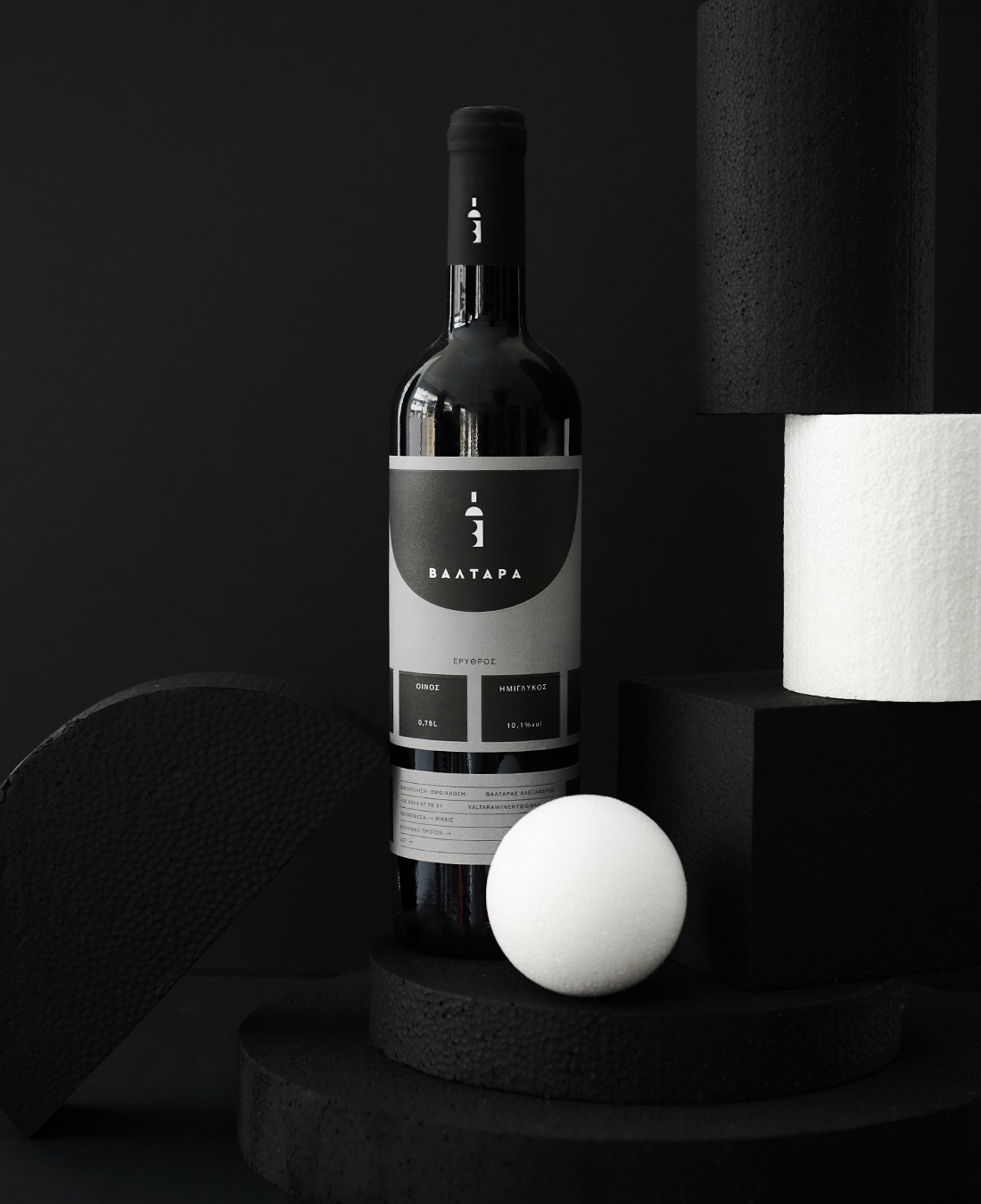
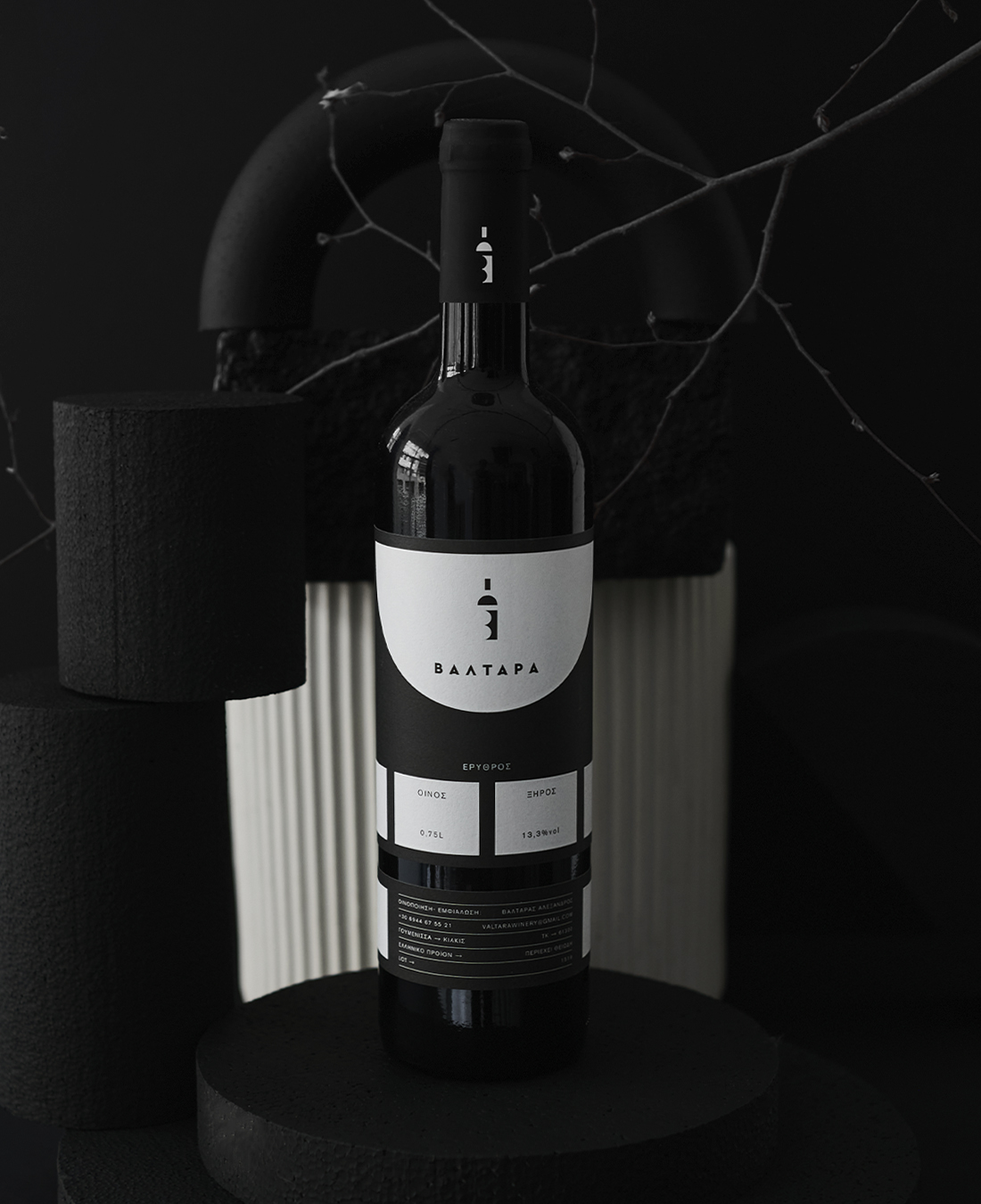
The VALTARA wine series features minimalism at its finest. Nothing is cluttered about this bottle, with a simple black and grey label to a purely geometrical logo. It’s delicate but also bold. It balances the finest details flawlessly and truly makes you wonder about each of the five flavor palates in the collection. Many wine labels give some emotion or thought process away, but this series is as mysterious as it is luxe.
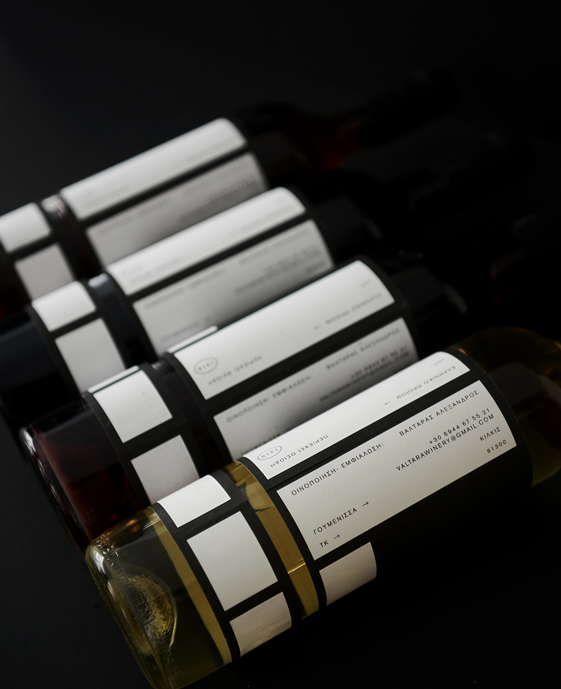
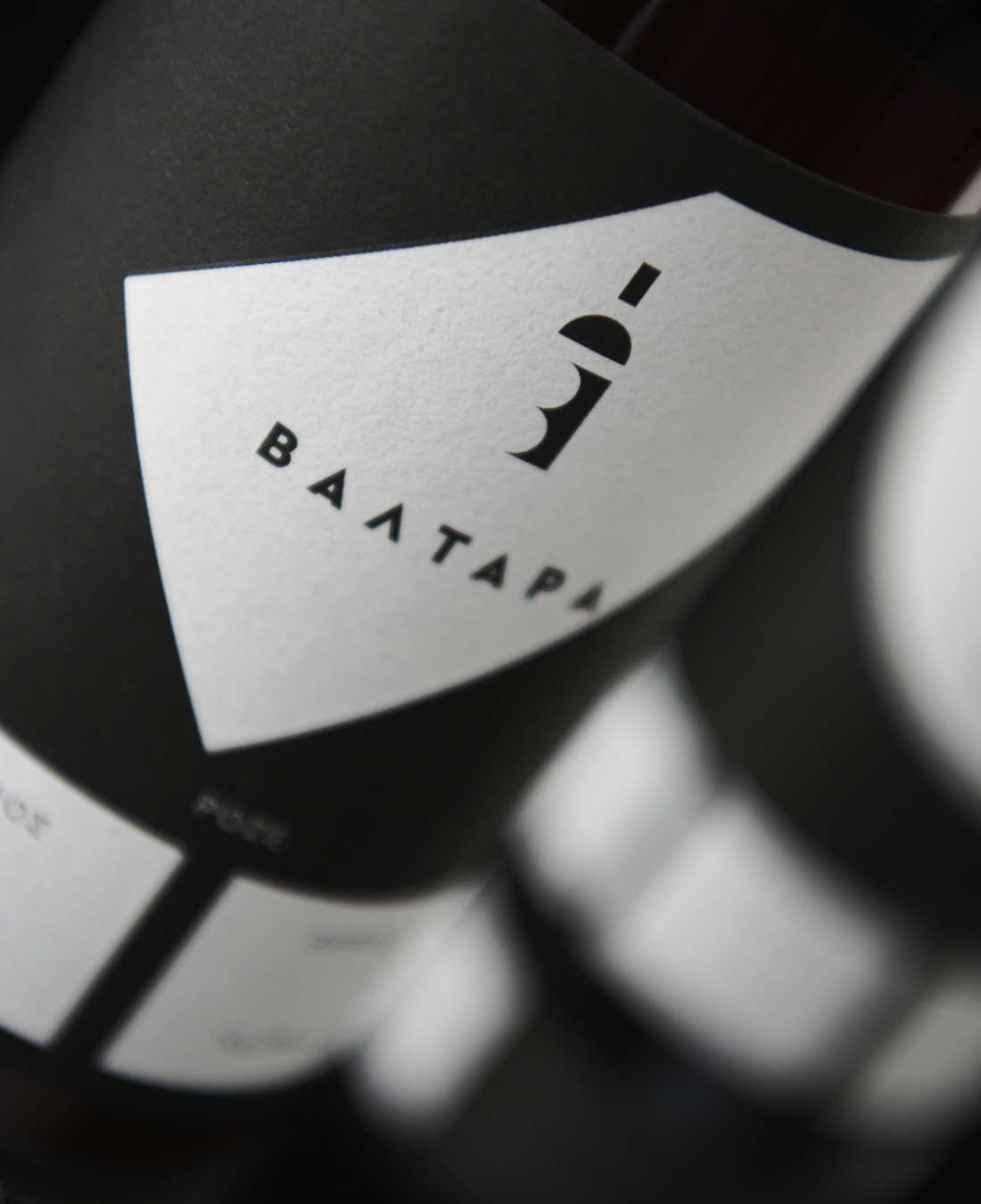
The design of the Valtara package is a design solution based on both minimalism was chosen (in sequence with the logo) as well as in the art of typography.
Regarding the design of the labels for the VALTARA wine series, a system based on the number of bottles was selected (5 bottles) as well as in both different types of wines (dry – semi-sweet).
Based on the above, a 5-point system was designed, in order to separate both the space and the creation of visual elements. In any case, we keep the bottom grid of four, with the fifth to give way to one of the 3 elements of the logo.
The uniqueness of this series of labels is created through the design grid in combination with the parts of the logo, giving the consumer the feeling of a very dynamic and careful label that raises the bar in the product.