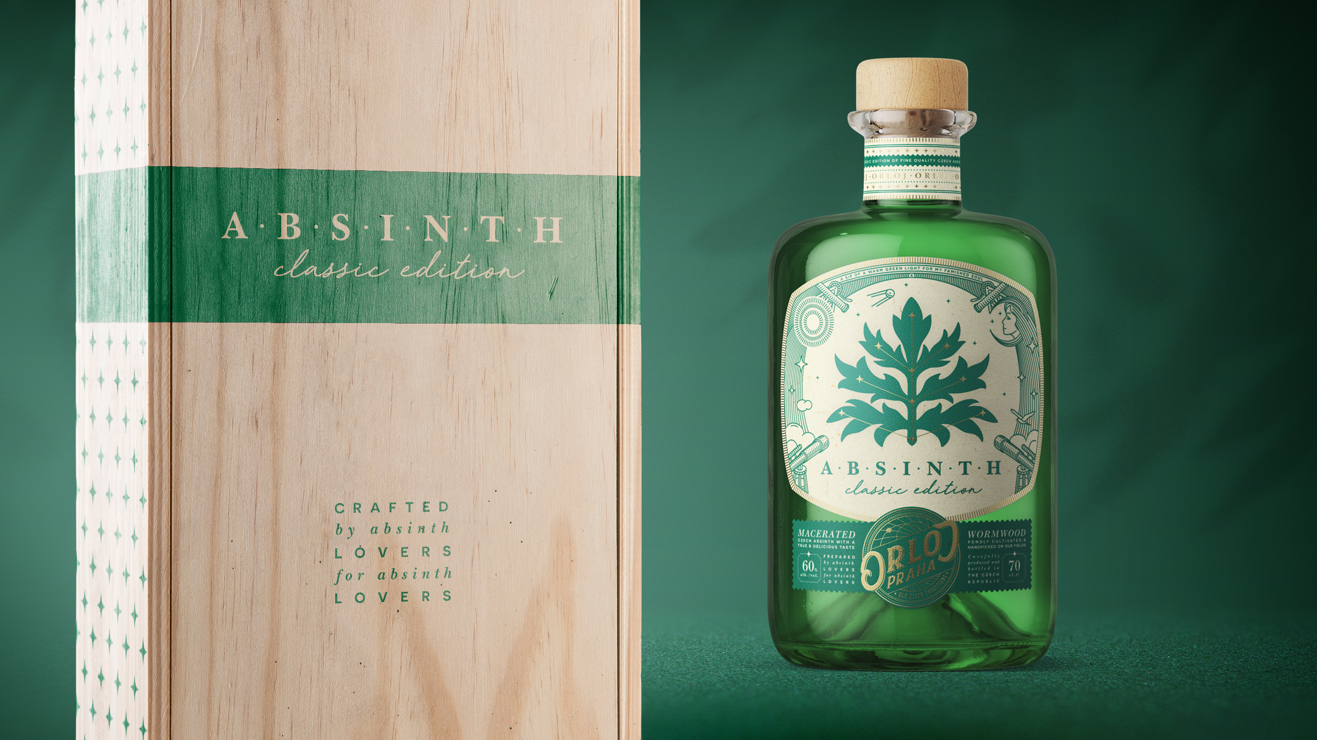
When it comes to absinthe, mysticism reigns deep within. With absinthe comes the hallucinations, and tourists often visit the Czech Republic to see their effects. Orloj has developed two types of absinthe, one classic and one distilled version. Designed by Amoth Studio, the focus was to keep the brand soft, mystical, and natural, and the intricate and otherworldly border illustrations balanced with the oversized wormwood leaf paired with sophisticated typefaces that flawlessly executes the goals. This absinthe is a premium product based on its packaging alone, and although I’m not one to wish to hallucinate, this Orloj might convince me otherwise.
It is not a secret that the Czech Republic is famous for its absinthe. Plenty of tourists come here every year to try this mystical beverage. Prague, the capital of the country, is known for its astronomical clock, Orloj. It was installed in 1410, which makes it the third-oldest astronomical clock in the world.
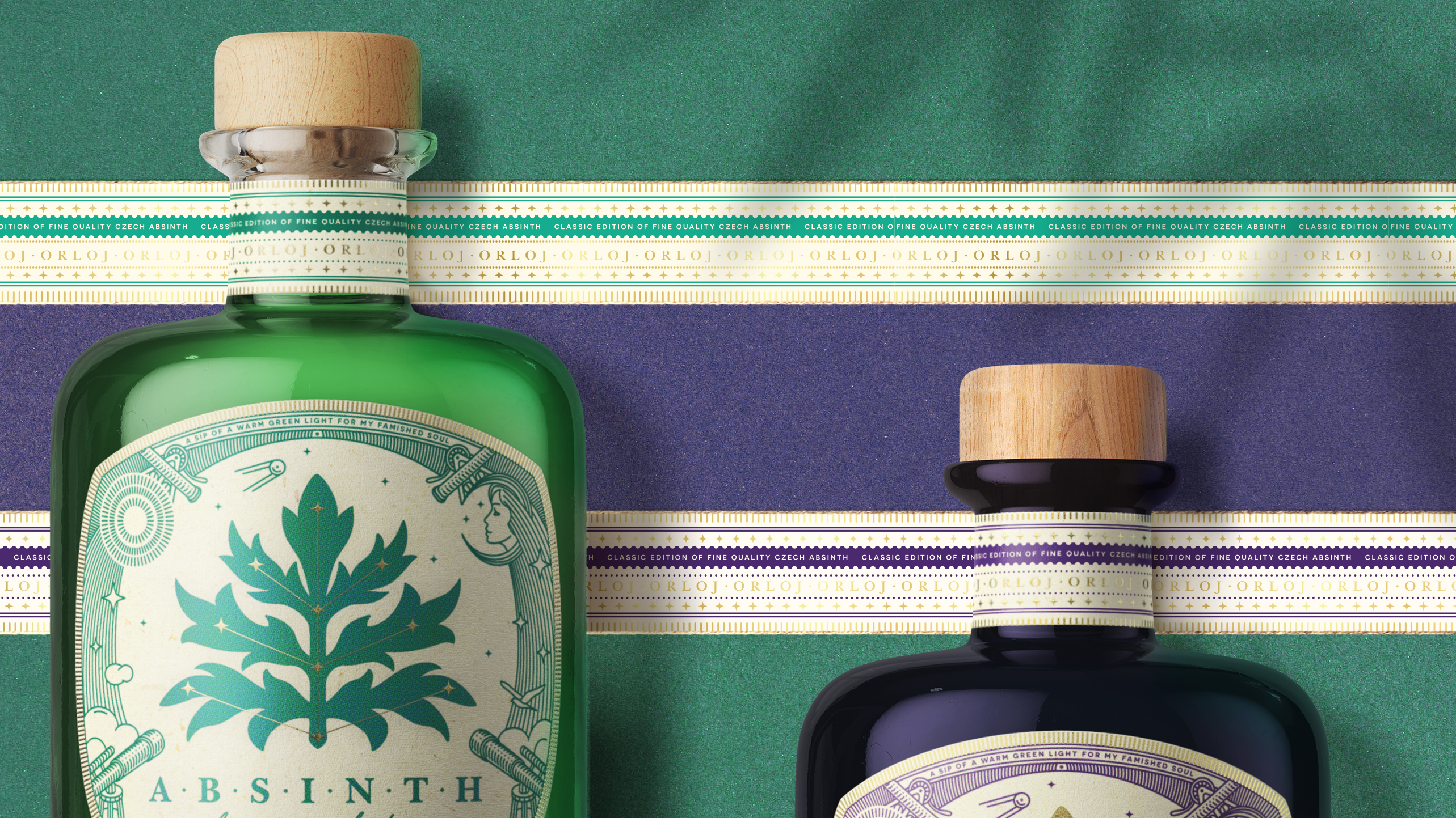
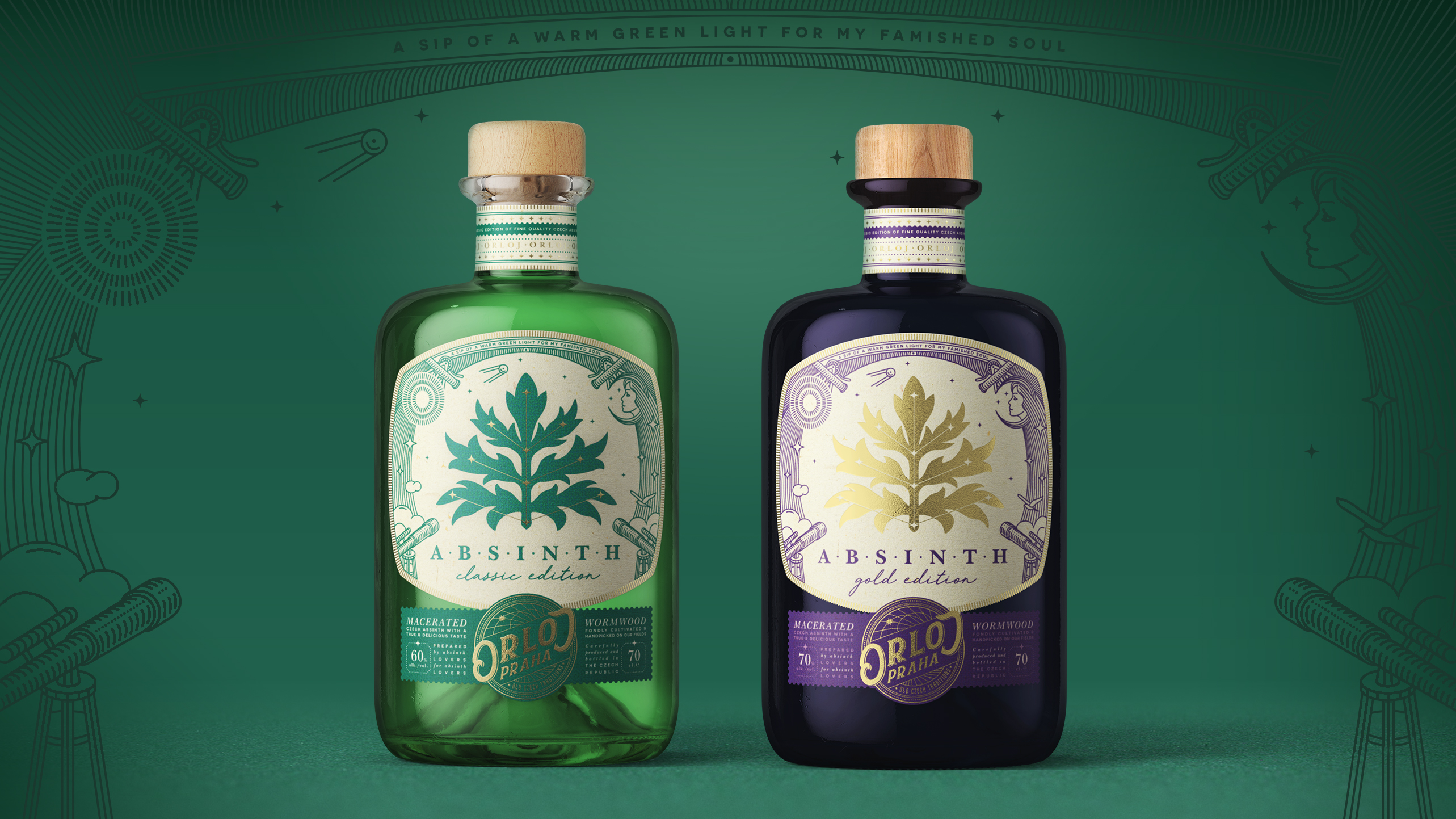
Once two alcohol producers decided to collaborate and craft a new high-quality edition of absinthe. They brought the traditional Czech absinthe recipe and the medieval symbol of the capital together – this is how new astronomical absinthe called “Orloj” appeared. It was decided to craft two editions of the beverage: classic (macerated) and golden (distilled) one. Our task was to create a product logo, label design, and basic visual identity for the product.
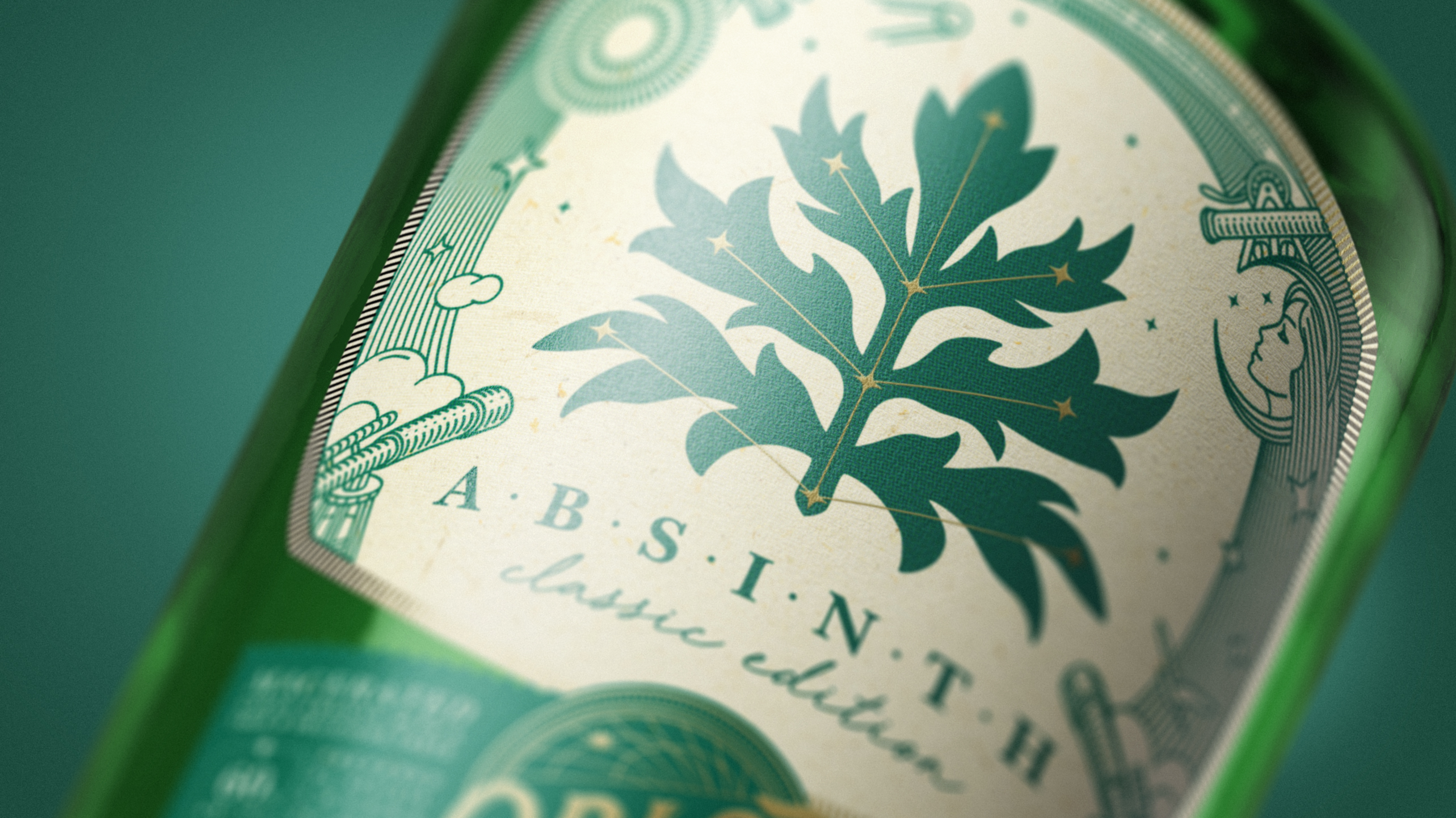
The body label is divided into three parts. The first one establishes the mood of the label, the second contains all the technical information and works as a color identifier of the edition, and the third one forms the logo block, which connects the other two parts. The central area of the label is dedicated to the main theme of the product: astronomical absinthe. It is represented by a wormwood leaf surrounded by the constellations in the starry sky. This composition serves as a metaphor for the discovery of a new product in the universe of absinthe producers. The linear style of the illustration was chosen to support the sense of an astronomical study of the product. Simplicity and minimalism suited the visual identity of the brand well.
Prague clock, Orloj, has very specific details in its construction. These details have become the elements of the logo block, connecting the upper and bottom parts of the label.
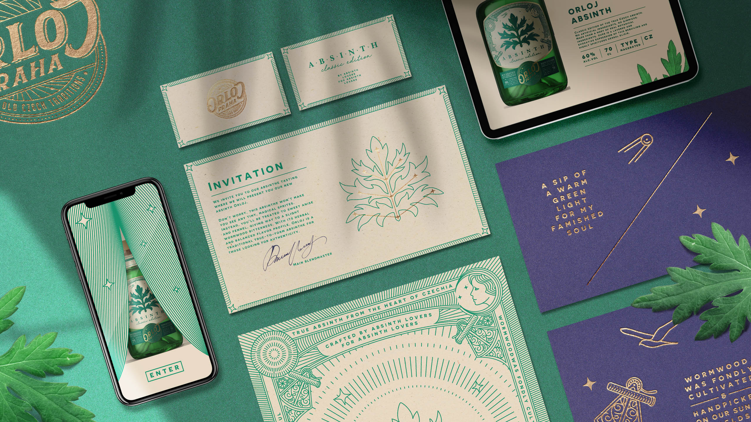
The brand’s visual identity is based on the label elements. Three main colors (forest green, night violet, and sand cream) create a deep yet soft atmosphere of mysticism. The choice of natural and crafted materials emphasizes the premium category of the product.