The Labelmaker is transforming a unique story into a memorable and robust wine brand known as Downtown Urban Winery. This label truly showcases its history through its name, iconic gilded design, and the illustrated houses featured front and center. The design’s purity is overwhelming in history, allowing for the focus to be where it should. The details within the gold foil are absolutely breathtaking, and it’s always fascinating to see how a brand story can genuinely come to light through something as simplistic as an illustration on a label.
Like many of my projects, this one started with a phone call from Vesselin. I knew about his project already from a very dear friend who recommended me and my work to Vesselin. They are a team of 4. They have their vineyards and a small craft winery based at Sliven city center. The building they renovated has been used for more than 30 years for a carpentry workshop run by Vesselin’s Grandfather. So much about the story and history – 4 friends, city center location, old carpentry, craft wines, own vineyards – probably couldn’t be more interesting!
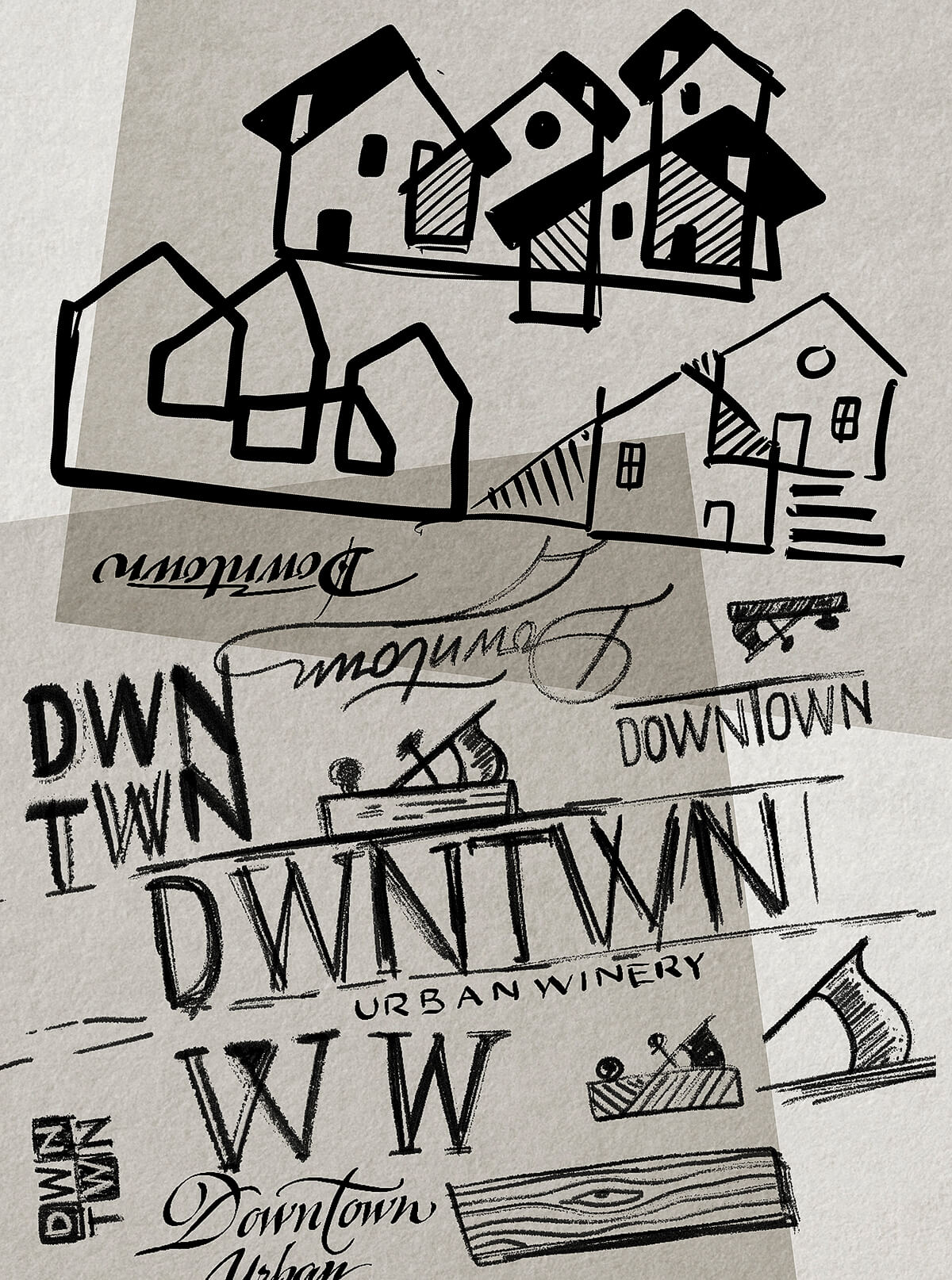
Initially, I started to think of a wise and respectful name; then, when I thought more carefully, I said to myself – Hey, these guys have a unique story; it would be petty if you don’t use it! I decided to focus on their location, the carpentry – all those things that are so unique about them – and this is how the name came out. Located in the downtown of Sliven means only one thing – this is a downtown winery! All true. I first wanted to name it Downtown Sliven Winery, but then I decided to replace ‘Sliven’ with a more fashionable word, ‘urban,’ and my final proposal was Downtown Urban Winery. There were plenty of other ideas we discussed with Vesselin, but this one was mainly obvious, very true, and very memorable for the audience, so we decided to use it.
The brand name creation and logo design for me was one workflow. Once I get a clear idea of how to name the winery, I was 100% decided how to proceed with the logo design to create a short version of this long unique story. The winery name was already done, and I wanted to focus on the logotype. I was looking for a very recognizable image related to carpentry and woodwork.
First, I thought about a logo based on workshop building but ditched this idea very quickly. Then I stumbled upon a vision to create a logo and label based on saw image. I even designed them but never showed them to my client. Then I started looking for something both related to woodwork and refinement. From that moment, I decided to focus on the smoothing plane. It was a perfect choice as it has a very recognizable familiar silhouette, looking memorable but straightforward, and it was one of those hand tools used for precise wood smoothing. I then took a thorough search through the Stanley database, and I was inspired by their smoothing planes. My task was even more apparent from that moment, and I started to create the Downtown logo based on my smoothing plane silhouette, trying to keep things simple and recognizable.
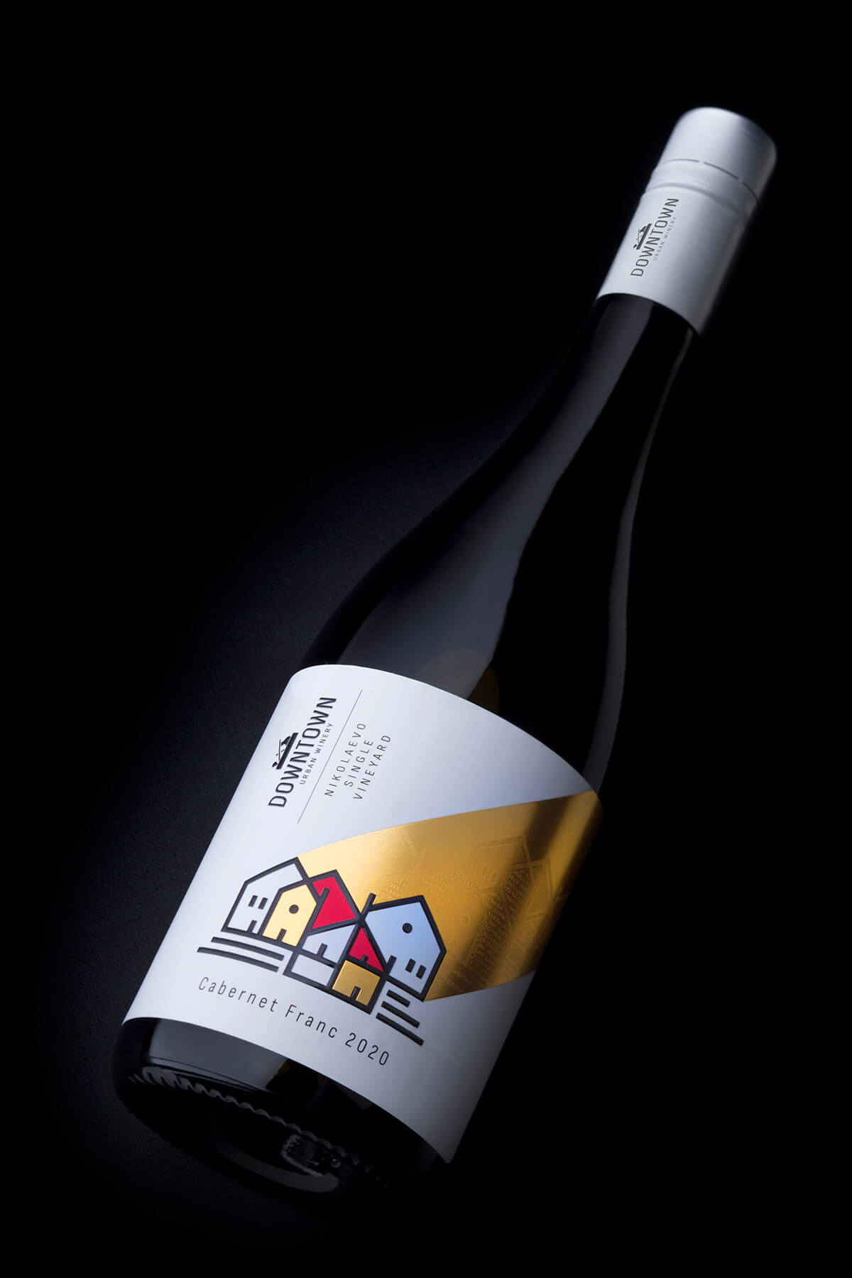
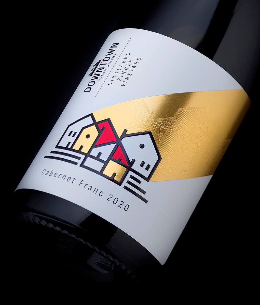
Like always, the label was the most exciting part to me. It is exciting to design a wine label after creating a winery name and a logo. The label is the place where all these elements unite and start to live as a family. I always try to make very memorable labels that carry a special message, which stands out. A unique thing in this project, from my point of view, was the winery location. Usually, wineries are in the vineyards or somewhere close around them. We had a unique exception, and I wanted to use it in my wine label design. Sliven is a small town in Bulgaria, and classic tiny houses with traditional roofs dominate its urban landscape. Being located close to one another in combination with narrow streets and small yards creates a specific crowded atmosphere which I decided to use. I did dozens of naive elementary sketches of houses on my Ipad, which I did on paper when I was a kid.

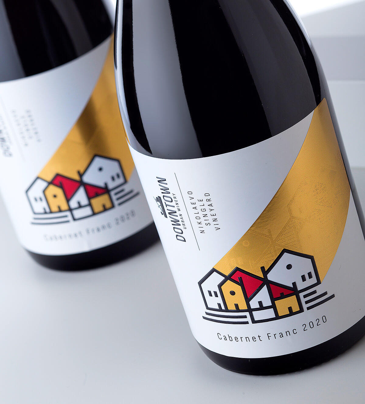
What made my homes unique and different was that I found a way to intersect one home with another and create various artistic elements, which brought my simple picture to life and reflected this crowded feeling I mentioned above. The outlined silhouettes of all houses were printed with black and overprinted with high build raised varnish to shine and reflect the light. I also added a solid element printed with hot foil going from the rooftops towards the label’s top right corner. This element was crucial because it was stamped with different hot foil to make the color difference between the wines inside the range.
Additionally – and this is something I feel thrilled and proud of – I decided to make this hot foil figure even more interesting without being annoying and competitive to the house’s illustration. I decided to modify the composition with the houses and use the micro-embossing effect to implement it inside the hot foil. Micro-embossing creates unique and delicate engraving effects on the foil’s surface, making it reflect the light at different angles. So when you get the bottle in your hands, these reflections start to work, and you begin to see this hidden cityscape inside the foil. The Result
Downtown was a very exhausting but also exciting and challenging project. Starting from ground zero and finishing with brand naming, logo design, and finished wine label was and will always be an Olympic marathon to me. I love requests like that.
What I was aiming at in this project was to create something very recognizable and memorable, and at the same time, I was looking for a way to use simplicity and transform it into rich complexity.
The wine label is the final element of this process where all other elements meet. I played with high contrast, solid foil reflection, and fabulous paper material that helped me create a unique harmony of colors and embellishments. Printing this design was a real challenge, too, and it took me a lot of time & effort together with the Daga Print team to bring every detail to absolute perfection.
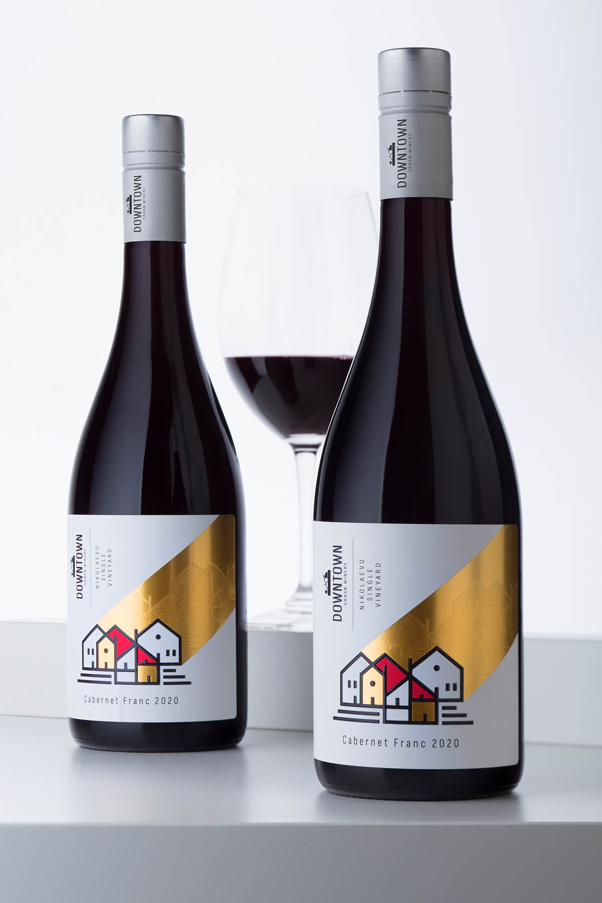
The result is a label that shines out with its beauty and character – a true reflection of the Downtown Urban Winery story. I still keep it on my desk and enjoy it every time I see it.