The concept for Tequilas Rudo and Tecnico, designed by Anton Burmistrov, comes from Lucha Libre’s, a type of professional wrestling in Mexico. The packaging highlights the roots and quality of tequila and furthers the connection with the customer base. The intricate details of the design create a mesmerizing and exquisite pattern that any demographic will love. Each label’s colors change depending on the tequila style, but the tones remain earthy with constant pops of gold throughout each. Tequilas Rudo and Tecnico’s packaging is executed exceptionally well through the illustrations, colors, and font choices.
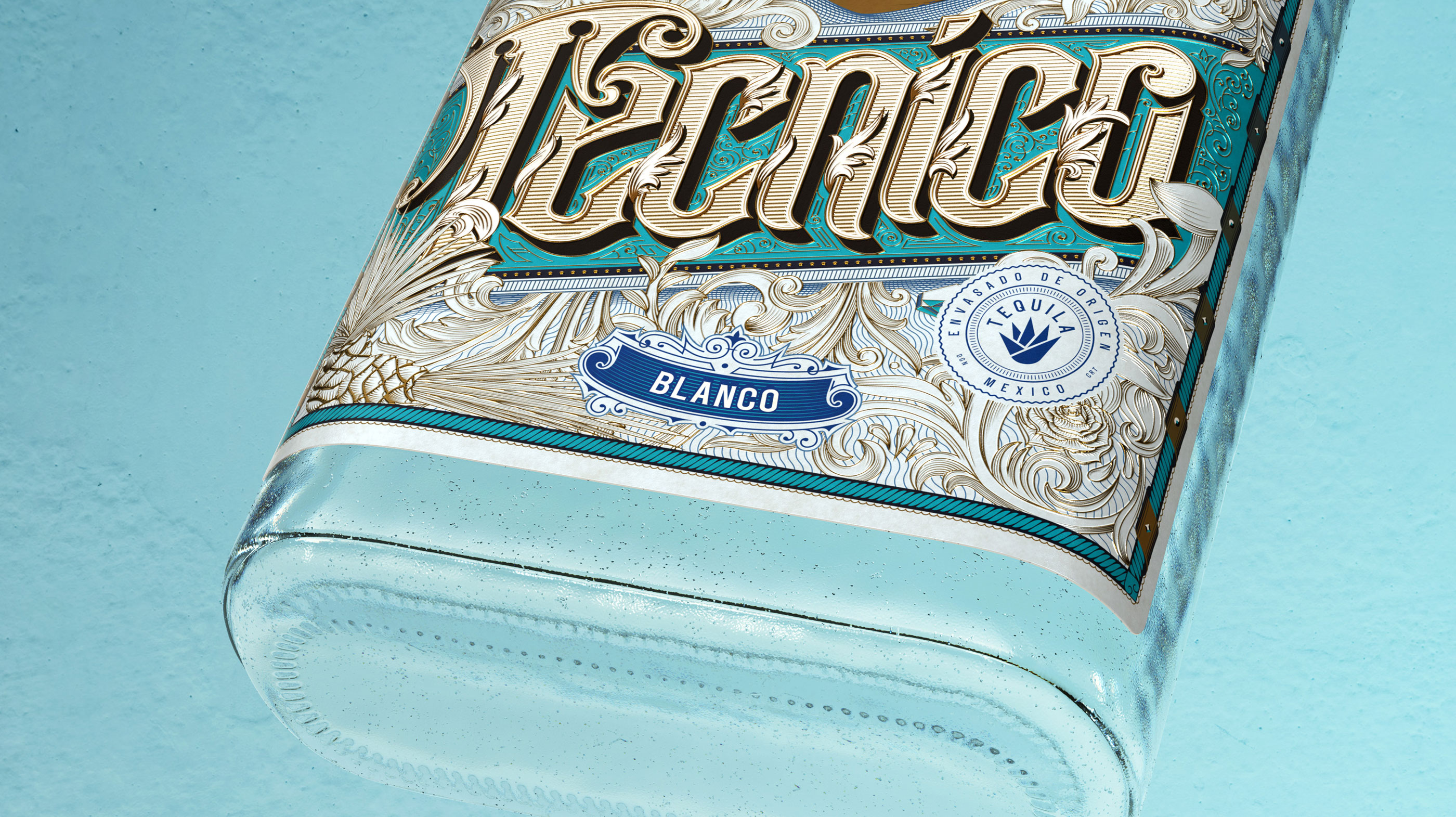
Tequilas Rudo and Tecnico are inspired by Lucha Libre, an extremely popular Mexican style of professional wrestling, and its rich cultural tradition. All Lucha matches are based on the eternal battle between forces of good and evil, represented by two groups of wrestlers: Tecnicos, noble fighters and heroes, and the famous villains of the sport, brawlers and rule-breakers, Rudos.


