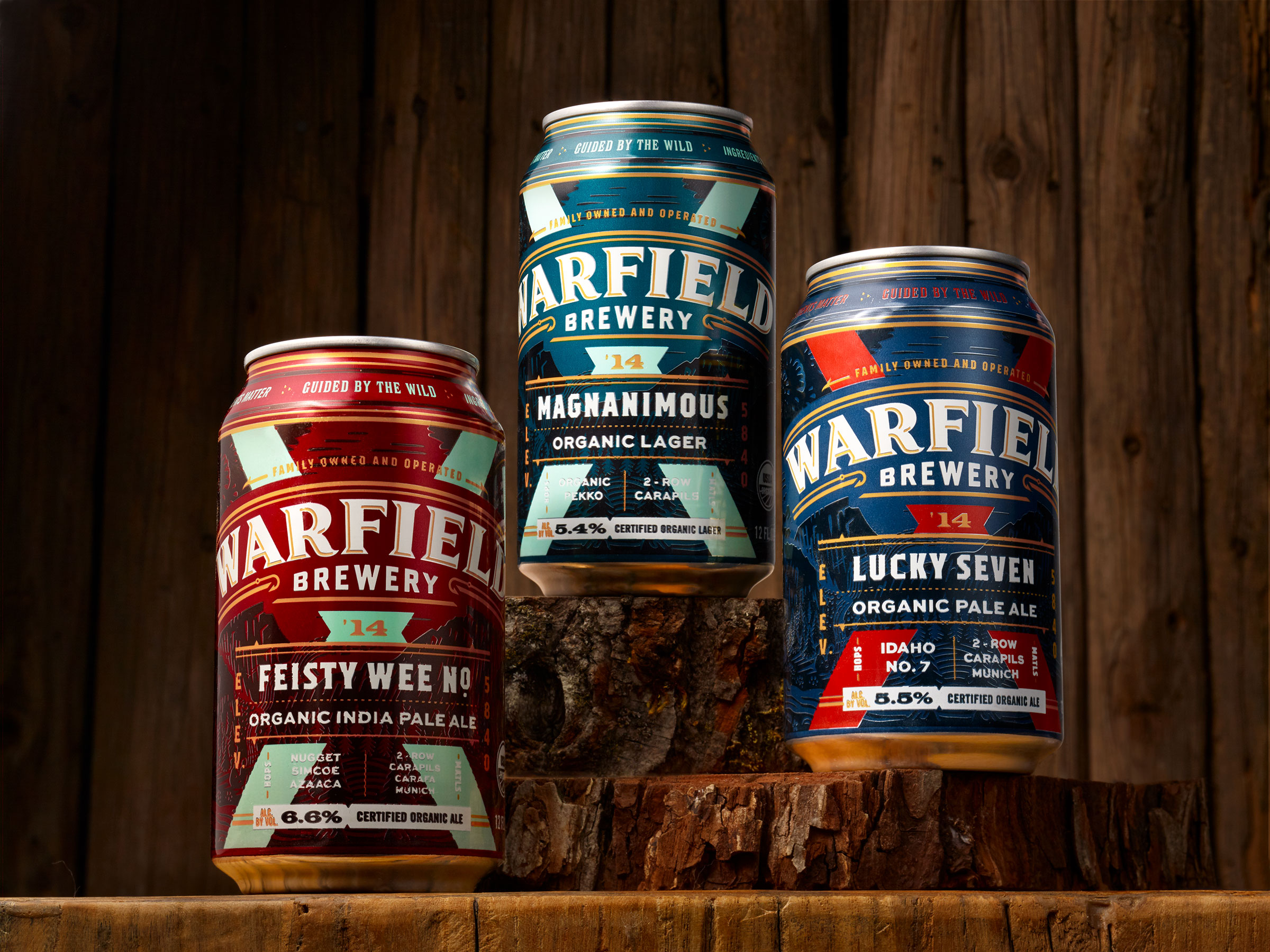
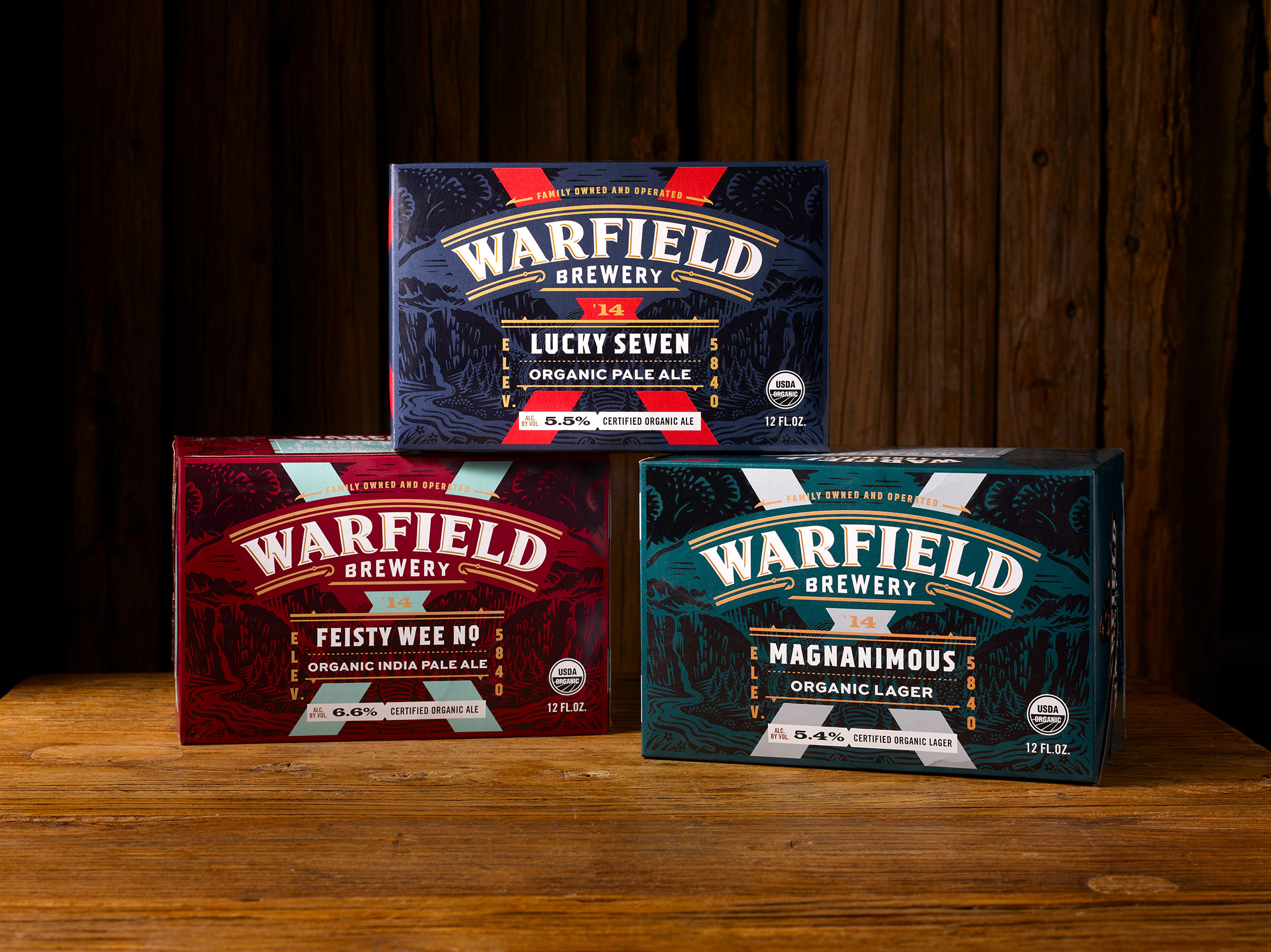
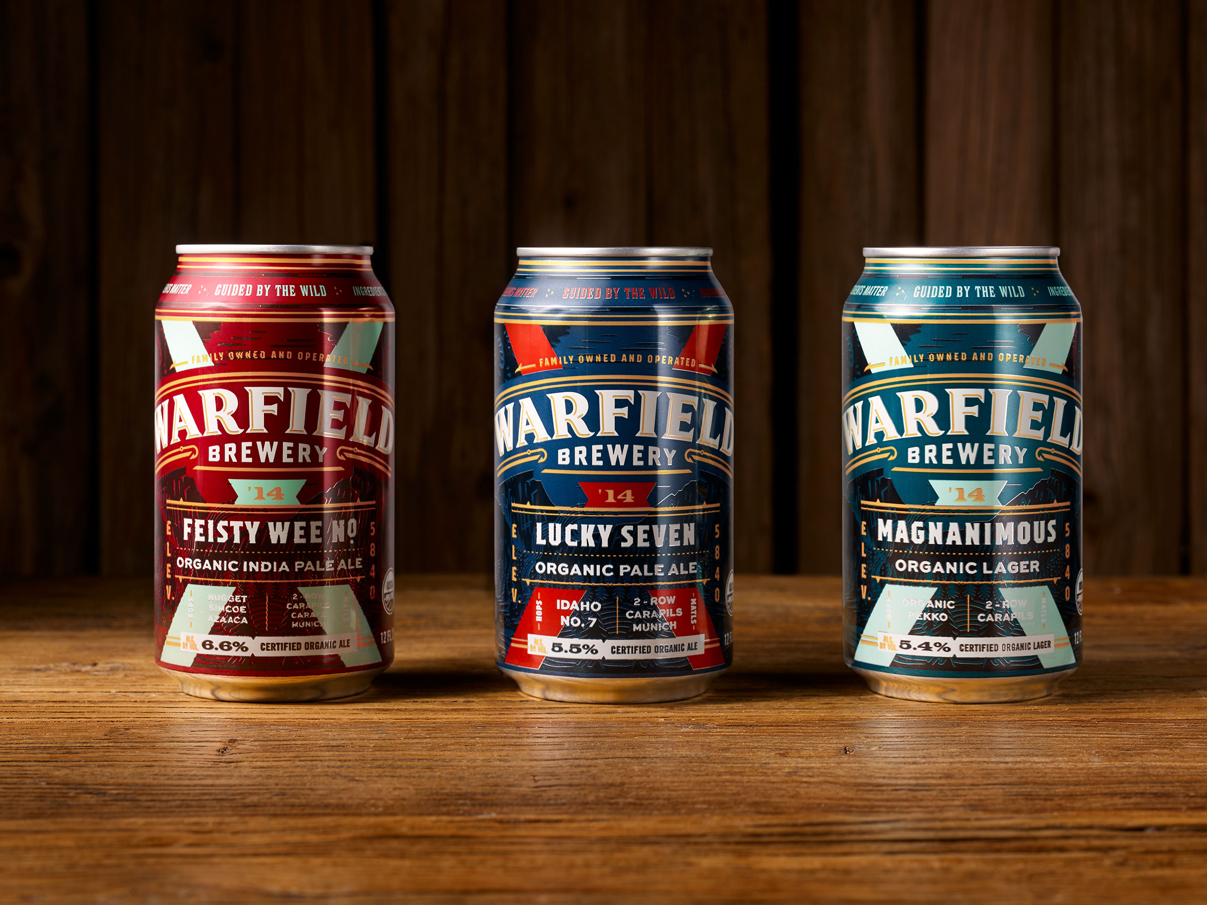
Chad Michael Studio designed Warfield Brewing Co.’s cans that ooze with inspiration from the great outdoors’ ferociousness. The font choice for the logo was chosen with perfection in mind; it somehow sits at the intersection of power and poise. The color palettes of each can are bright but not overbearing, and even though the design was “guided by the wild,” it’s always refreshing when color choices aren’t cliche but still impact. Cheers to adventurous packaging.

A range of beers that are all “guided by the wild.” Designed for Warfield Brewing in Ketchum, Idaho. Designs printed directly onto cans with superior registration.


