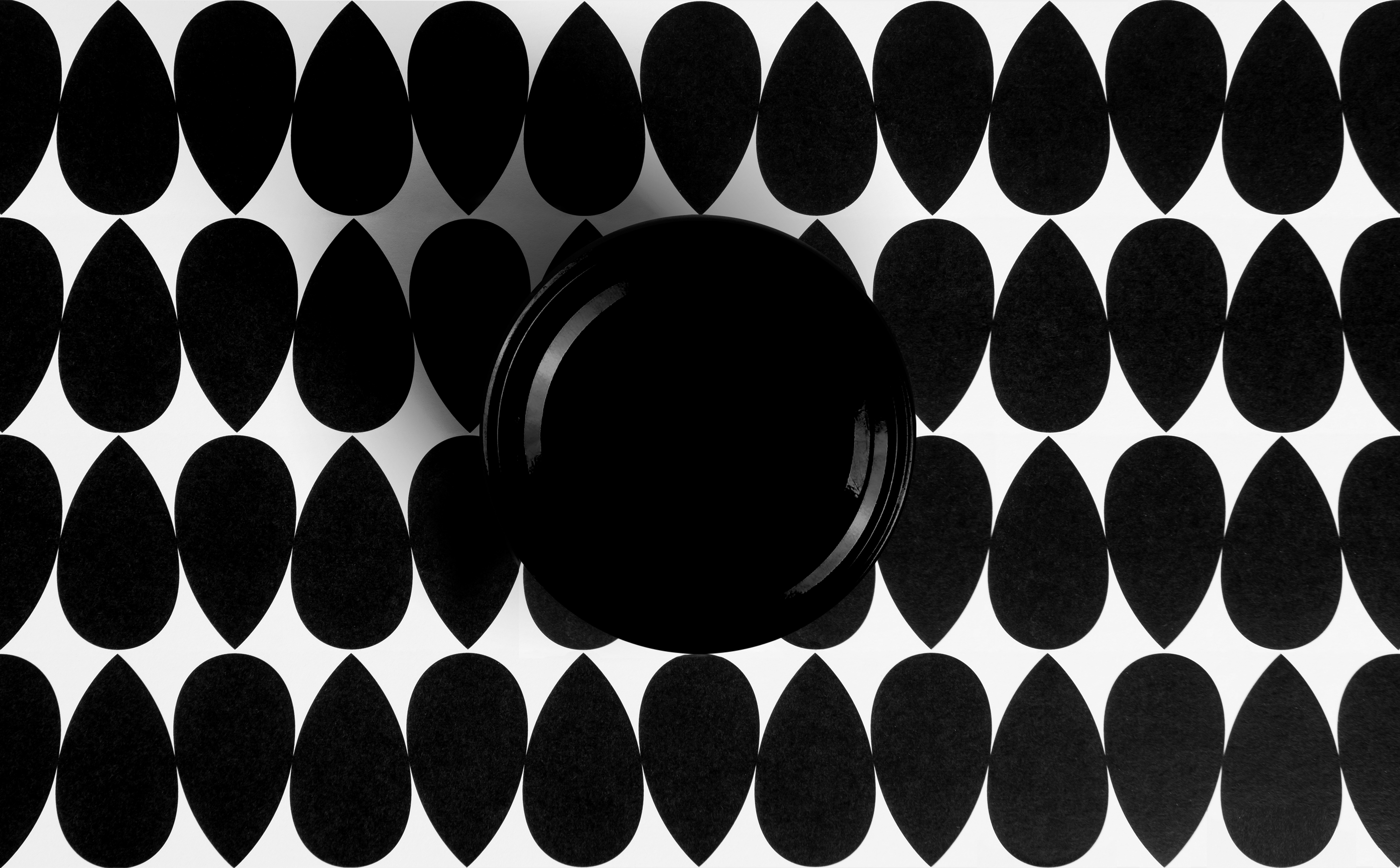
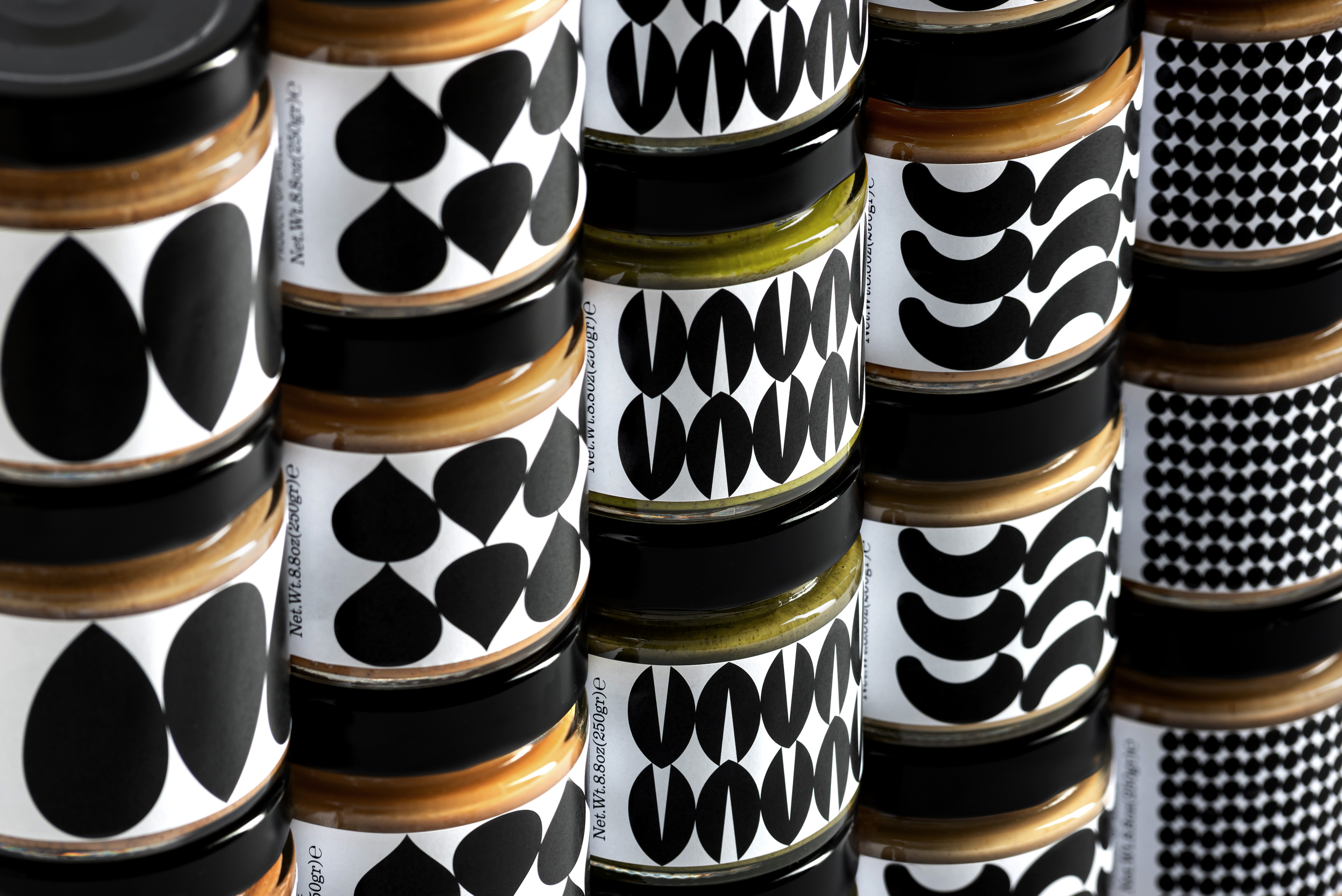
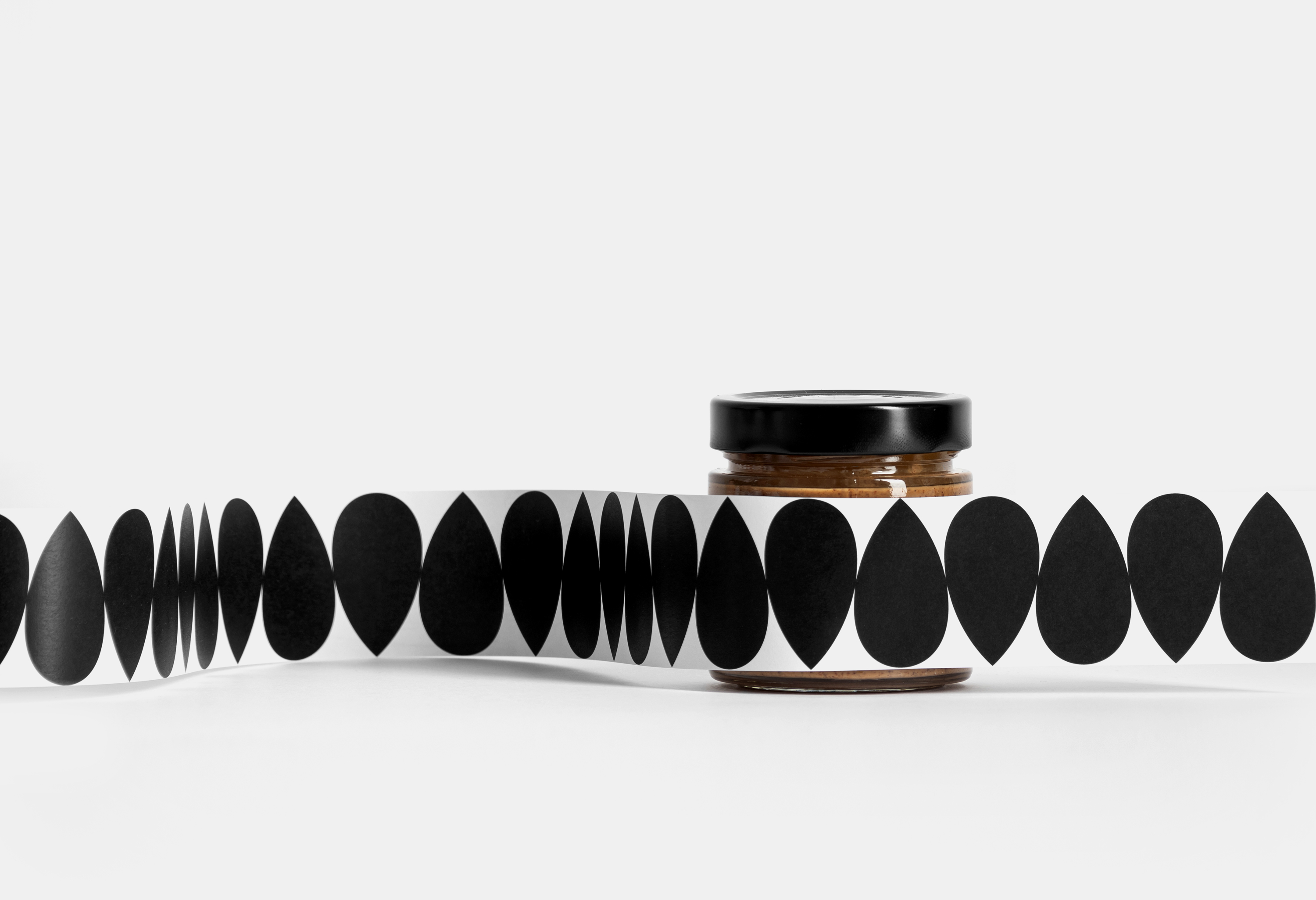
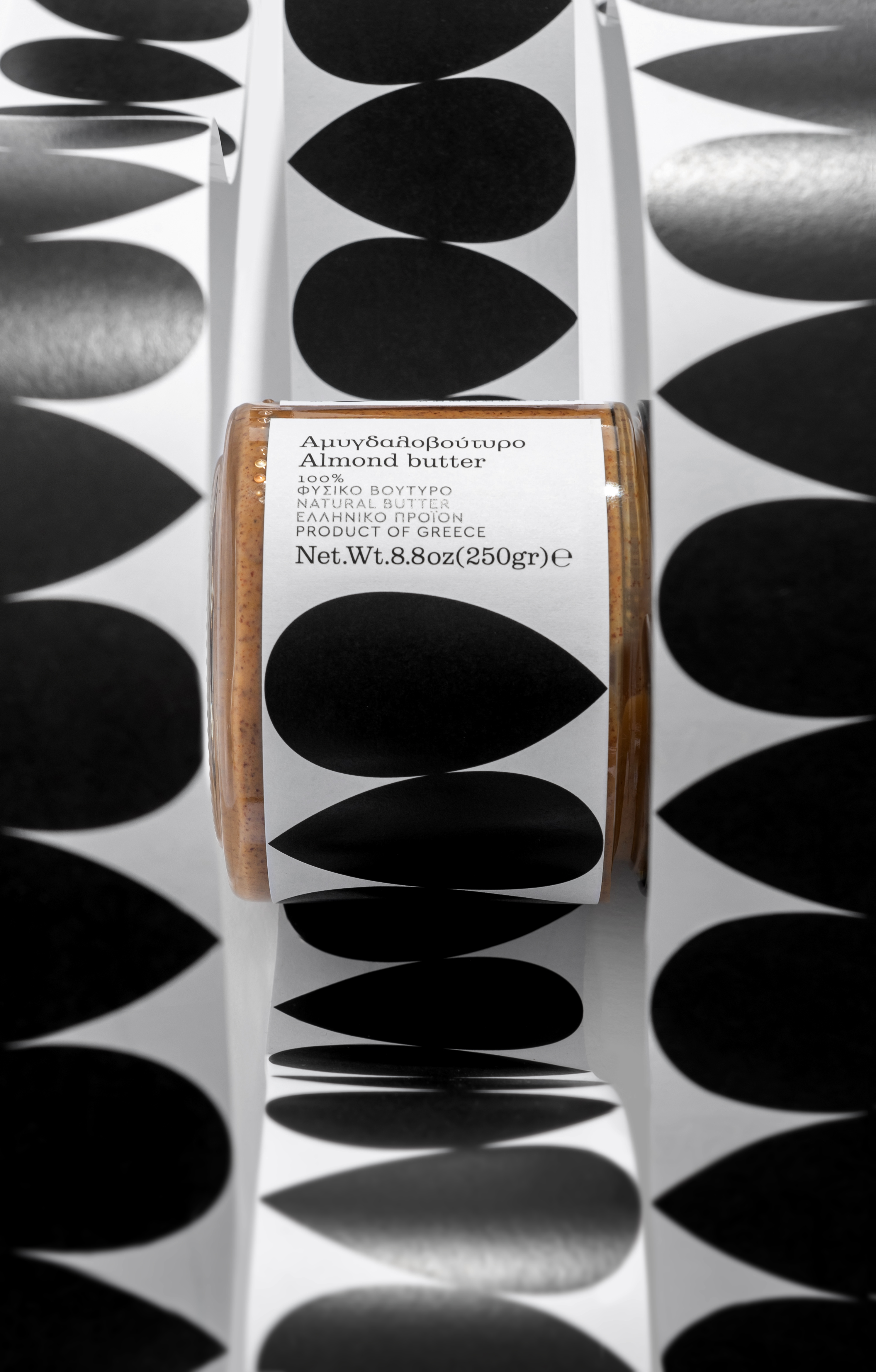
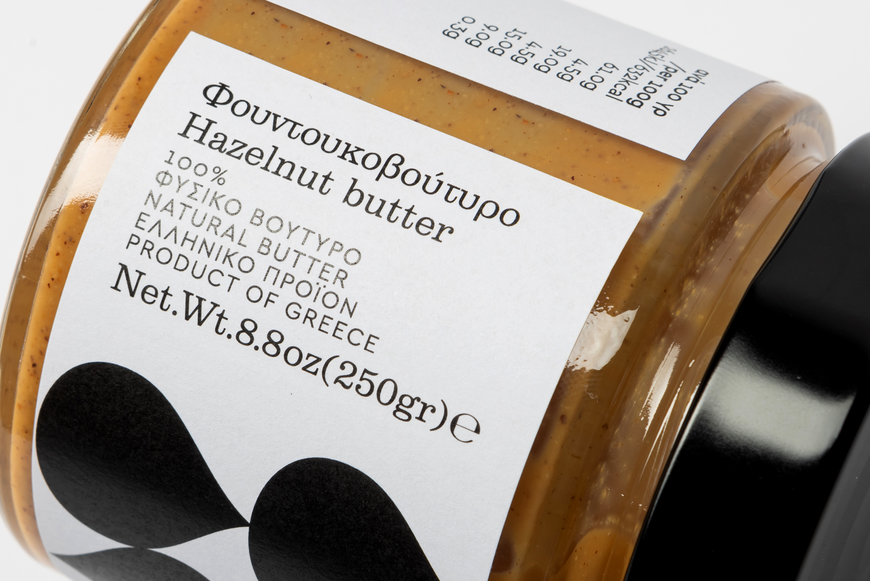
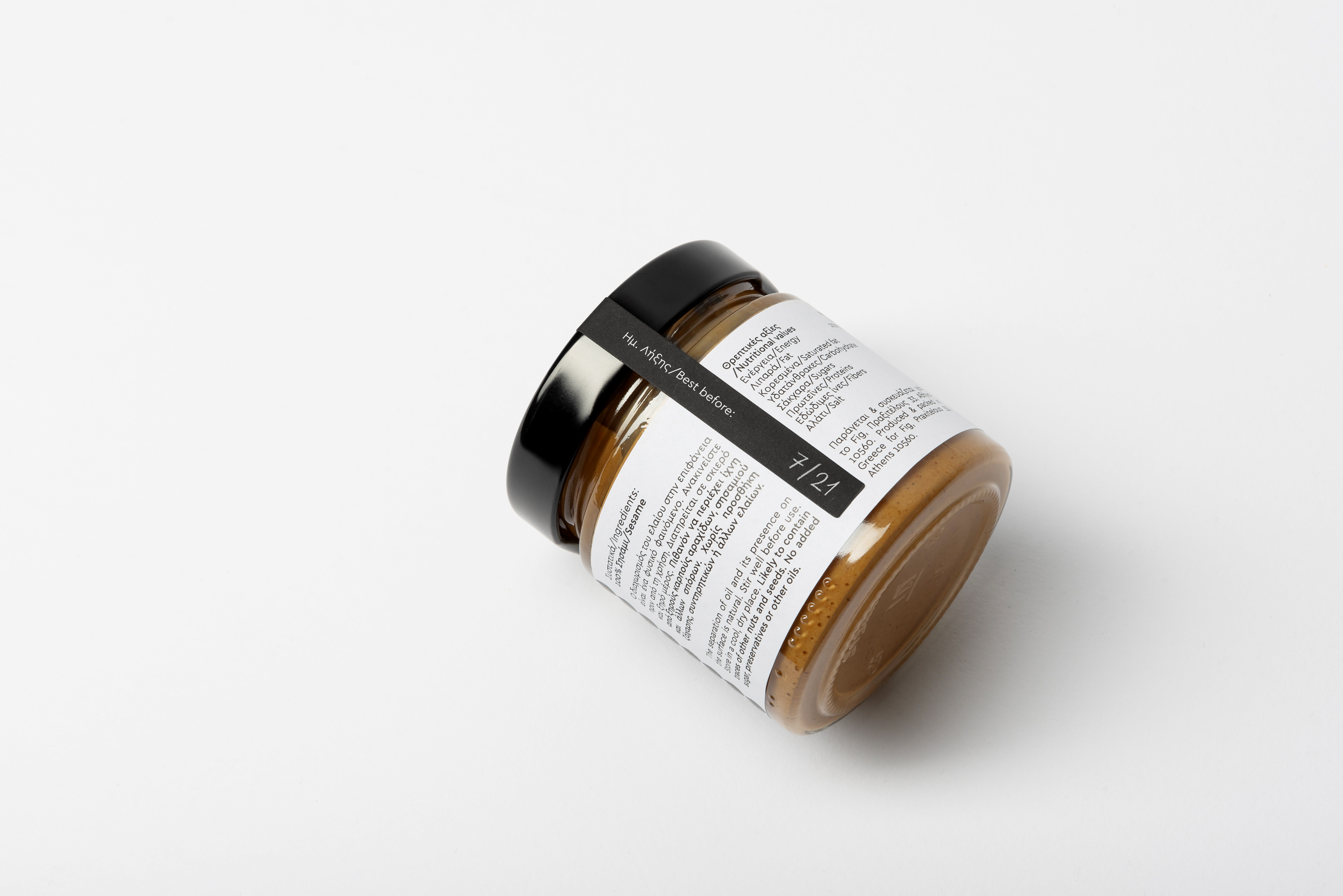
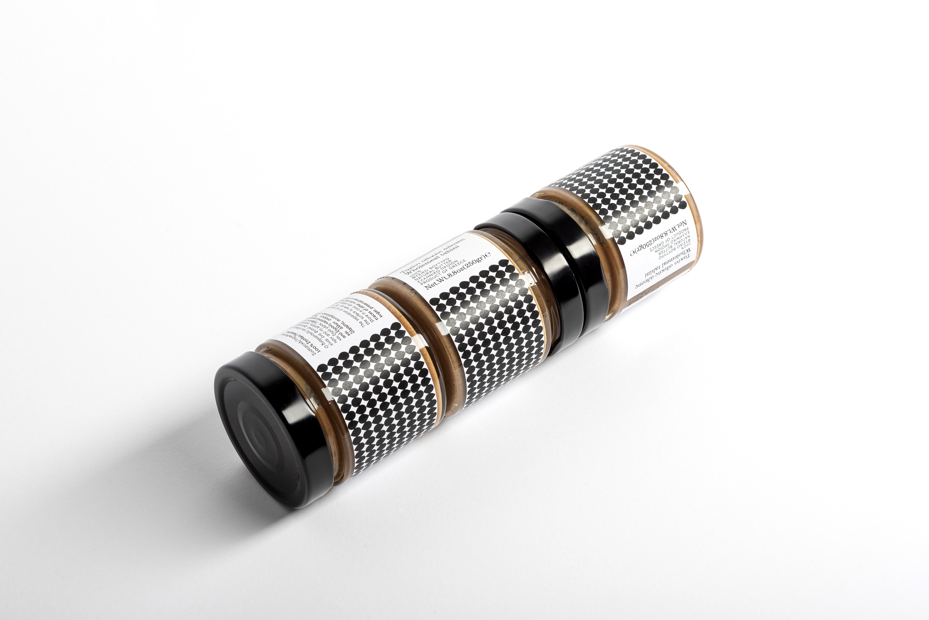
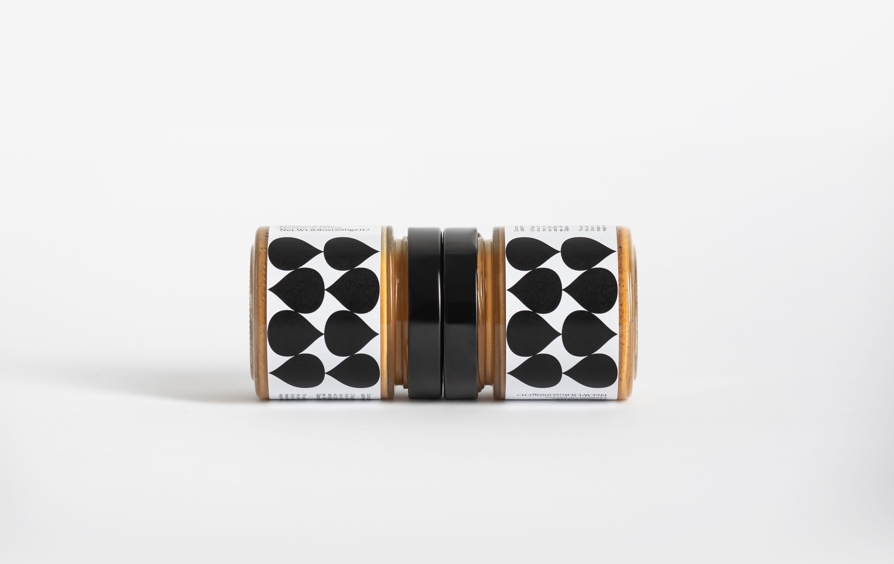
Fig Shop boasts a line of nut butters that are 100% natural and true to form. Products as simple as nut butters, which often involve one or two ingredients at most, do not need too many elements, illustrations, and copy in their branding. For this reason, Loukas Chondros took a simple approach. Sticking to black and white, he used a number of silhouetted shapes, reflective of each respective nut’s shape for the label. Using a tile effect across the label’s length, a pattern was formed that makes it clear which flavor is which before you even pick up the jar. A simplistic serif font is used for the details and is positioned and formatted on its side.
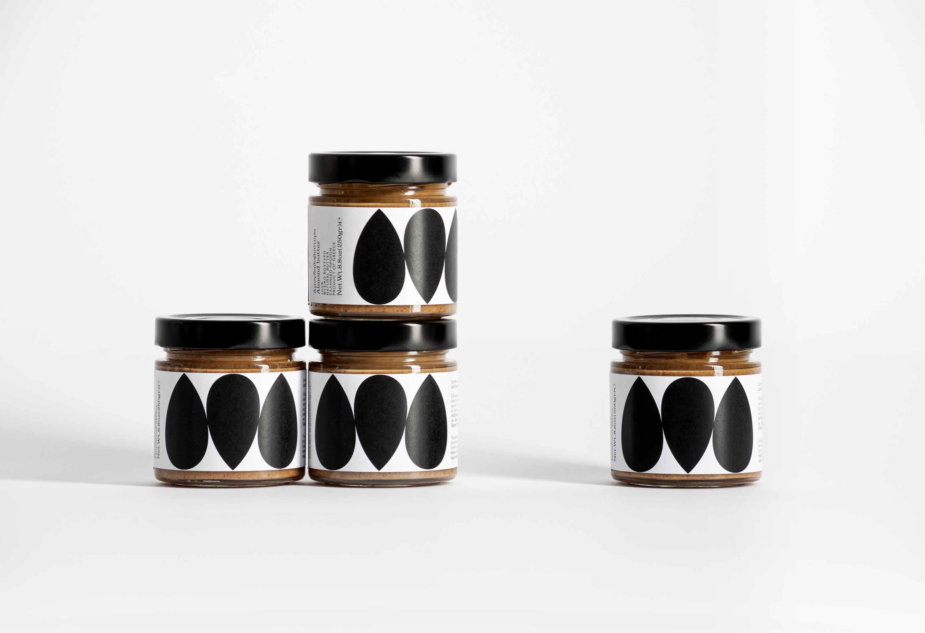
The goal was to reveal the pureness of 100% nut butter, made solely from almonds, pistachios, cashews, hazelnuts & sesame. So we designed a low budget solution for an expandable series of nut butters.
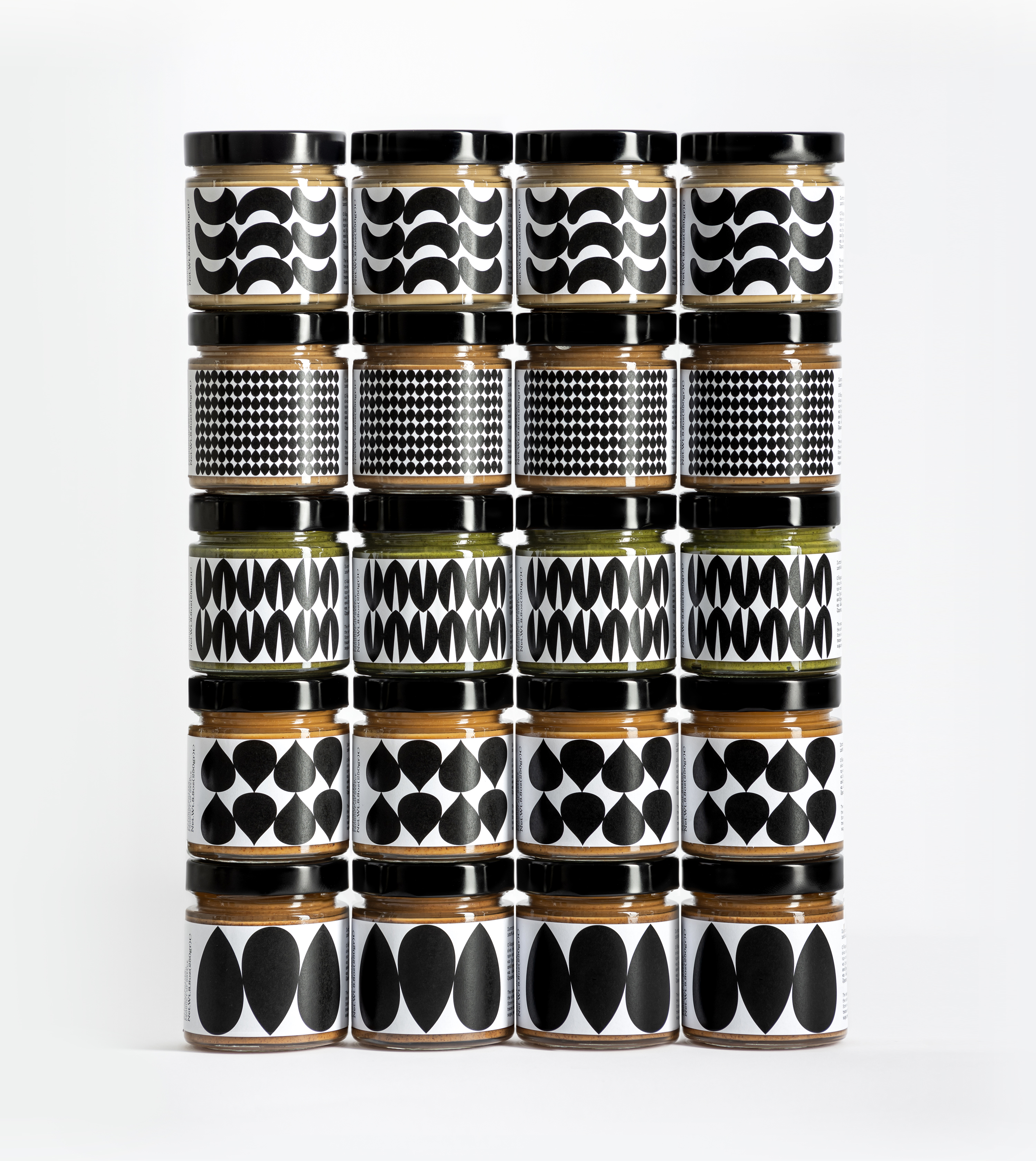
The design concepts focus on strong contrast and iconic patterns in order to identify the brand and its different flavors.