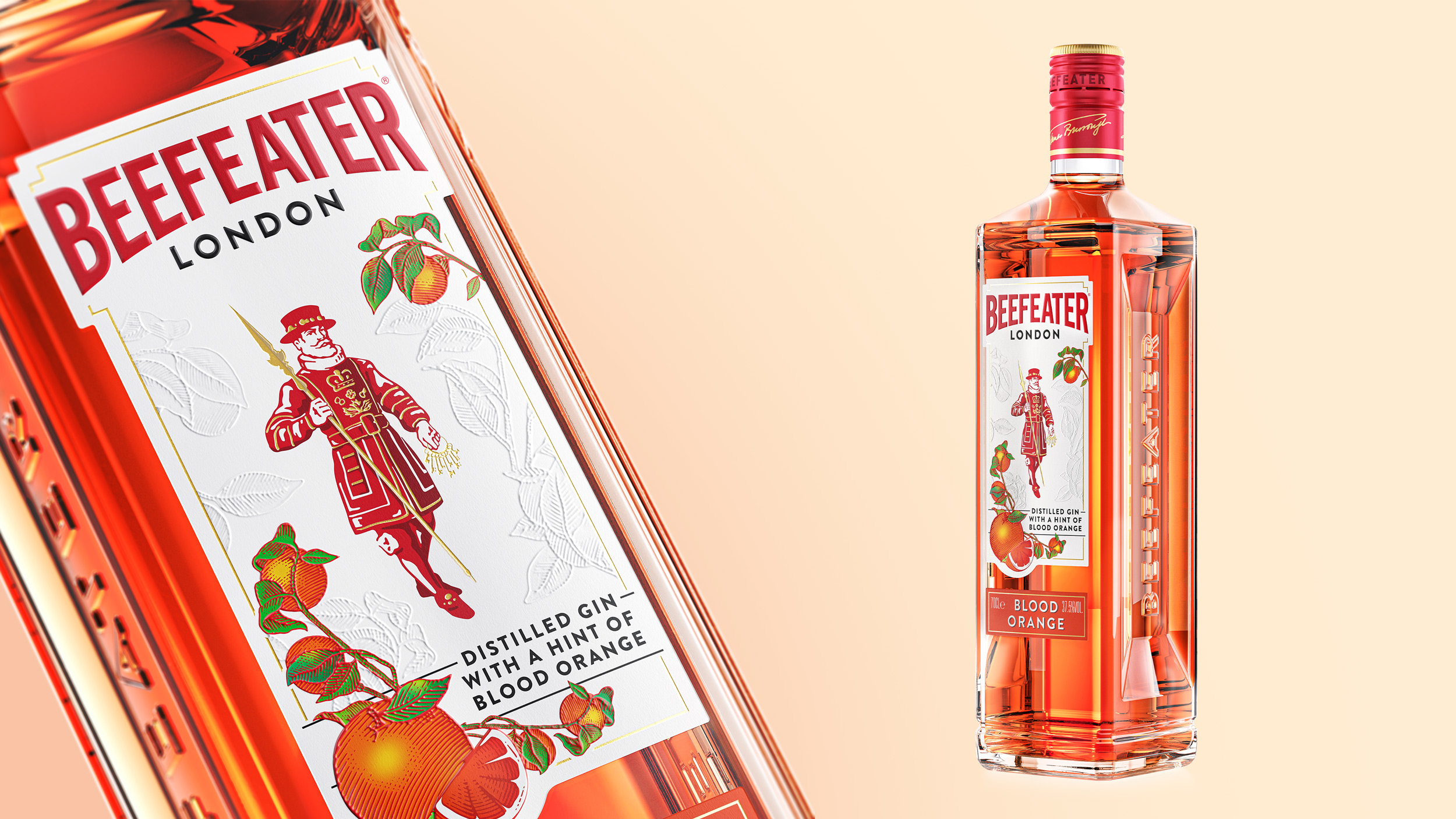
The famous Gin brand, Beefeater, has rebranded to reinforce its contemporary design preferences while still building on the bright and bold variants within its colorful range. One of the most moving components of this rebrand is the modernized illustrative elements featured on the new recyclable label paper. This recyclable label has replaced the previous plastic ones; we love these steps towards a more sustainable future, especially in the alcohol category.
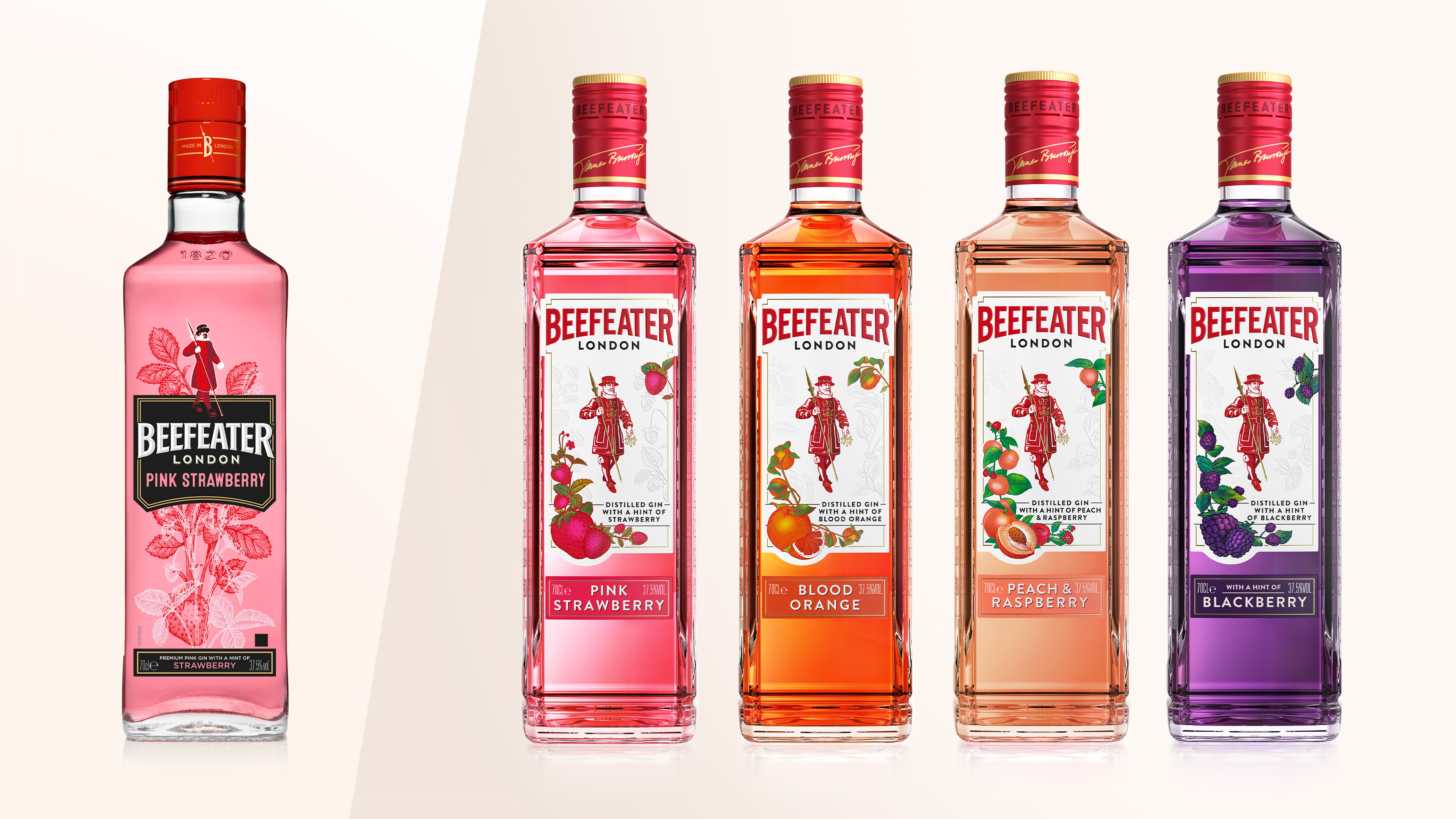
Off the back of the rebrand earlier in the year, the world’s most awarded Gin, Beefeater, is now re-launching its popular flavoured gins as part of a series of 2021 innovations. An iconic brand from London, Beefeater was looking to reinvigorate these highly successful gins to solidify its position as leaders within the flavoured gin category.
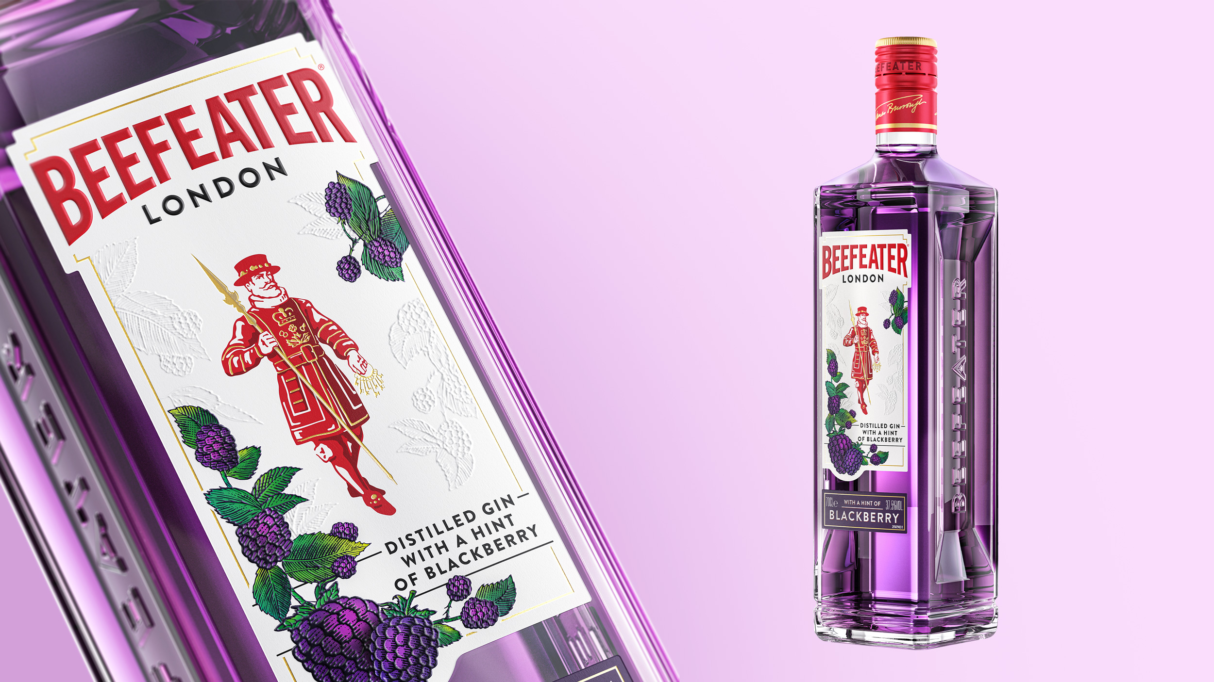
Inspired by the spirit and energy of its London heritage, Beefeater looked to re-launch its existing Pink Strawberry and Blood Orange flavours, as well as launch an NPD variant Peach & Raspberry. The new designs looked to reflect the level of authenticity, quality and passion that is delivered in the gins themselves.
Working with design partners, Boundless Brand Design, Beefeater wanted to reinforce its current contemporary design cues, whilst visually building on the bright and bold variants within its colourful range. Looking to champion the brand’s quality, craft and premium cues, Boundless looked to bring to life the delicious flavours with thoughtful strategy and vibrant creative design, in line with the new Masterbrand positioning. The new range also needed to establish a fresh, natural and intricate look and feel for the range, creating a sense of modernity and appetite appeal.
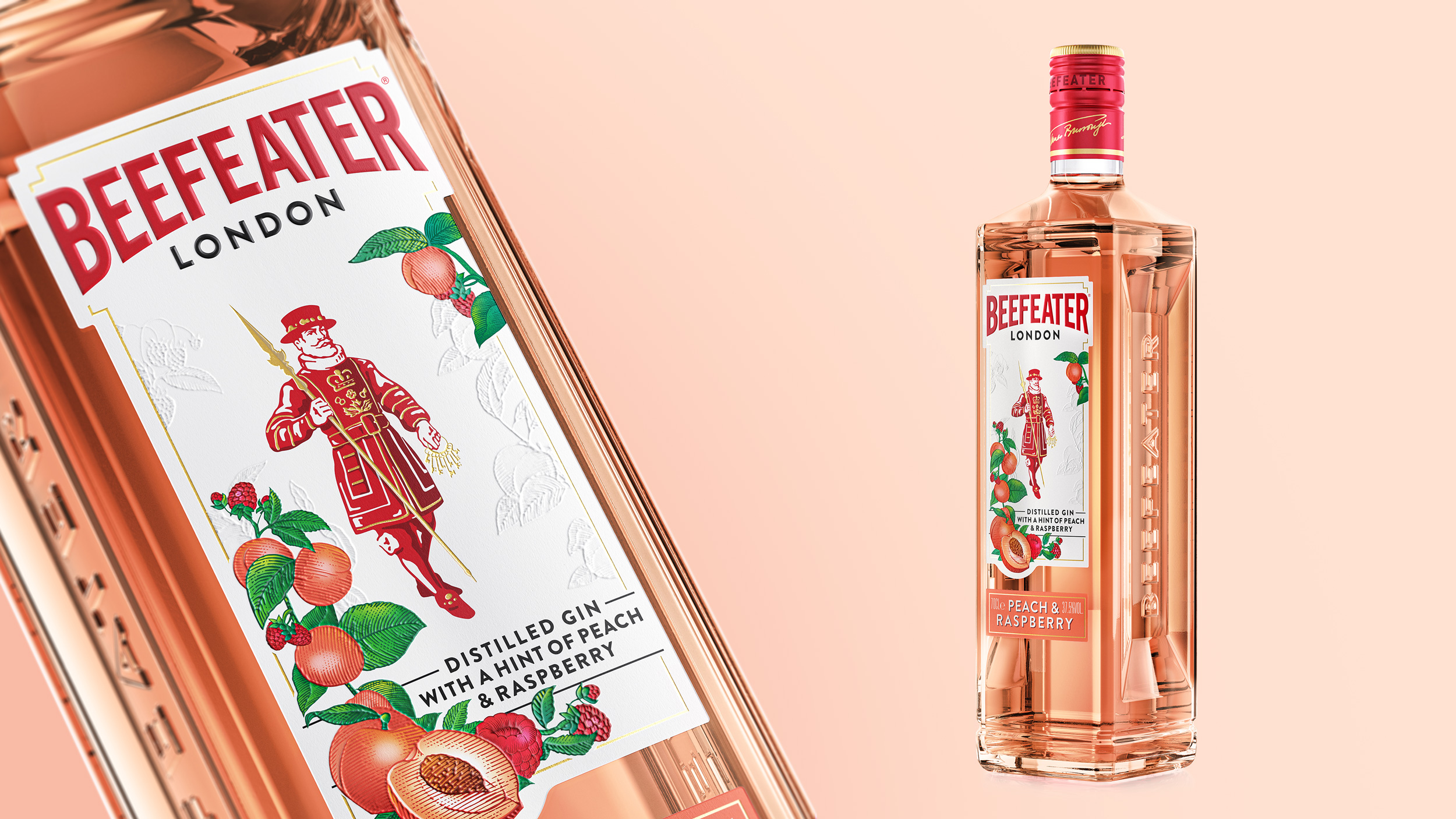
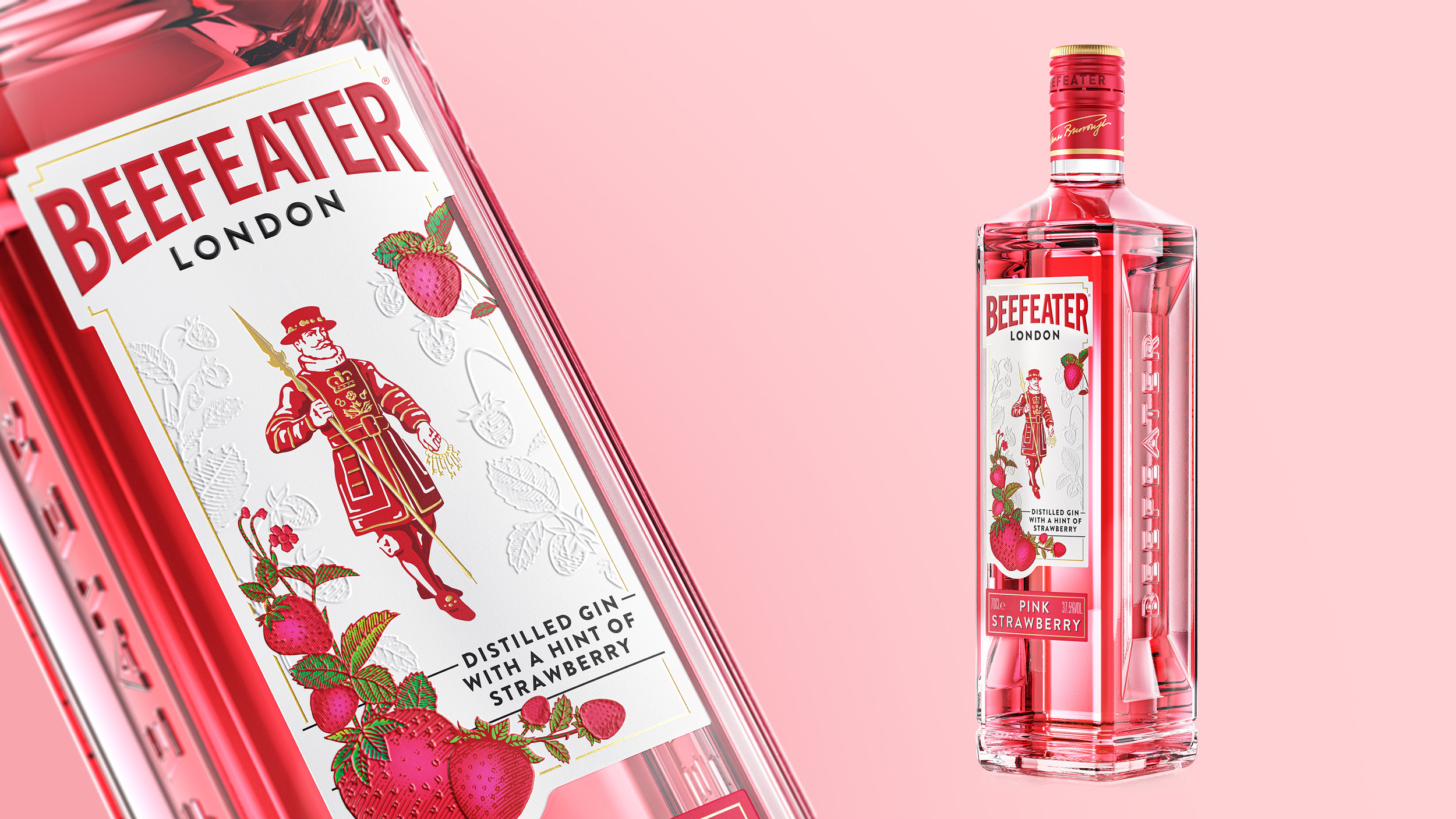
The new designs feature modernised elements such as intricate botanical illustrations, beautifully printed and embossed on a new recyclable paper label, replacing the previous plastic labels driven by Beefeater’s new sustainability guidelines. With micro embossing in the background, a secondary label denoting the flavours, and special varnishes, the design achieves an elevated sense of craftsmanship and naturality.
Hamish Shand, Founder and Creative Director Says; ‘This Beefeater re-launch is the latest in a series of exciting packaging innovations. We employed high level craftsmanship to showcase the authenticity of the range, giving a solid foundation to build a more contemporary and authentic product story that truly reflects the fantastic quality of the liquid inside. Delivering against evolving consumer needs, this proposition now has increased standout, strongly showcasing naturality and refreshment.’