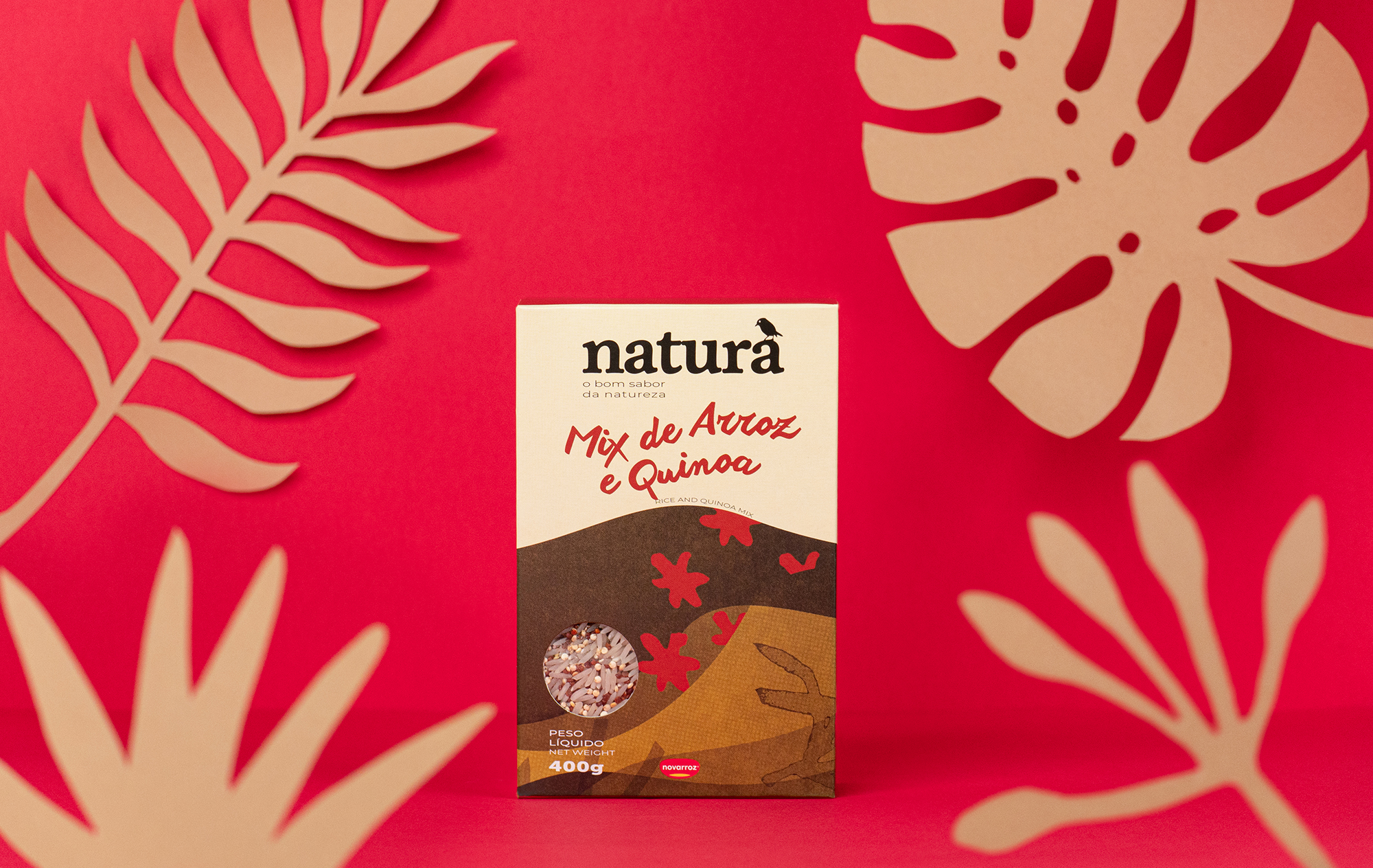
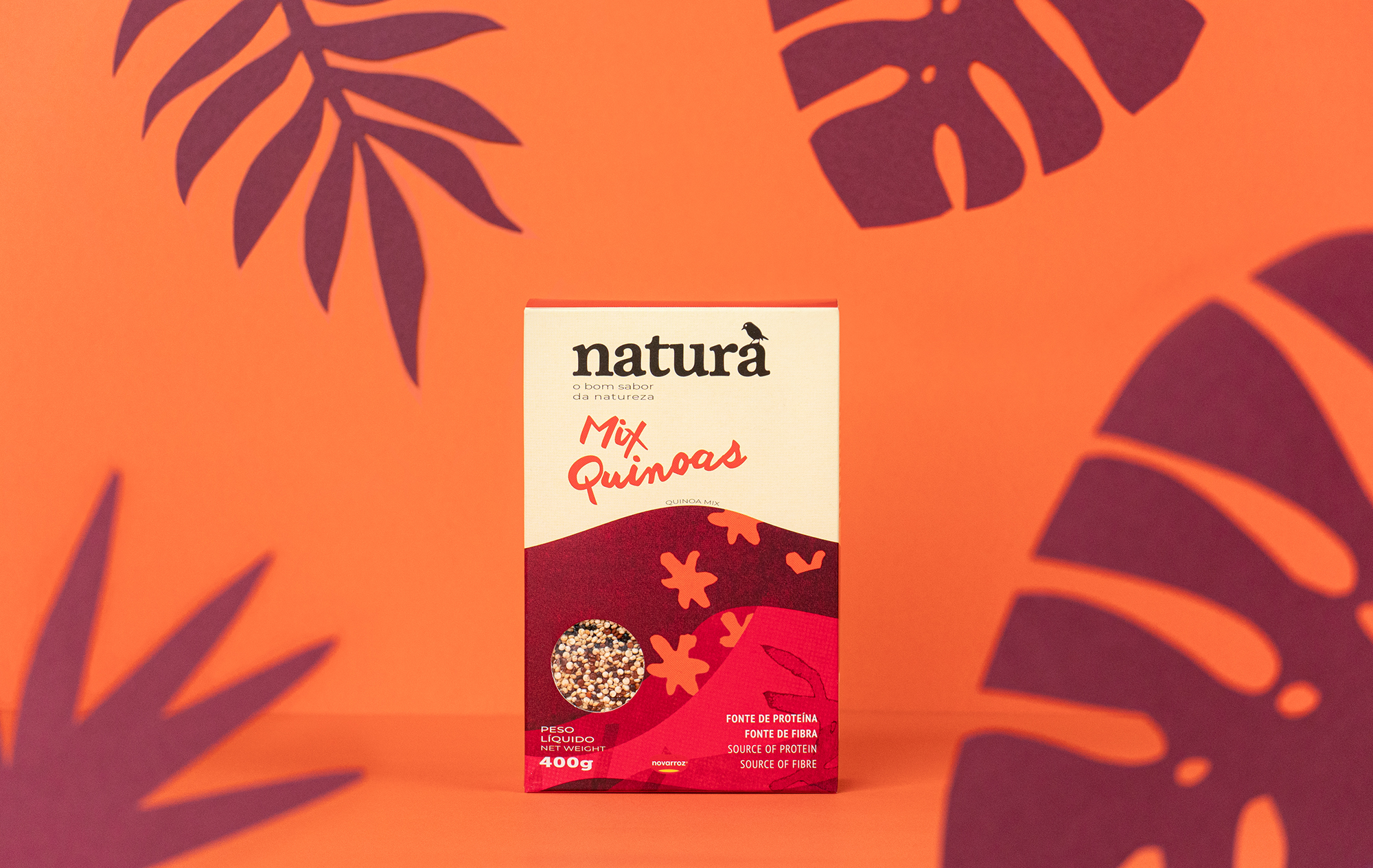
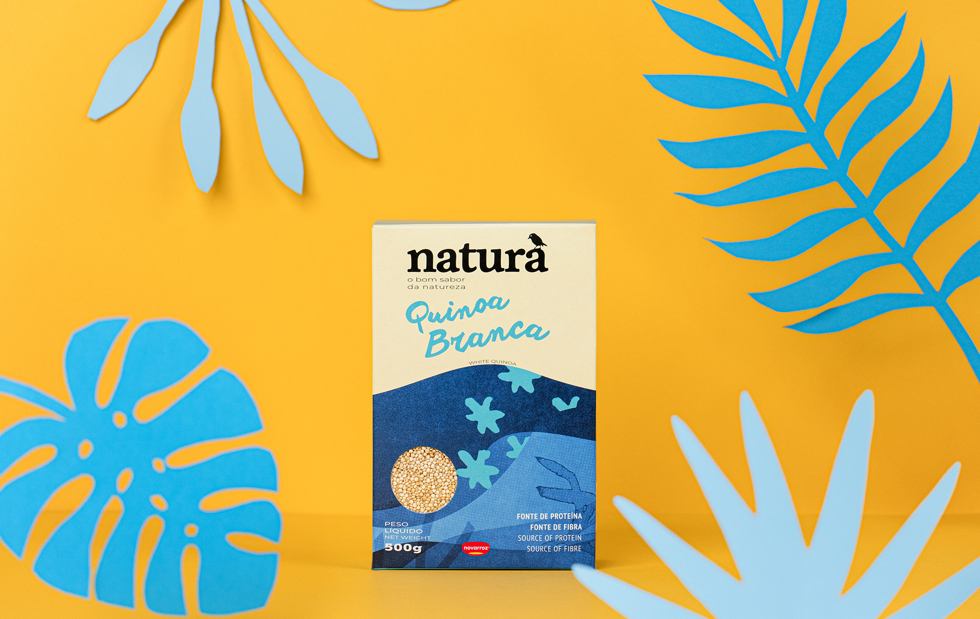
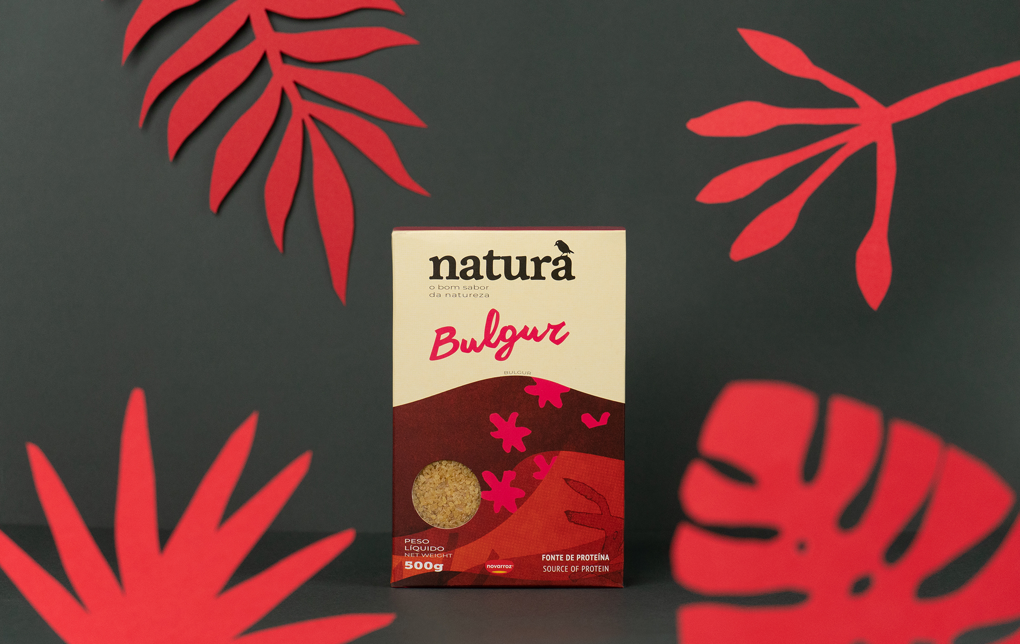
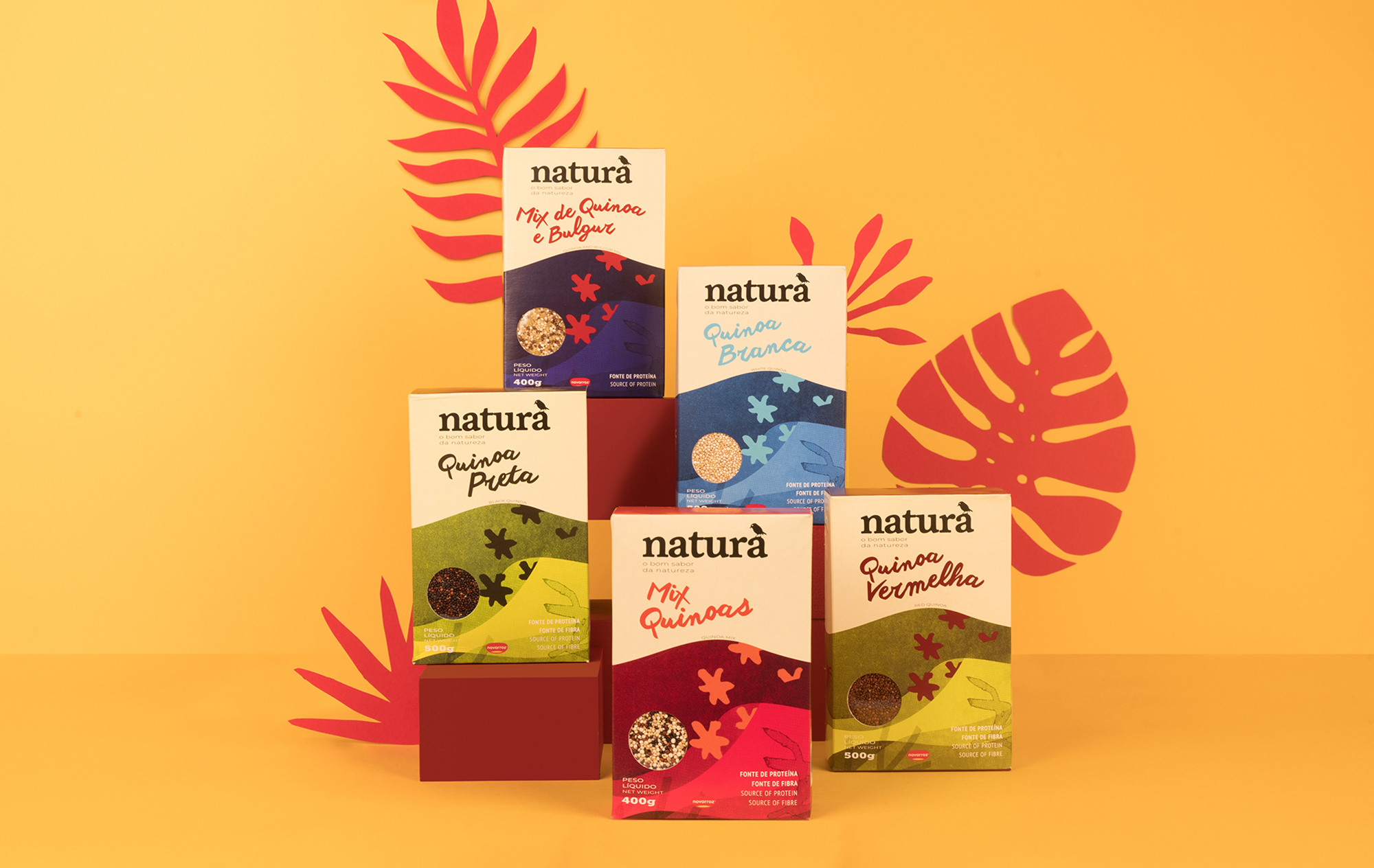
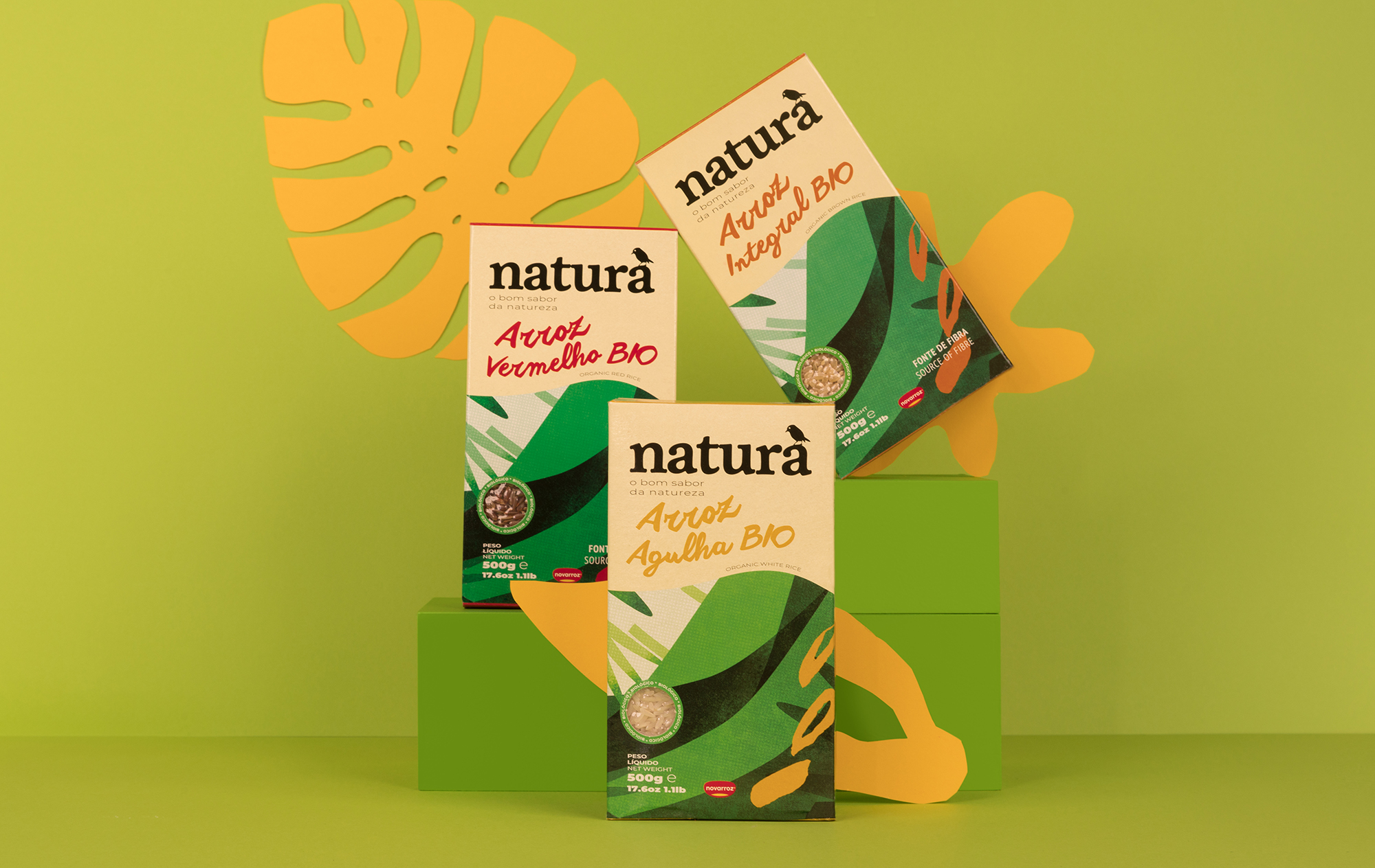
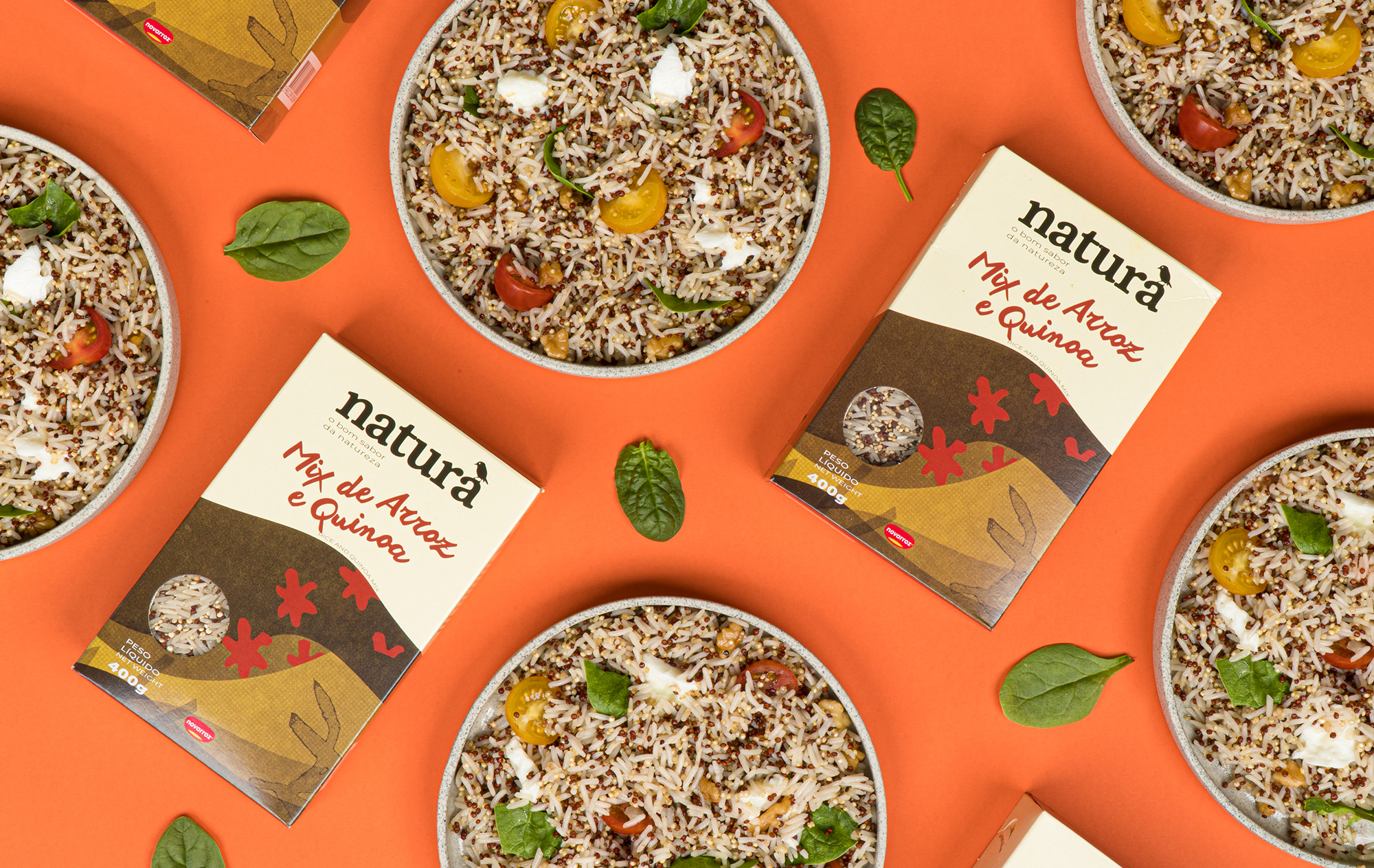
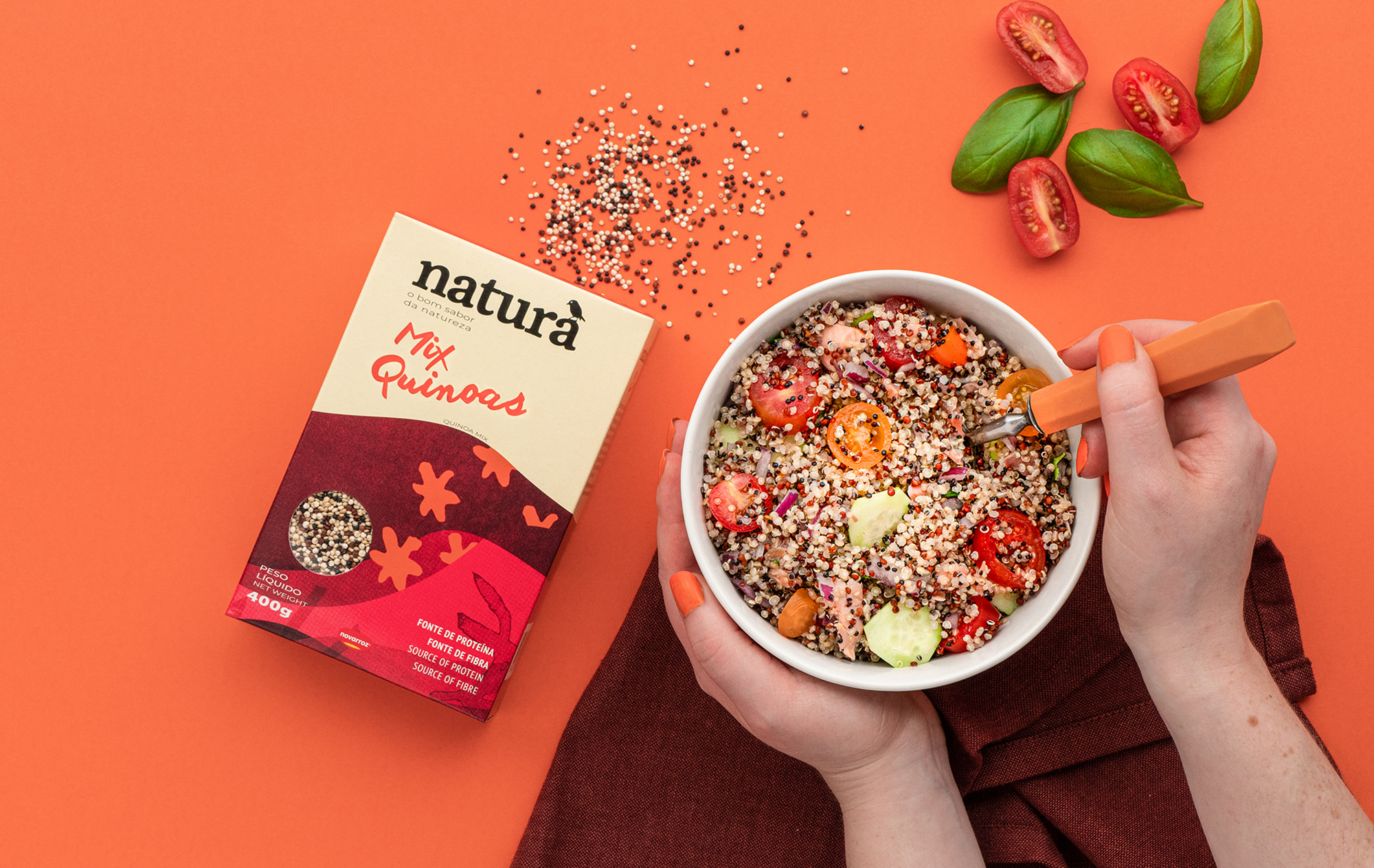
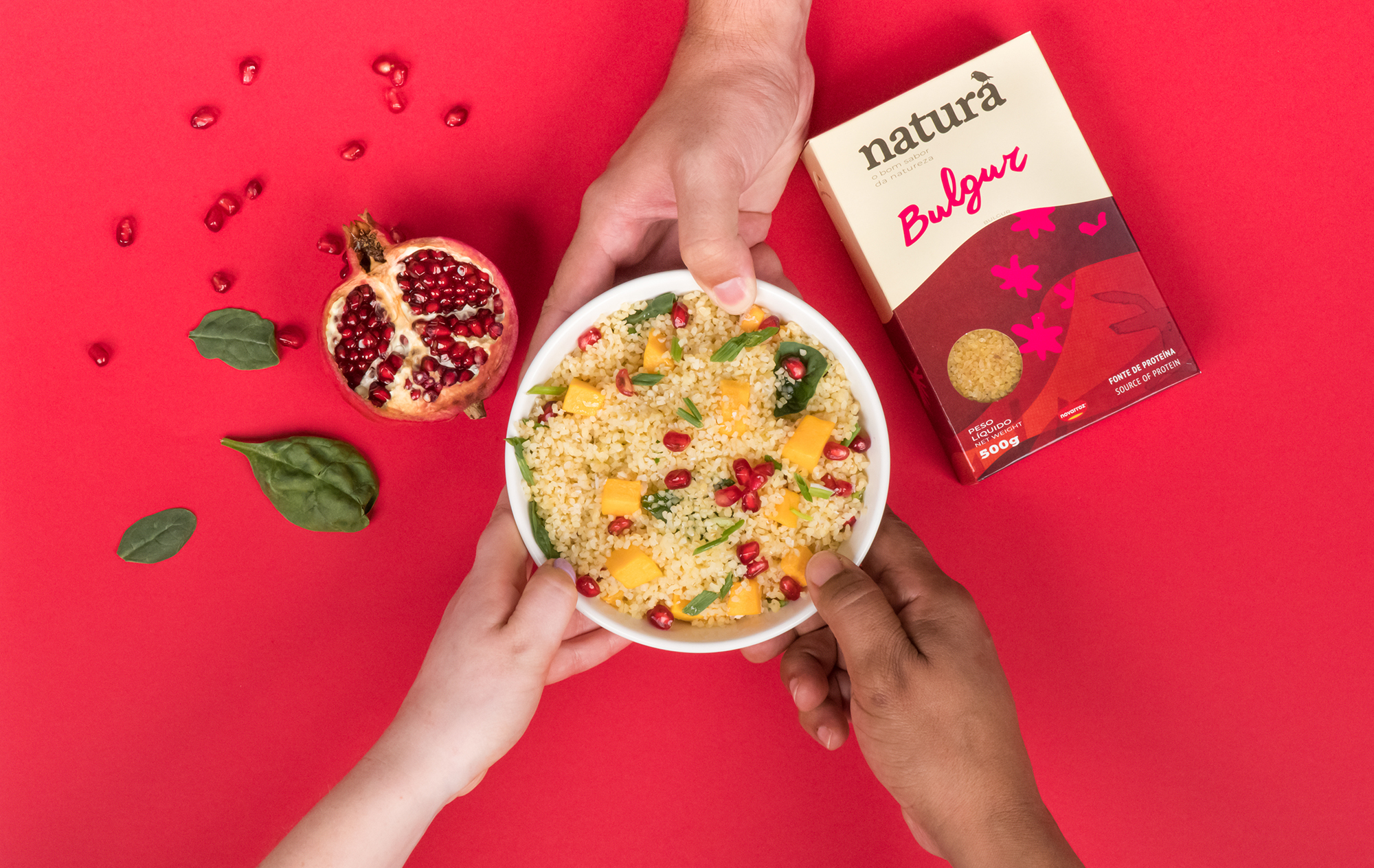
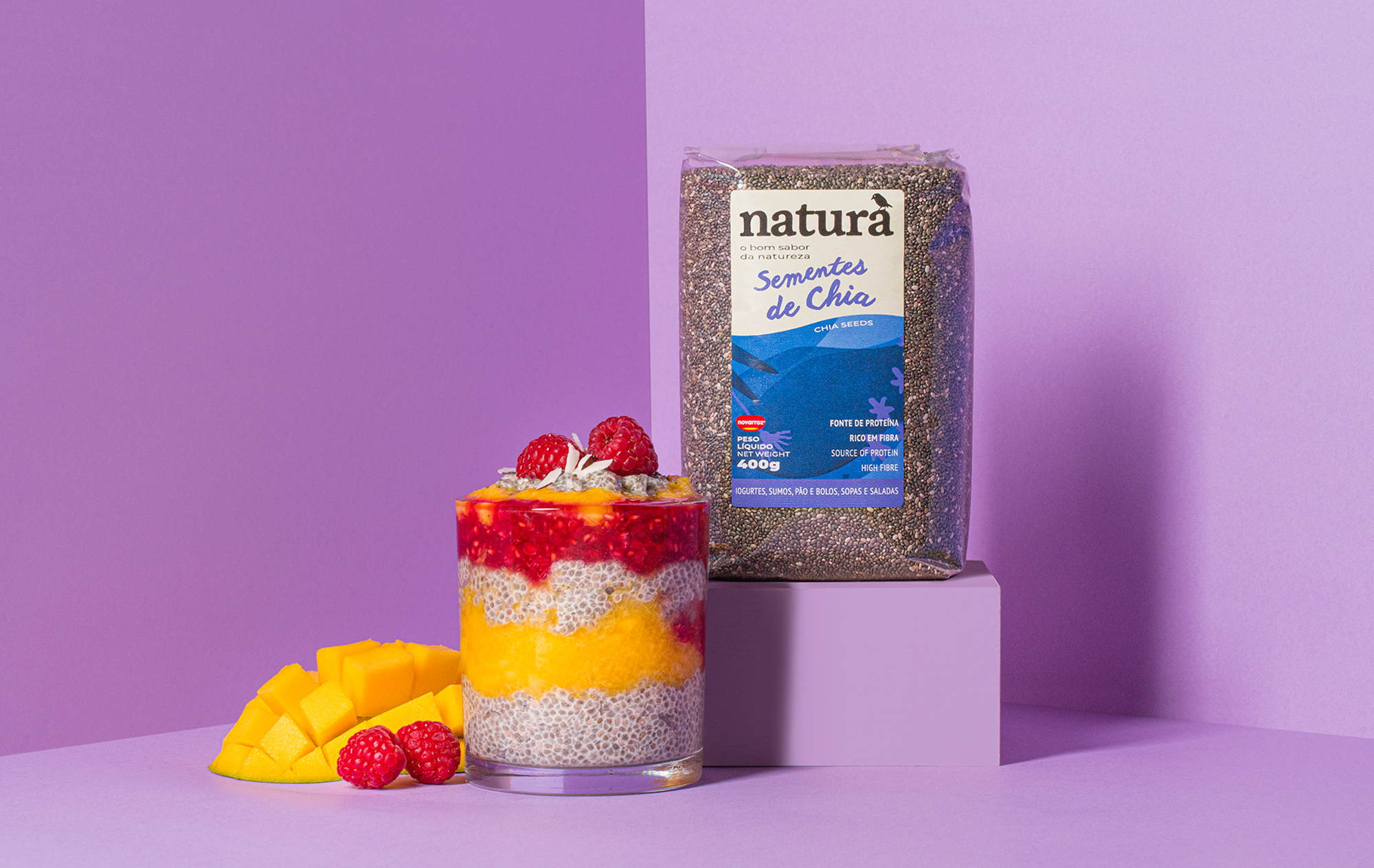
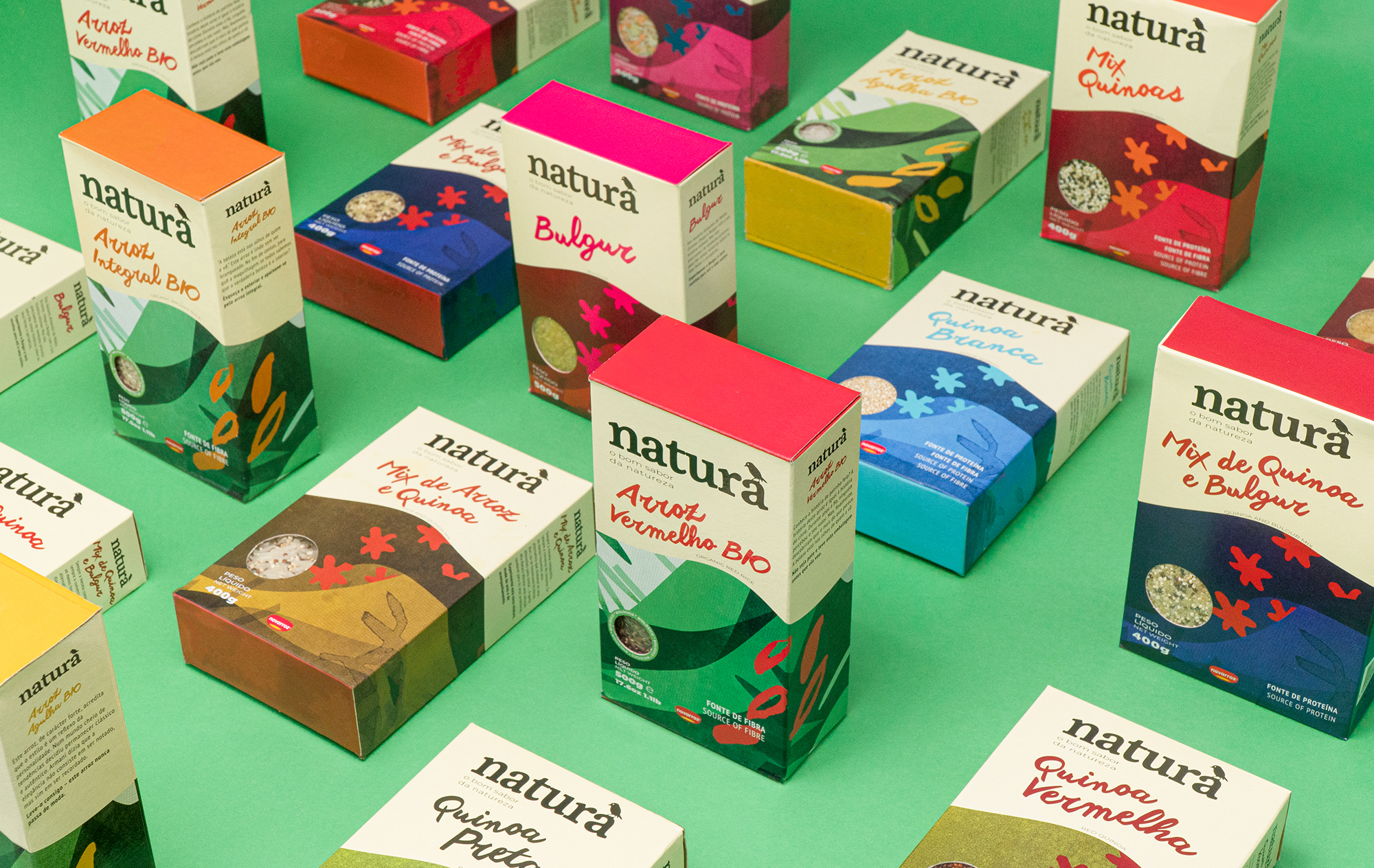
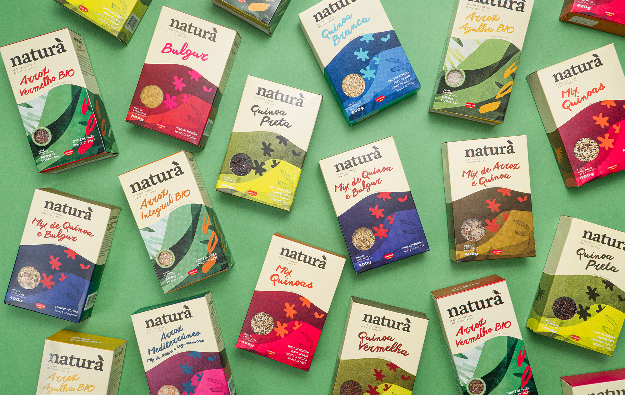
Natura is a whole foods brand that offers a plethora of grain products, including rice, quinoa, chia seeds, and more. In order to appeal to and target their desired demographic, they reached out to Super. to develop their brand identity. Including abstract and linear illustrations, they were able to create movement on the box. They used textures, both contrasting and complementary colors, as well as a cut-outs to feature the product within. The handwritten-like font gives the label a sense of humbleness and evokes trustworthiness in the foods’ quality.
In recent years, thousands of people are beginning to change their eating habits. They question the composition of the food they eat, the presence of artificial ingredients, the provenance and authenticity of the ingredients, how food is produced & processed, the consequences for their health, and the impact on the planet. Natura’s ambition was to provide the possibility of integrating healthy foods into people’s diets. Serving as the basis for a diversified, rich, tasty, and planet-friendly diet, while at the same time promoting and supporting values related to sustainability and nutrition.
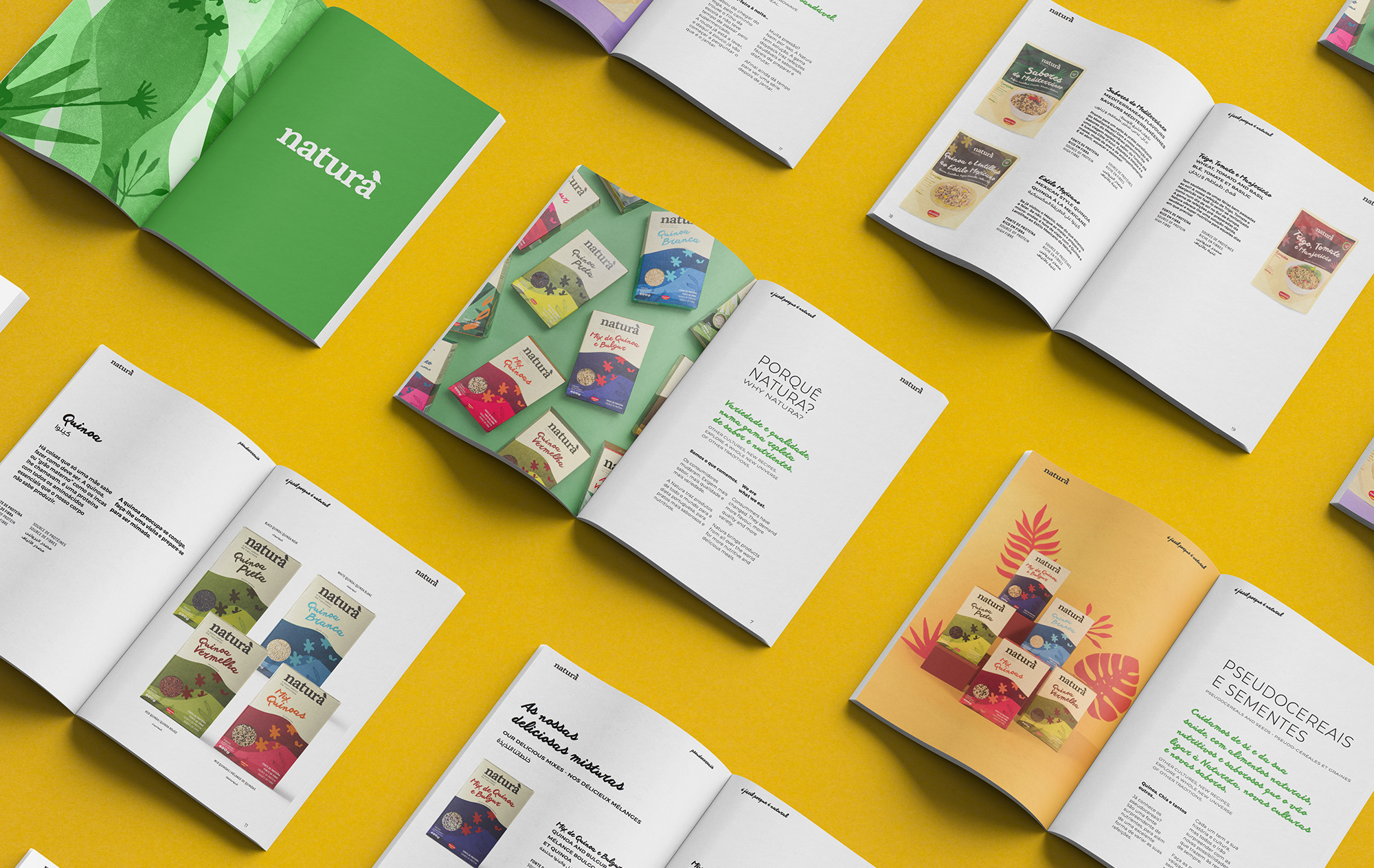
Our mission was to bring Natura closer to its audiences. To do so, we modernized and humanized its visual identity and tone of voice across all its different touchpoints. We began by defining the brand strategy, establishing a unique, ownable, and relevant set of values that, aligned with the brand personality and purpose, laid the cornerstone for a distinct character that would be the foundation of the new expression of the brand—both visually and verbally.
We then created a tone of voice for Natura, focusing on humanizing the language, and ensuring that it delivered against the defined values of honesty, quality, empathy, positive change, and advocacy of what is natural.
The key output was to visually realize the new brand personality through the articulation of a new visual language — a visual language that could communicate a wider range of products without losing consistency.
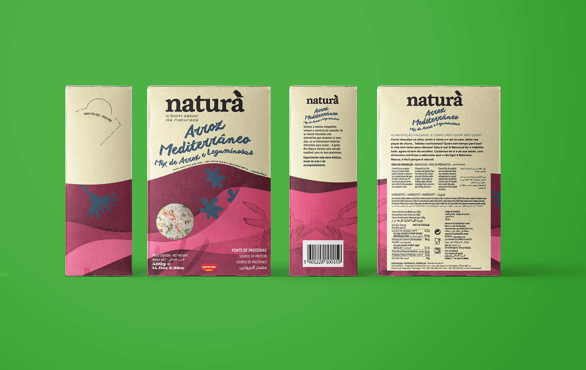
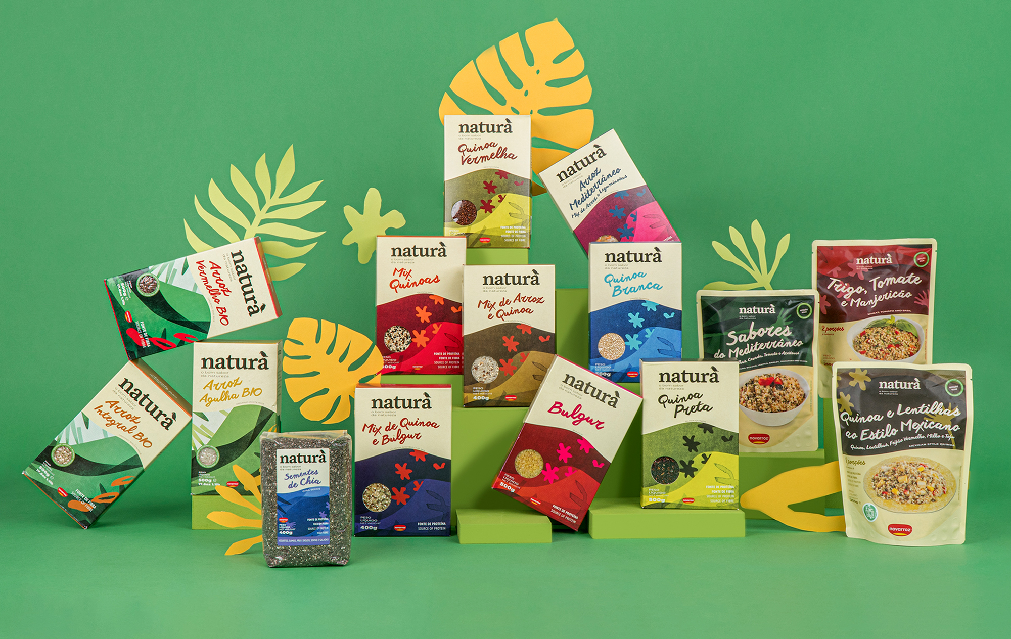
We created an identity that is clearer and more relatable, and that puts nature in the limelight, granting, at the same time, the central stage to the new brand purpose. Simplicity became the core of the brand identity, producing, in turn, a package structure completely detached from the standards of the category. This allows both the package and the identity to be easily recognizable on the shelves.
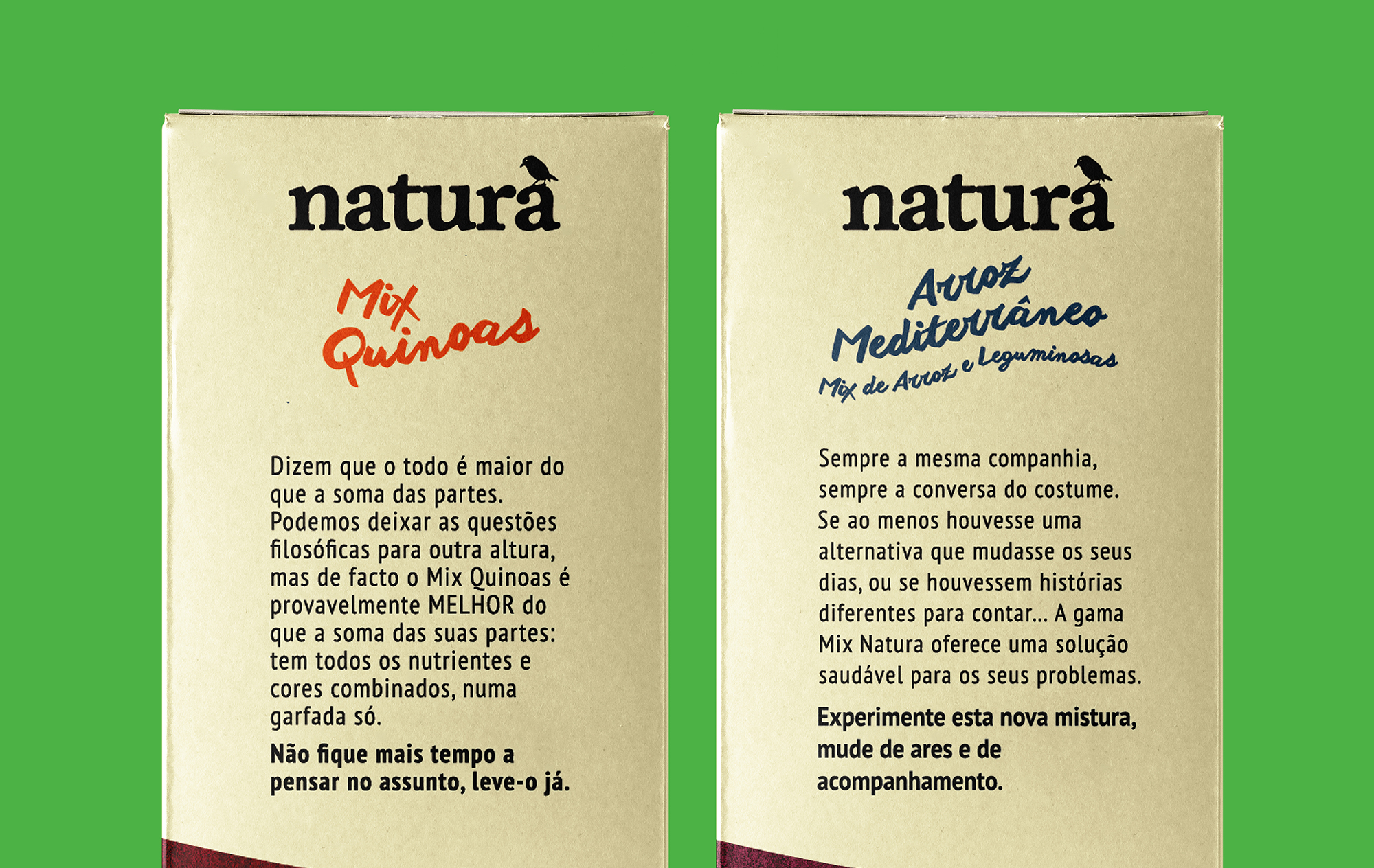
The unique graphic system developed for the brand aims at emphasizing the close relationship with nature. The colors, along with the illustrations, are the most daring element of the graphic system, breaking with the stereotypes commonly present in the communication of many existing products in the category. We created an illustration that identifies each of the product families and a color palette that distinguishes different products within the same family. We also choose an organic and handwritten typographic composition that sets a more emotional tone, and accentuates the natural and organic character of the product and packaging.
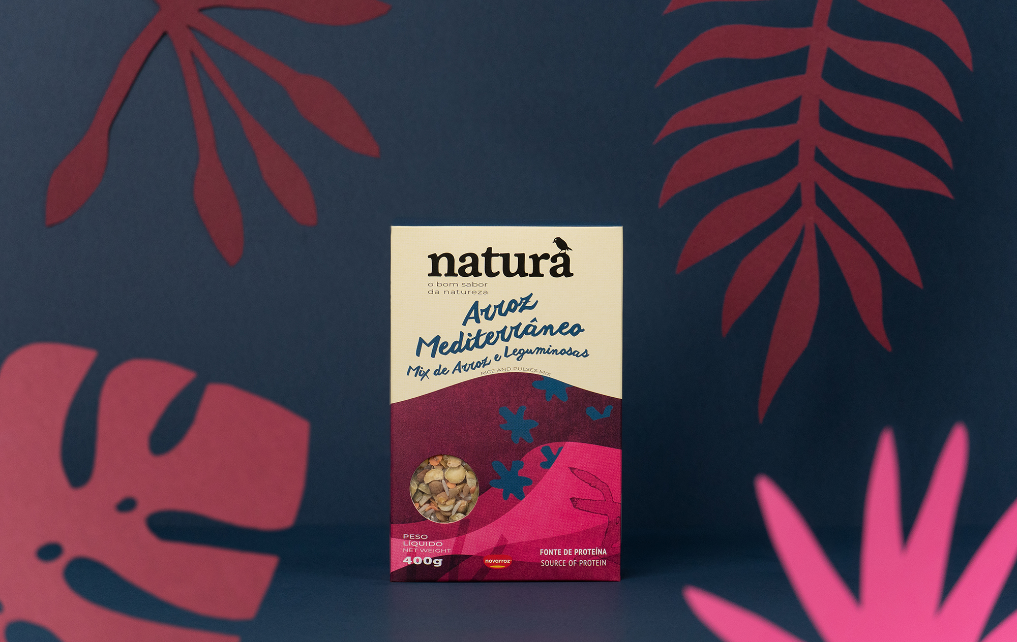
The stroke, texture and energy was intentionally organic, imperfect, and rough. Like in nature, imperfection becomes perfect. To reinforce this concept, the illustrations were developed manually and later edited and adjusted in digital format. This way, the final result preserves a manual and organic appearance – a subtle detail that holds a lot of weight in the general perception of the package.