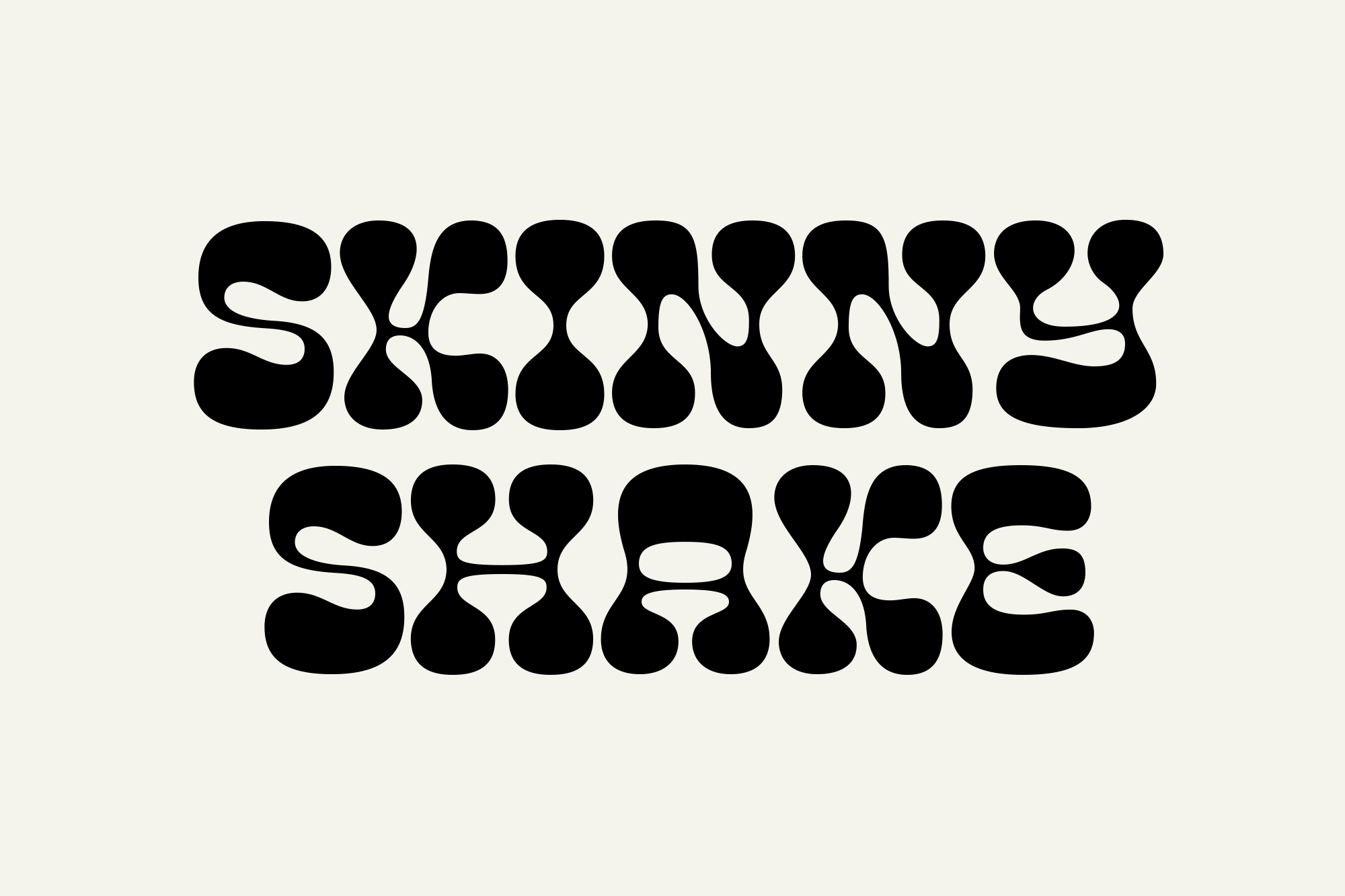
Light, natural, and authentic is what you look for when you buy smoothies. That is exactly what Studio SMPL was looking to parallel when they began to design Skinny Shakeâs branding. A company that ensures nothing but clean and pure ingredients, with ânone of the bad stuffâ needed to emulate simplicity above all else. Choosing a trendy and groovy typeface with notable pastel tones set the bottles of smoothies and shakes apart from other busy brand labels in a way that demands a first sip. And by including visceral and sharp imagery of their ingredients and products within their marketing, they further call attention to their target audience.
Skinny Shake needed a brand identity that is distinct in the noisy world of beverage retail. Our approach was to balance minimal design that could stand out against competitors with charismatic typography and color that draws inspiration from the product itself.


