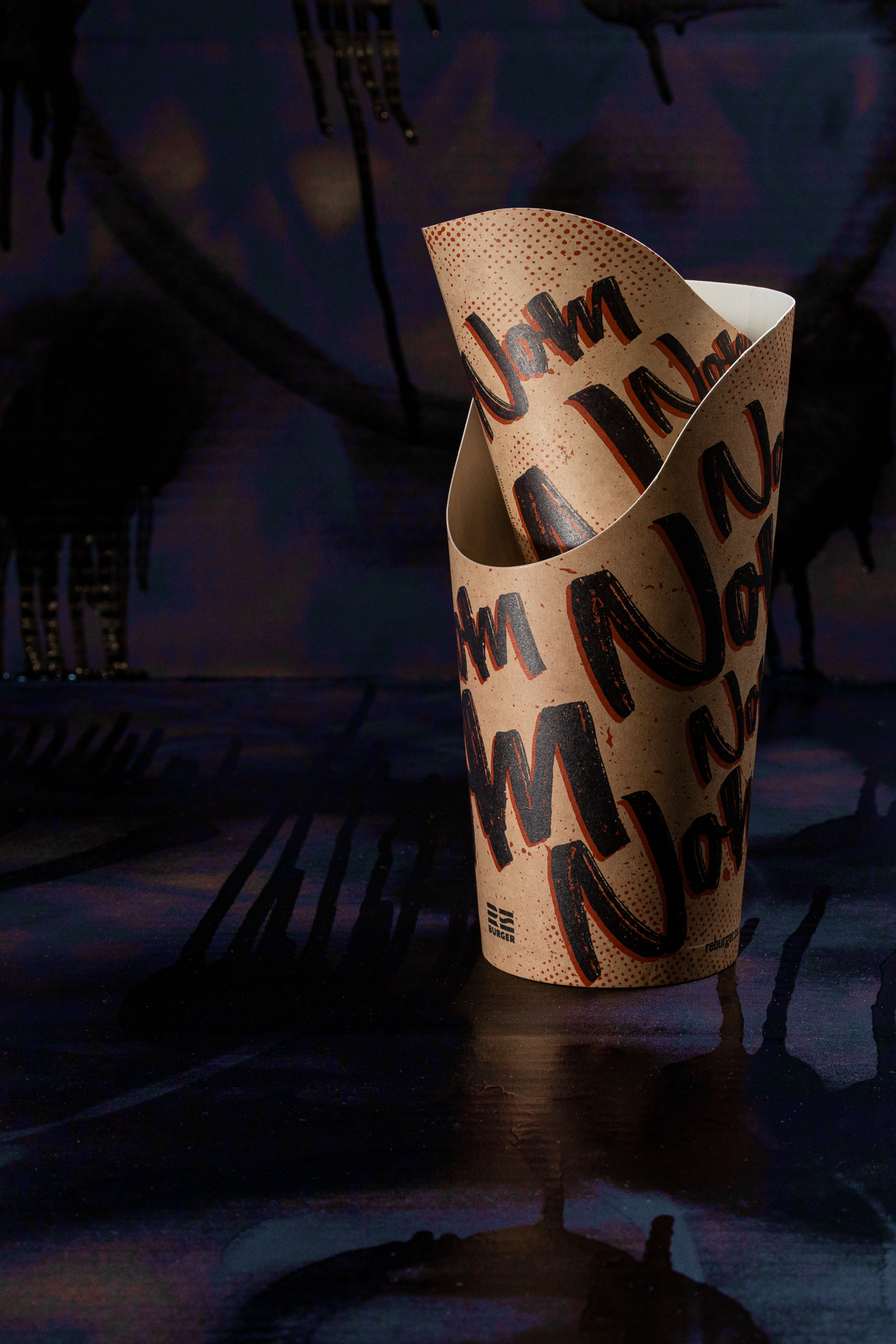
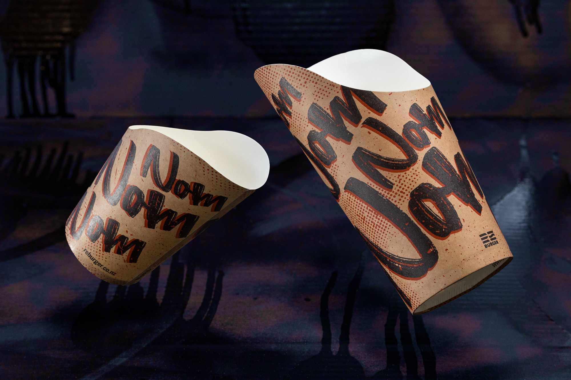
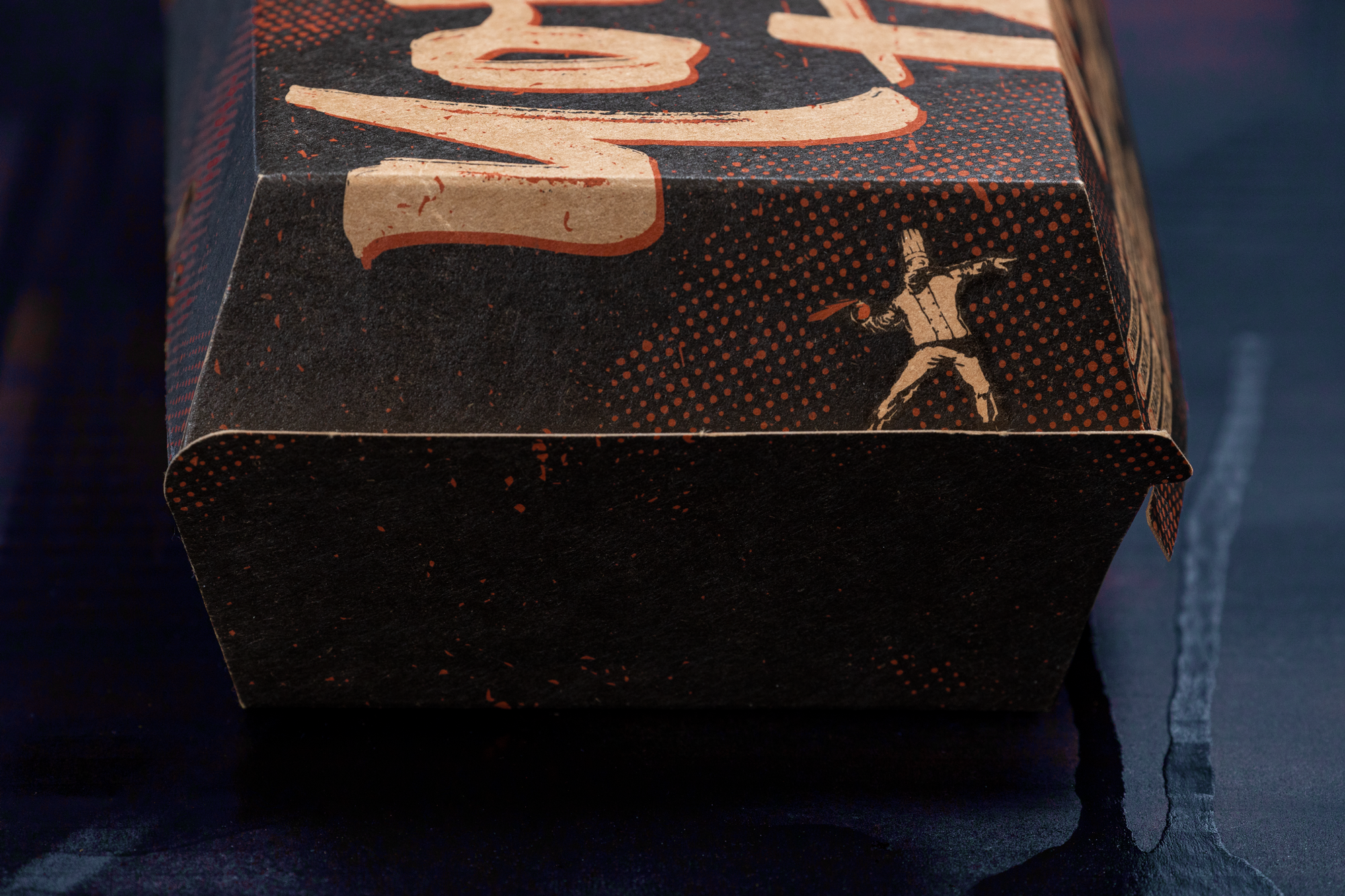
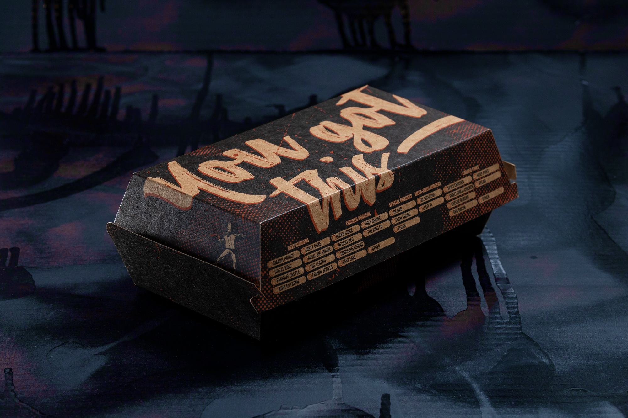
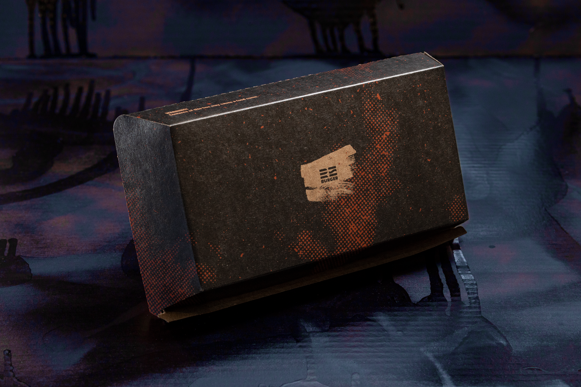
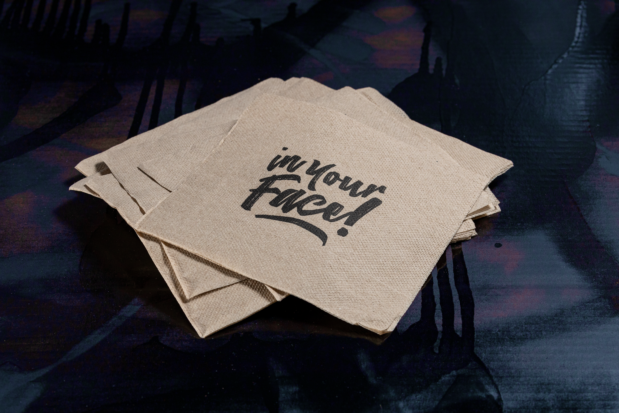
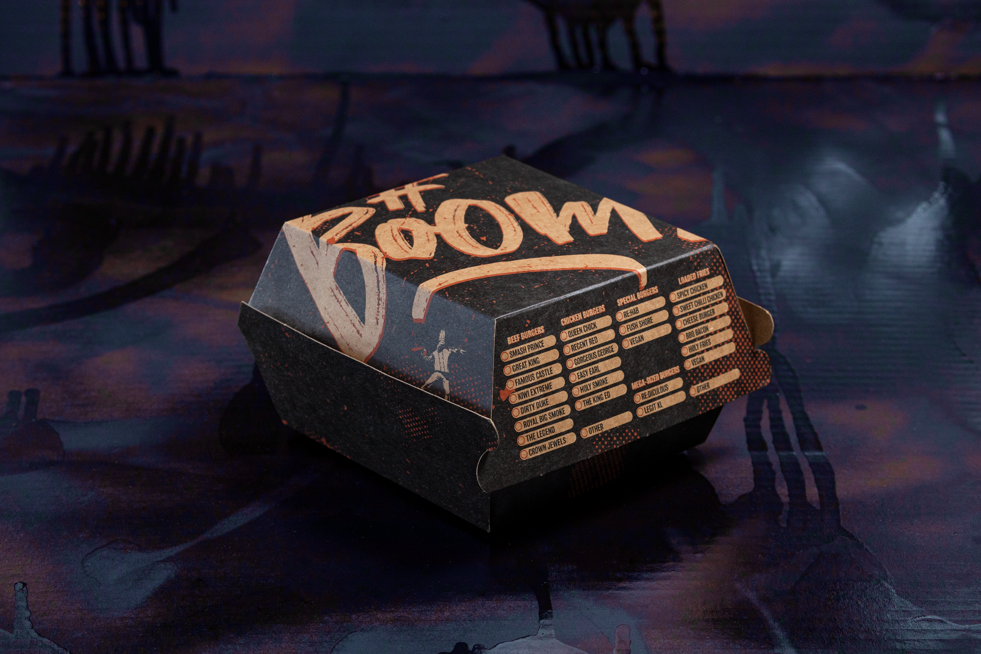
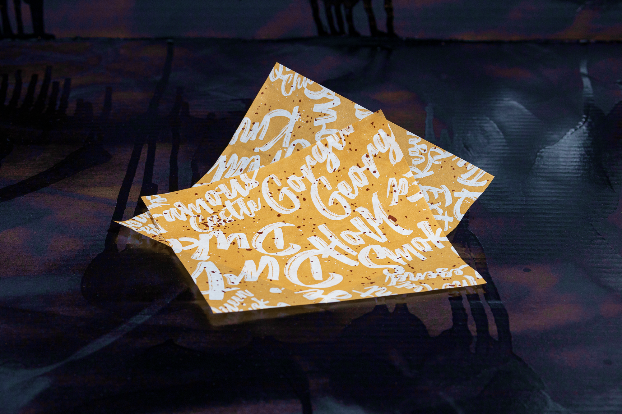
The New Zealand-based creative studio, The Bold, has beefed up ReBurger’s packaging so they can serve their burgers loudly, proudly, and unapologetically, just the way we like it. The simple color scheme paired with the bold graphics goes together like ketchup and mustard. They might’ve used a script font, but there’s nothing gentle about it. ReBurger’s packaging is in your face in the best way possible.
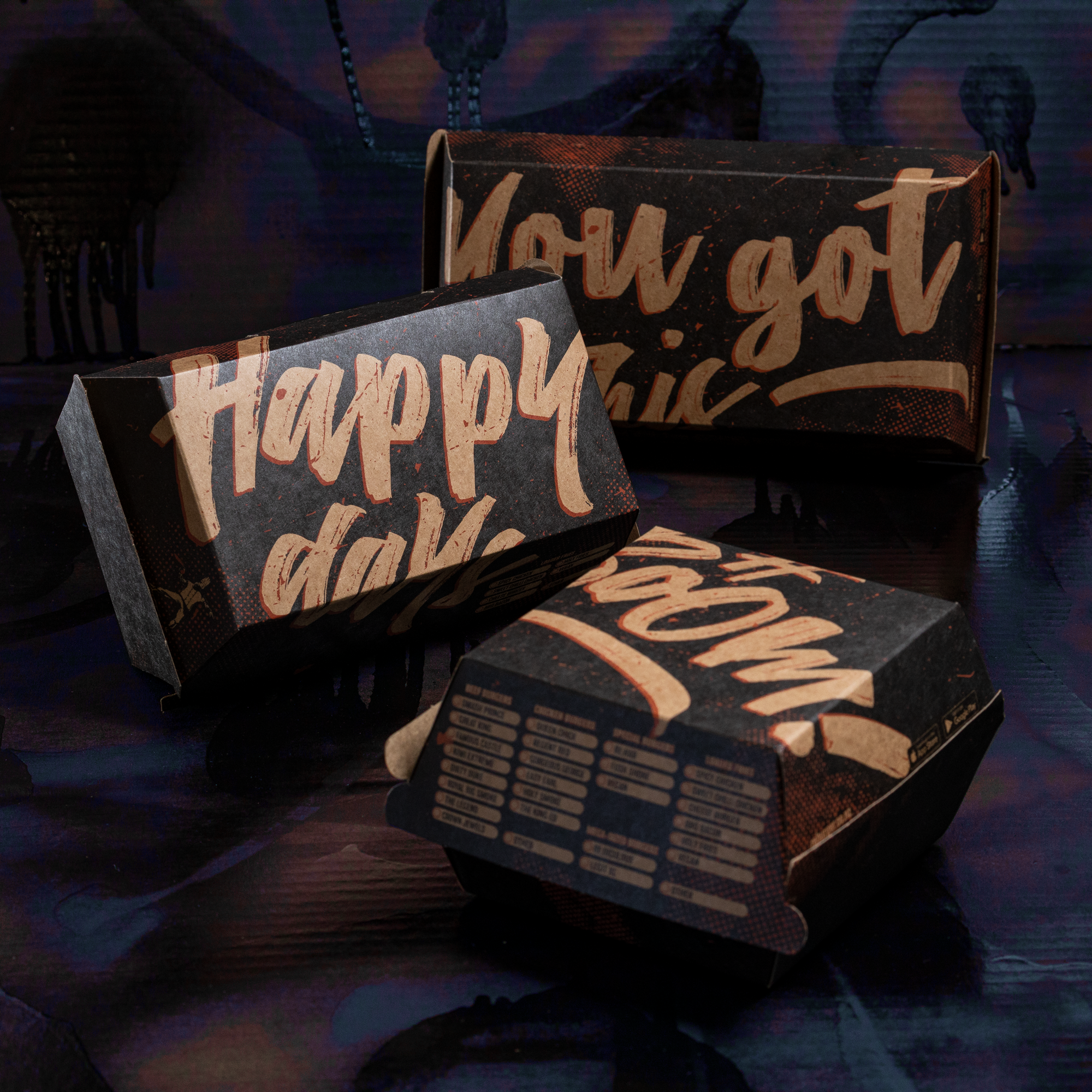
ReBurger is a burger bar franchise in New Zealand full of theatre and good vibes. The people, atmosphere, smells and bangin’ tunes all combine to create vibrant #burg-memories. The missing piece for their graphic identity has always been packaging. Until now, their burgers and fries were handed-out in plain recycled paper bags and boxes. The Bold redesigned this packaging, sticking with recycled materials plastered with the loud and proud street character of the ReBurger brand.