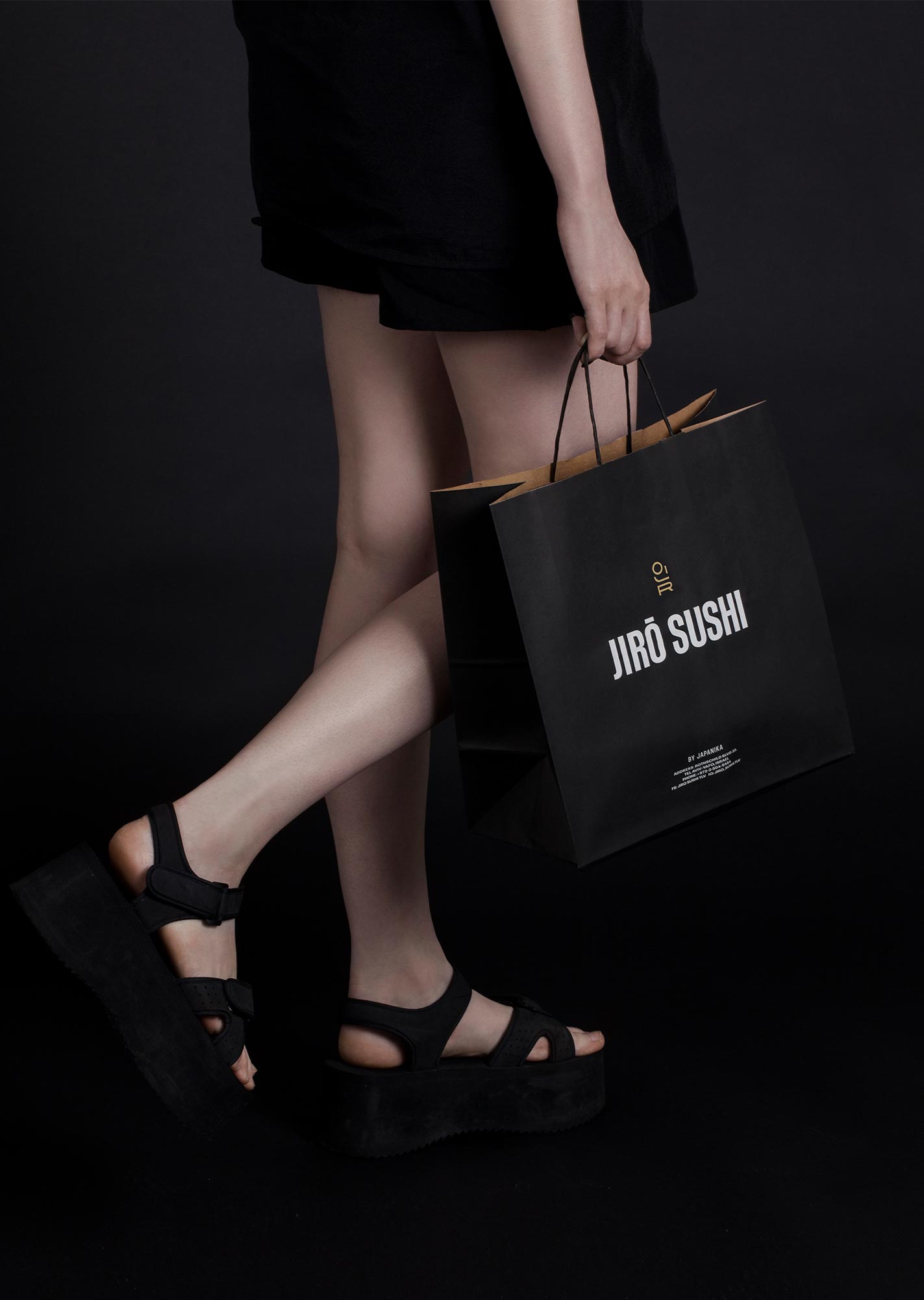
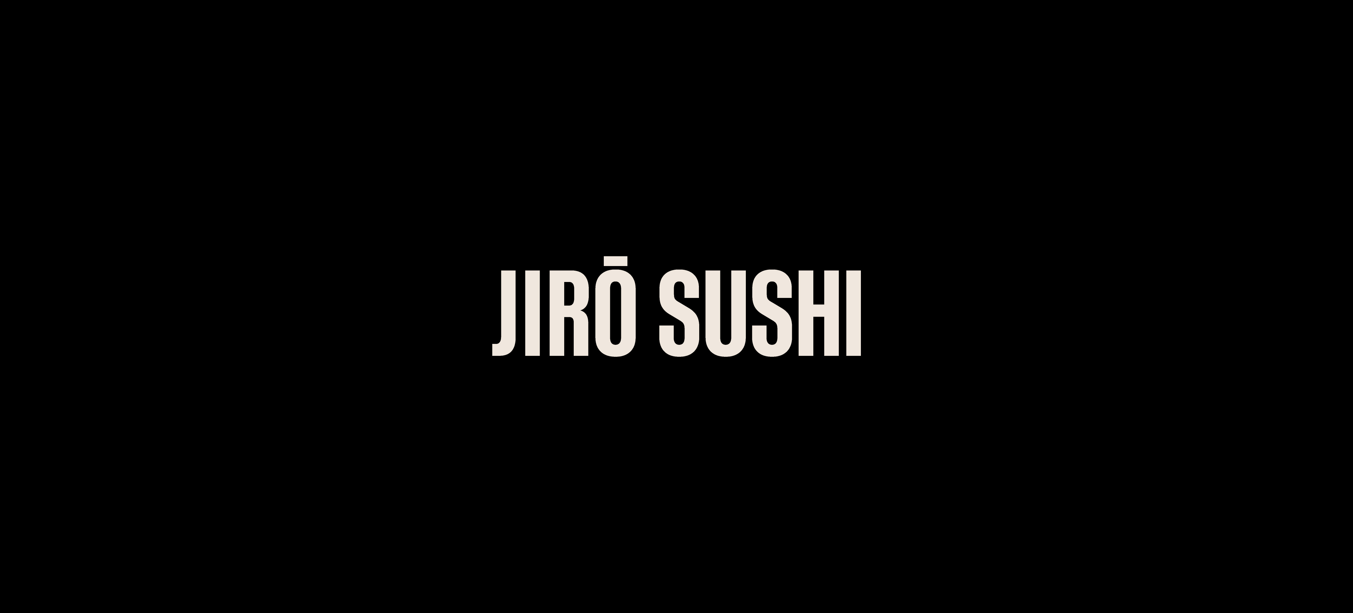
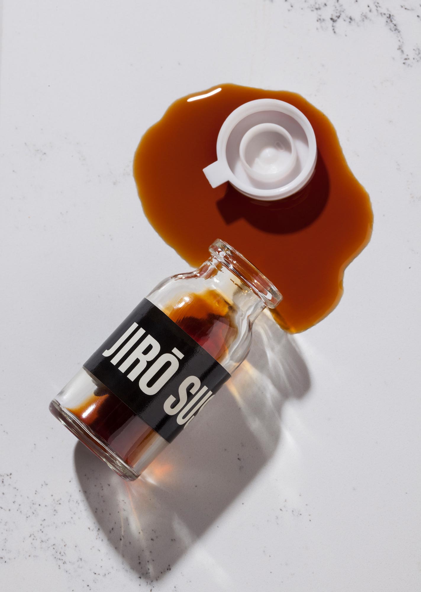
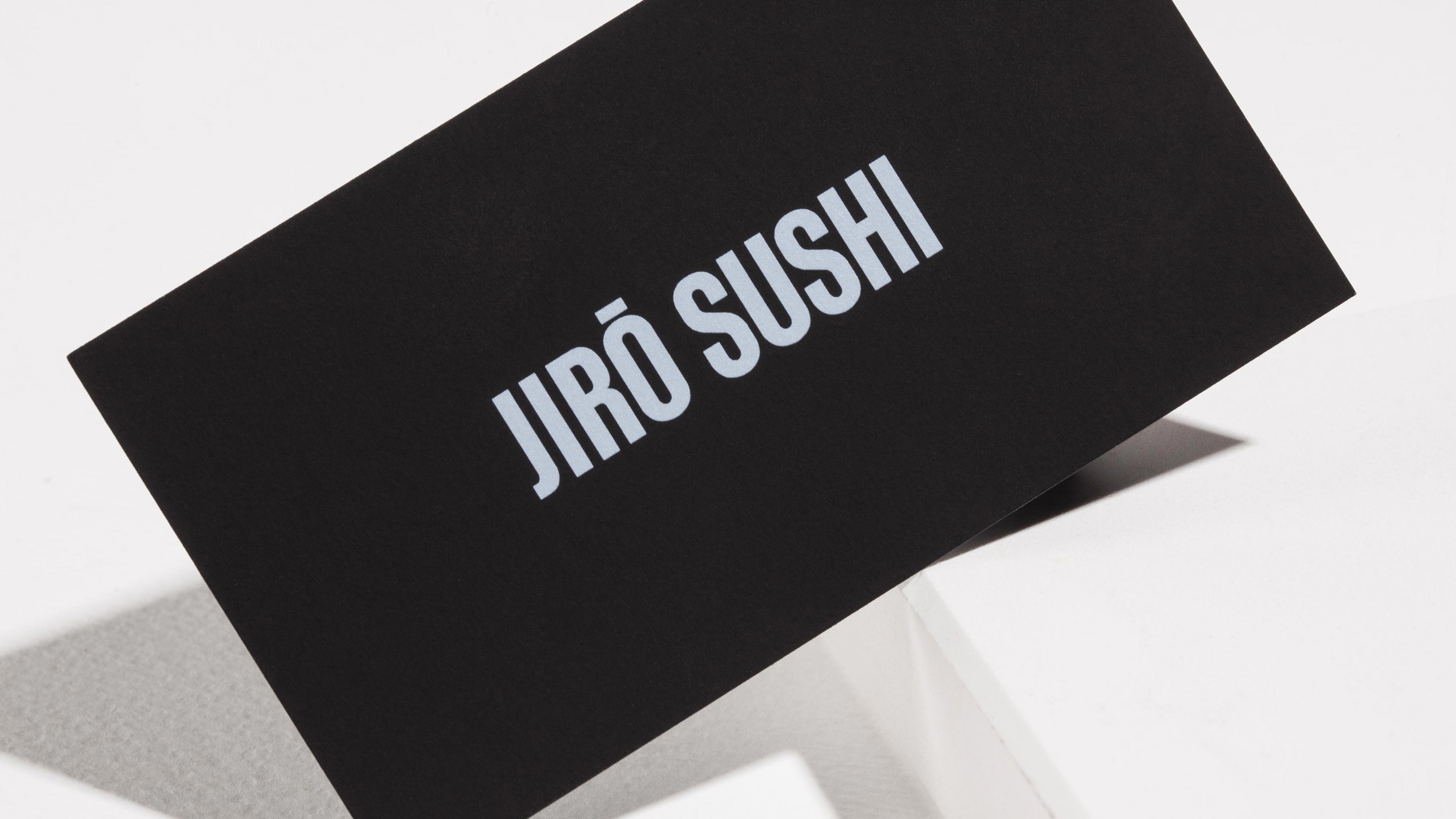
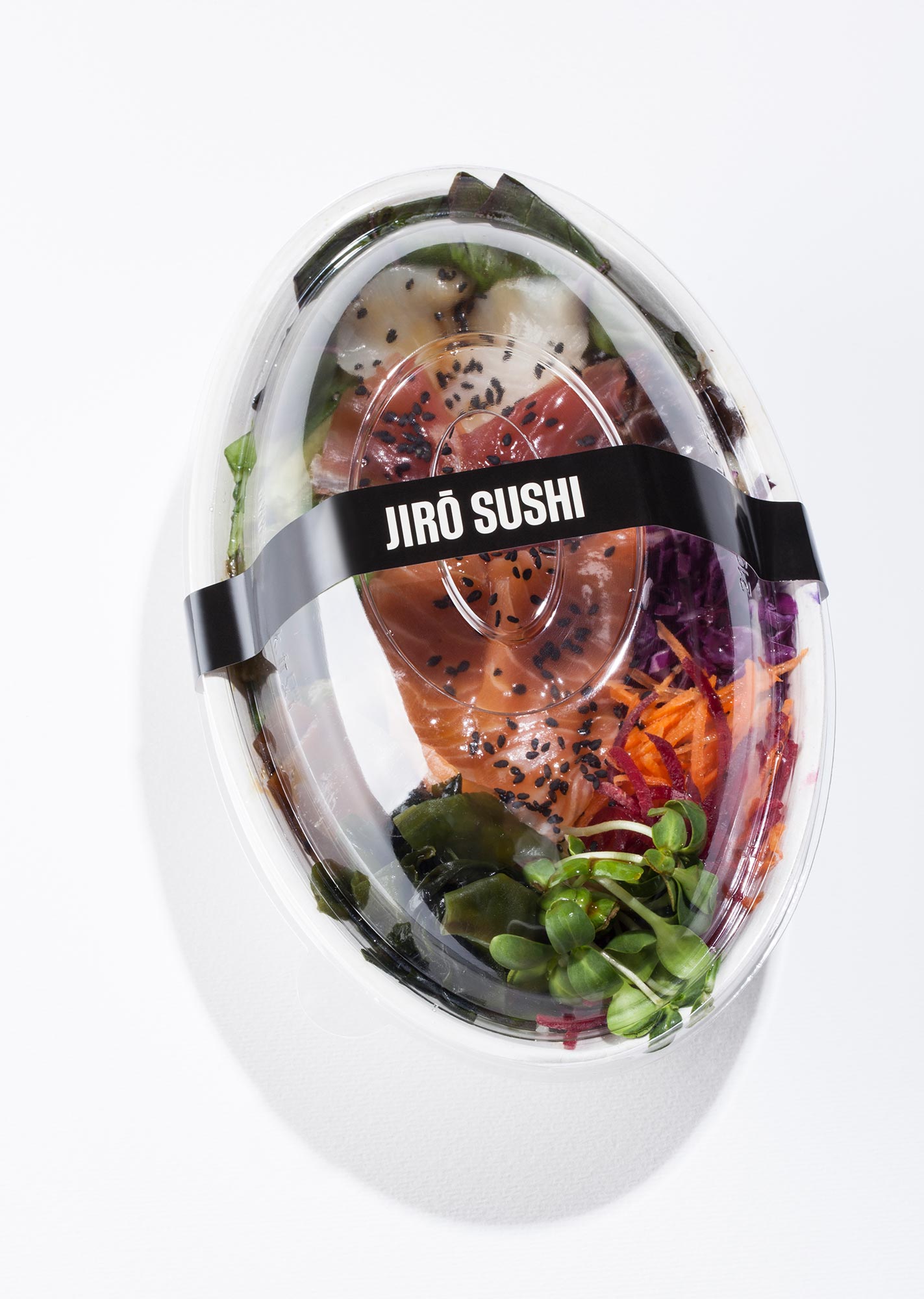
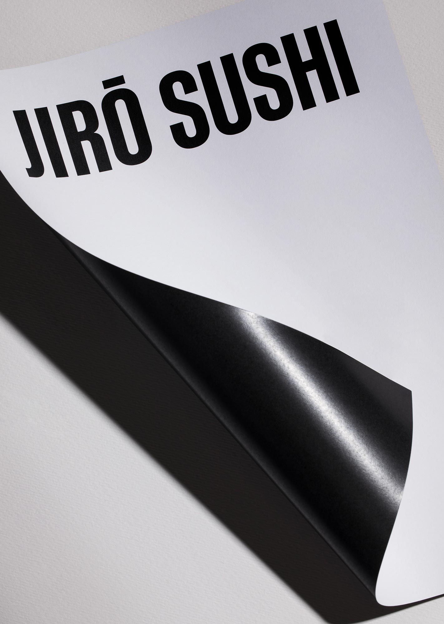
I could eat sushi every single day, and honestly, I do eat it at least once a week. I can’t stop myself. It’s refreshing and simplistic, which is exactly how I feel about the brand identity and packaging that Ark Visual has crafted for Jiro Sushi. The sans serif font of the logo is bold, impactful, and makes a statement on the packaging. The simplicity of the black and white design truly allows space for the sushi’s artfulness to shine through. Because let’s be honest, sushi is an art form.
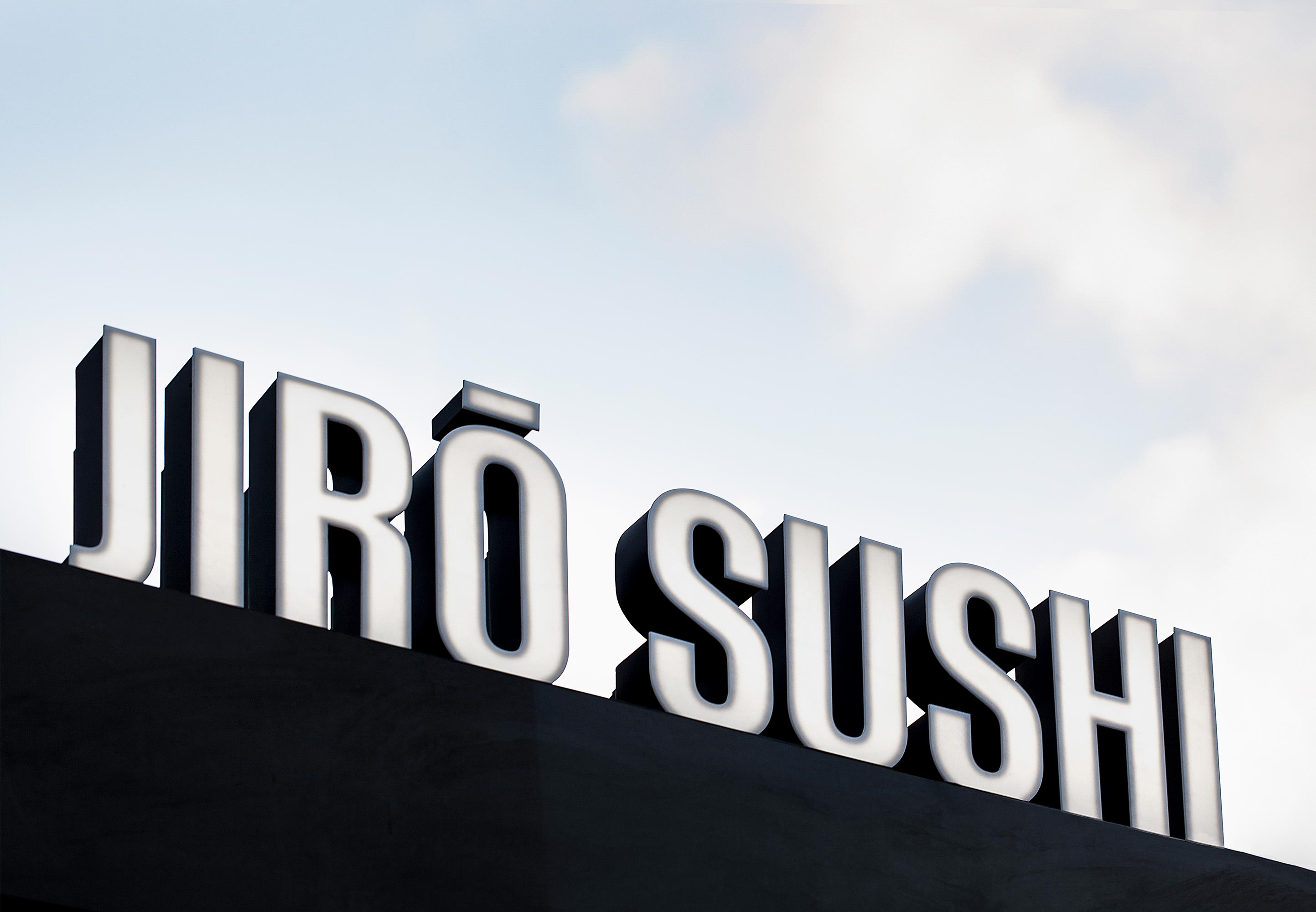
Ark Visual design studio unveils the brand identity for Tel Aviv’s Jiro Sushi, a new sub-brand of Japanika, Israel’s first and largest Asian cuisine chain with more than 40 branches throughout the country. Housed in the iconic food kiosk at the corner of Allenby Street and Rothschild Boulevard, Jiro Sushi is a fast-casual concept, offering on-the-go sushi for lunch, dinner and late-night bites. Japanika hopes to tap into the millennial and Gen-Z consumer, seeking an elevated experience from its existing offerings. Ark Visual took cues from the urban landscape of Tel Aviv to craft a simplistic, yet powerful visual language through shape, neon lighting and minimal tones to allow the food to act as color. The studio’s design for Jiro Sushi brings the hotspot to life in its central location at the heart of the city’s business and nightlife district.
Tel Aviv is no stranger to Japanese fare, trailing only behind Tokyo and New York as the city with the most sushi restaurants per capita. Ark Visual was tasked with defining the visual direction and concept of Jiro Sushi and helping the brand stand out amongst a crowd of competition. Inspired by the iconic 1930s International Style buildings of Tel Aviv, the studio incorporated the harmonious lines and curvatures of the Bauhaus-inspired architecture within the condensed typography and dynamic symbol design.
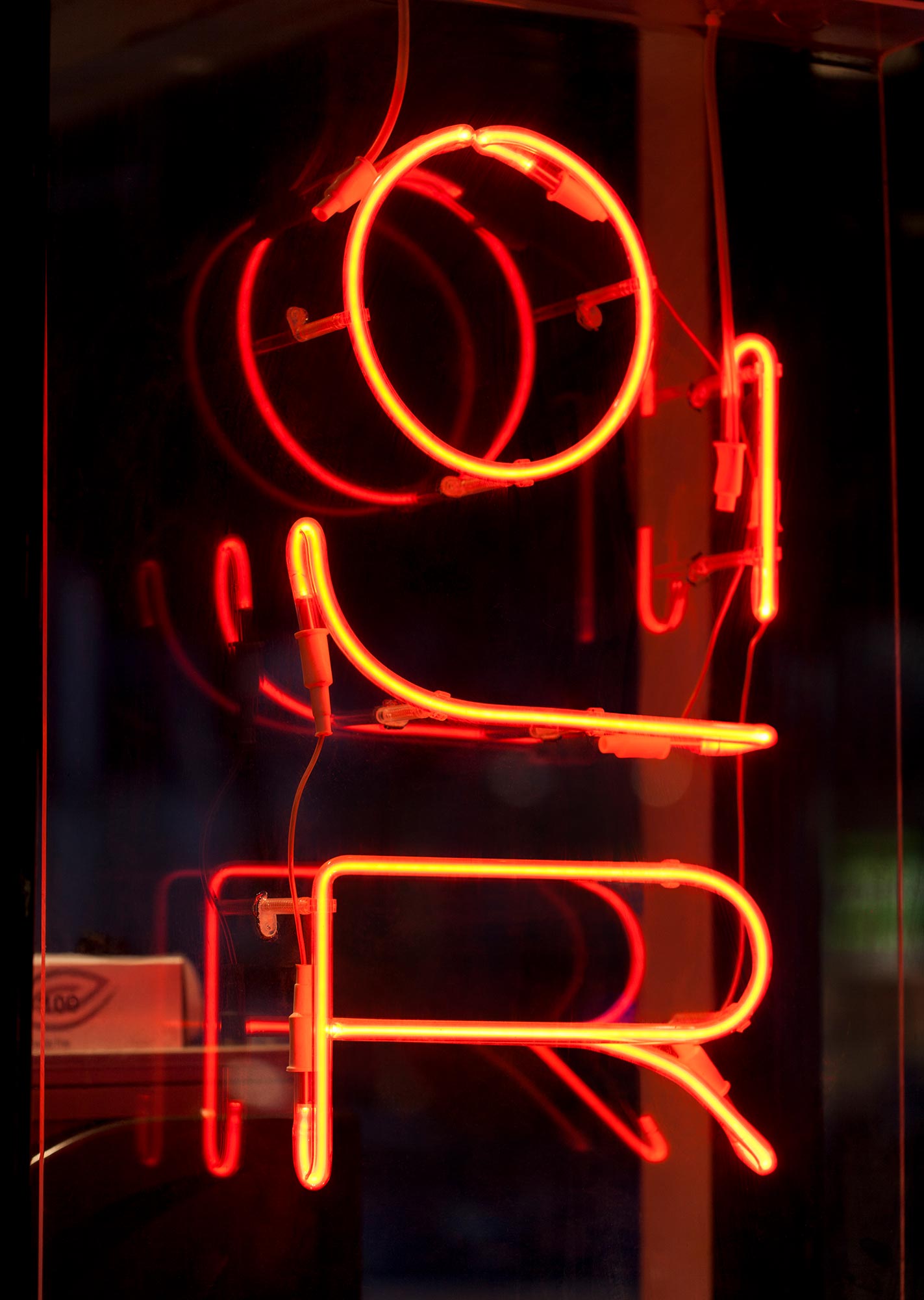
In particular, Ark Visual was inspired by the work of Genia Averbuch, a pioneering female architect who designed the famed Dizengoff Square in central Tel Aviv in 1934. The circular buildings that surround the square are one of the city’s most esteemed examples of regional International Style. Their curvatures and unique balcony parapets influenced Ark Visual’s direction with the Jiro Sushi symbol, which plays with the aesthetic values of Bauhaus type and style. It encapsulates a modernist visual representation of the word “Jiro”, fusing traditional Japanese vertical writing with International Style/Bauhaus characteristics.
“The deeper we found ourselves in the design process, the more we reduced the visual language,” says Ark Visual Founder and Lead Designer, Hagar Erez. “The result translated into a black and white color system, using typography as the central means to reflect simplicity and communicate the flow of the city and laidback Telavivian urban state of mind and living.”
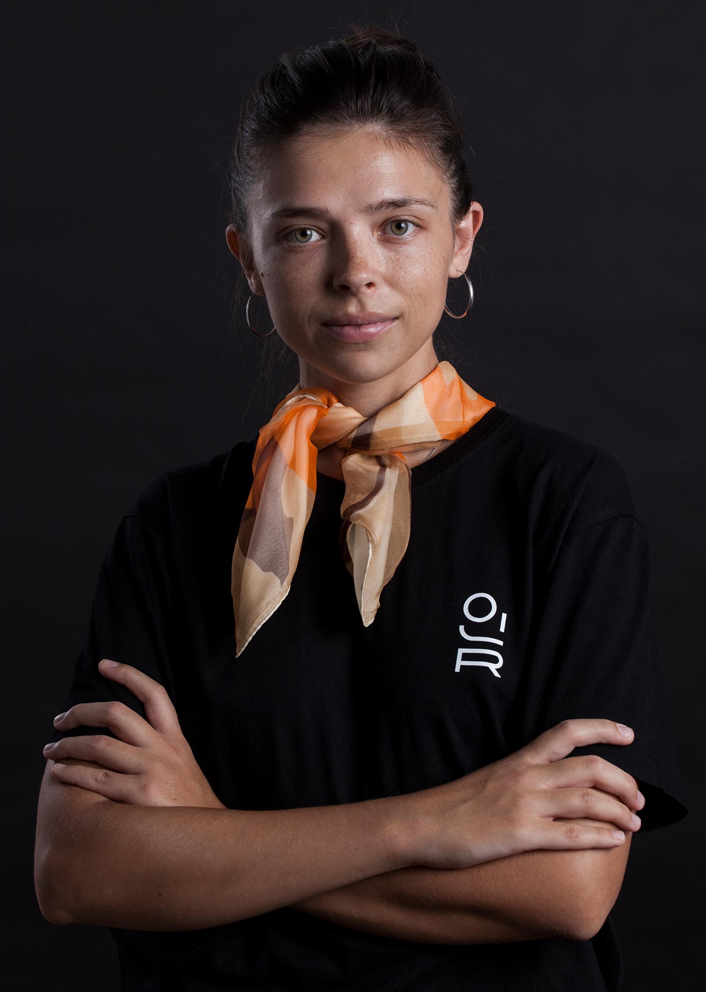
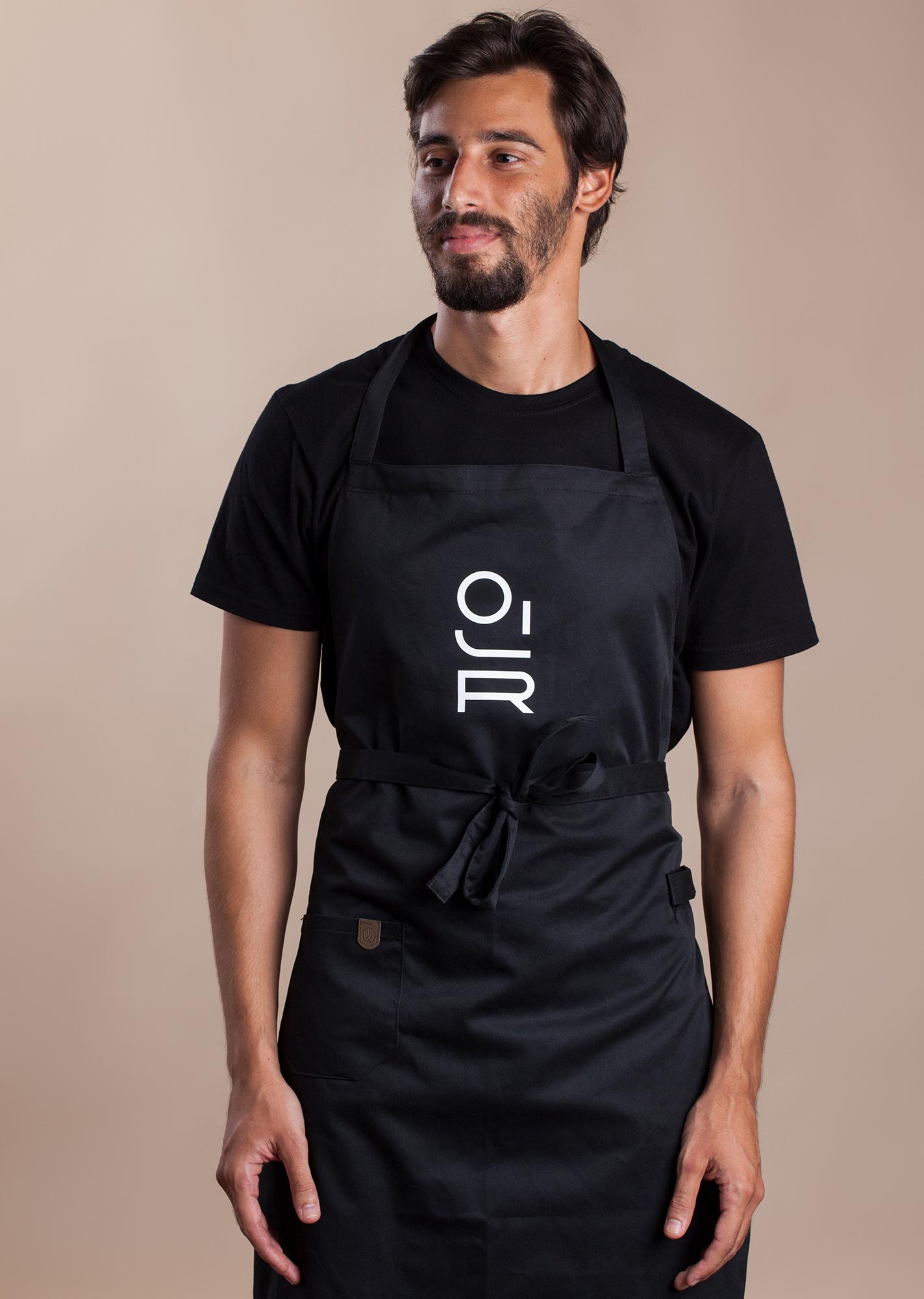
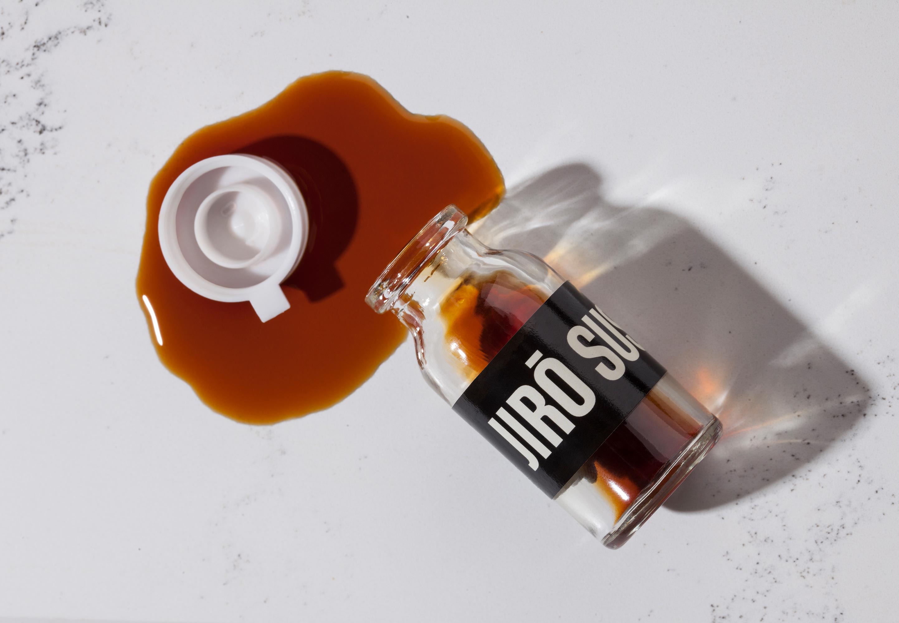
Ark Visual’s branding and visual language encompasses a 360-degree approach from research, design, strategy, brand packaging, to neon and traditional signage, menu design and employee uniforms.
Jiro Sushi will prove to be a powerful sub-brand for Japanika, offering take-away service, delivery and on-the-go bites during the Covid-19 era when traditional dining has ceased. The eatery offers classic sushi, hand rolls, sushi bowls, nigiri and a comprehensive wine and Japanese beer list.