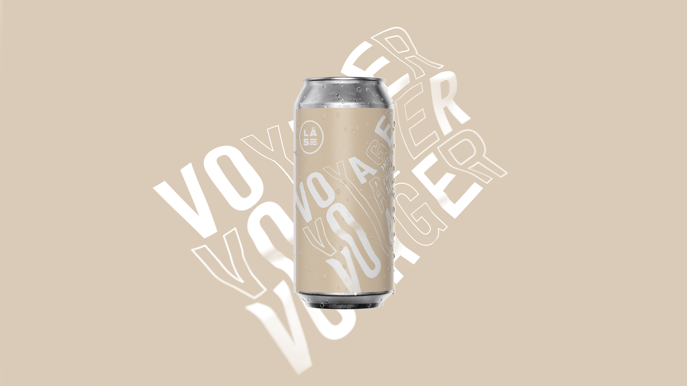
Society Studios was tasked to create a visual language, naming convention, and branding for Lost At Sea Brewing Co. that would easily stand out on the shelf. Not a simple task when the beer market is so saturated. Because Lost At Sea has such a nautical flare, the identity is rooted in it. Whether the font on the can is inspired by how you’ll feel after drinking a few of these beers or by waves themselves, I adore it. The simple packaging will stand out on the shelf as many beer brands have turned away from the minimalistic approach.
Lost At Sea Brewing Co commissioned Leeds-based Society Studios to develop a visual language, naming convention and brand that would help them stand out in the crowded craft beer market. With imaginative packaging fast becoming the new normal in this sector, Society Studiosâ challenge was to find a way to make waves for Lost At Sea that was true to the product yet would appeal to potential punters.