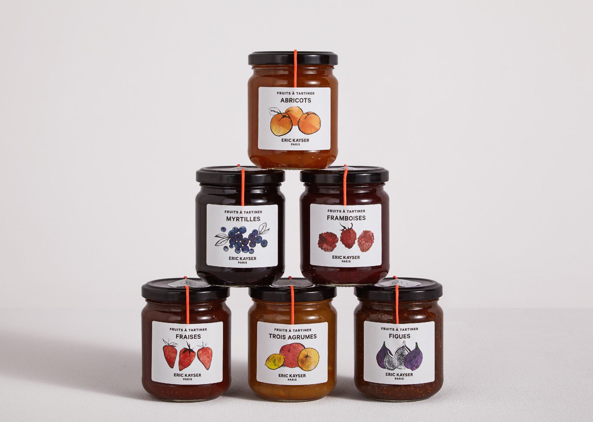
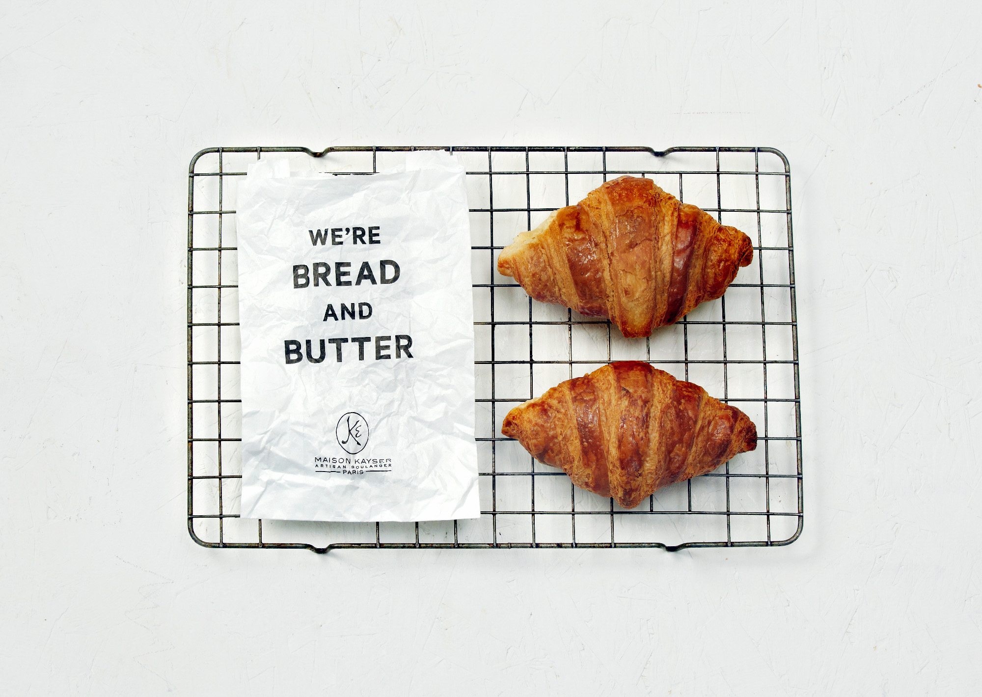
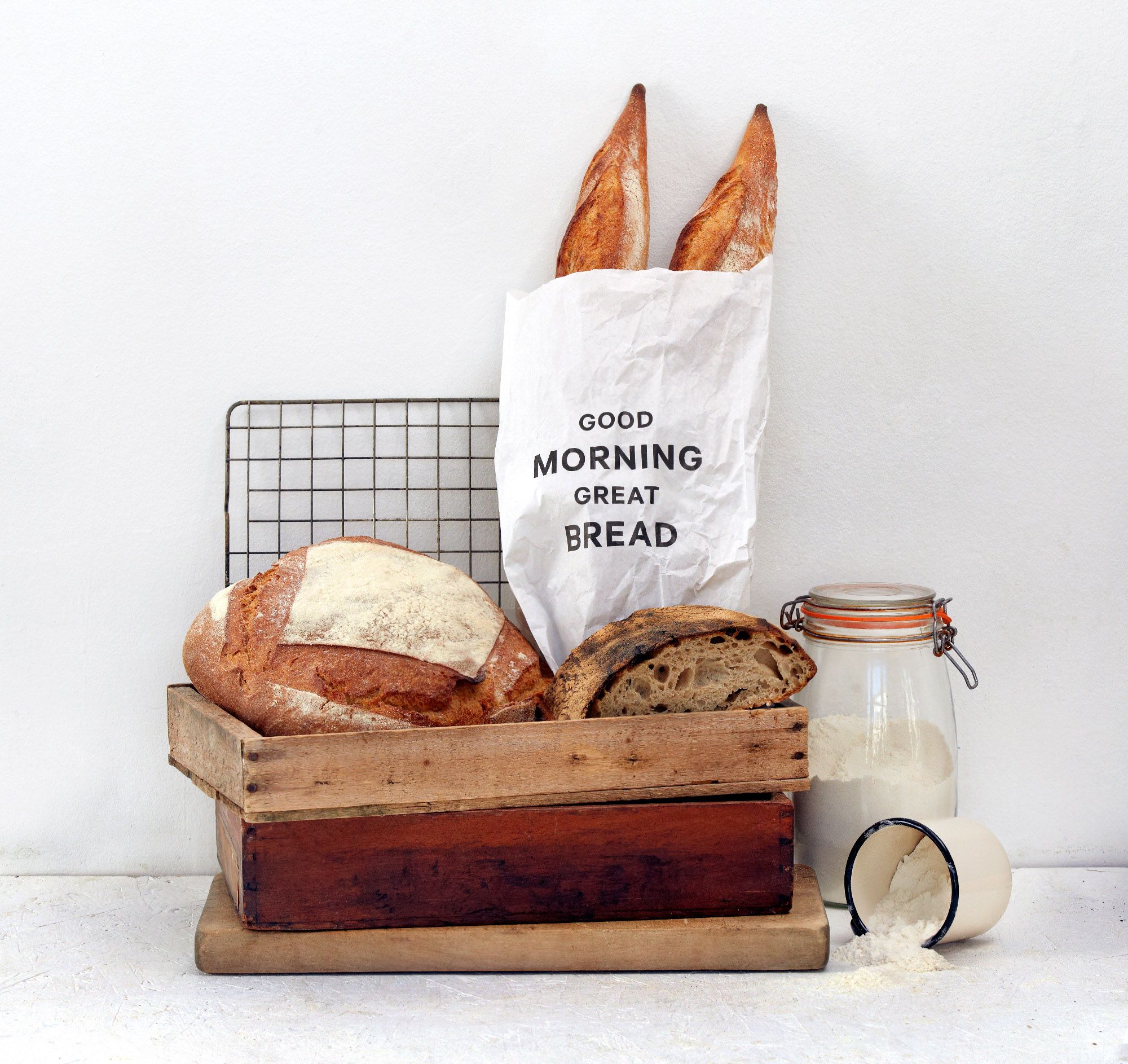
Sometimes less is more. When it comes to baked goods that involve the simplest of ingredients, the presentation should follow suit. En Ville studio took the opportunity to provide witty, straightforward descriptions on Maison Kayser’s packaging designs. The pairing of high-definition photos of the bread products, as well as fruits and other ingredients, juxtaposed by the crisp, black font, calls the perfect attention to the brand’s identity.
In Paris, as well as in more than 100 shops worldwide, Eric Kayser’s boulangeries and cafes are an institution. With a commitment to artisanal baking and natural ingredients, their breads and pastries are savored daily by devotees. En Ville worked closely with Eric Kayser to articulate a distinctive brand position that clearly sets the brand apart from its competitors. The design team developed this strategic platform into a completely refreshed and refocused identity.
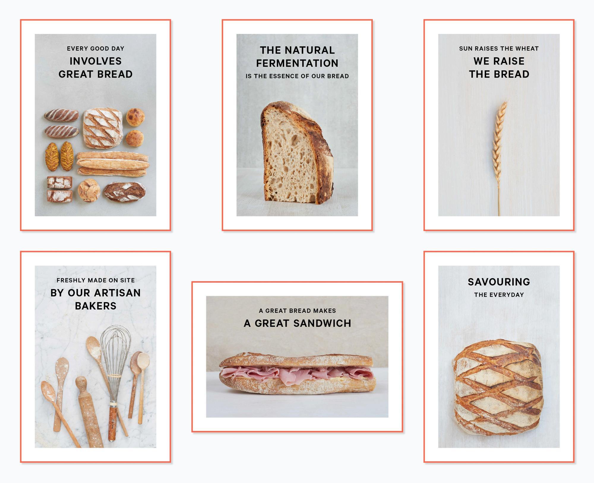
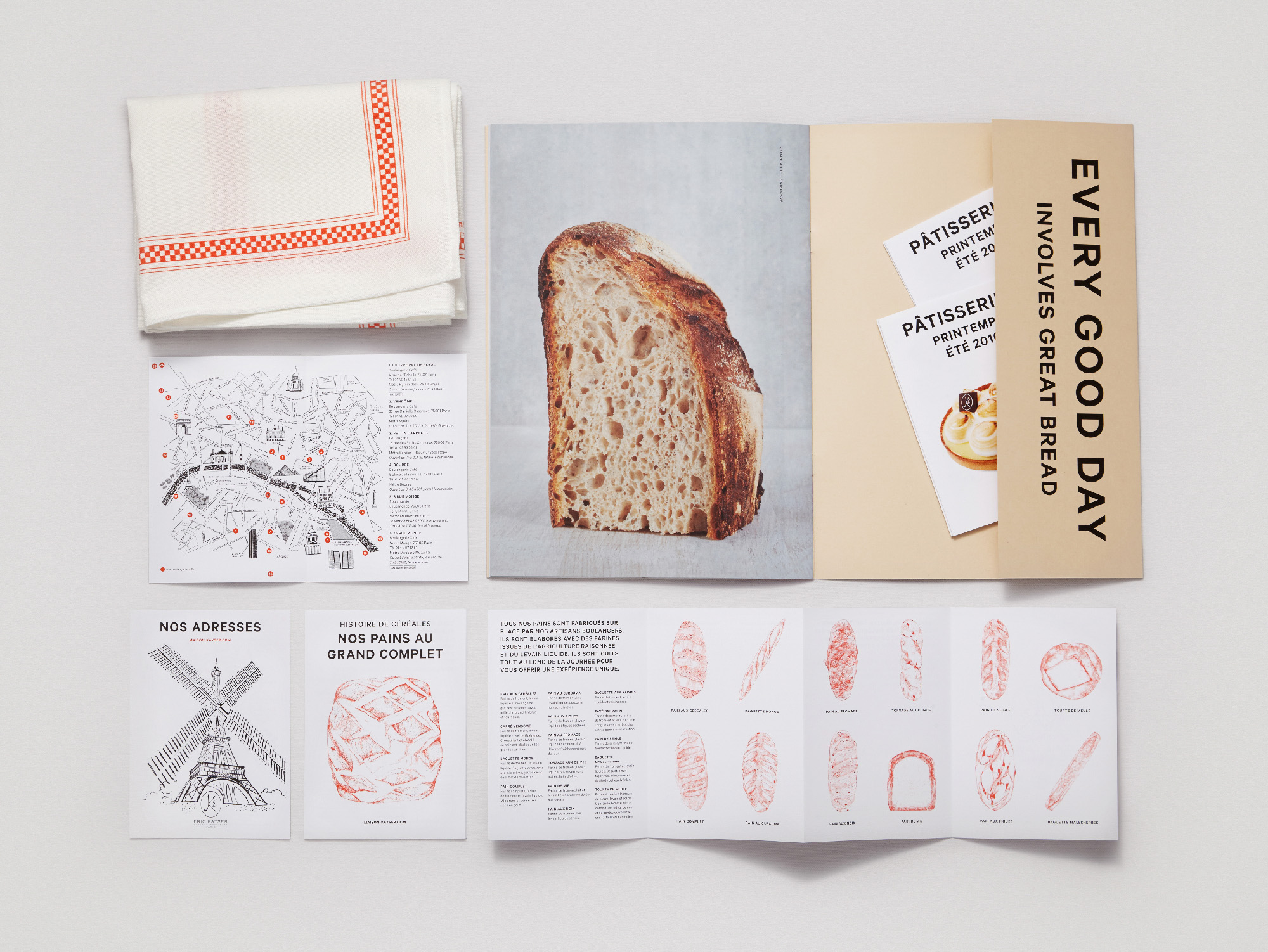
An expansive, cohesive range of applications received the En Ville treatment, from art direction and photographic prints to signage and packaging. Commissioned illustrations add warmth to custom packaging for treats such as house-made preserves and macarons to complete the update.