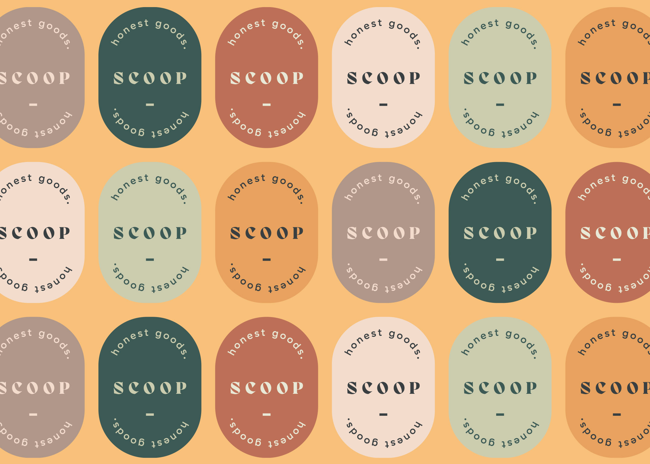
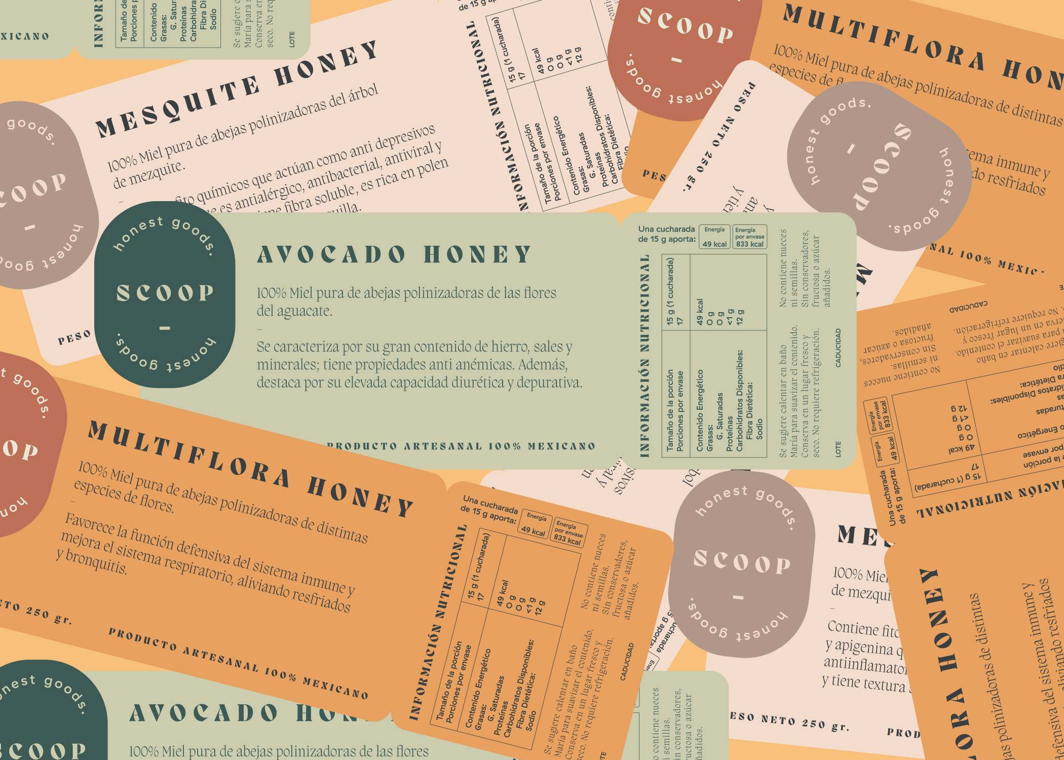
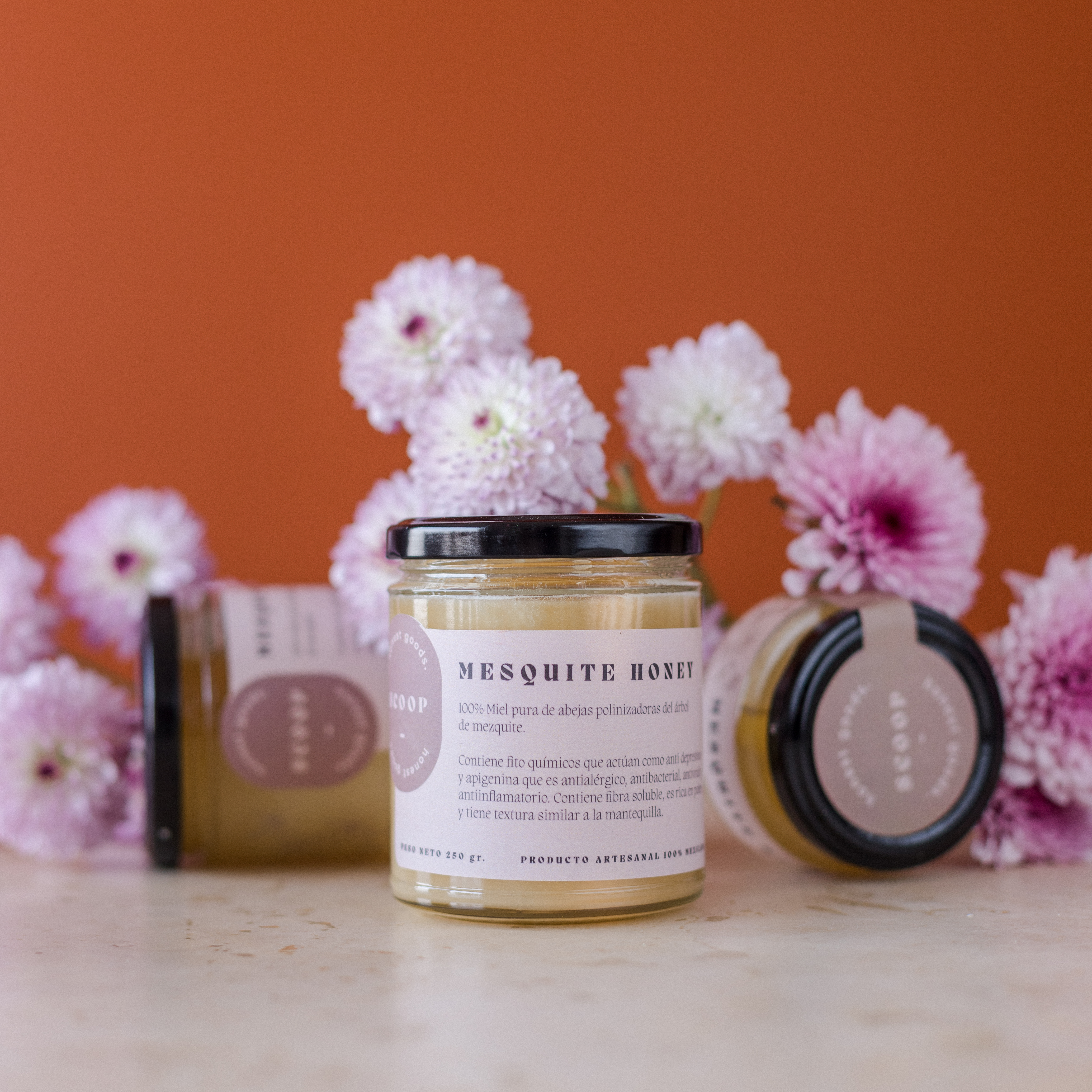
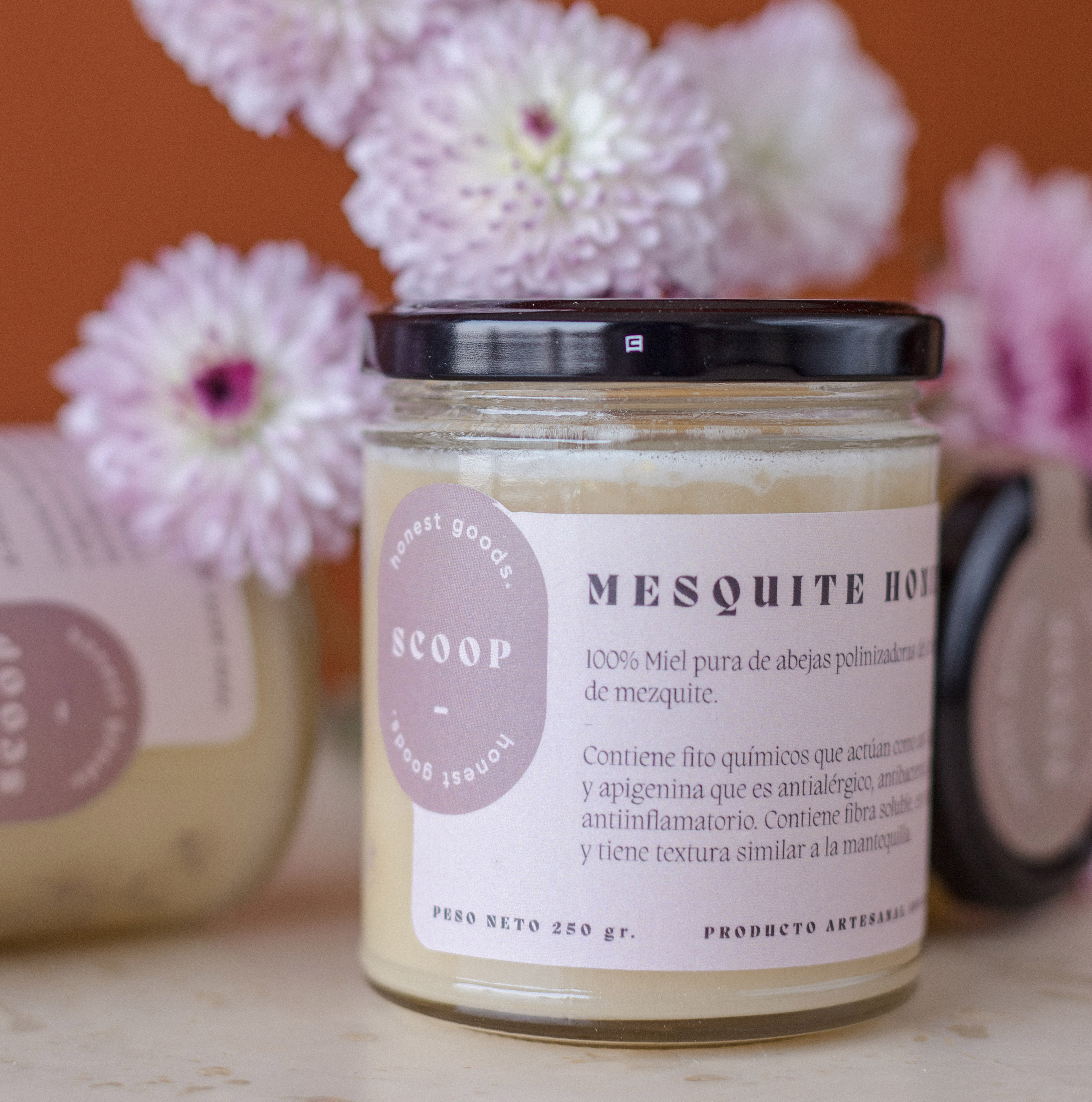
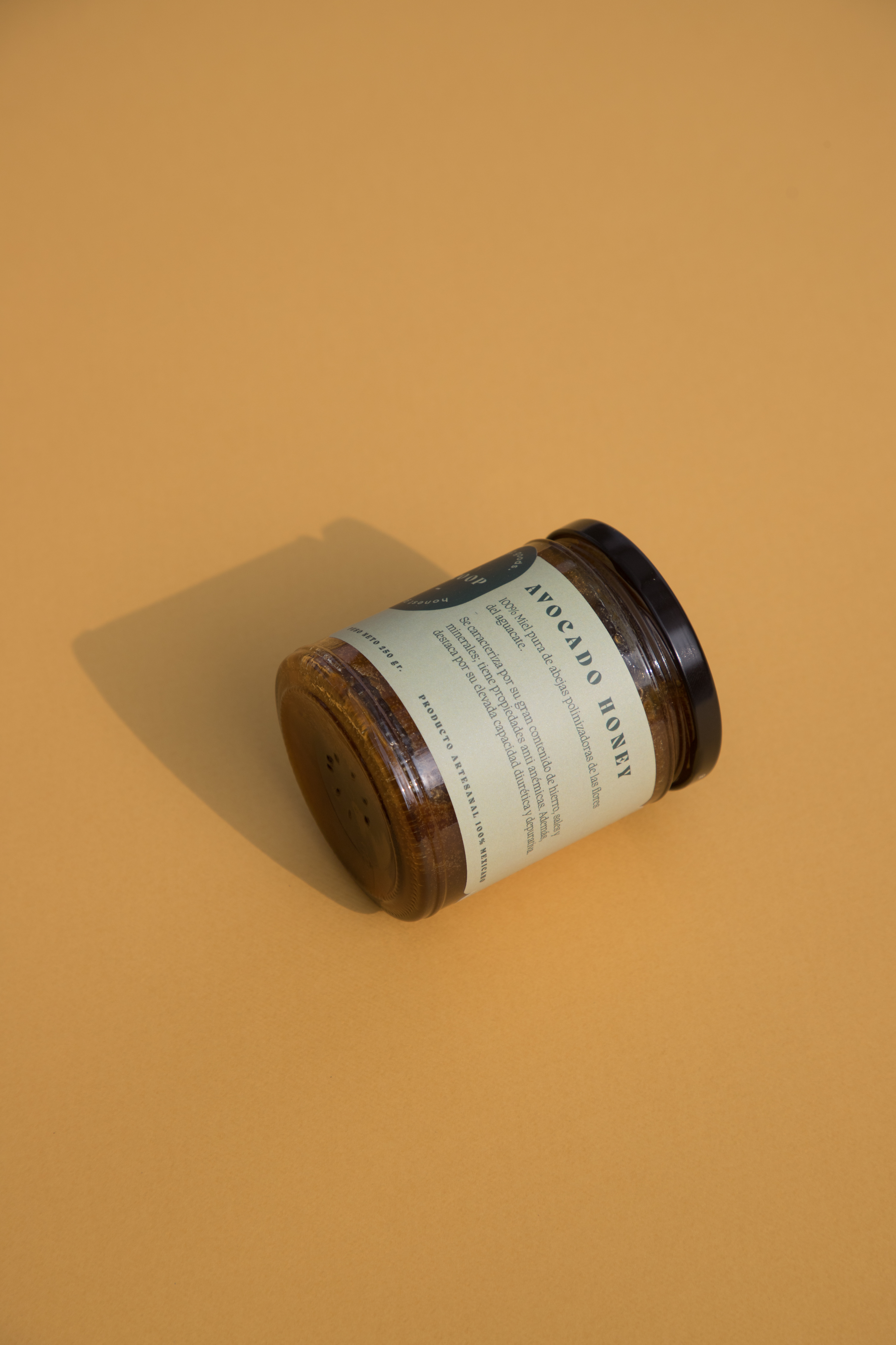
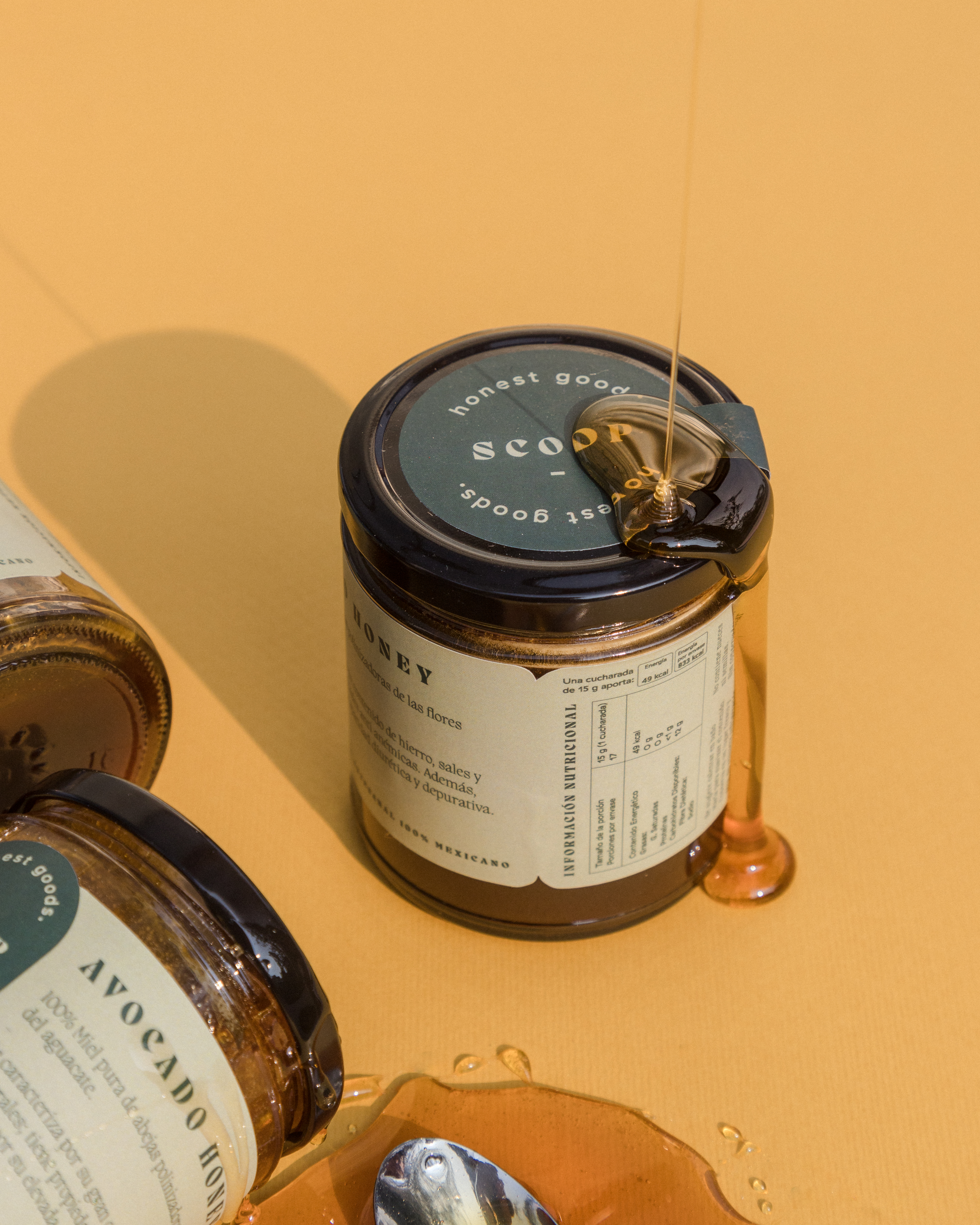
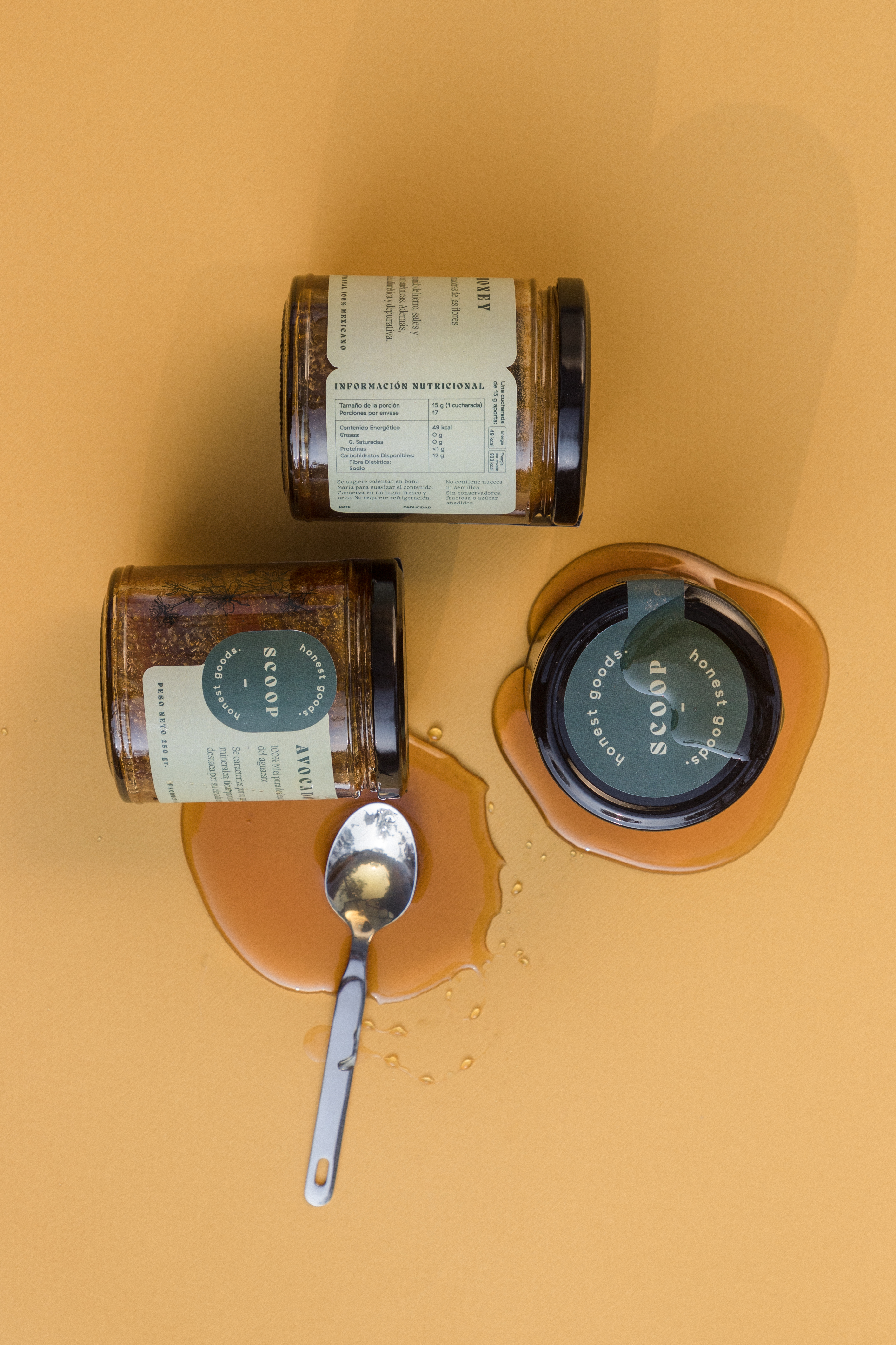
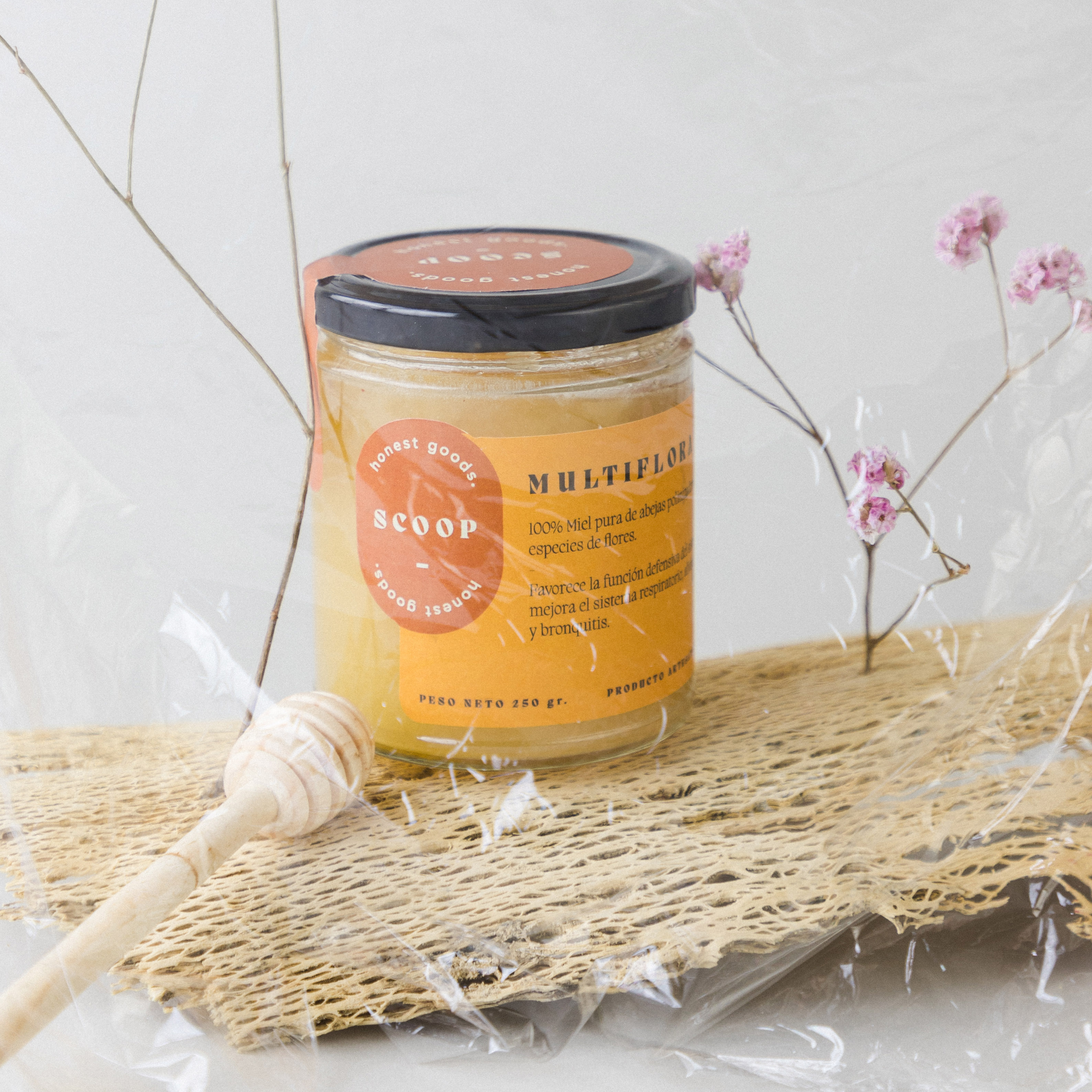
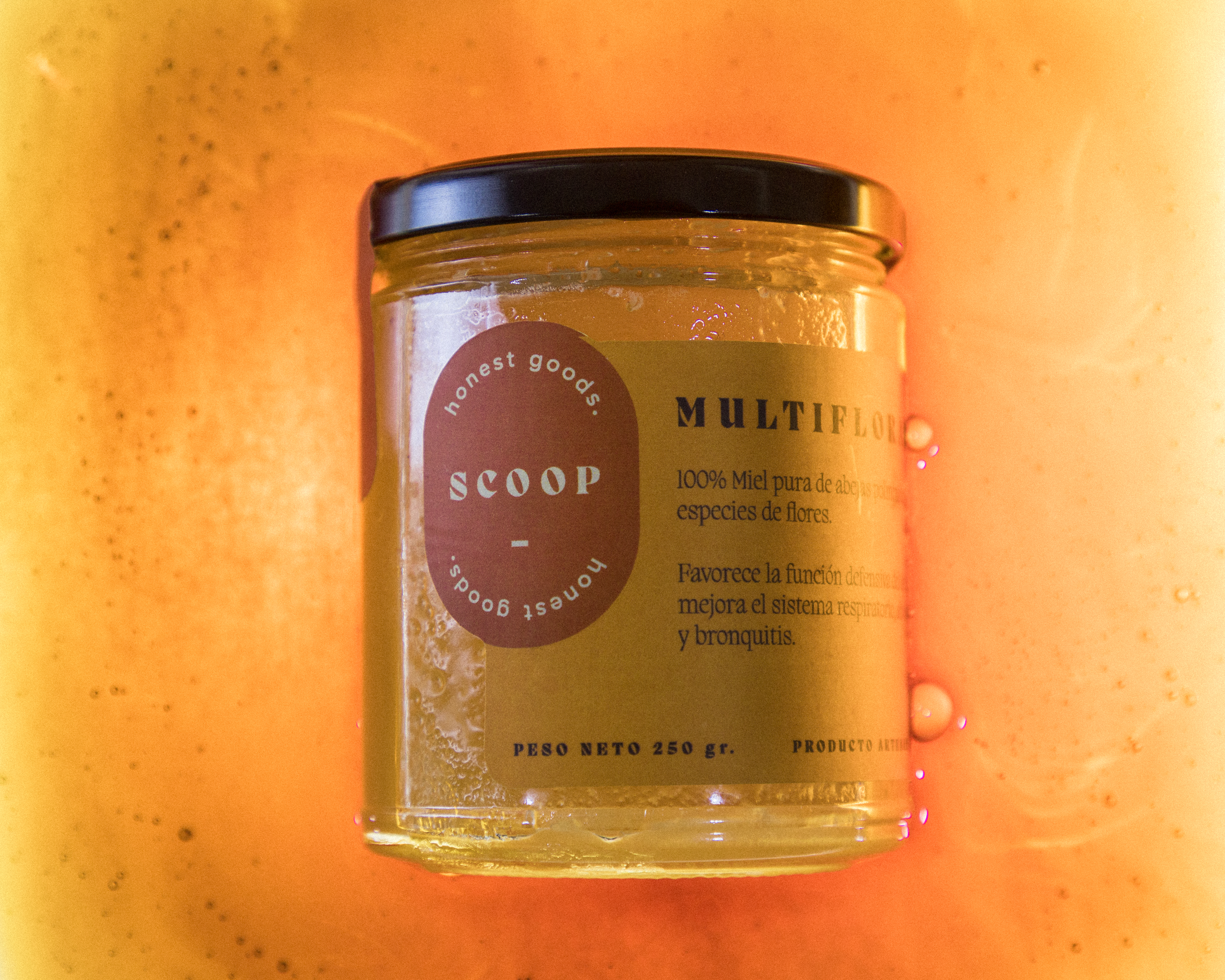
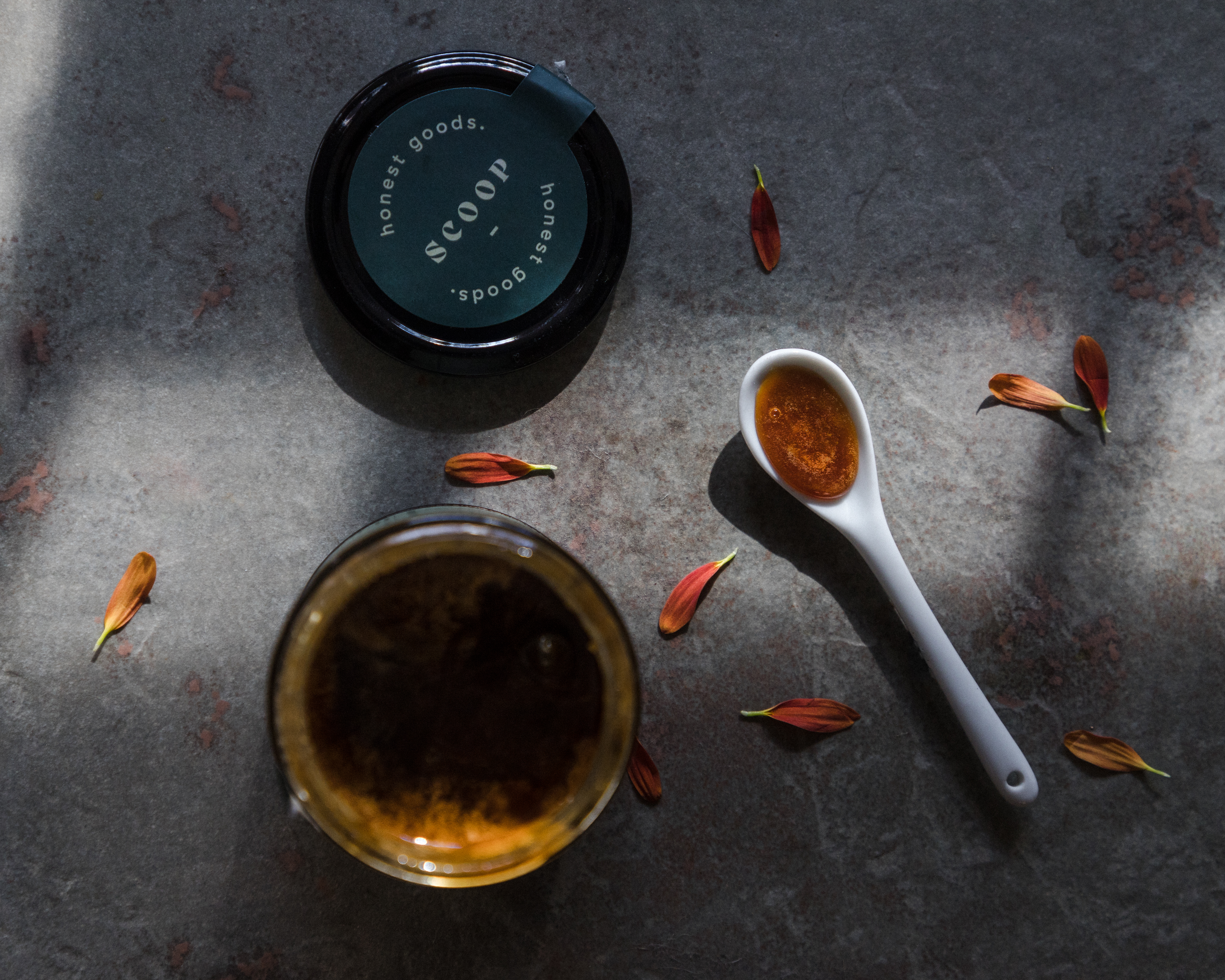
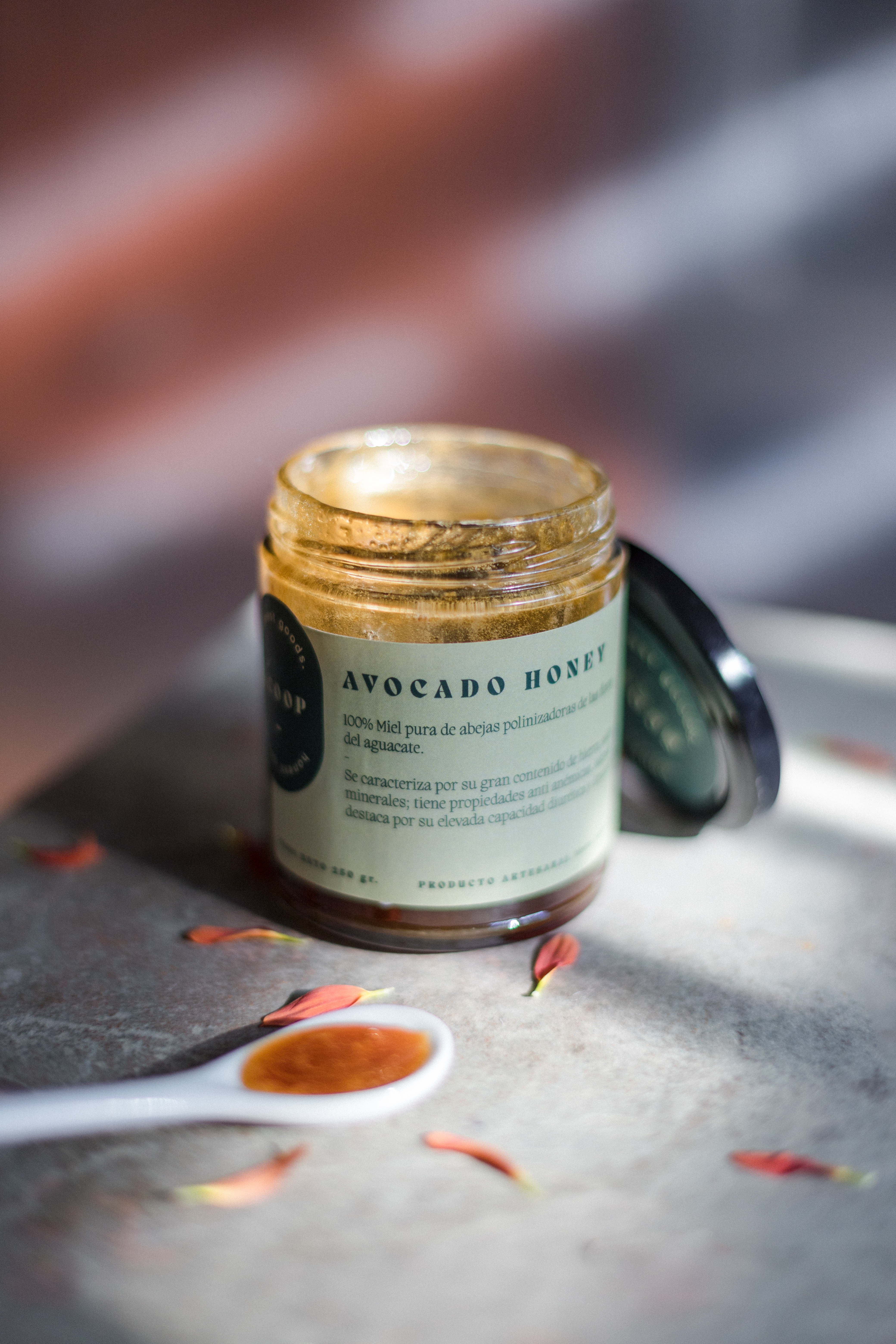
Honey just got a major makeover thanks to the redesign for Scoop: Honest Goods. The charming and approachable serif typeface blends homemade with modern, and the homey color palette stays consistent across all variants while maintaining their own personality.
By creating a branding system that is flexible and instantly endearing, Scoop: Honest Goods can focus on the quality of the product, and the customers can focus on the wild flavors.
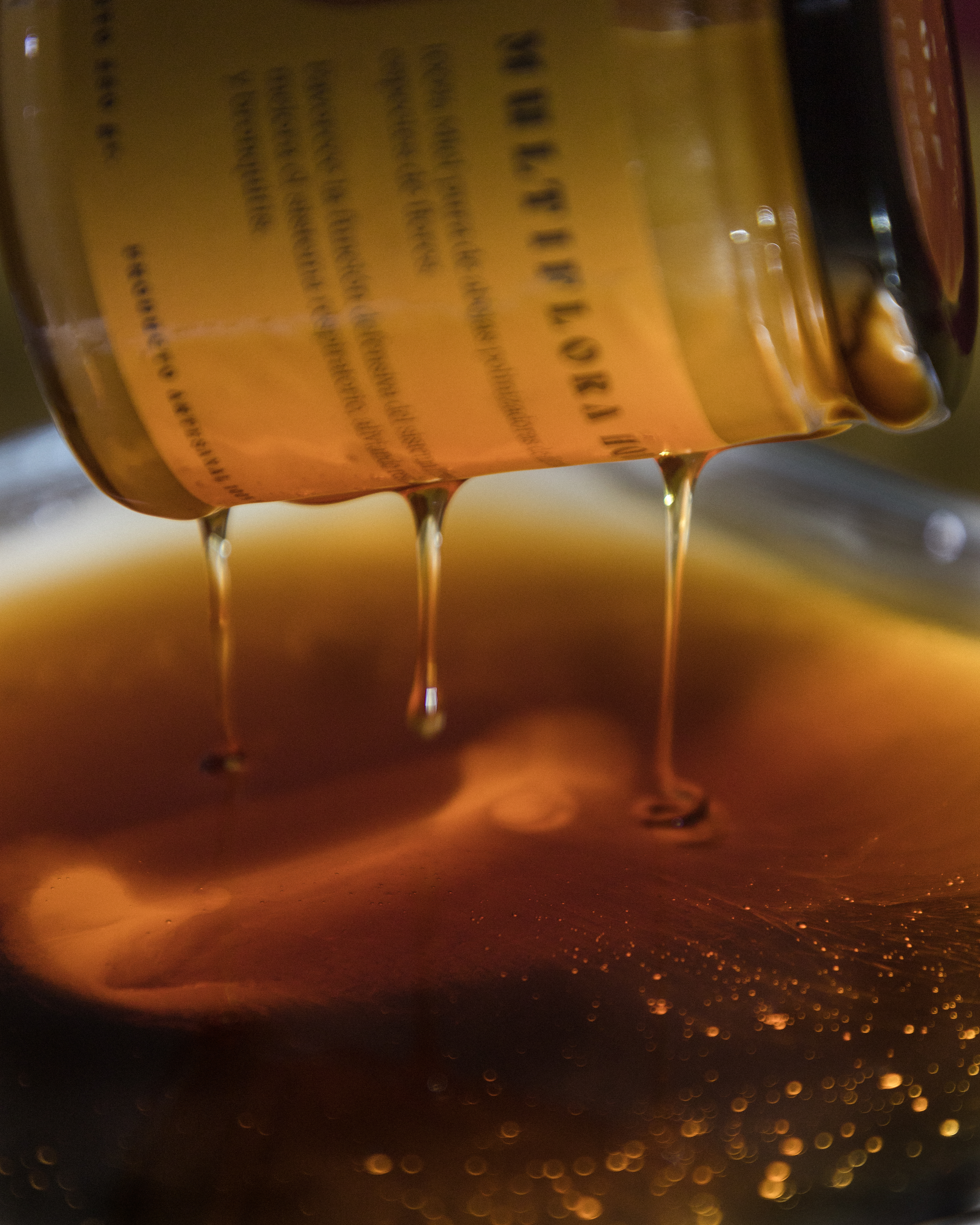
Rebranding for Scoop: Honest Goods., a brand of raw, artisanal honey made in Jalisco, Mexico. The essence of the product is in how its made, since the bees that create it are pollinators of different species of flowers and that’s what gives it its characteristic flavor. The goal for this rebrand new version was to make a much more sober and minimalist visual system emphasizing the colors of each flavor.