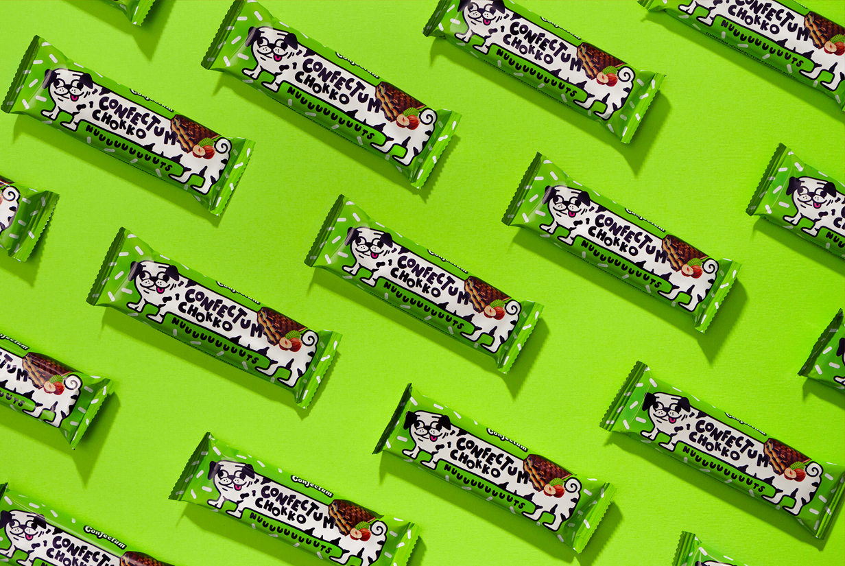
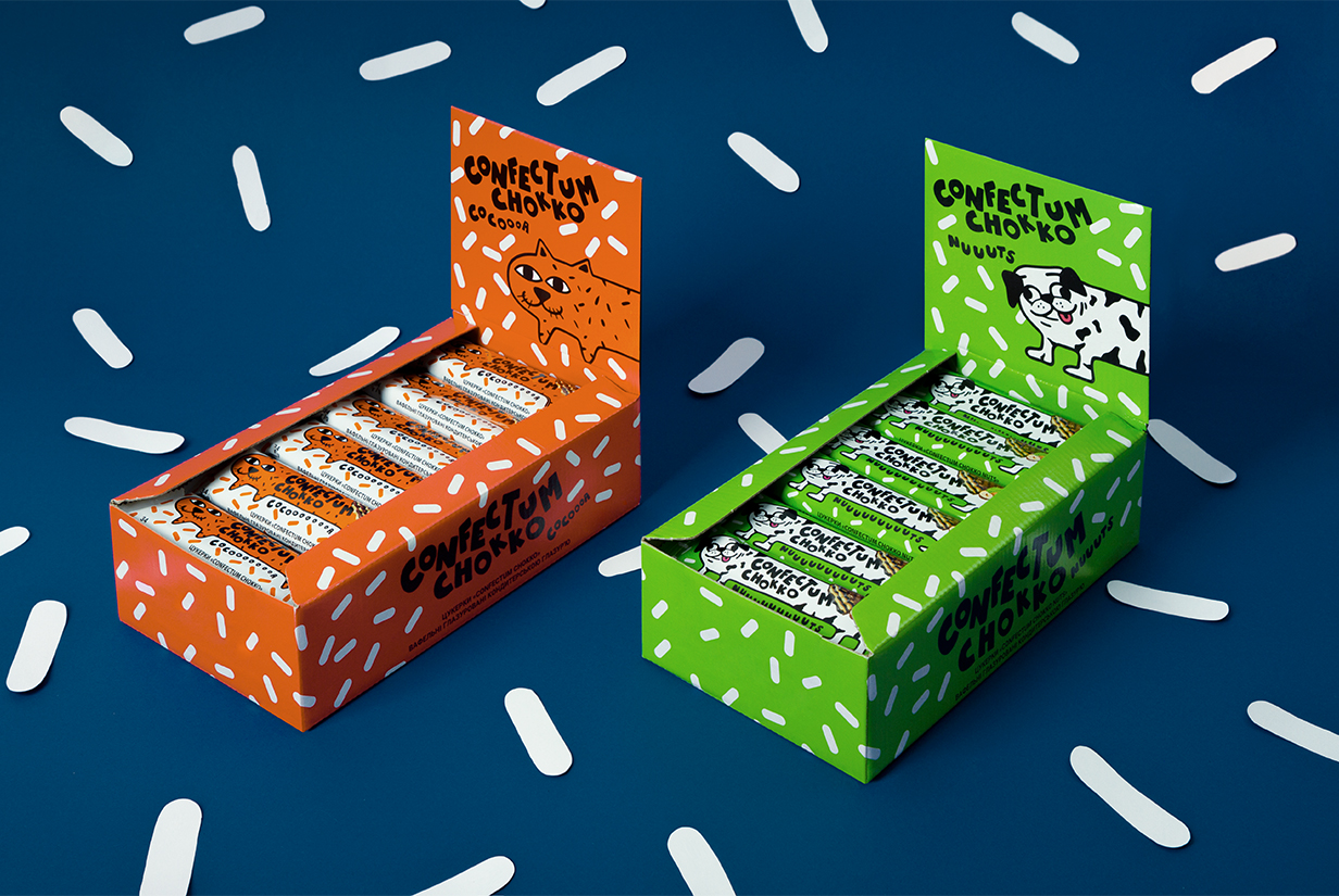
The designs for Confectum Chokko Bars feature fun illustrations that will remind some folks of the cartoon CatDog. The hero colors of lime green and traffic cone orange make each variant pop, and the sprinkle pattern adds to the playfulness of the brand. Although the hero characters and colors are drastically different for each flavor, the illustration style and typeface give the brand a cohesive feel. Each of these illustrations is light-hearted and youthful, making them the perfect way to bring back the feeling of being a kid.
New glazed wafer bars with different flavors from Ukrainian manufacturer Lisova Kazka entered the established world of big recognizable brands with almost no rational differences between products. The challenge is to gain market share in this world with a minimal advertising budget.
Our research has shown that people who buy bars are particularly willing to switch to new things. 95% of our respondents aged 18-30 years old admitted that they often or sometimes take new brands and flavors of chocolate wafer bars, and 56% are constantly looking for something new in the category.
In-depth interviews showed that in daily consumption people refuse chocolate, pastries, cakes due to healthy food trend and the desire to save money. They buy sweets with a lower sugar and fat content, in smaller packages and at a lower price. So chocolate wafer bars are just such and are perceived as a light snack, “something simpler, not super nutritious”, guilty pleasure, but easy to forgive yourself for.
Even if the promotion budget is 0, we always have packaging. In addition, if we are talking about sweet snacks, then the main channel of influence is visual, you cannot smell or touch the product.
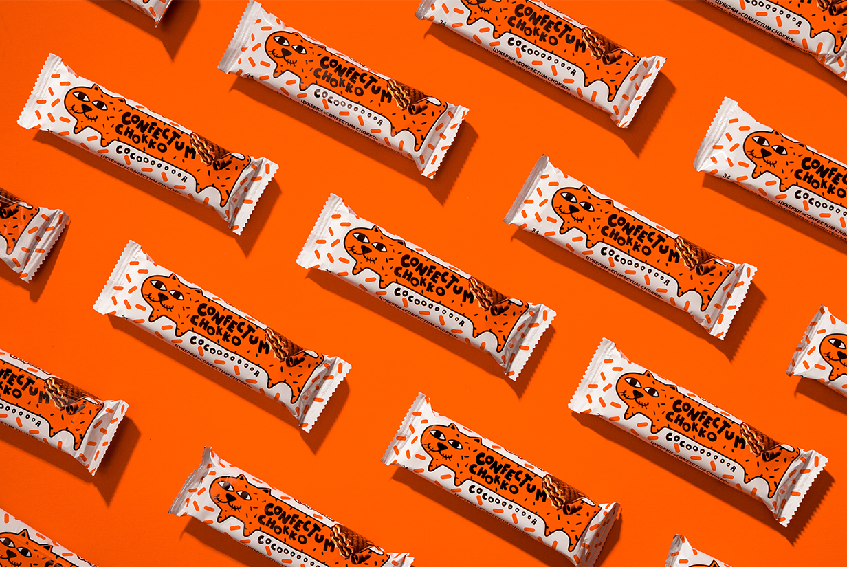
What the customer sees is associated with the taste of the product and the feeling during and after its consumption. All over the world, waffle bars are the choice of the young, so the color in the category is mostly colorful. The orange, red and green colors of first two flavors and the color contrast between the background and the image clearly indicate that there will be a lot of energy. The packaging of Confectum Chokko looks like a frame from a cartoon, but for adults. So there is also a moment of joyful escapism.
Max Burtsev: “This is how we create the uniqueness of the product through packaging and make a pitch for future media campaigns.”
In small pleasures, a trigger, an emotional impulse, a user experience at the store plays an important role. Confectum Chokko mascot works as such a trigger. There are almost no mascots in the chocolate wafer category, so you can only meet CatDog’s eyes at the shelf.