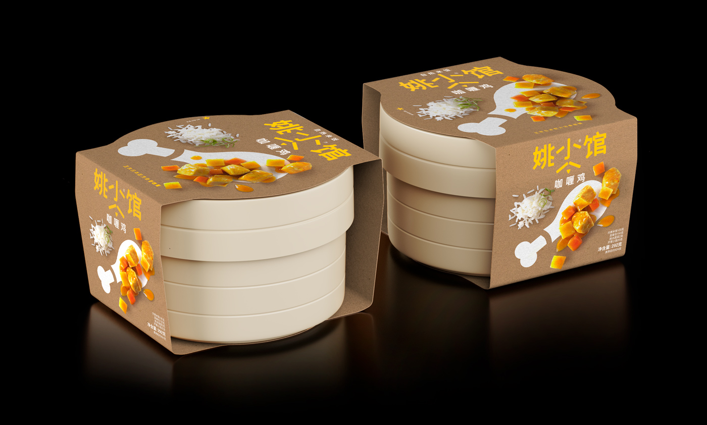
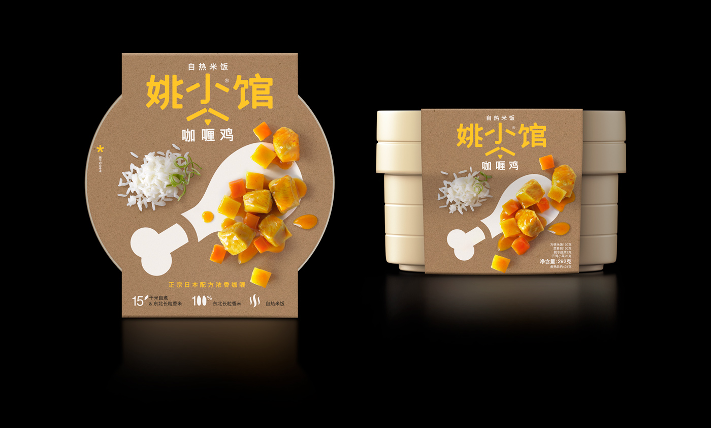
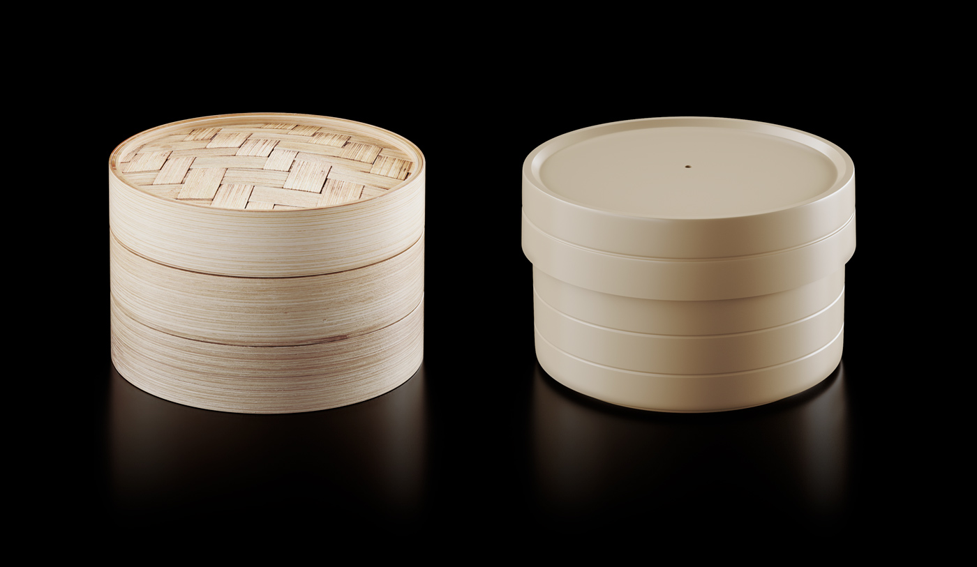
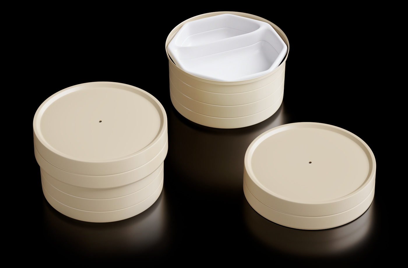
Mousegraphics PC worked with The Restaurant Of Yao to provide a universal language to cooking delicious, traditional, Chinese dishes in the comfort of your home. The logo’s design incorporates the human form within the Chinese characters, giving the label a playful twist at first glance. Each packet of provided ingredients is designed in a minimalist fashion, using pictures for reference. The containers pay homage to custom, bamboo steaming containers which make consumers feel like they are having professionally-made food with little to no necessary knowledge of how to cook.
The Restaurant Of Yao tasked us with preparing smart packaging for their at-home, instant food preparation brand. The objective was to create a package that would make identifying form and function easy for consumers. We designed both the brand logo and the product container with a parallel principle: human agency is the primary source of energy.
The logo applies the brand name, “The restaurant of Yao”, in a way that places emphasis on the human form inherent in the Chinese ideogram. The container is inspired by the traditional Chinese basket for steaming rice and the related steaming pots. In the innovative hybrid form that we created out of plastic, an otherwise traditionally complicated process and its components are demystified, clearly annotated and easily performed.
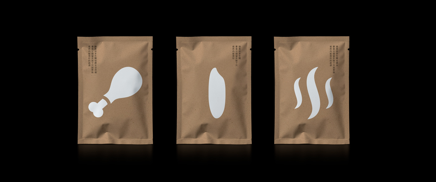
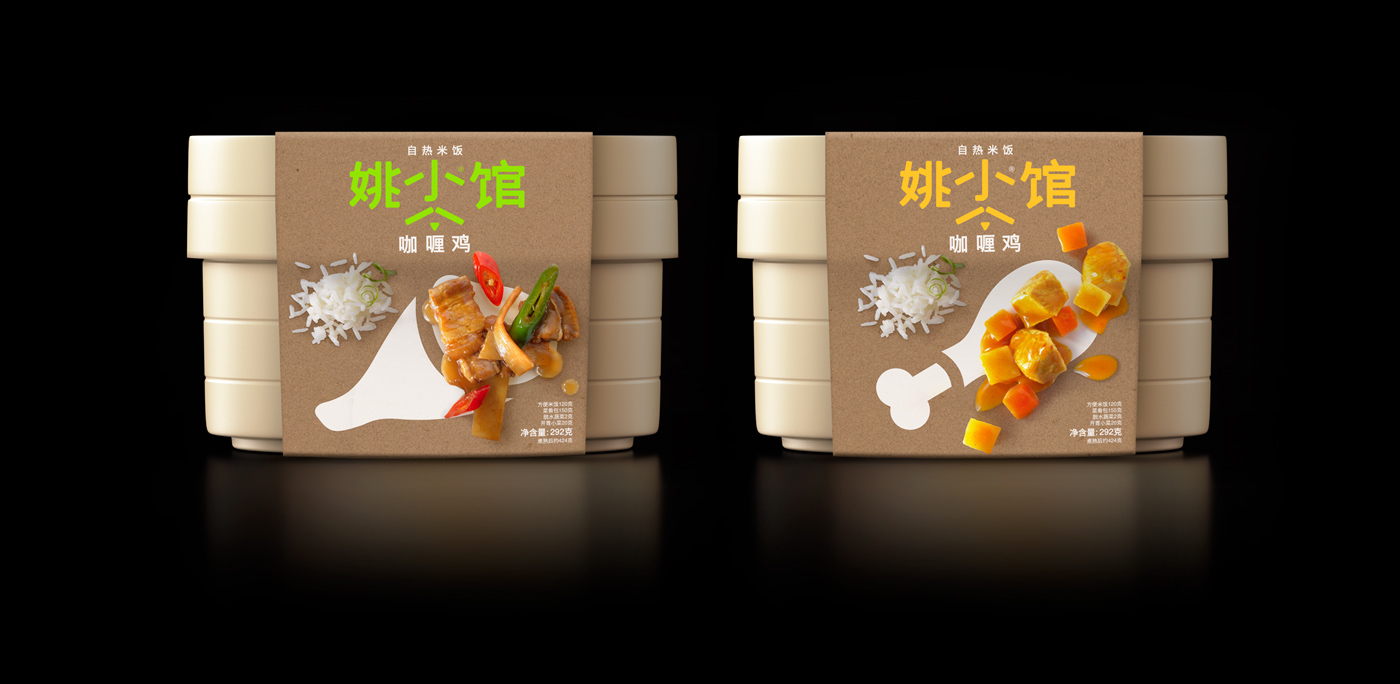
The sachets of ingredients are marked with universal info graphics (meat, rice, heating agent), while designated food placement is clarified by the additional compartmentalized disc. The covering carton provides the “restaurant’s” menu for the day. The consumer needs to simply add water and an instant hot dish appears.
Yao’s restaurant of wonders worked almost as an architectural challenge that we had to turn into a familiar, pocket-practice to provide a satisfying design experience.