ANA is a prêt-à -porter tool-kit that transforms the way parents and toddlers respond to tantrums. Together with Human, ANAâs brand development and packaging was reimagined in order to appeal to both. Drawing connections from classic board games and their respective primary color-saturated palettes, the brand identity is both crisp, modern, and bold.
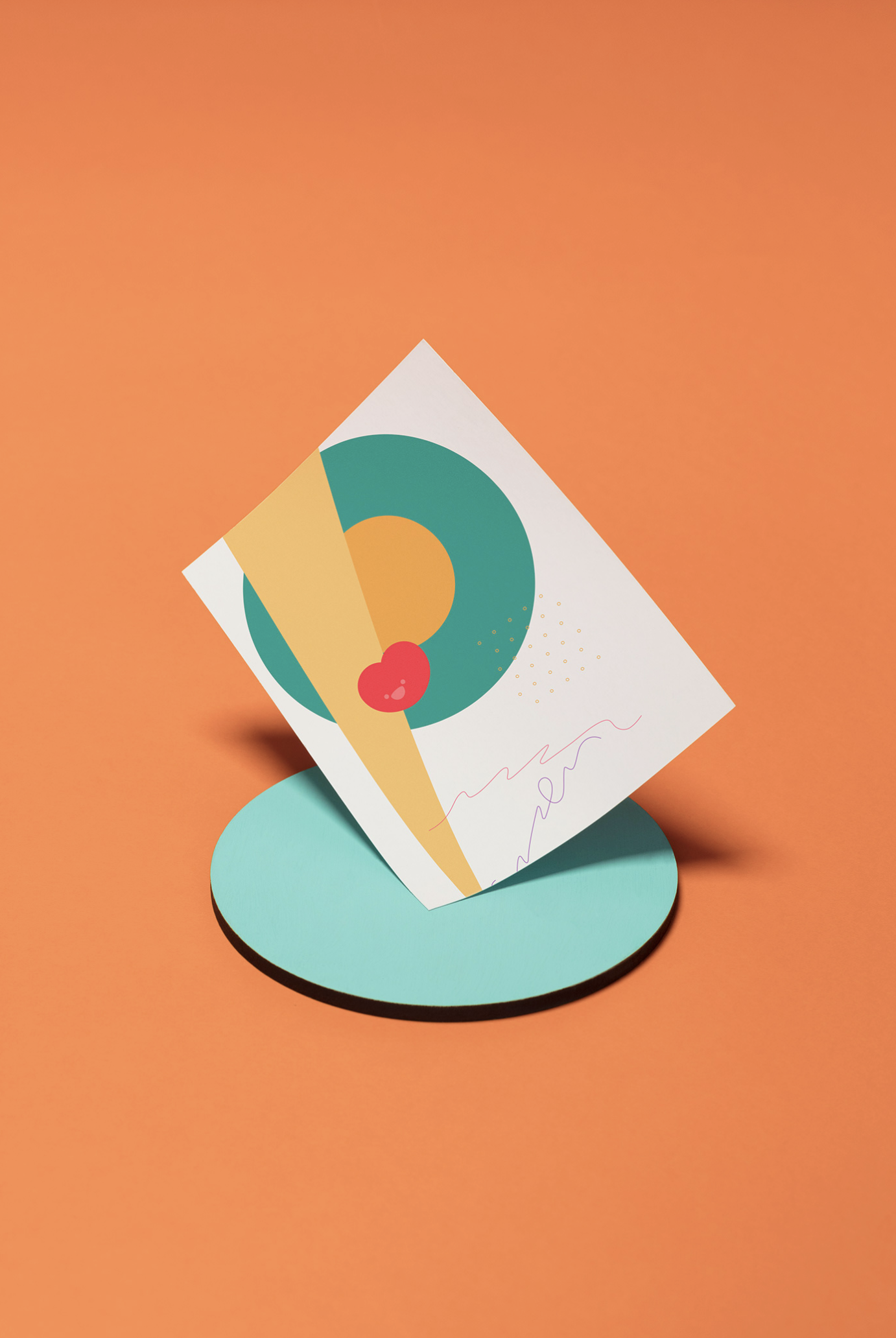
We found inspiration in traditional children’s games, such as tic-tac-toe, Scrabble, and a Mexican game called “avión”, to create a modular logo that can adapt on any peripheral. The graphic system is friendly, full of characters, icons, and patterns contrasted by a vibrant color palette in order to resemble a board game, which will be more appealing to children and parents.


