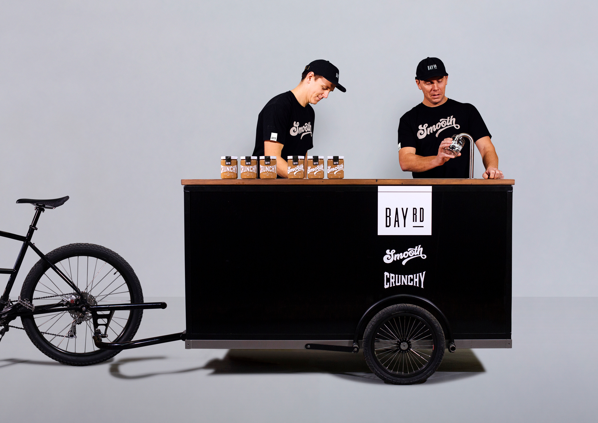
If you ask people their favorite peanut butter brand, that might not be able to give you a reason for loving it beyond that it was what they always ate as a child. Not that there’s anything wrong with a little bit of childhood loyalty, but sometimes, it’s worth exploring new options to not only expand your palette but to appreciate the art of certain products further, peanut butter included, of course.
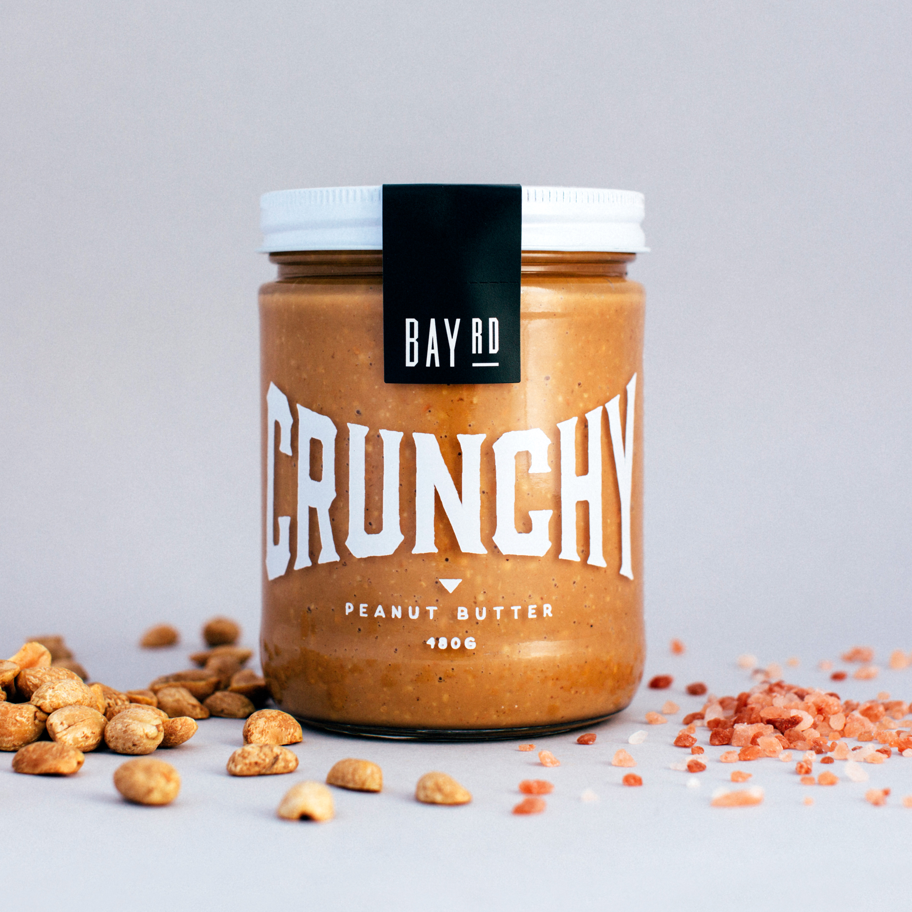
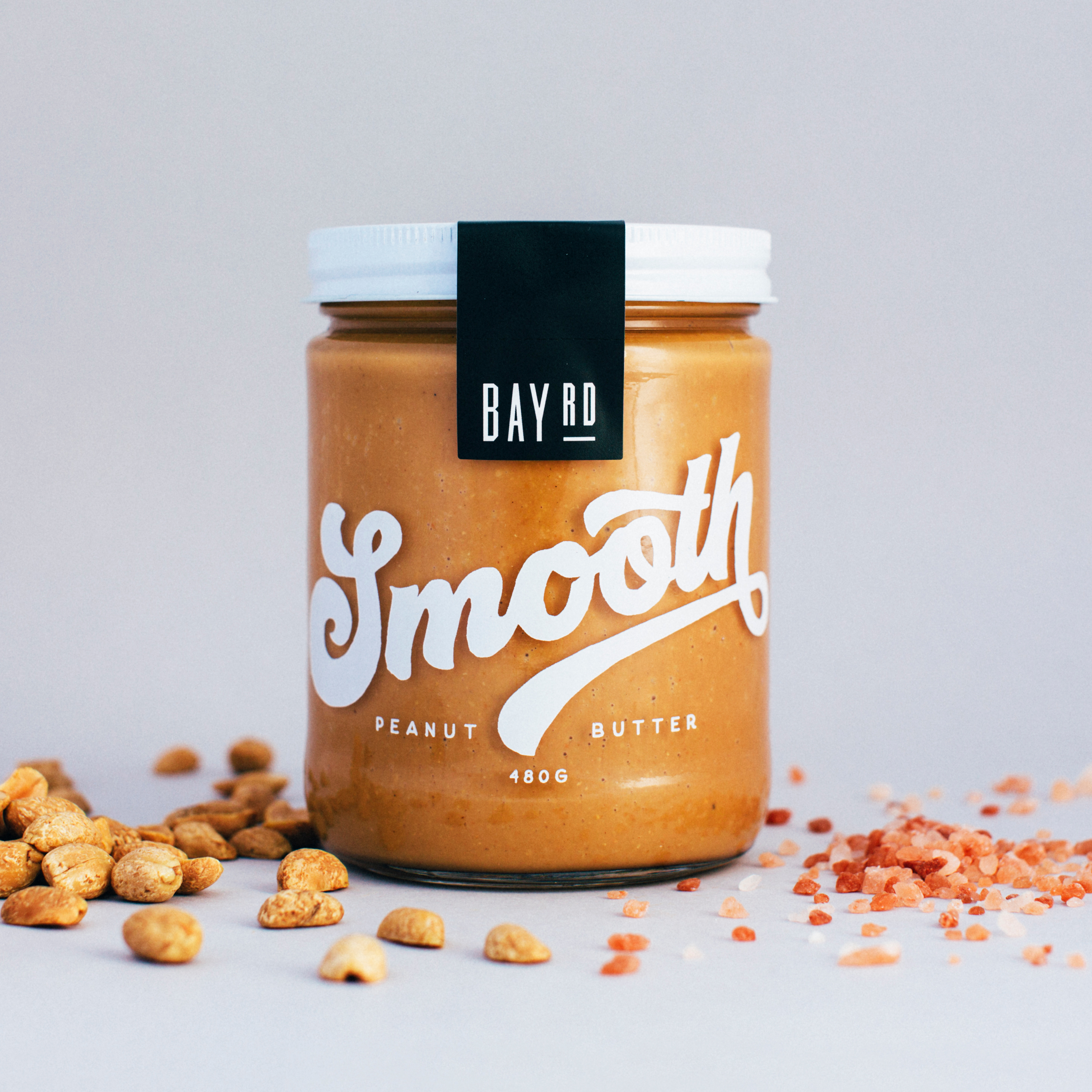
Bay Rd is a peanut butter brand with packaging designed by BrandAid that’ll instantly make you want to drop your childhood brand, thanks to its punchy typography and beautifully sustainable jars. The crunchy and smooth varieties are represented through oversized typography that fits both personalities to a tee. As a crunchy lover, the luchador-inspired typeface makes me feel superior in my choice, no argument necessary.
The simplicity of the design takes this peanut butter brand from just another brand to the brand to know.

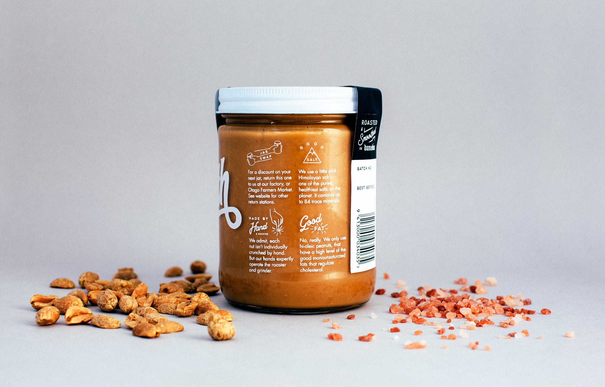
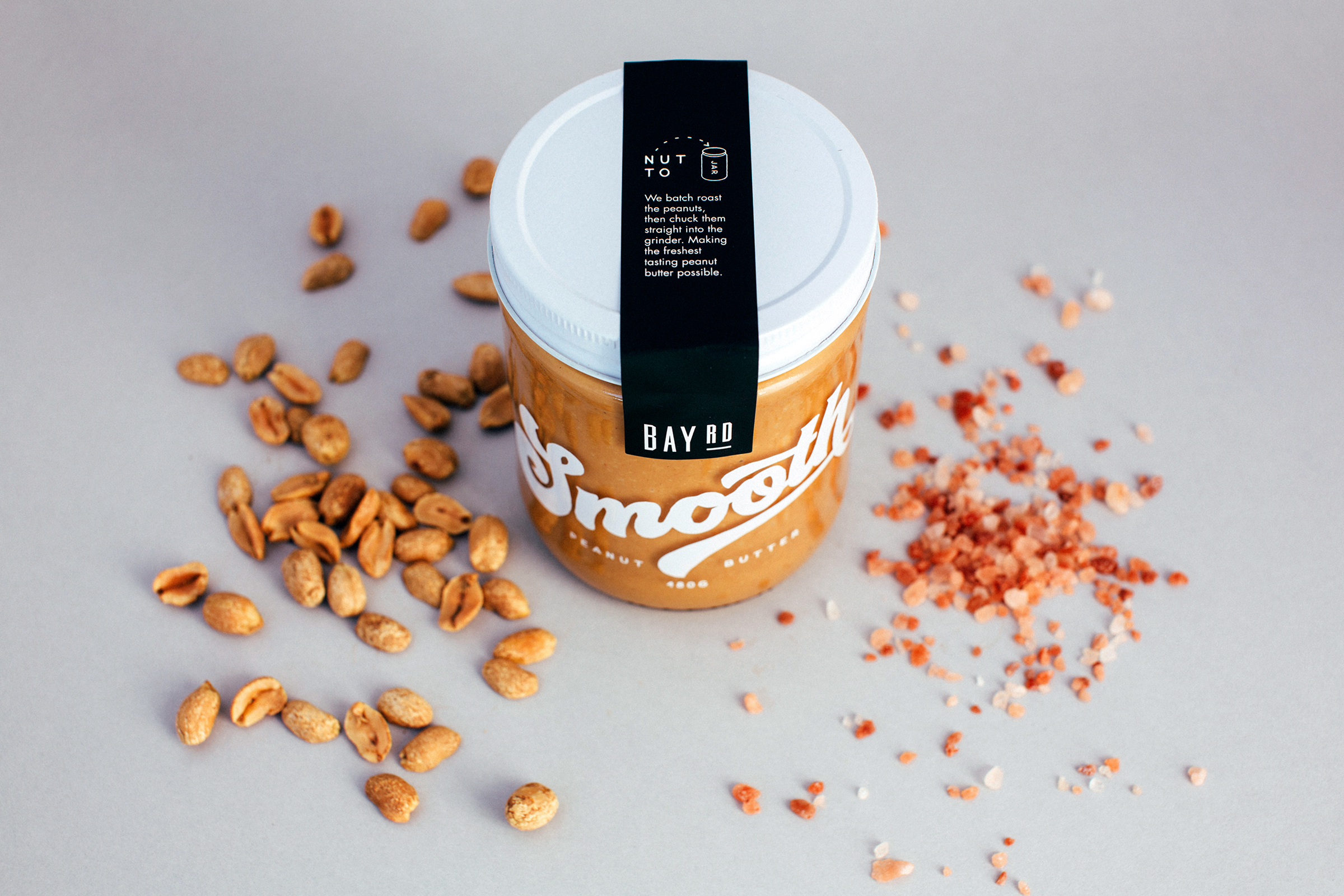
The design brief was to create truly sustainable peanut butter packaging, that also made them stand out on-shelf. The result was a reusable jar with hand-drawn type printed directly onto the glass jar surface. Jars can be returned for a discount on your next, or refilled. Good for the planet and good for you, the peanut butter is pretty damn tasty too.
